

Examples
Basic Usage
Date Range Filtering
Pivoting
Prior Year Comparison
Calculated Measures
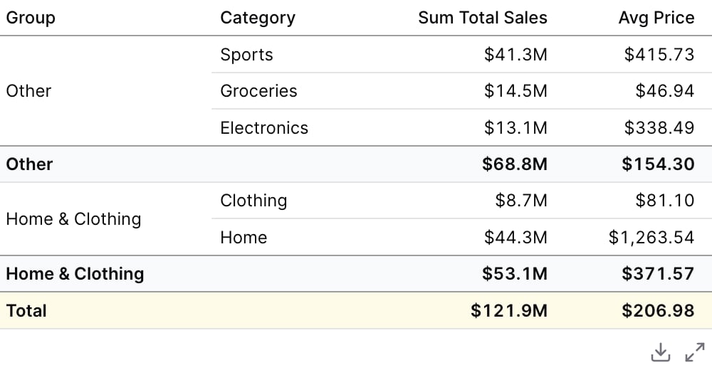
Custom Grouping
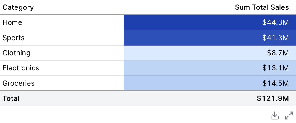
Viz: Color Scale
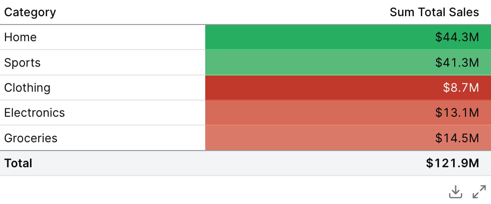
Viz: Color Scale with Custom Colors
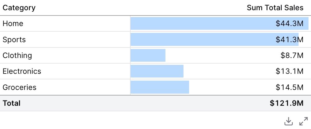
Viz: Bar
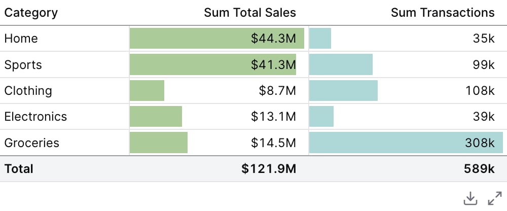
Viz: Bar with Custom Colors
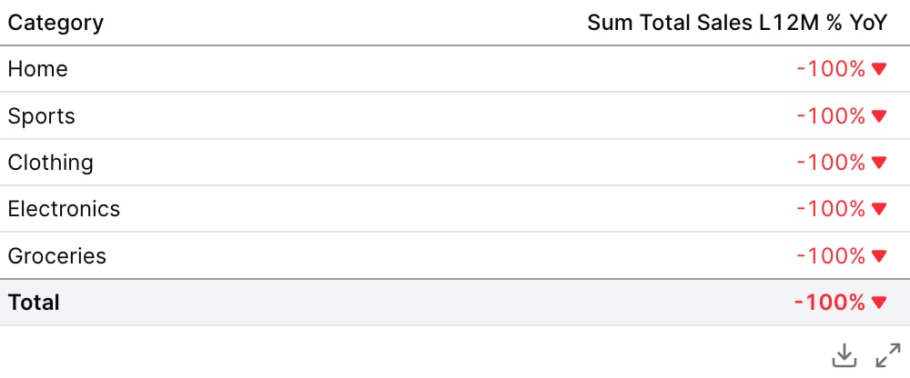
Viz: Delta
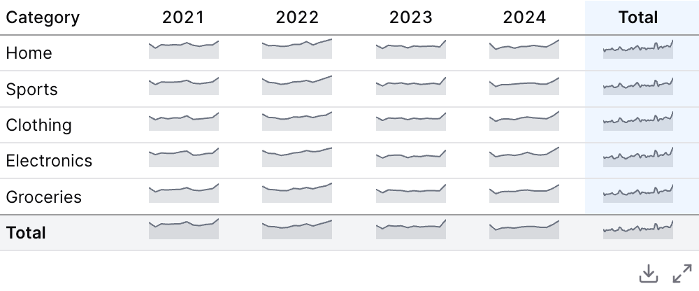
Viz: Sparkline
Links
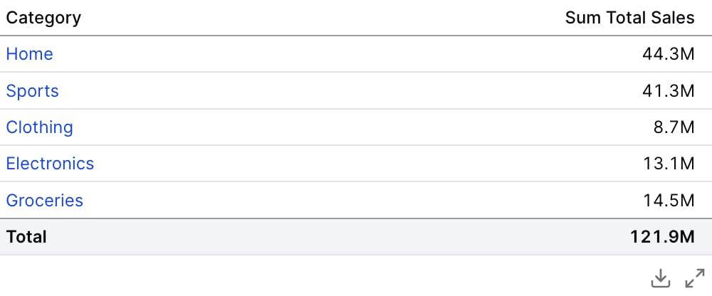
Column Info
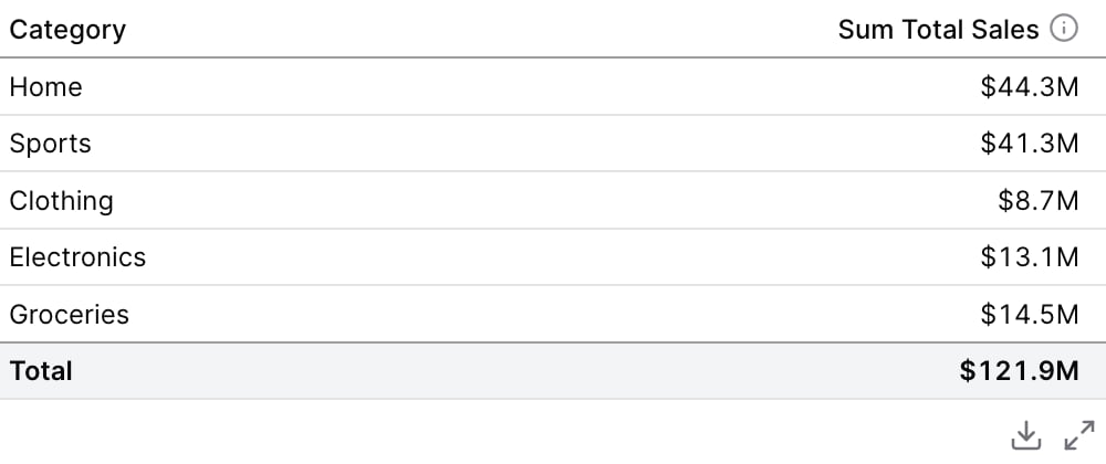
Sorting
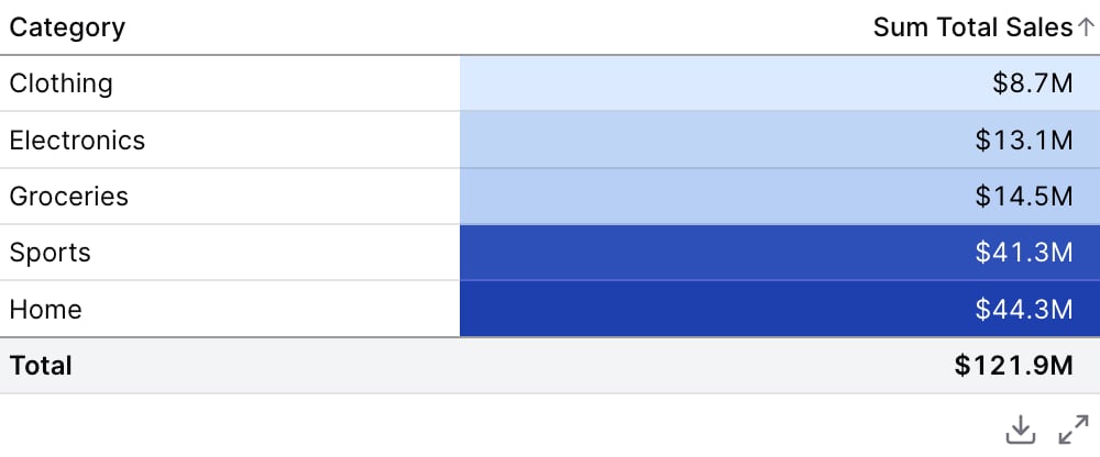
Date Grains: Day of Week
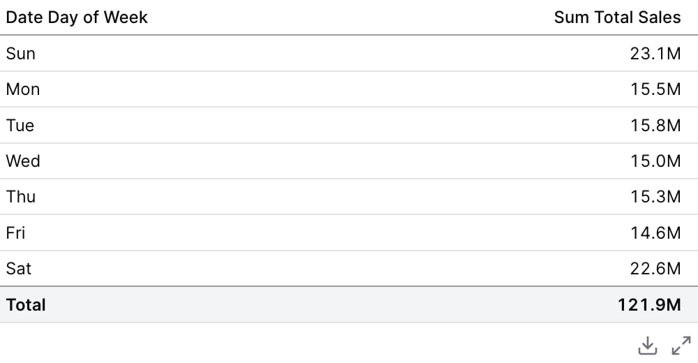
Repeat Dimension Values
Attributes
Use date_range to filter data for specific time periods. Accepts predefined ranges (e.g., “last 12 months”), dynamic ranges (e.g., “Last 90 days”), custom date ranges (e.g., “2020-01-01 to 2023-03-01”), or partial ranges (e.g., “from 2020-01-01”, “until 2023-03-01”)Example:Attributes:
- range:
string- Time period to filter. Use presets like ‘last 7 days’, dynamic patterns like ‘Last 90 days’, custom ranges like ‘2020-01-01 to 2023-03-01’, or partial ranges like ‘from 2020-01-01’.- Allowed values:
todayyesterdaylast 7 dayslast 30 dayslast 3 monthslast 6 monthslast 12 monthsprevious weekprevious monthprevious quarterprevious yearthis weekthis monththis quarterthis yearnext weeknext monthnext quarternext yearweek to datemonth to datequarter to dateyear to dateall time
- Allowed values:
- date:
string- Date column to filter on. Required when the data has multiple date columns.
Custom SQL WHERE condition to apply to the query. For date filters, use date_range instead.
Custom SQL HAVING condition to apply to the query after GROUP BY
Maximum number of rows to return from the query. Note: When used with tables, limit will disable subtotals to prevent incomplete subtotal rows.
Column name(s) with optional direction (e.g. “column_name”, “column_name desc”)
Custom SQL QUALIFY condition to filter windowed results
Title to display above the table
Subtitle to display below the title
Info text to display in a tooltip next to the title. Can only be used with the title prop.
URL to link the info text to (can only be used with info)
Create a custom link title for the info link, placed after the info text (can only be used with info_link)
Array of dimension column names or SQL expressions. Each item must be a string (e.g., [“column_name”, “count(category) as count”])
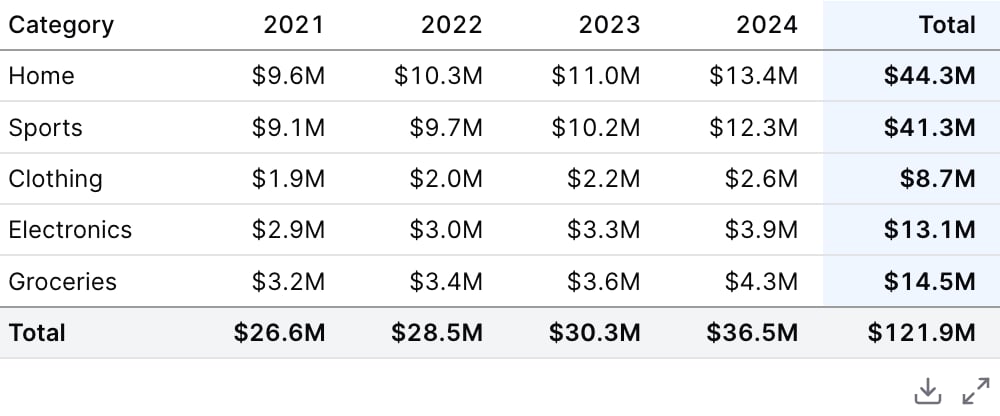
Array of pivot column names or SQL expressions. These will be pivoted in the table output. Each item must be a string (e.g., [“category”, “region”])
Array of SQL expressions for aggregations. Each item must be a string (e.g., [“sum(transactions)”, “avg(value) as average”])
Whether to include subtotals and totals in the table
The label to display in total/subtotal rows and columns. Useful when using non-sum aggregations like avg, min, max, or count.
Whether to display the total row at the bottom. Only applies when subtotals=true. Note: Temporal comparisons may hide totals even when this is true.
Whether to display intermediate subtotal rows. Only applies when subtotals=true. Note: Temporal comparisons may hide subtotals even when this is true.
Whether to display the total column in pivoted tables. Only applies when subtotals=true and pivots are used.
Whether to display intermediate subtotal columns in pivoted tables. Only applies when subtotals=true and pivots are used.
Whether to put measures before pivots in the column hierarchy (e.g., Sales > 2021|2022 instead of 2021|2022 > Sales)
Number of rows to display per page in pagination (maximum 200)
Whether to display a search box above the table for filtering results
Whether to apply formatting to column titles. When false, titles will be displayed as-is.
Whether to allow column titles to wrap across multiple lines. When false, titles will be on a single line.
Whether to allow table cell content to wrap across multiple lines. When false, cell content will be on a single line.
Whether to apply alternating background colors to table rows for easier reading.
Whether to display borders between table rows. When false, row borders are hidden.
Column name containing URLs to make each row clickable. When specified, clicking a row will navigate to the URL in that column.
Whether to display the link column in the table. Only applies when no explicit columns are specified and the link prop is used.
Time in seconds between automatic data refreshes (minimum 60). Overrides the page-level auto-refresh setting for this component.
Number of left-most columns to freeze when scrolling horizontally. Frozen columns remain visible while the rest of the table scrolls.
Whether to repeat dimension values on every row. When true, dimension values are displayed on every row even when they are the same as the row above.
Whether to enable collapsible groups. When enabled, subtotal rows become clickable to expand/collapse their child rows. Only works when subtotals are enabled and there are dimensions. Note: pagination is disabled when collapsible is enabled.
Whether all groups should start collapsed on initial load. Defaults to true when collapsible=true.
Where to position subtotal rows relative to their group data rows. “top” places subtotals before the detail rows, “bottom” places them after. Defaults to “top” when collapsible=true, otherwise “bottom”.Allowed values:
topbottom
Where to position the grand total row. “top” places it as the first row, “bottom” places it as the last row (default).Allowed values:
topbottom
SQL expression that returns a hex color for each row’s background. Used to conditionally highlight entire rows based on data (e.g., “case when sum(amount) > 10000 then ‘#dcfce7’ else null end”).
Set the width of this component (in percent) relative to the page width