

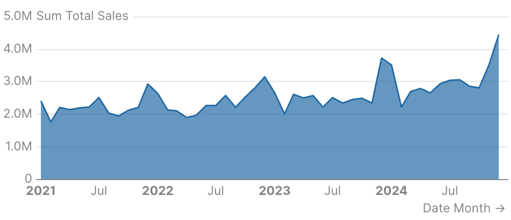
Examples
Basic Usage
Area Chart with Series
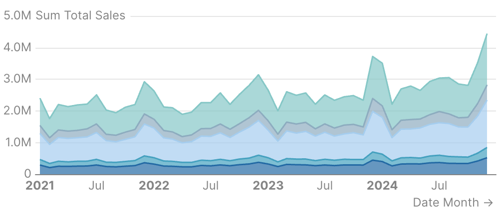
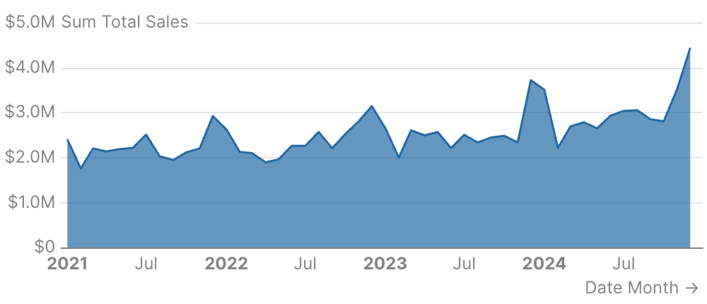
Area Chart with Formatting
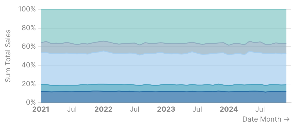
100% Stacked Area Chart
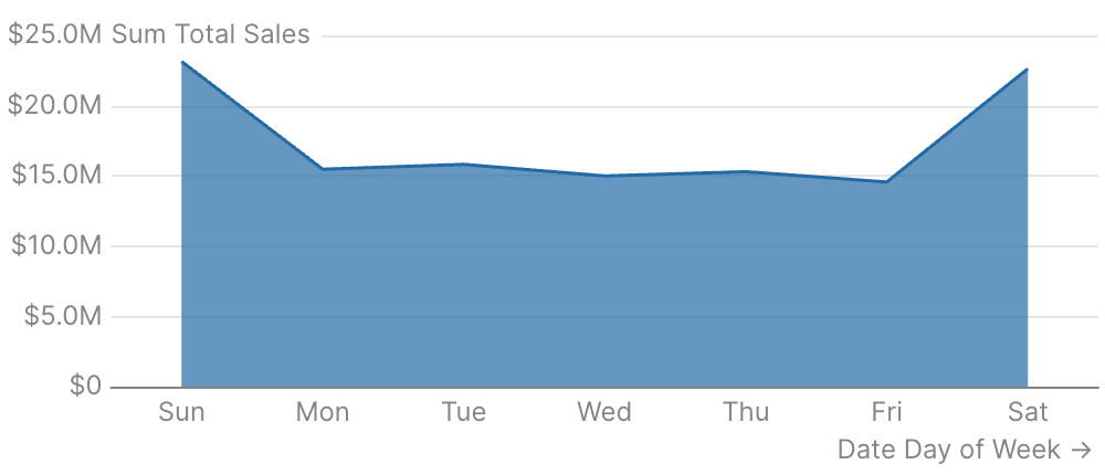
Revenue by Day of Week
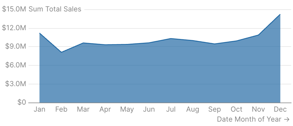
Seasonality Analysis (Month of Year)
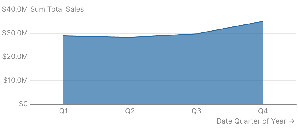
Quarterly Trends
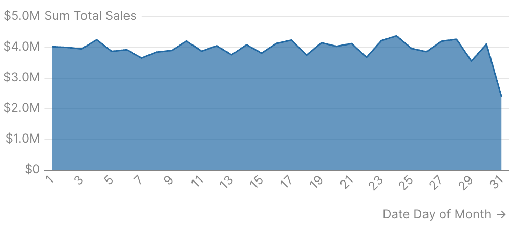
Monthly Billing Cycle Patterns
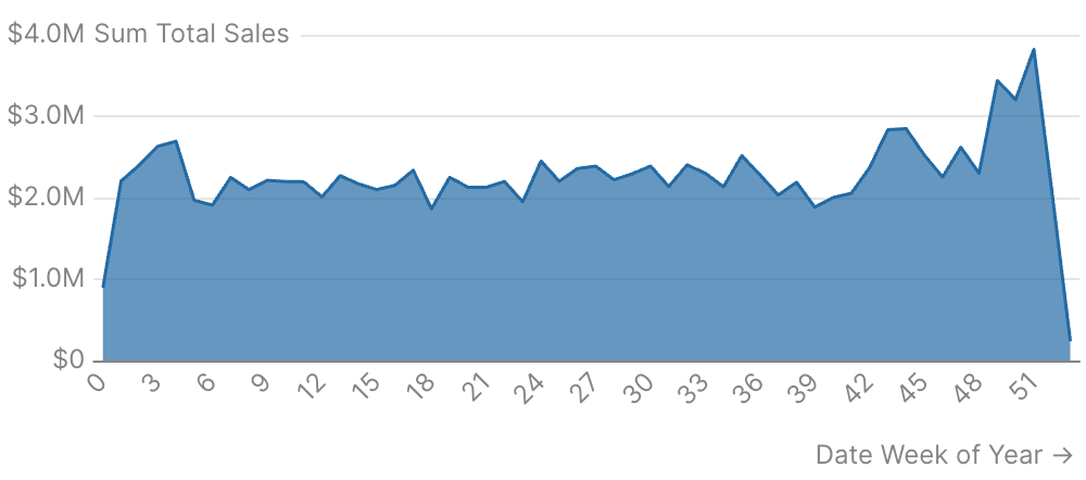
Week Number Analysis
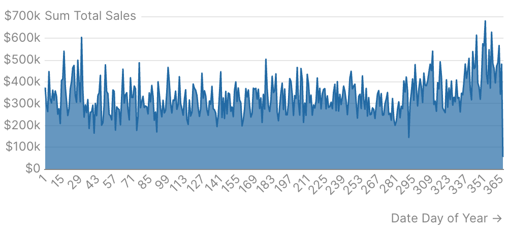
Day of Year Analysis
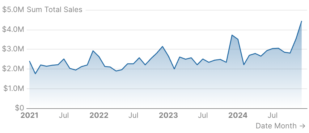
Area Chart with Gradient Fill
Attributes
Name of the table to query
IDs of filters to apply to the query
Use date_range to filter data for specific time periods. Accepts predefined ranges (e.g., “last 12 months”), dynamic ranges (e.g., “Last 90 days”), custom date ranges (e.g., “2020-01-01 to 2023-03-01”), or partial ranges (e.g., “from 2020-01-01”, “until 2023-03-01”)Example:Attributes:
- range:
string- Time period to filter. Use presets like ‘last 7 days’, dynamic patterns like ‘Last 90 days’, custom ranges like ‘2020-01-01 to 2023-03-01’, or partial ranges like ‘from 2020-01-01’.- Allowed values:
todayyesterdaylast 7 dayslast 30 dayslast 3 monthslast 6 monthslast 12 monthsprevious weekprevious monthprevious quarterprevious yearthis weekthis monththis quarterthis yearnext weeknext monthnext quarternext yearweek to datemonth to datequarter to dateyear to dateall time
- Allowed values:
- date:
string- Date column to filter on. Required when the data has multiple date columns.
Bucket dates into a grain. Pass the raw date column as
x and the chart truncates and groups for you. Temporal grains (day, week, month, quarter, year, hour) preserve the year — use for time-series. Seasonality grains (day of week, day of month, day of year, week of year, month of year, quarter of year) collapse across years — use for cyclical patterns like “which month sells most regardless of year”.Allowed values:dayweekmonthquarteryearhourday of weekday of monthday of yearweek of yearmonth of yearquarter of year
How to handle missing data points. “connect” auto-connects points (default), “gaps” shows visual breaks, “zero” fills with zeros.Allowed values:
connectgapszero
Column name for x-axis
Format for x values and axis labels. See Value Formatting for available formats.
Format for y values and axis labels. See Value Formatting for available formats.
Format for y2 values and axis labels. See Value Formatting for available formats.
Column name for series grouping (applies to all series)
Column name for individual point labels displayed at the top of the tooltip
Title to display above the component
Subtitle to display below the title
Information tooltip text (can only be used with title). Displays an info icon next to the title.
URL to link the info text to (can only be used with info)
Create a custom link title for the info link, placed after the info text (can only be used with info_link)
Time in seconds between automatic data refreshes (minimum 60). Overrides the page-level auto-refresh setting for this component.
Custom SQL WHERE condition to apply to the query. For date filters, use date_range instead.
Custom SQL HAVING condition to apply to the query after GROUP BY
Maximum number of rows to return from the query. Note: When used with tables, limit will disable subtotals to prevent incomplete subtotal rows.
Column name(s) with optional direction (e.g. “column_name”, “column_name desc”)
Custom SQL QUALIFY condition to filter windowed results
Set the width of this component (in percent) relative to the page width
Set a fixed height for the chart in pixels
Link this chart to others sharing the same id, syncing their tooltips, axis-pointer, and zoom
Sort order for x-axis categories. Options:
asc (alphabetical), desc (reverse alphabetical), data (preserve query order), or an array for custom order like ["A", "B", "C"]Allowed values:ascdescdata
Configure the y-axisExample:Attributes:
- title:
string - title_position:
string- Position of the axis title. “top” places it horizontally at the top, “side” places it vertically along the axis. Defaults to “side” for 100% stacked charts, “top” otherwise.- Allowed values:
topside
- Allowed values:
- ticks:
boolean - baseline:
boolean - labels:
boolean- Show/hide axis labels - gridlines:
boolean- Show/hide gridlines - min:
number- Minimum value for this axis (number for numeric axes, date string for date axes) - max:
number- Maximum value for this axis (number for numeric axes, date string for date axes) - fit_to_data:
boolean- Fit the axis to the data instead of including 0 - interval:
number- Interval between axis ticks for numeric axes. This option is a suggestion, the actual interval may differ.
Configure the secondary y-axisExample:Attributes:
- title:
string - title_position:
string- Position of the axis title. “top” places it horizontally at the top, “side” places it vertically along the axis. Defaults to “side” for 100% stacked charts, “top” otherwise.- Allowed values:
topside
- Allowed values:
- ticks:
boolean - baseline:
boolean - labels:
boolean- Show/hide axis labels - gridlines:
boolean- Show/hide gridlines - min:
number- Minimum value for this axis (number for numeric axes, date string for date axes) - max:
number- Maximum value for this axis (number for numeric axes, date string for date axes) - fit_to_data:
boolean- Fit the axis to the data instead of including 0 - interval:
number- Interval between axis ticks for numeric axes. This option is a suggestion, the actual interval may differ.
Configure the x-axisExample:Attributes:
- title:
string - show_title:
boolean- Whentrue, renders the auto-derived axis title (the x column name) below the chart. Ignored whentitleis set explicitly. Defaults tofalse— auto-derived column-name titles usually read as visual noise and the axis labels speak for themselves. - label_wrap:
boolean - ticks:
boolean - baseline:
boolean - labels:
boolean- Show/hide axis labels - gridlines:
boolean- Show/hide gridlines - min:
number- Minimum value for this axis (number for numeric axes, date string for date axes) - max:
number- Maximum value for this axis (number for numeric axes, date string for date axes) - fit_to_data:
boolean- Fit the axis to the data instead of including 0 - min_interval:
string- Minimum interval between axis ticks for time-based axes. This option is a suggestion, the actual interval may differ.- Allowed values:
yearquartermonthweekdayhour
- Allowed values:
- max_interval:
string- Maximum interval between axis ticks for time-based axes. This option is a suggestion, the actual interval may differ.- Allowed values:
yearquartermonthweekdayhour
- Allowed values:
- interval:
number- Interval between axis ticks for numeric axes. This option is a suggestion, the actual interval may differ. - label_rotate:
number- Rotation angle of axis label in degrees. Positive values rotate clockwise, negative values rotate counter-clockwise. - title_arrow:
boolean- Show/hide the arrow (⭢) on the axis title - max_label_length:
number- Maximum character length for axis labels. Labels exceeding this length will be truncated with an ellipsis. Defaults to 20 characters when labels are rotated.
Show legend. Studio’s built-in legend renders a compact color swatch + series name. For chart-wide style overrides that need the legend to reflect them precisely (line width, custom symbols, richer styling), set
legend=false and provide legend={ show=true ... } inside echarts_options to use ECharts’ native legend instead.Position of the legend (top or bottom)Allowed values:
topbottom
Array of series names to define the order of series in the chart and legend. Series not in the array will appear after the ordered ones.
Studio-shaped chart styling shortcuts (palette, series colors, zoom, padding). For raw ECharts overrides, use Attributes:
echarts_options instead.Example:- color_palette:
array of strings- Array of hex color codes to use for series colors - series_colors:
map of key-value pairs- Map of series names to hex color codes for custom series coloring - zoom:
boolean- Enables zoom by dragging on the chart area - top_padding:
number- Additional padding (in px) above the chart area to prevent labels from being cut off
Raw ECharts options deep-merged over the chart’s final configuration. Use for anything the structured props do not expose —
dataZoom, visualMap, graphic, tooltip styling, and so on. Partial overrides win key-by-key without clobbering Studio’s computed siblings. For per-series overrides, use echarts_series_options or the per-series echarts_options on a line/bar/etc. child.Example:Raw ECharts series options deep-merged into every data series in the chart. Use when the same override should apply to all series. Skips reference lines/areas/points. For a single series, set
echarts_options on the series child instead.Example:Column name for y-axis
Format for this series’ values. See Value Formatting for available formats.
Extra columns to include in the tooltip on hover. Each entry is
{ value, label?, fmt?, color_by_sign?, down_is_good? }. See the tooltip fields guide for examples.Label each point in the series with its valueExample:Attributes:
- position:
string- Position the label relative to its data point- Allowed values:
abovebelowleftrightmiddle
- Allowed values:
- fmt:
string- Format the label value. Defaults to series or axis fmt.- Allowed values: See Value Formatting for all available formats.
- size:
number- Font size in px - distance:
number- How far the label is from the data point - rotate:
number- Rotate each label (degrees) - color:
string- Change the text color of the labels - border_color:
string- Change the border color surrounding text labels, defaults to chart background - show_overlap:
boolean- Show labels for every point even when they overlap
Example:Attributes:
- step:
string- Show a stepped line rather than a smooth line between points and control where the step happens (start, middle, or end)- Allowed values:
startmiddleend
- Allowed values:
- smooth:
boolean - gradient:
boolean- Apply a color-to-transparent gradient fill to the area, fading from the series color at the top to transparent at the bottom
Whether to stack the areas. Set to “100%” for percentage stacking where each area shows its proportion of the total.
Column name for secondary y-axis
Example:Attributes:
- step:
string- Show a stepped line rather than a smooth line between points and control where the step happens (start, middle, or end)- Allowed values:
startmiddleend
- Allowed values:
- smooth:
boolean - gradient:
boolean- Apply a color-to-transparent gradient fill to the area, fading from the series color at the top to transparent at the bottom