
- Project theme — a
theme.yamlfile at the project root. - Page overrides — a
theme:key in a page’s settings. - Organization theme — set in Settings → Theme; applies as the default for every project.
Resolution order
For each color or setting, the most specific value wins: Evidence default → organization → projecttheme.yaml → page settings → component attributes
A value set at one level overrides the levels above it. Leave a value out (or delete the key) to inherit from the level above.
The theme.yaml file
theme.yaml lives at the project root, next to evidence.config.yaml. Colors take separate light and dark variants as 6-digit hex. A key present here overrides your organization’s theme; delete a key to inherit it from the org.
colors
Each color is an object with light and dark 6-digit hex values.
base— the base color for pages and charts. All other UI colors (text, borders, gridlines, etc.) are automatically derived from it for good contrast.card— background of individual component cards. Only takes effect when cards are enabled.cardLayoutBackground— the page background shown behind the cards. Only takes effect when cards are enabled.inputSurface— fill for input controls (dropdowns, button groups, text inputs). Leave unset to auto-derive a raised surface from your theme; set it to pin a color.sidebarBackground— background of the published report’s navigation sidebar. Unset → the sidebar tracks the page background.positive/negative— semantic up/down colors used by deltas, gains/losses, candlestick bodies, and red-negative values.
colorPalettes.default
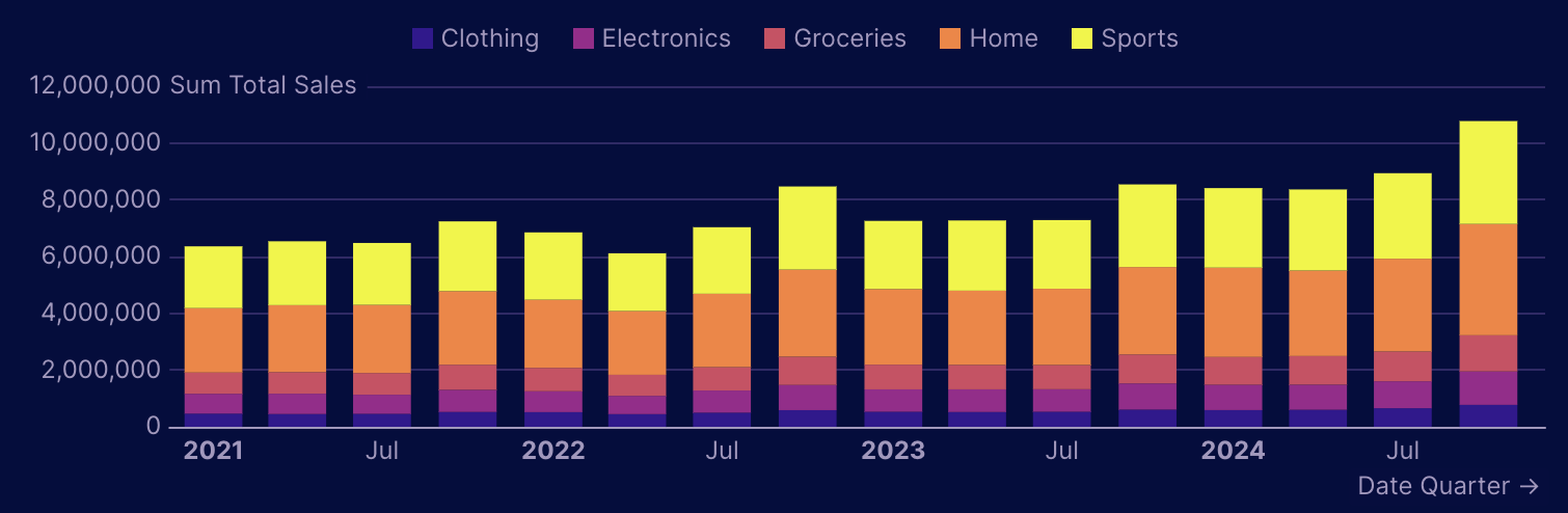
The categorical palette — the ordered list of series colors used by charts with multiple series (bar charts, line charts, etc.). Each series uses the next color in the list. Provide light and dark arrays of hex values.
colorScales.default
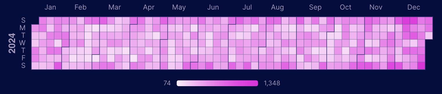
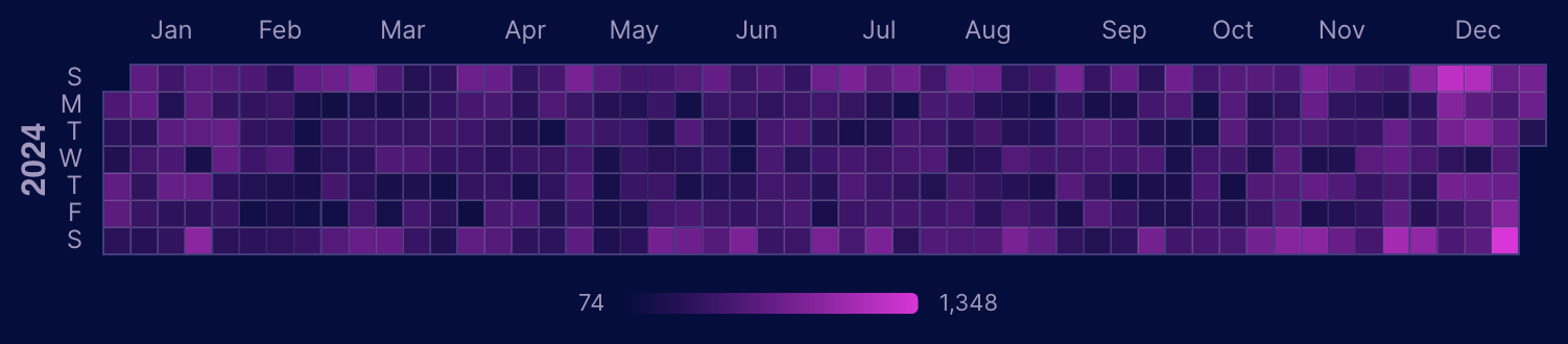
The sequential scale used for heatmaps, calendar heatmaps, and tables with viz="color" on a measure. Provide light and dark arrays of hex values.
Two or more colors form a custom gradient between your exact colors:
Style tokens
Beyond colors, the theme controls typography, shape, spacing, and chart/table defaults. All are optional — omit a key to inherit it. The in-product theme editor exposes every token, and the generatedtheme.yaml includes a commented block of all defaults you can uncomment and edit.
fonts—heading,body, andmono, each one ofsans-serif|serif|mono(mapped to the bundled Geist / Source Serif 4 / Geist Mono). Charts follow the body font unlesschart.fontFamilyis set.baseFontSize— base size for report text (CSS length, e.g.16px); scales the whole type scale proportionally.sidebarFontSize— font size for the published sidebar navigation. Unset → follows the report size.radius— corner radius of cards, inputs, and buttons (CSS length).depth— shadow depth on cards/inputs:flat|subtle|elevated.density— spacing between components and inside cards:flush|compact|default|comfortable.flushremoves grid gutters and tiles cards edge-to-edge.chart—gridlines,baselines(booleans);gridlineColor,axisLabelColor,baselineColor(light/dark colors);fontFamily;barRadius(px);smooth,areaGradient(booleans); andanimateIntro/animateUpdates(chart draw-in on first render / re-animate on data change).table—rowLines,rowShading(default behaviors); andbarColor,subtotalBackground,totalBackground,rowBorderColor,hoverColor,linkColor,pivotBackground(light/dark colors).
Overriding the theme on a page
To customize a single page, add atheme: key to its page settings. It mirrors the structure of theme.yaml. Anything you set overrides the project theme for that page only; anything you leave out is inherited.
- Set only
light(or onlydark) and the other mode is inherited. - Palette and scale arrays are overlaid positionally — the colors you list take the first slots and the inherited theme fills the rest — so listing a couple of palette colors keeps the remaining defaults.
Component overrides
Component attributes are the most specific level. Set directly in your markdown, they override every theme setting for that one component.Cards mode
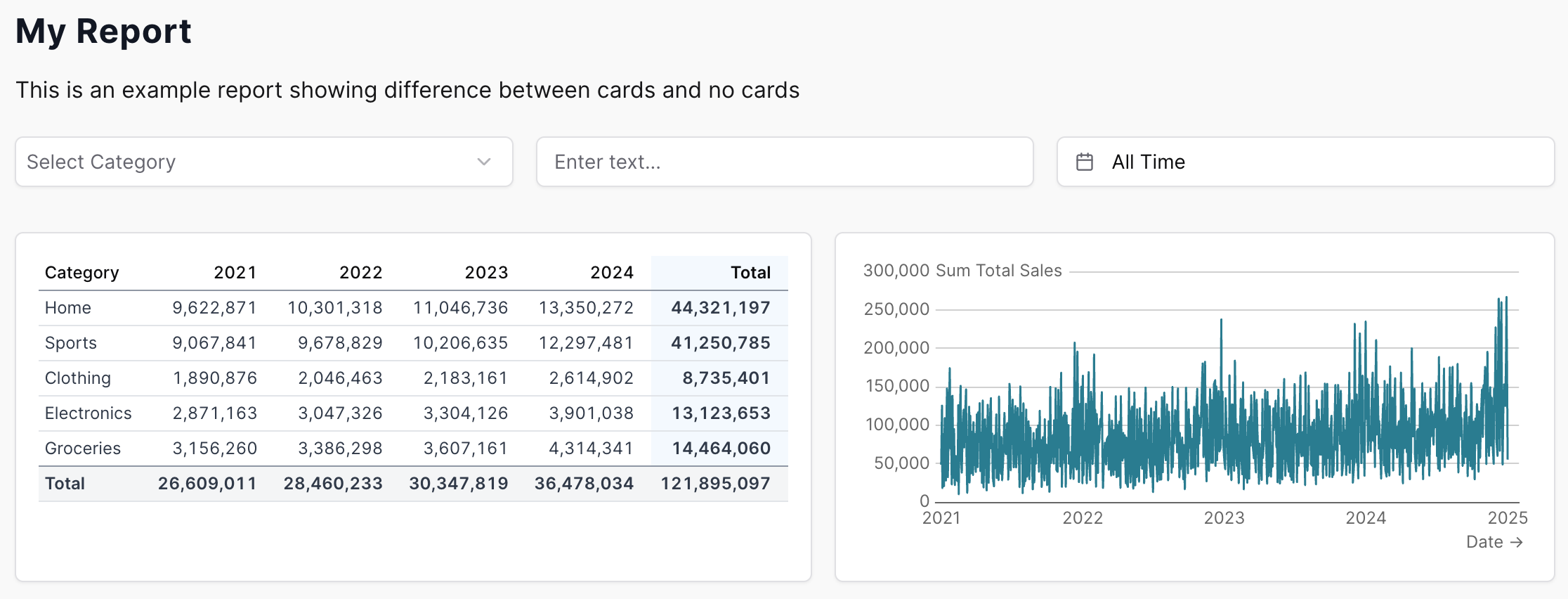
Cards wrap each component in a visual container (border + shadow) for a dashboard-style look. Cards are a layout setting — enable them project-wide inevidence.config.yaml, or per page in page settings with cards: true. When cards are on, the card and cardLayoutBackground colors from your theme take effect.
Without cards, components render directly on the page background for a clean, document-style appearance:
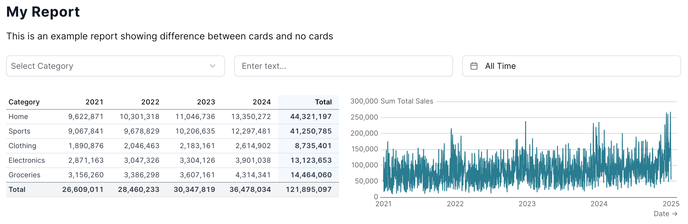
card background and the cardLayoutBackground color shows behind them: