
Examples
Basic Usage
Using where
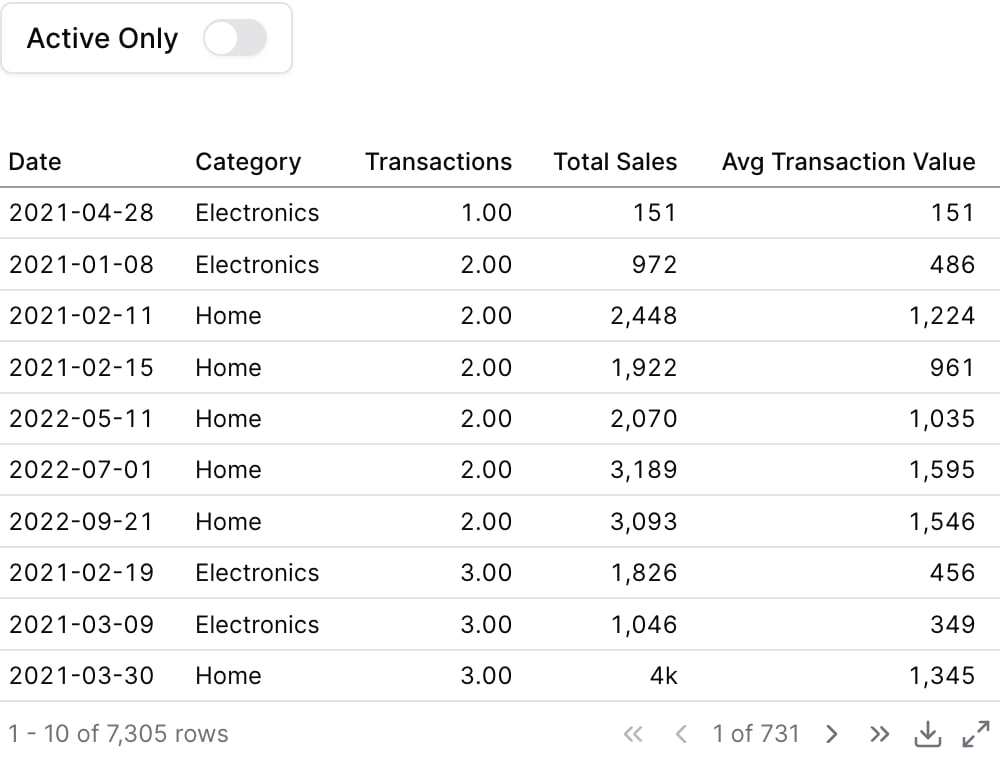
Using Inline SQL

Attributes
The id of the toggle to be used in a
filters propText displayed next to the toggle inside the box. Defaults to the id if not provided.
Information tooltip text that appears after the label
Invert the boolean value output. When true, checked = false and unchecked = true. Useful when toggle label semantics are opposite to the filter logic (e.g., a “Show inactive” toggle that filters for is_active = false when checked).
Initial state of the toggle
Using the Filter Variable
Reference this filter using{{filter_id}}. The value returned depends on where you use it.
| Context | Default Property | No Selection | Result |
|---|---|---|---|
| Inline SQL query | .value | true | |
where attribute | .value | true | |
| Text / Markdown | .value | true |
Available Properties
You can also access specific properties using{{filter_id.property}}:
.value
Returns the boolean value of the toggle.true