# Changelog
Source: https://docs.evidence.studio/changelog
Track the latest updates and improvements to Evidence
### 🚀 Adjusted Developer Role Privileges
Previously, developers and admins could manage users, groups and customers. This is now restricted to Admins only.
### ✨ Motherduck Connector Schema Support
You can now use schema with the Motherduck connector
### 🐛 Dropdown Component Now Supports 'where' Attribute
The `dropdown` component now supports the `where` attribute for filtering dropdown options with custom SQL WHERE conditions, bringing it to feature parity with other filter components like `button_group` and `input_tabs`.
### 🐛 Horizontal Bar Chart X-Axis Formatting
Fixed issue where the `x_fmt` parameter was not being applied to axis labels in horizontal bar charts. Formatting now works consistently for both axis labels and tooltips.
### ✨ Add your organization logo
Add your organization's logo in settings
### ✨ Github Data Connector
Sync data about your Github repos directly into Evidence.
### ✨ Deltalake (S3) Connector
Connect using your S3 with Delta Lake format your data remains at rest in your S3 bucket.
### ✨ Smooth Line Option
New `smooth` attribute inside line options lets you create a line with rounded corners

[View Documentation](https://docs.evidence.studio/components/line_chart#param-line-options)
### ✨ Chart `height` attribute
Control the height of your charts using the `height` attribute
[View Documentation](https://docs.evidence.studio/components/area_chart#param-height)
### ✨ Groups
Add team members to groups to simplify permissions on projects and pages
[View Documentation](https://docs.evidence.studio/core-concepts/access-control#groups)
### ✨ Customer Groups
Create customers, and invite customer users to view reports that you choose.

[View Documentation](https://docs.evidence.studio/core-concepts/access-control)
### 🚀 Improved Excel Export
Excel exports now use component titles to create tab names, and exclude logic and filter components
### ✨ User Variables
Access the user's name, email and organization using variables in markdown.
[View Documentation](http://docs.evidence.studio/core-concepts/variables#built-in-variables)
### ✨ Themes
Set color themes at the organization, project, and page level - including background, chart, and card colors
Access theme settings in page settings, project settings, or org settings. You can override theme colors at each level (e.g., project can override org theme, page overrides project and org themes)
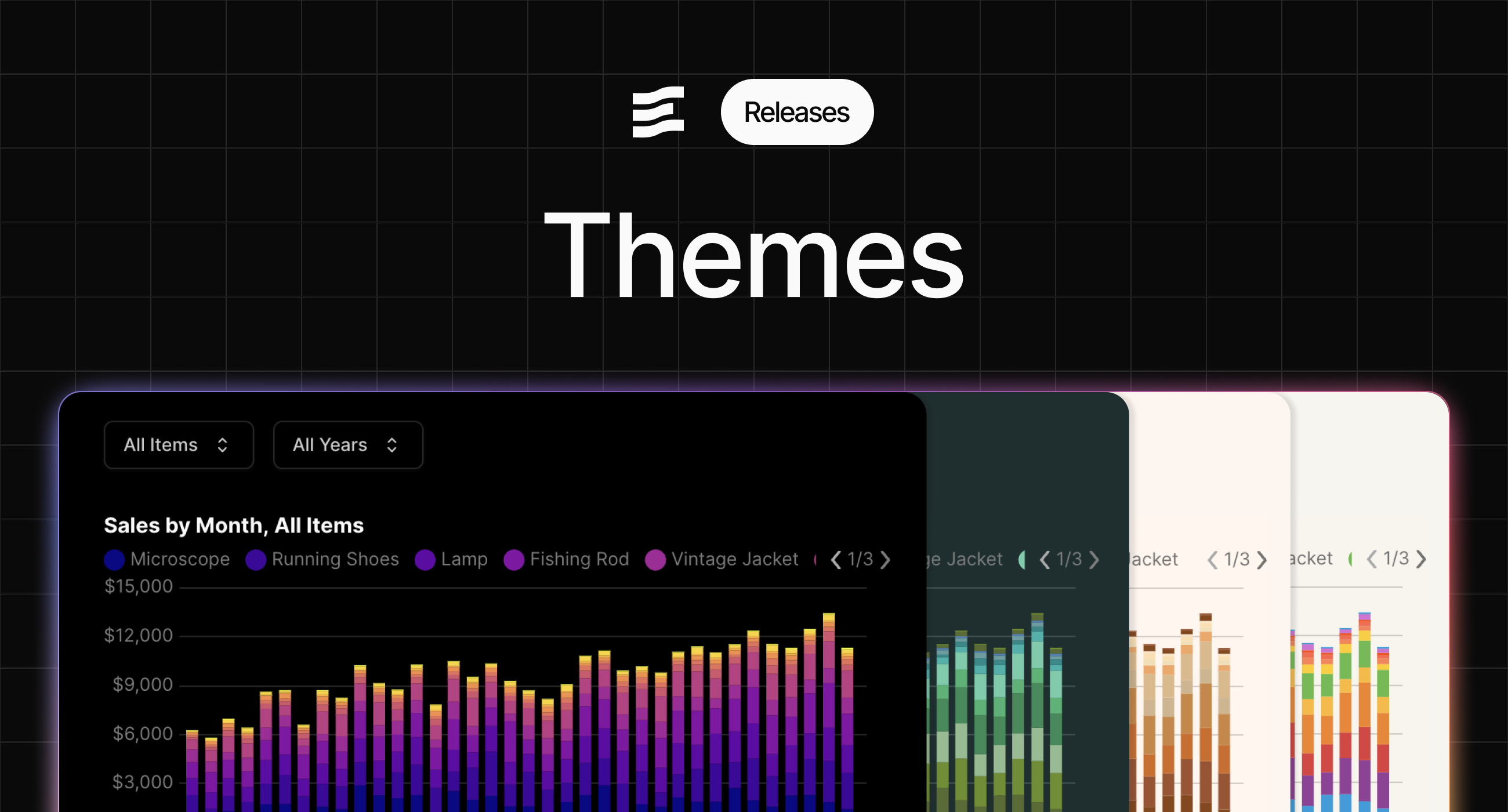
[View Documentation](https://docs.evidence.studio/core-concepts/themes)
### 🚀 Improved Translation Validation Errors
Incorrect structures for translation maps will provide useful errors
### 🚀 Translations Editor
Modify translations with a fully featured text editor
### 🚀 Improved bucket docs
Adds more information about using bucket connectors
[View Documentation](https://docs.evidence.studio/data-sources)
### ✨ Translation Management
Define variables with different translations for multi-language apps.

[View Documentation](https://docs.evidence.studio/core-concepts/translations)
### ✨ Standalone Horizontal Bar Chart Component
New dedicated `horizontal_bar_chart` component makes it easier to create horizontal bar charts
We recommend migrating any existing horizontal bar charts to this new component
[View Documentation](https://docs.evidence.studio/components/horizontal_bar_chart)
### ✨ Display control for total and subtotals in table
Choose which totals or subtotals to display in your table
[View Documentation](https://docs.evidence.studio/components/table#param-show-subtotal-rows)
### ✨ Dark Mode Chart Colors
Configure colors for both light and dark mode in your project and org settings
![Dark Mode Chart Colors]() ### ✨ Input tabs full\_width and align attributes
Input tabs now allows the same styling configuration as the Tabs component, including full width and right align
[View Documentation](https://docs.evidence.studio/components/input_tabs#param-full-width)
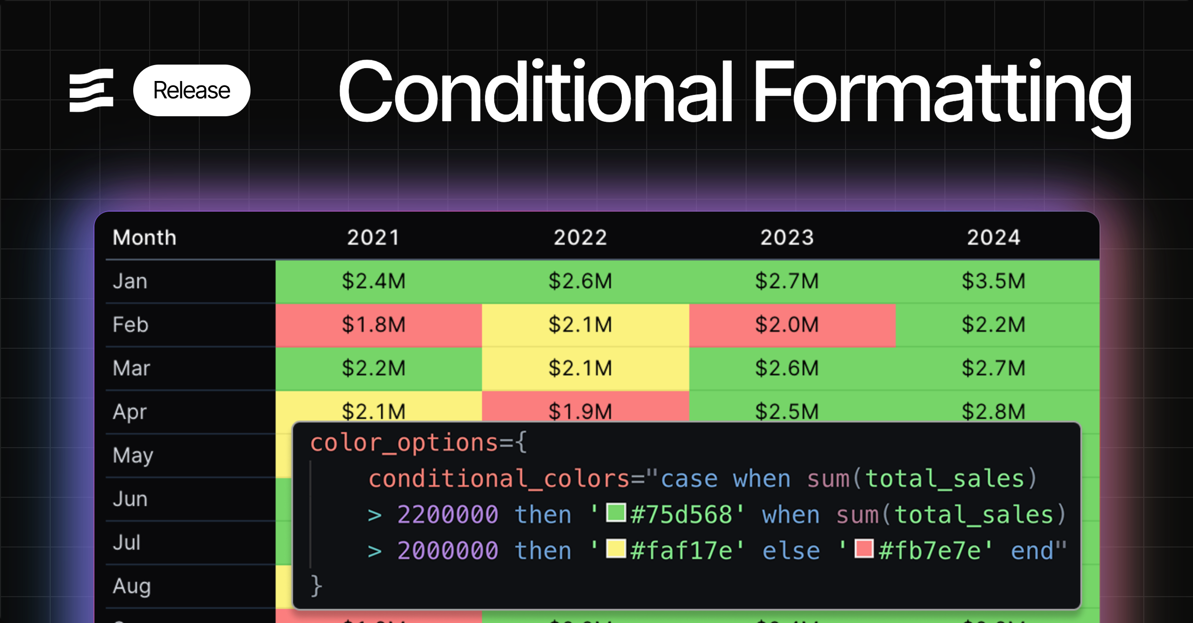
### ✨ Conditional Formatting
Apply conditional logic to choose colors for visualizations
### ✨ Series Color Mapping
Option to select specific colors for series in your charts
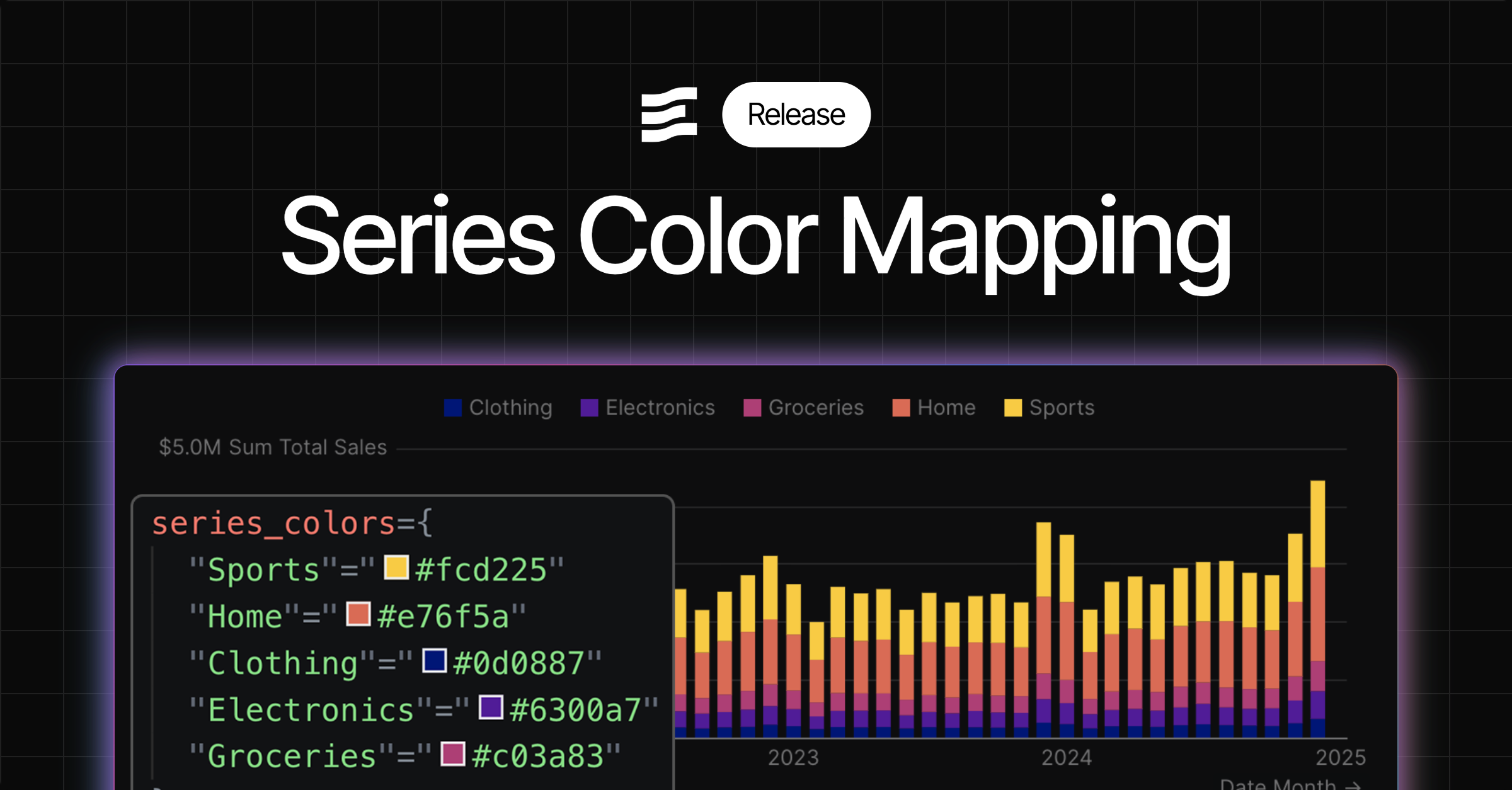
[View Documentation](https://docs.evidence.studio/components/bar_chart#bar-chart-with-series-colors)
### 🚀 Assign access to pending users
You can now grant project and page access to users who have not yet accepted invitations to join the Evidence organization.
### 🚀 Control order of series in combo chart
Combo chart now displays your series in the order you define them in your markdown
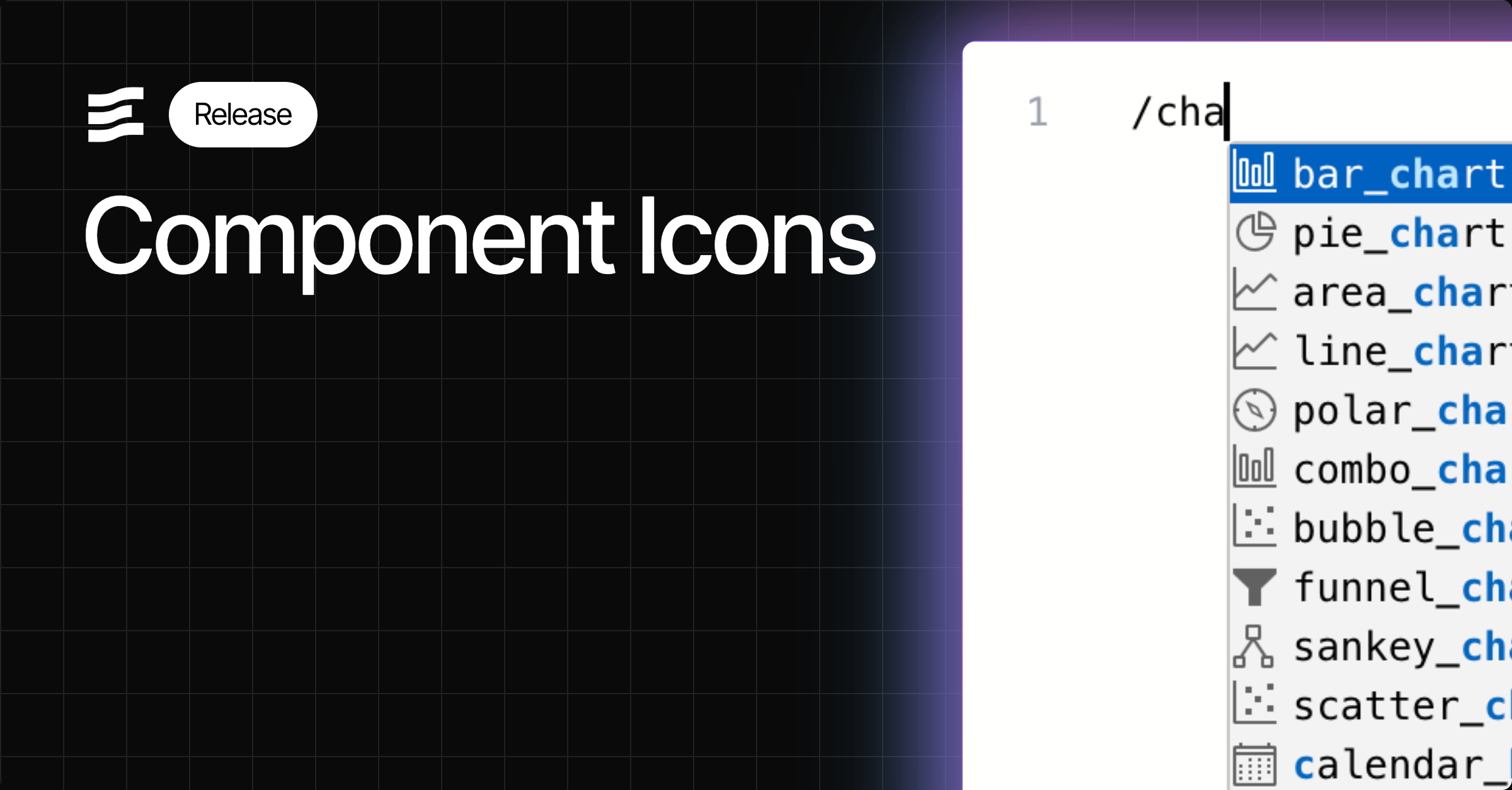
### 🚀 Icons in Autocomplete
Find components more easily in component autocomplete menus using the mini-icons
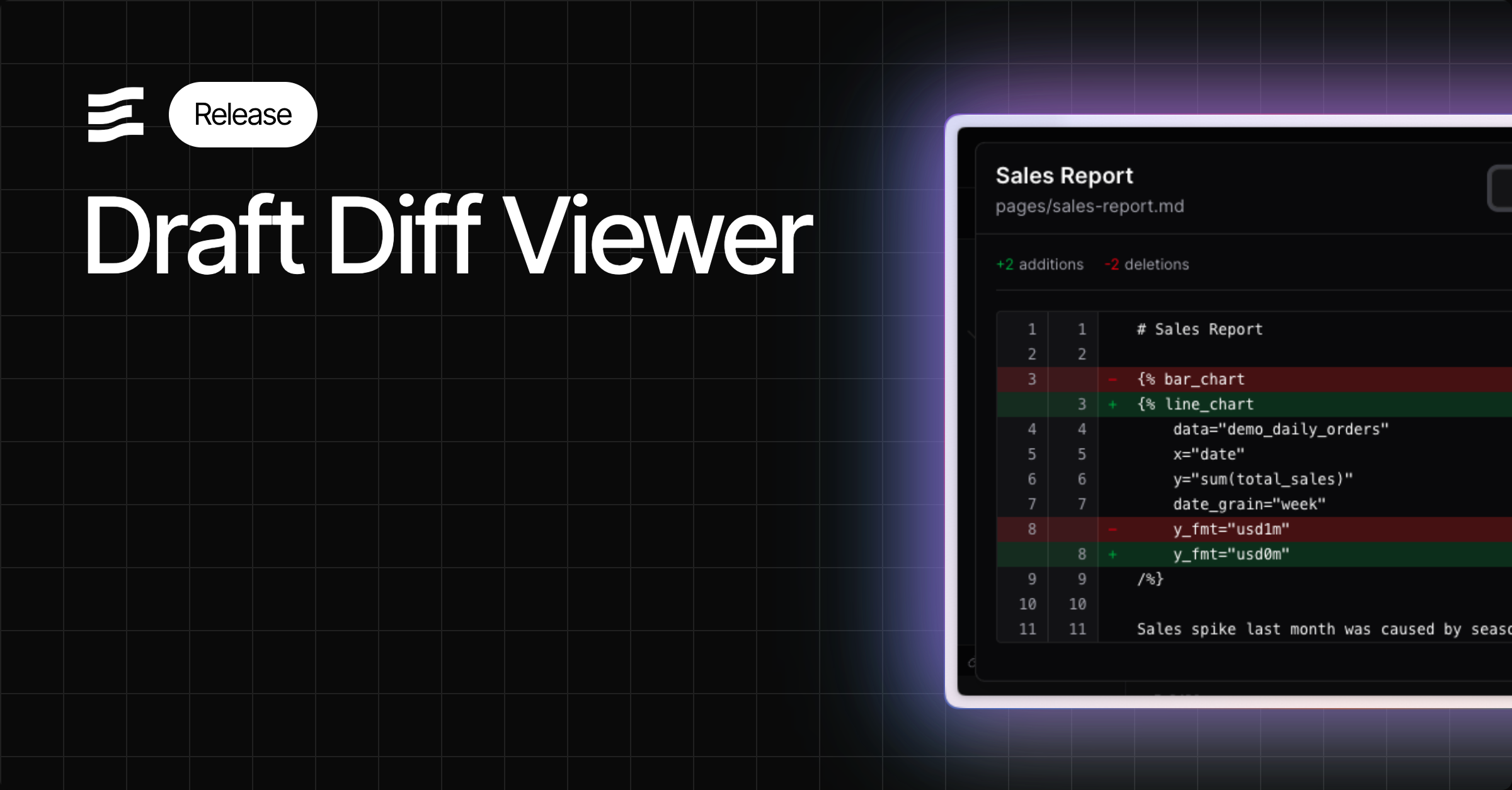
### ✨ Draft Diff Viewer
Review your changes using the diff viewer before you publish
### 🚀 Smoother chart loads on input changes
Improved chart loading behaviour and animation when changing inputs on your page
### ✨ Input tabs full\_width and align attributes
Input tabs now allows the same styling configuration as the Tabs component, including full width and right align
[View Documentation](https://docs.evidence.studio/components/input_tabs#param-full-width)
### ✨ Conditional Formatting
Apply conditional logic to choose colors for visualizations

### ✨ Series Color Mapping
Option to select specific colors for series in your charts

[View Documentation](https://docs.evidence.studio/components/bar_chart#bar-chart-with-series-colors)
### 🚀 Assign access to pending users
You can now grant project and page access to users who have not yet accepted invitations to join the Evidence organization.
### 🚀 Control order of series in combo chart
Combo chart now displays your series in the order you define them in your markdown
### 🚀 Icons in Autocomplete
Find components more easily in component autocomplete menus using the mini-icons

### ✨ Draft Diff Viewer
Review your changes using the diff viewer before you publish

### 🚀 Smoother chart loads on input changes
Improved chart loading behaviour and animation when changing inputs on your page
![Smoother chart loads on input changes]() ### 🐛 Fix for table pivoting issues
Fixed issue where tables were not pivoting in certain situations
### ✨ Variable `label` property
You can now reference the `label` property of a variable - useful when adding labels to viz components based on input selection
[View Documentation](https://docs.evidence.studio/components/dropdown#label)
### ✨ `fmt` property for input options
Use dynamic formats in viz components when creating an input to select a metric - e.g., show 'usd' for sales or 'pct1' for growth
[View Documentation](https://docs.evidence.studio/components/dropdown#fmt)
### 🐛 Fix for scale\_column
Fixes issue where scale\_column in the measure component was not properly assigning colors
### 🐛 Fix for custom date range end dates
Fixes issue where custom end date defined in SQL was not taking effect
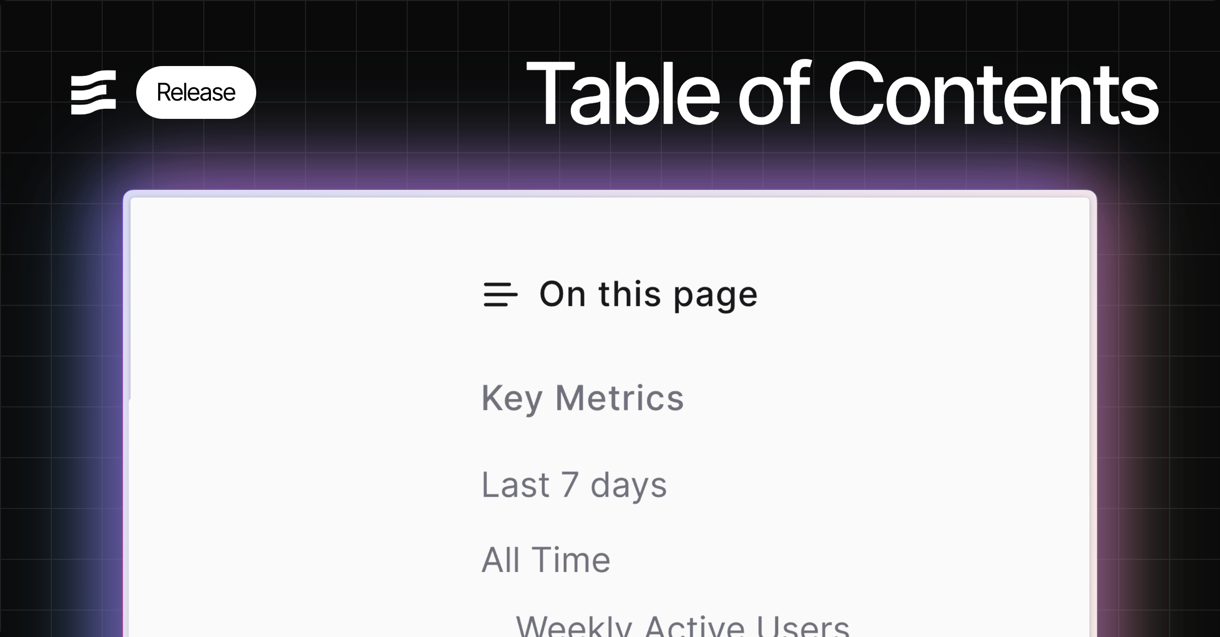
### ✨ Table of Contents
A generated table of contents from the headings in your report. Enable from page settings.
### 🚀 Improved handling of date grains in charts
Automatically handles formatting and positioning of labels on x-axis for date grains including month of year and day of week
### ✨ x\_sort attribute
Choose a specific sort order for your x-axis, including specifying explicit strings
### ✨ Top padding option for charts
Top padding override option to allow more room for data labels - helps in cases where labels are cut off
### 🐛 Histogram support for inline queries
Fix for Histogram issue where it could not accept inline queries
### 🚀 Toggle `invert` attribute
Invert attribute added to make toggled state = `false` instead of `true`
### ✨ Slider Input
New slider input component to filter on numeric values
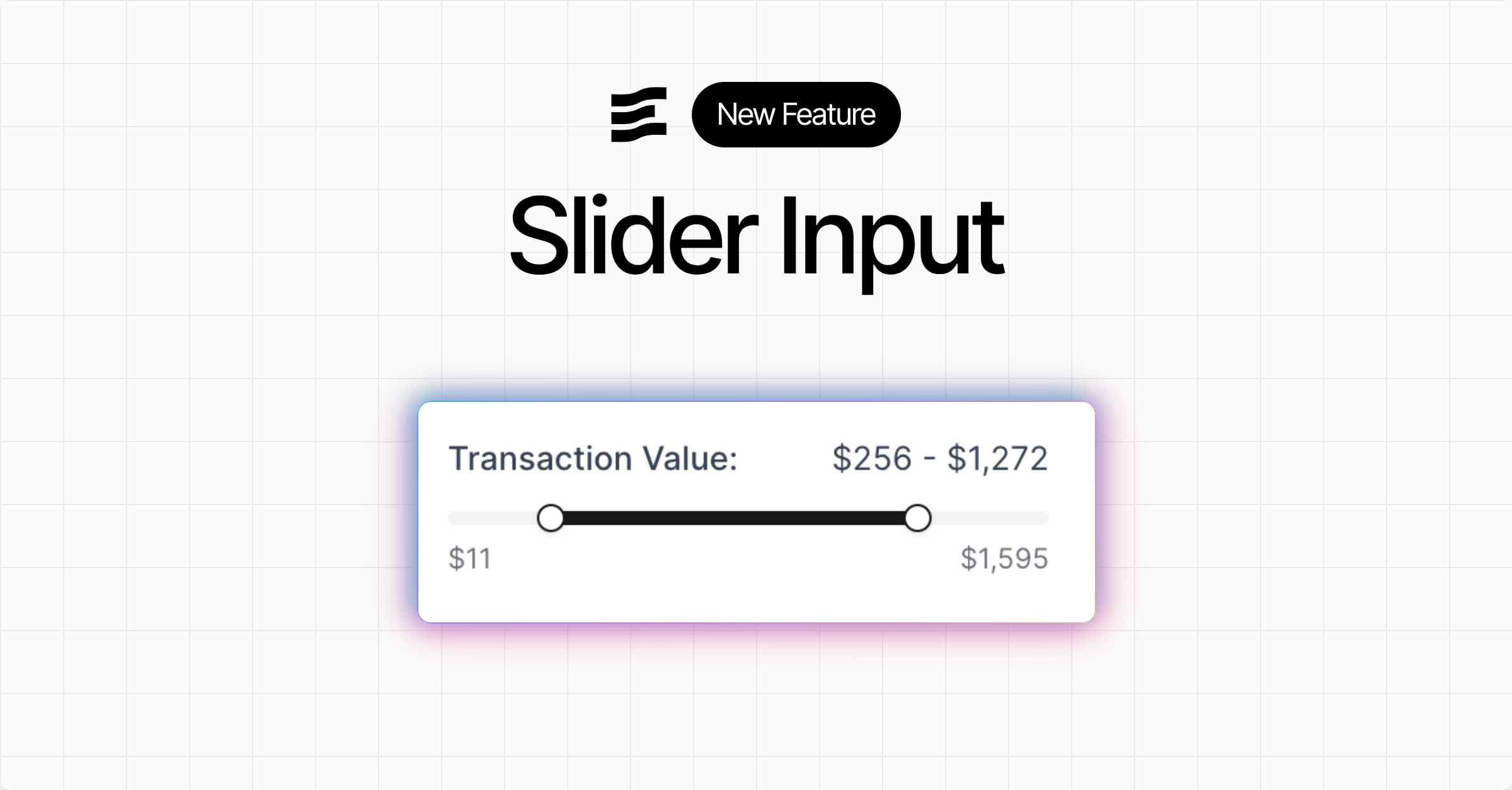
[View Documentation](https://docs.evidence.studio/components/slider)
### ✨ Query timing metadata
Queries in the SQL Console, and the pop out component inspector at the bottom of the editor now display how long the query took to run in the Evidence query engine
### ✨ Zoomable charts
Adds a new "zoom" chart option to enable zooming into the data
### 🐛 Fix for table pivoting issues
Fixed issue where tables were not pivoting in certain situations
### ✨ Variable `label` property
You can now reference the `label` property of a variable - useful when adding labels to viz components based on input selection
[View Documentation](https://docs.evidence.studio/components/dropdown#label)
### ✨ `fmt` property for input options
Use dynamic formats in viz components when creating an input to select a metric - e.g., show 'usd' for sales or 'pct1' for growth
[View Documentation](https://docs.evidence.studio/components/dropdown#fmt)
### 🐛 Fix for scale\_column
Fixes issue where scale\_column in the measure component was not properly assigning colors
### 🐛 Fix for custom date range end dates
Fixes issue where custom end date defined in SQL was not taking effect
### ✨ Table of Contents
A generated table of contents from the headings in your report. Enable from page settings.

### 🚀 Improved handling of date grains in charts
Automatically handles formatting and positioning of labels on x-axis for date grains including month of year and day of week
### ✨ x\_sort attribute
Choose a specific sort order for your x-axis, including specifying explicit strings
### ✨ Top padding option for charts
Top padding override option to allow more room for data labels - helps in cases where labels are cut off
### 🐛 Histogram support for inline queries
Fix for Histogram issue where it could not accept inline queries
### 🚀 Toggle `invert` attribute
Invert attribute added to make toggled state = `false` instead of `true`
### ✨ Slider Input
New slider input component to filter on numeric values

[View Documentation](https://docs.evidence.studio/components/slider)
### ✨ Query timing metadata
Queries in the SQL Console, and the pop out component inspector at the bottom of the editor now display how long the query took to run in the Evidence query engine
### ✨ Zoomable charts
Adds a new "zoom" chart option to enable zooming into the data
![Zoomable charts]() ### ✨ Toggle input
New toggle input component which sets a boolean variable you can use in queries and components
### ✨ Toggle input
New toggle input component which sets a boolean variable you can use in queries and components
![Toggle input]() [View Documentation](https://docs.evidence.studio/components/toggle)
### ✨ Button group and input tabs
New input components as visual alternatives to dropdowns: `button_group` and `input_tabs`
Note that this update also deprecates the `dropdown_option` component in favour of the more general `option` component. The `option` component can be used inside `dropdown`, `button_group`, or `input_tabs`
[View Documentation](https://docs.evidence.studio/components/toggle)
### ✨ Button group and input tabs
New input components as visual alternatives to dropdowns: `button_group` and `input_tabs`
Note that this update also deprecates the `dropdown_option` component in favour of the more general `option` component. The `option` component can be used inside `dropdown`, `button_group`, or `input_tabs`
![Button group and input tabs]() [View Documentation](https://docs.evidence.studio/components/button_group)
### 🚀 Info Links
Add links to info text popovers using
[View Documentation](https://docs.evidence.studio/components/button_group)
### 🚀 Info Links
Add links to info text popovers using info\_link and info\_link\_title atttributes.
### 🚀 User Management Performance
Adding and removing users from reports is now faster
### 🐛 Fix for custom pivot formatting
Formatting for pivots now works as expected for custom date formats - e.g., `fmt="yyyy-mm"`
### ✨ Select all in dropdown
New button to select all options in a dropdown
![Select all in dropdown]() ### ✨ Text input component
Input component accepting free text input
### ✨ Text input component
Input component accepting free text input
![Text input component]() [View Documentation](https://docs.evidence.studio/components/text_input)
### ✨ Feature Requests
Submit and track feature requests directly in your settings menu
From Settings > Feature Requests, you can create requests or bug reports, and set their priority. This integrates directly with the Evidence team's roadmap, with status changes synced into your view
[View Documentation](https://docs.evidence.studio/components/text_input)
### ✨ Feature Requests
Submit and track feature requests directly in your settings menu
From Settings > Feature Requests, you can create requests or bug reports, and set their priority. This integrates directly with the Evidence team's roadmap, with status changes synced into your view
![Feature Requests]() ### ✨ Stacked bar series in combo charts
Bar series in combo charts can now be stacked using the new
### ✨ Stacked bar series in combo charts
Bar series in combo charts can now be stacked using the new stack\_id attribute. Bars with the same stack\_id will be stacked together, allowing for flexible combinations of stacked and grouped bars.
[View Documentation](https://docs.evidence.studio/components/bar)
### ✨ Max label length for x-axis labels
Truncate labels after a certain number of characters using the `max_label_length` attribute inside `x_axis_options`
![Max label length for x-axis labels]() ### ✨ Rotate x-axis labels
Use the new `label_rotate` option in `x_axis_options` to rotate the labels on your x-axis
### ✨ Rotate x-axis labels
Use the new `label_rotate` option in `x_axis_options` to rotate the labels on your x-axis
![Rotate x-axis labels]() [View Documentation](https://docs.evidence.studio/components/line_chart#param-x-axis-options)
### 🚀 Sidebar Icons and Sorting
Add custom icons and adjust the sort order of projects and pages in the sidebar
### ✨ Jump to Code
In the editor preview, Cmd/Ctrl + click on a component to jump to the code for that component
You can jump to code by Cmd/Ctrl + clicking a component in the preview pane, or you can jump to the component preview by Cmd/Ctrl + clicking the code in your editor
[View Documentation](https://docs.evidence.studio/components/line_chart#param-x-axis-options)
### 🚀 Sidebar Icons and Sorting
Add custom icons and adjust the sort order of projects and pages in the sidebar
### ✨ Jump to Code
In the editor preview, Cmd/Ctrl + click on a component to jump to the code for that component
You can jump to code by Cmd/Ctrl + clicking a component in the preview pane, or you can jump to the component preview by Cmd/Ctrl + clicking the code in your editor
![Jump to Code]() ### 🐛 Fixes for table pivoting
Fixed issue where columns were not properly pivoting in tables
### ✨ Set custom end date for date ranges
Use a dynamic end date for date ranges based on your data or a standard offset
By default, date ranges end as of today's date, but this setting allows you to choose a date based on a standard offset (e.g., 1 day ago) or by passing a sql query to calculate the date (e.g., `select max(date) from my_table`)
### ✨ Models (Beta)
Join sources together and materialize the results to improve performance
Models can be used to execute joins across sources, centralize type casting, and create clean tables to use when building reports. Models are run and materialized every 8 hours
[View Documentation](https://docs.evidence.studio/core-concepts/models)
### 🚀 Drag and drop image support
Drag, or paste images into the editor to add them to your page.
### ✨ Bar chart opacity setting
Customize the opacity of bars in bar chart and combo chart components
### 🚀 Project Sections
Organize projects into sections for easier navigation during development
Sections will not impact how projects are arranged in the app published to Viewer users
### 🐛 Version control overflow
Fixes a bug where if you changed lots of files it overflowed the Version History panel
### ✨ Option to choose first day of week
In project settings, you can now choose whether weeks start on Sunday or Monday
### 🚀 Variable name shortcuts + use in markdown
Variables no longer require specifying a property - simply use the name, like `{{ my_var }}`
You can also use variables directly in markdown, including in headers and lists. You still have access to variable properties and can reference them like this: `{{ my_var.selected }}`
### 🐛 Fixes for table pivoting
Fixed issue where columns were not properly pivoting in tables
### ✨ Set custom end date for date ranges
Use a dynamic end date for date ranges based on your data or a standard offset
By default, date ranges end as of today's date, but this setting allows you to choose a date based on a standard offset (e.g., 1 day ago) or by passing a sql query to calculate the date (e.g., `select max(date) from my_table`)
### ✨ Models (Beta)
Join sources together and materialize the results to improve performance
Models can be used to execute joins across sources, centralize type casting, and create clean tables to use when building reports. Models are run and materialized every 8 hours
[View Documentation](https://docs.evidence.studio/core-concepts/models)
### 🚀 Drag and drop image support
Drag, or paste images into the editor to add them to your page.
### ✨ Bar chart opacity setting
Customize the opacity of bars in bar chart and combo chart components
### 🚀 Project Sections
Organize projects into sections for easier navigation during development
Sections will not impact how projects are arranged in the app published to Viewer users
### 🐛 Version control overflow
Fixes a bug where if you changed lots of files it overflowed the Version History panel
### ✨ Option to choose first day of week
In project settings, you can now choose whether weeks start on Sunday or Monday
### 🚀 Variable name shortcuts + use in markdown
Variables no longer require specifying a property - simply use the name, like `{{ my_var }}`
You can also use variables directly in markdown, including in headers and lists. You still have access to variable properties and can reference them like this: `{{ my_var.selected }}`
![Variable name shortcuts + use in markdown]() ### 🚀 Better SQL Autocomplete Suggestions
Improved SQL suggestions for columns, and tables after joins
### 🚀 Performance improvement for table comparisons
Tables containing comparisons should now load much faster
### 🚀 More source sync info
View the number of rows in a source, and the amount of time it took for the source sync from the Sources page.
### ✨ Use variables inside components
You can now reference filter variables directly in component attributes
Supports the following attributes: title, subtitle, info, where, date\_grain, date\_range.range, comparison.compare\_vs
### 🚀 Better SQL Autocomplete Suggestions
Improved SQL suggestions for columns, and tables after joins
### 🚀 Performance improvement for table comparisons
Tables containing comparisons should now load much faster
### 🚀 More source sync info
View the number of rows in a source, and the amount of time it took for the source sync from the Sources page.
### ✨ Use variables inside components
You can now reference filter variables directly in component attributes
Supports the following attributes: title, subtitle, info, where, date\_grain, date\_range.range, comparison.compare\_vs
![Use variables inside components]() ### ✨ Icon support for dropdowns
Include an icon in your dropdown using the icon option
### ✨ Icon support for dropdowns
Include an icon in your dropdown using the icon option
![Icon support for dropdowns]() ### ✨ Selector components for date grain and comparisons
Special components for selecting date grain and comparisons
### 🚀 Dynamic date ranges
Input arbitrary ranges into the date\_range attribute in components, like "last 14 weeks" or "2023-01-14 to 2025-11-30"
### ✨ Select preset ranges in range calendar
Choose which preset ranges you want your users to see when clicking the range calendar component
### 🐛 SQL comments in inline queries
You can now add comments to inline queries without breaking them
### 🐛 Filter scroll fix
Fixed a bug where selecting a filter caused the page to jump back to the top.
### ✨ Option to turn legend off in charts
You can now turn off chart legends with legend=false
### 🚀 Conditional component render instantly
When previewing or viewing published pages, the initial state of any if/else\_if/else conditions will be pre-calculated before the page loads.
### 🚀 Better label spacing on x-axis
Improvement to the alignment and spacing of labels on the x-axis
### 🐛 Fix target comparison totals in table
Fixed an issue where target comparisons were hidden in total rows
### 🐛 Improved date behaviour
Previously, database columns that returned Date type would return DateTime precision, which is confusing in the UI. Now dates will return no additional time component
Values that are Date type will no longer display time component in Tables, Values, and in various input components. Eg a Date previously formatted 2025-09-22T14:05:23Z would now be returned as 2025-09-22.
### 🐛 Fix Explore table resize and scroll
Fixes an issue where tables on the Explore page would resize and cut off content
### 🚀 Comparison Tooltip Improvements
Fixed issue with percentage calculations for negative values. Added support for custom formats.
### ✨ Make Feature Requests in AI Chat
Now you can ask the Evidence chat to submit a feature request to the Evidence team
### 🐛 Fixed unexpected date offsets
In certain timezones, dates were being transposed by a small number of seconds in Chrome and Safari. This could cause date formats to render incorrectly, for example showing the day before the expected date.
### 🚀 RLS Enhancements
Added variable support for IN/NOT IN operators, 'Apply All' rule option, new panel interface, and per-user variable editing capabilities.
### ✨ Page Loading (table)
Tables now load instantly on preview and published pages
This is the first change in a journey to fully enable Server-Side Rendering in Evidence pages. The table is the first component to support this behavior, which enables the following features:
### ✨ Selector components for date grain and comparisons
Special components for selecting date grain and comparisons
### 🚀 Dynamic date ranges
Input arbitrary ranges into the date\_range attribute in components, like "last 14 weeks" or "2023-01-14 to 2025-11-30"
### ✨ Select preset ranges in range calendar
Choose which preset ranges you want your users to see when clicking the range calendar component
### 🐛 SQL comments in inline queries
You can now add comments to inline queries without breaking them
### 🐛 Filter scroll fix
Fixed a bug where selecting a filter caused the page to jump back to the top.
### ✨ Option to turn legend off in charts
You can now turn off chart legends with legend=false
### 🚀 Conditional component render instantly
When previewing or viewing published pages, the initial state of any if/else\_if/else conditions will be pre-calculated before the page loads.
### 🚀 Better label spacing on x-axis
Improvement to the alignment and spacing of labels on the x-axis
### 🐛 Fix target comparison totals in table
Fixed an issue where target comparisons were hidden in total rows
### 🐛 Improved date behaviour
Previously, database columns that returned Date type would return DateTime precision, which is confusing in the UI. Now dates will return no additional time component
Values that are Date type will no longer display time component in Tables, Values, and in various input components. Eg a Date previously formatted 2025-09-22T14:05:23Z would now be returned as 2025-09-22.
### 🐛 Fix Explore table resize and scroll
Fixes an issue where tables on the Explore page would resize and cut off content
### 🚀 Comparison Tooltip Improvements
Fixed issue with percentage calculations for negative values. Added support for custom formats.
### ✨ Make Feature Requests in AI Chat
Now you can ask the Evidence chat to submit a feature request to the Evidence team
### 🐛 Fixed unexpected date offsets
In certain timezones, dates were being transposed by a small number of seconds in Chrome and Safari. This could cause date formats to render incorrectly, for example showing the day before the expected date.
### 🚀 RLS Enhancements
Added variable support for IN/NOT IN operators, 'Apply All' rule option, new panel interface, and per-user variable editing capabilities.
### ✨ Page Loading (table)
Tables now load instantly on preview and published pages
This is the first change in a journey to fully enable Server-Side Rendering in Evidence pages. The table is the first component to support this behavior, which enables the following features:
- Tables load instantly on preview and published pages (no more loading spinner when the page loads)
- Chat can now debug SQL query errors in Table components
This change lays the groundwork for other components to opt into this new Server-Side Rendering system.
### 🚀 Improved international character support in SQL queries
You can now include Japanese, Chinese, emoji, and other non-Latin characters directly in SQL passed to components
### 🚀 Improved Inline SQL Editor
See available variables, inline queries, and a preview of compiled SQL when editing queries in the inline SQL editor
![Improved Inline SQL Editor]() ### ✨ Add optional dark\_url prop to image component
Image components can now display different images in light and dark modes using the new
### ✨ Add optional dark\_url prop to image component
Image components can now display different images in light and dark modes using the new dark\_url prop.
### ✨ Themes
Define a custom color palette to apply to all charts in a project
![Themes]() ### 🚀 Improved Default Funnel Chart Styling
Funnel Charts are more intuitive to read, with a squared off style
### 🚀 Improved Default Funnel Chart Styling
Funnel Charts are more intuitive to read, with a squared off style
![Improved Default Funnel Chart Styling]() [View Documentation](https://docs.evidence.studio/components/funnel_chart)
### 🐛 Fix Comparison Issues
Fixed bug for target comparisons which resulted in undefined error
### ✨ Inline SQL Editor
A new SQL editor for running and modifying inline queries on your page
[View Documentation](https://docs.evidence.studio/components/funnel_chart)
### 🐛 Fix Comparison Issues
Fixed bug for target comparisons which resulted in undefined error
### ✨ Inline SQL Editor
A new SQL editor for running and modifying inline queries on your page
![Inline SQL Editor]() ### ✨ Icon Component
Add icons inline into markdown, with configuration for color and size
### ✨ Icon Component
Add icons inline into markdown, with configuration for color and size
![Icon Component]() [View Documentation](https://docs.evidence.studio/components/icon)
### ✨ Row Level Security
Add rules to restrict which rows of are visible to users from sources
Add RLS rules to data source columns, and add user variables to determine which values in these columns allow access.
[View Documentation](https://docs.evidence.studio/core-concepts/access-control)
### 🐛 Fix Editor Overwriting Bug
Fixed bug where switching pages and then hitting Ctrl+Z would overwrite your page with the content of the previous page.
### 🚀 Custom Color Palettes
All charts now support custom color palettes via the "chart\_options" attribute
Pass an array of hex codes to the color\_palette option e.g. `color_palette=["#ff0000","#00ff00"]`
[View Documentation](https://docs.evidence.studio/components/icon)
### ✨ Row Level Security
Add rules to restrict which rows of are visible to users from sources
Add RLS rules to data source columns, and add user variables to determine which values in these columns allow access.
[View Documentation](https://docs.evidence.studio/core-concepts/access-control)
### 🐛 Fix Editor Overwriting Bug
Fixed bug where switching pages and then hitting Ctrl+Z would overwrite your page with the content of the previous page.
### 🚀 Custom Color Palettes
All charts now support custom color palettes via the "chart\_options" attribute
Pass an array of hex codes to the color\_palette option e.g. `color_palette=["#ff0000","#00ff00"]`
![Custom Color Palettes]() [View Documentation](https://docs.evidence.studio/components/pie_chart#with-custom-colors)
### 🐛 Table Filter Option Overflow
Fixed a bug where long string values in the table filter overlapped each other
### 🚀 Sidebar Hover Text
Adds hover text to sidebar items that are truncated due to length
### 🐛 Expose SQL Errors
Exposes some SQL errors that were not being shown
### 🚀 Charting Library Upgrade
Upgraded to ECharts 6, fixed some issues where labels got cut off
[View Documentation](https://docs.evidence.studio/components/pie_chart#with-custom-colors)
### 🐛 Table Filter Option Overflow
Fixed a bug where long string values in the table filter overlapped each other
### 🚀 Sidebar Hover Text
Adds hover text to sidebar items that are truncated due to length
### 🐛 Expose SQL Errors
Exposes some SQL errors that were not being shown
### 🚀 Charting Library Upgrade
Upgraded to ECharts 6, fixed some issues where labels got cut off
![Charting Library Upgrade]() ### 🐛 Fix High Precision Decimals in Postgres
Resolves issue where tables containing decimal columns with more that 9 digits of precision were failing to publish
### 🚀 Editor Loading Speed
We've significantly improved the load speeds when switching between pages in the editor.
### ✨ Link Button
Use the link button to link to another page in Evidence or an external location
[View Documentation](https://docs.evidence.studio/components/link_button)
### ✨ Print Format Components
Add page breaks, print groups, and hide elements from PDF downloads
### ✨ PDF Download
Download your page as a PDF
### 🐛 If / Else Behaviour Fix
Fixed some issues with the if /else components which sometimes caused them to not display information when they should
### ✨ Axis Label Interval Control
More control over the intervals between labels on charts
### ✨ Accordian components
Organize content into collapsible accordian sections
### ✨ Range Calendar Input
New range calendar component for date filtering.
### 🐛 Long Page Name Overflow
Long page and directory names now truncate in the sidebar to prevent the action button being hidden
### 🐛 Fix High Precision Decimals in Postgres
Resolves issue where tables containing decimal columns with more that 9 digits of precision were failing to publish
### 🚀 Editor Loading Speed
We've significantly improved the load speeds when switching between pages in the editor.
### ✨ Link Button
Use the link button to link to another page in Evidence or an external location
[View Documentation](https://docs.evidence.studio/components/link_button)
### ✨ Print Format Components
Add page breaks, print groups, and hide elements from PDF downloads
### ✨ PDF Download
Download your page as a PDF
### 🐛 If / Else Behaviour Fix
Fixed some issues with the if /else components which sometimes caused them to not display information when they should
### ✨ Axis Label Interval Control
More control over the intervals between labels on charts
### ✨ Accordian components
Organize content into collapsible accordian sections
### ✨ Range Calendar Input
New range calendar component for date filtering.
### 🐛 Long Page Name Overflow
Long page and directory names now truncate in the sidebar to prevent the action button being hidden
![Long Page Name Overflow]() ### ✨ Tabs
New Tabs, and Tab components for tabbed layouts.
### ✨ Variables
Define variables in frontmatter and use them in markdown, SQL and components
[View Documentation](https://docs.evidence.studio/core-concepts/variables)
### ✨ Column-level control for tables
Control formatting for each column in a table
### ✨ Conditional formatting in tables
Use color scale to conditionallyformat values in a table
### ✨ New table visualizations
Add bar charts, sparklines, and deltas to your columns
### ✨ Image support in tables
Add images to columns in a table
### ✨ Link support in tables
Add links to columns in a table, or set up row links
### ✨ Period over period comparisons
Automatically compare values vs. prior year, prior period, or target. Available in table and big value.
### 🚀 New date grain options
Inclues special grains like 'day of week' and 'month of year', with built-in labels
### 🚀 Improved pivot table
Table now supports more complex pivot table scenarios
### 🚀 Improved Explore page
Supports more date grain options and improved share experience
### ✨ Hubspot Connector
Import data from Hubspot directly into Evidence
[View Documentation](https://docs.evidence.studio/data-sources/hubspot)
### ✨ Modals
New modal component that can contain content in a dialogue or drawer.
[View Documentation](https://docs.evidence.studio/components/modal)
### 🐛 Delete Connections Fix
Fixed a bug which only allowed you to delete the most recently added connection
### ✨ Page linking
Link to other Evidence pages using markdown links
### ✨ Tabs
New Tabs, and Tab components for tabbed layouts.
### ✨ Variables
Define variables in frontmatter and use them in markdown, SQL and components
[View Documentation](https://docs.evidence.studio/core-concepts/variables)
### ✨ Column-level control for tables
Control formatting for each column in a table
### ✨ Conditional formatting in tables
Use color scale to conditionallyformat values in a table
### ✨ New table visualizations
Add bar charts, sparklines, and deltas to your columns
### ✨ Image support in tables
Add images to columns in a table
### ✨ Link support in tables
Add links to columns in a table, or set up row links
### ✨ Period over period comparisons
Automatically compare values vs. prior year, prior period, or target. Available in table and big value.
### 🚀 New date grain options
Inclues special grains like 'day of week' and 'month of year', with built-in labels
### 🚀 Improved pivot table
Table now supports more complex pivot table scenarios
### 🚀 Improved Explore page
Supports more date grain options and improved share experience
### ✨ Hubspot Connector
Import data from Hubspot directly into Evidence
[View Documentation](https://docs.evidence.studio/data-sources/hubspot)
### ✨ Modals
New modal component that can contain content in a dialogue or drawer.
[View Documentation](https://docs.evidence.studio/components/modal)
### 🐛 Delete Connections Fix
Fixed a bug which only allowed you to delete the most recently added connection
### ✨ Page linking
Link to other Evidence pages using markdown links []() with Intellisense support
[View Documentation](https://docs.evidence.studio/components/link)
### ✨ Motherduck Connector
Add data sources from your Motherduck DB
[View Documentation](https://docs.evidence.studio/data-sources/motherduck)
### 🐛 Table filter responsiveness
Fix bug which prevented table filter inputs from taking effect immediately after adding the table filter to the page.
### 🐛 Respect columns option in table filter
Fix bug which ignored columns selection in table filter
### ✨ Filter interpolation
Reference filter values inside of inlined queries, and view the state of your filters in the new filters pane of the devtools sidebar.
[View Documentation](https://docs.evidence.studio/core-concepts/markdown#filters)
### 🚀 Agent Keyboard Shortcut
Ctrl+Alt+I (Mac: Cmd+Shift+I) to open a chat with the Evidence agent from anywhere in the Editor
### ✨ If, Else If, Else
Use conditional blocks to choose what to render based on data.
[View Documentation](https://docs.evidence.studio/components/if)
### ✨ Reference Components
Use reference\_line, reference\_area, and reference\_point to add reference annotations to your charts
[View Documentation](https://docs.evidence.studio/components/reference_line)
### 🚀 Postgres Schema Support
Use tables in any Postgres schema (not just the default "public" schema)
### ✨ Import Views as Sources
All supported DBs now allow importing views as sources
### 🚀 Public Documentation
We've published full documentation at [https://docs.evidence.studio](https://docs.evidence.studio)
### ✨ Card Option for Row and Stack Components
Added card option to row and stack components to display their contents as a single card.
### ✨ Data Point Labels
Label each data point in your chart with the data\_labels option
### ✨ Downloadable Data
Right click any chart to download its data, or use the kebab menu in the top left of the published page to download a whole page's data.
### ✨ Chart, Axis, and Series Options
New chart\_options, x\_axis\_options, y\_axis\_options, y2\_axis\_options, and series options for customizing your charts.
### ✨ Partials
Define sections of markdown for re-use across pages.
### ✨ Polar Chart
Added a new polar chart component.
### ✨ Table Search
Search bar for the Table component.
### 🐛 Inline Query Date Validation
Fixes issue creating visualizations using inline queries with dates
### ✨ Markdown Comments
Adds support for mardown comments with \. Mac: Cmd + / Windows: Ctrl + /
### ✨ Histogram
Added a new histogram chart component.
### ✨ Calendar Heatmap
Added a new calendar heatmap chart.
### ✨ Combo Chart
Added a combo\_chart component that allows you to combine area, bar, bubble, line, and scatter series on one chart.
### ✨ Accept and Reject Changes Panel in Diff View
Added accept and reject buttons to the top of the diff view.
### ✨ Heatmap Chart
Added a new heatmap chart component.
### 🚀 Connection Documentation
Added generaldocumentation for data connections.
### 🚀 Link to All Docs in Sidepane
Added a link to all docs in the docs tab of the editor.
### 🐛 Fix to Maintain Chart Height
Fixed the issue where the chart height was shrinking when title and legend were added.
### 🐛 Fix to give AI agent knowledge of inline queries
Fixed the issue where the AI agent did not know about inline queries on your page.
### ✨ Funnel Chart
Added a new funnel chart component.
### ✨ Sankey Chart
Added a new sankey chart component.
### ✨ Custom X and Y Chart Titles
Added the ability to customize x\_title and y\_title for charts.
### ✨ Changelog
We're shipping features and fixes very quickly. Keep an eye out here for updates.
### ✨ Pie and Donut Charts
Added a new pie chart component.
### ✨ Open Chat Automatically for Fix in Chat
When the fix in chat button is pressed, the chat window will open automatically.
### 🐛 Fix Slash Commands When Inside Parent Component
Fixed the issue where slash commands were not working when inside a parent component.
### 🚀 Helpful Warning for Aggregating Columns
Added a warning to consider aggregating a column for a chart.
### 🚀 Fix in Chat Now Available on All Error Messages
Error messages throughout the platform now include the fix in chat feature.
### 🚀 More Readable SQL Errors
SQL error messages have been redesigned to be clearer and more actionable.
### 🚀 Collapse the Sidebar
Added the ability to collapse and expand the sidebar on all screen sizes.
### 🚀 Faster Sources Page
Significantly improved loading performance on the sources page.
### 🐛 Row and Stack Components
Fixed issues with Row and Stack components rendering and layout behavior.
# Accordion
Source: https://docs.evidence.studio/components/accordion
An accordion component that organizes content into collapsible sections.
```liquid theme={null}
{% accordion %}
...
{% /accordion %}
```
## Attributes
Whether only one item can be open at a time
Visual style variant of the accordion
**Allowed values:**
* `default`
* `well`
Set the width of this component (in percent) relative to the page width
## Allowed Children
* [accordion\_item](/components/accordion_item)
# Accordion Item
Source: https://docs.evidence.studio/components/accordion_item
An accordion item that can be expanded or collapsed.
```liquid theme={null}
{% accordion %}
{% accordion_item title="Section 1" open=true %}
Content for section 1.
{% /accordion_item %}
{% accordion_item title="Section 2" %}
Content for section 2.
{% /accordion_item %}
{% accordion_item title="Section 3" icon="settings" %}
Content for section 3 with an icon.
{% /accordion_item %}
{% /accordion %}
```
## Examples
### Accordion with Items
```liquid theme={null}
{% accordion %}
{% accordion_item title="Section 1" open=true %}
Content for section 1.
{% /accordion_item %}
{% accordion_item title="Section 2" %}
Content for section 2.
{% /accordion_item %}
{% accordion_item title="Section 3" icon="settings" %}
Content for section 3 with an icon.
{% /accordion_item %}
{% /accordion %}
```
## Attributes
Title displayed in the accordion item header
Icon to display in the accordion item header
**Allowed values:**
* `trending-up`
* `trending-down`
* `clock`
* `calendar`
* `check`
* `x`
* `info`
* `alert-circle`
* `help-circle`
* `eye`
* `eye-off`
* `user`
* `users`
* `settings`
* `cog`
* `plus`
* `minus`
* `up`
* `down`
* `right`
* `left`
* `star`
* `heart`
* `search`
* `file`
* `file-text`
* `home`
* `mail`
* `filter`
* `share`
* `bell`
* `trash`
* `credit-card`
* `globe`
* `key`
* `croissant`
* `map`
* `rotate`
* `rewind`
* `bank`
* `receipt`
* `activity`
* `chart-column`
* `chart-pie`
* `chart-no-axes-combined`
* `goal`
* `rocket`
* `trophy`
* `apple`
* `cookie`
* `donut`
* `beef`
* `cake`
* `soup`
* `utensils`
* `milk`
* `nut`
* `pyramid`
* `triangle`
* `arrow-down`
* `arrow-left`
* `arrow-right`
* `arrow-up`
* `chevron-down`
* `chevron-left`
* `chevron-right`
* `chevron-up`
* `chevrons-down`
* `chevrons-left`
* `chevrons-right`
* `chevrons-up`
* `menu`
* `external-link`
* `check-circle`
* `x-circle`
* `edit`
* `trash-2`
* `copy`
* `save`
* `download`
* `upload`
* `send`
* `refresh`
* `redo`
* `undo`
* `folder`
* `folder-open`
* `image`
* `file-image`
* `user-plus`
* `user-minus`
* `user-check`
* `lock`
* `unlock`
* `log-in`
* `log-out`
* `message-square`
* `message-circle`
* `phone`
* `phone-call`
* `bell-off`
* `video`
* `video-off`
* `play`
* `pause`
* `stop`
* `skip-back`
* `skip-forward`
* `volume`
* `volume-1`
* `volume-2`
* `volume-off`
* `volume-x`
* `bookmark`
* `tag`
* `link`
* `unlink`
* `share-2`
* `alert-triangle`
* `loader`
* `more-vertical`
* `more-horizontal`
* `grid`
* `list`
* `maximize`
* `minimize`
* `zoom-in`
* `zoom-out`
* `thumbs-up`
* `thumbs-down`
* `shopping-cart`
* `dollar-sign`
* `camera`
* `printer`
* `monitor`
* `smartphone`
* `laptop`
* `calculator`
* `cloud-sun-rain`
* `sun-snow`
* `thermometer-sun`
* `thermometer-snowflake`
* `cloudy`
* `cloud-rain-wind`
* `cloud-rain`
* `wind`
* `sun`
* `cloud-snow`
* `thermometer`
* `cloud-drizzle`
* `cloud-sun`
* `cloud`
* `cloud-lightning`
* `snowflake`
* `flame`
* `atom`
* `fuel`
* `magnet`
* `factory`
* `tree-deciduous`
* `waypoints`
* `plug`
* `dam`
* `battery`
Whether the accordion item is initially open
## Allowed Parents
* [accordion](/components/accordion)
# Area
Source: https://docs.evidence.studio/components/area
Add an area series to a [combo_chart](/components/combo_chart)
```liquid theme={null}
{% combo_chart data="demo_daily_orders" x="date" date_grain="month" %}
{% area y="sum(total_sales)" /%}
{% /combo_chart %}
```
## Examples
### Basic Area Series
```liquid theme={null}
{% combo_chart data="demo_daily_orders" x="date" date_grain="month" %}
{% area y="sum(total_sales)" /%}
{% /combo_chart %}
```
### Unstacked Areas
```liquid theme={null}
{% combo_chart data="demo_daily_orders" x="date" date_grain="month" %}
{% area y="sum(total_sales)" series="category" stacked=false /%}
{% /combo_chart %}
```
## Attributes
Column name for y-axis
Column name for series grouping
The axis to render the series on
**Allowed values:**
* `y1`
* `y2`
Format for this series' values. See [Value Formatting](/core-concepts/value-formatting) for available formats.
Label each point in the series with its value
**Example:**
```
data_labels={
position = "above"
fmt = "date"
size = 0
distance = 0
rotate = 0
color = "string"
show_overlap = true
}
```
**Attributes:**
* position: `string` - Position the label relative to its data point
* **Allowed values:**
* `above`
* `below`
* `left`
* `right`
* `middle`
* fmt: `string` - Format the label value. Defaults to series or axis fmt.
* **Allowed values:** See [Value Formatting](/core-concepts/value-formatting) for all available formats.
* size: `number` - Font size in px
* distance: `number` - How far the label is from the data point
* rotate: `number` - Rotate each label (degrees)
* color: `string` - Change the text color of the labels
* show\_overlap: `boolean` - Show labels for every point even when they overlap
**Example:**
```
options={
step = "start"
smooth = true
}
```
**Attributes:**
* step: `string` - Show a stepped line rather than a smooth line between points and control where the step happens (start, middle, or end)
* **Allowed values:**
* `start`
* `middle`
* `end`
* smooth: `boolean`
Whether to stack areas with the same series value. Set to "100%" for percentage stacking.
Stack identifier - areas with the same stack\_id value will be stacked together. Overrides the stacked prop.
## Allowed Parents
* [combo\_chart](/components/combo_chart)
# Area Chart
Source: https://docs.evidence.studio/components/area_chart
Display an area chart
![Basic Usage]() ```liquid theme={null}
{% area_chart
data="demo_daily_orders"
x="date"
y="sum(total_sales)"
date_grain="month"
date_range={
date="date"
range="last 12 months"
}
/%}
```
## Examples
### Basic Usage
```liquid theme={null}
{% area_chart
data="demo_daily_orders"
x="date"
y="sum(total_sales)"
date_grain="month"
date_range={
date="date"
range="last 12 months"
}
/%}
```
## Examples
### Basic Usage
![Basic Usage]() ```liquid theme={null}
{% area_chart
data="demo_daily_orders"
x="date"
y="sum(total_sales)"
date_grain="month"
date_range={
date="date"
range="last 12 months"
}
/%}
```
### Area Chart with Series
```liquid theme={null}
{% area_chart
data="demo_daily_orders"
x="date"
y="sum(total_sales)"
date_grain="month"
date_range={
date="date"
range="last 12 months"
}
/%}
```
### Area Chart with Series
![Area Chart with Series]() ```liquid theme={null}
{% area_chart
data="demo_daily_orders"
x="date"
y="sum(total_sales)"
series="category"
date_grain="month"
/%}
```
### Area Chart with Formatting
```liquid theme={null}
{% area_chart
data="demo_daily_orders"
x="date"
y="sum(total_sales)"
series="category"
date_grain="month"
/%}
```
### Area Chart with Formatting
![Area Chart with Formatting]() ```liquid theme={null}
{% area_chart
data="demo_daily_orders"
x="date"
y="sum(total_sales)"
y_fmt="usd"
title="Sales Over Time"
subtitle="Monthly sales performance"
date_grain="month"
/%}
```
### 100% Stacked Area Chart
```liquid theme={null}
{% area_chart
data="demo_daily_orders"
x="date"
y="sum(total_sales)"
series="category"
stacked="100%"
date_grain="month"
title="Sales Distribution by Category"
/%}
```
### Revenue by Day of Week
```liquid theme={null}
{% area_chart
data="demo_daily_orders"
x="date"
y="sum(total_sales)"
y_fmt="usd"
date_grain="day of week"
title="Revenue by Day of Week"
subtitle="Weekday vs weekend sales patterns"
/%}
```
### Seasonality Analysis (Month of Year)
```liquid theme={null}
{% area_chart
data="demo_daily_orders"
x="date"
y="sum(total_sales)"
y_fmt="usd"
date_grain="month of year"
title="Seasonality Analysis"
subtitle="Sales patterns across months"
/%}
```
### Quarterly Trends
```liquid theme={null}
{% area_chart
data="demo_daily_orders"
x="date"
y="sum(total_sales)"
y_fmt="usd"
date_grain="quarter of year"
title="Quarterly Performance"
subtitle="Q1 through Q4 comparison"
/%}
```
### Monthly Billing Cycle Patterns
```liquid theme={null}
{% area_chart
data="demo_daily_orders"
x="date"
y="sum(total_sales)"
y_fmt="usd"
date_grain="day of month"
title="Daily Revenue by Day of Month"
subtitle="Identify billing cycle patterns"
/%}
```
### Week Number Analysis
```liquid theme={null}
{% area_chart
data="demo_daily_orders"
x="date"
y="sum(total_sales)"
y_fmt="usd"
date_grain="week of year"
title="Revenue by Week of Year"
subtitle="Weekly performance across the year"
/%}
```
### Day of Year Analysis
```liquid theme={null}
{% area_chart
data="demo_daily_orders"
x="date"
y="sum(total_sales)"
y_fmt="usd"
date_grain="day of year"
title="Revenue by Day of Year"
subtitle="Identify patterns across 365 days"
/%}
```
## Attributes
Name of the table to query
IDs of filters to apply to the query
Use date\_range to filter data for specific time periods. Accepts predefined ranges (e.g., "last 12 months"), dynamic ranges (e.g., "Last 90 days"), custom date ranges (e.g., "2020-01-01 to 2023-03-01"), or partial ranges (e.g., "from 2020-01-01", "until 2023-03-01")
**Example:**
```
date_range={
range = "last 7 days"
date = "string"
}
```
**Attributes:**
* range: `string` - Time period to filter. Use presets like 'last 7 days', dynamic patterns like 'Last 90 days', custom ranges like '2020-01-01 to 2023-03-01', or partial ranges like 'from 2020-01-01'.
* **Allowed values:**
* `last 7 days`
* `last 30 days`
* `last 3 months`
* `last 6 months`
* `last 12 months`
* `week to date`
* `month to date`
* `quarter to date`
* `year to date`
* `previous week`
* `previous month`
* `previous quarter`
* `previous year`
* `all time`
* date: `string` - Date column to filter on. Required when the data has multiple date columns.
Time grain for date truncation (default: day for date columns)
**Allowed values:**
* `day`
* `week`
* `month`
* `quarter`
* `year`
* `hour`
* `day of week`
* `day of month`
* `day of year`
* `week of year`
* `month of year`
* `quarter of year`
How to handle missing data points. "connect" auto-connects points (default), "gaps" shows visual breaks, "zero" fills with zeros.
**Allowed values:**
* `connect`
* `gaps`
* `zero`
Column name for x-axis
Format for x values and axis labels. See [Value Formatting](/core-concepts/value-formatting) for available formats.
Format for y values and axis labels. See [Value Formatting](/core-concepts/value-formatting) for available formats.
Format for y2 values and axis labels. See [Value Formatting](/core-concepts/value-formatting) for available formats.
Column name for series grouping (applies to all series)
Column name for size
Column name for individual point labels displayed at the top of the tooltip
Title to display above the component
Subtitle to display below the title
Information tooltip text (can only be used with title). Displays an info icon next to the title.
URL to link the info text to (can only be used with info)
Create a custom link title for the info link, placed after the info text (can only be used with info\_link)
Custom SQL WHERE condition to apply to the query. For date filters, use date\_range instead.
Custom SQL HAVING condition to apply to the query after GROUP BY
Maximum number of rows to return from the query. Note: When used with tables, limit will disable subtotals to prevent incomplete subtotal rows.
Column name(s) with optional direction (e.g. "column\_name", "column\_name desc")
Custom SQL QUALIFY condition to filter windowed results
Set the width of this component (in percent) relative to the page width
Set a fixed height for the chart in pixels
Sort order for x-axis categories. Options: `asc` (alphabetical), `desc` (reverse alphabetical), `data` (preserve query order), or an array for custom order like `["A", "B", "C"]`
**Allowed values:**
* `asc`
* `desc`
* `data`
Configure the y-axis
**Example:**
```
y_axis_options={
title = "string"
title_position = "top"
ticks = true
baseline = true
labels = true
gridlines = true
min = 0
max = 0
fit_to_data = true
interval = 0
}
```
**Attributes:**
* title: `string`
* title\_position: `string` - Position of the axis title. "top" places it horizontally at the top, "side" places it vertically along the axis. Defaults to "side" for 100% stacked charts, "top" otherwise.
* **Allowed values:**
* `top`
* `side`
* ticks: `boolean`
* baseline: `boolean`
* labels: `boolean` - Show/hide axis labels
* gridlines: `boolean` - Show/hide gridlines
* min: `number` - Minimum value for this axis
* max: `number` - Maximum value for this axis
* fit\_to\_data: `boolean` - Fit the axis to the data instead of including 0
* interval: `number` - Interval between axis ticks for numeric axes. This option is a suggestion, the actual interval may differ.
Configure the secondary y-axis
**Example:**
```
y2_axis_options={
title = "string"
title_position = "top"
ticks = true
baseline = true
labels = true
gridlines = true
min = 0
max = 0
fit_to_data = true
interval = 0
}
```
**Attributes:**
* title: `string`
* title\_position: `string` - Position of the axis title. "top" places it horizontally at the top, "side" places it vertically along the axis. Defaults to "side" for 100% stacked charts, "top" otherwise.
* **Allowed values:**
* `top`
* `side`
* ticks: `boolean`
* baseline: `boolean`
* labels: `boolean` - Show/hide axis labels
* gridlines: `boolean` - Show/hide gridlines
* min: `number` - Minimum value for this axis
* max: `number` - Maximum value for this axis
* fit\_to\_data: `boolean` - Fit the axis to the data instead of including 0
* interval: `number` - Interval between axis ticks for numeric axes. This option is a suggestion, the actual interval may differ.
Configure the x-axis
**Example:**
```
x_axis_options={
title = "string"
label_wrap = true
ticks = true
baseline = true
labels = true
gridlines = true
min = 0
max = 0
fit_to_data = true
min_interval = "year"
max_interval = "year"
interval = 0
label_rotate = 0
max_label_length = 0
}
```
**Attributes:**
* title: `string`
* label\_wrap: `boolean`
* ticks: `boolean`
* baseline: `boolean`
* labels: `boolean` - Show/hide axis labels
* gridlines: `boolean` - Show/hide gridlines
* min: `number` - Minimum value for this axis
* max: `number` - Maximum value for this axis
* fit\_to\_data: `boolean` - Fit the axis to the data instead of including 0
* min\_interval: `string` - Minimum interval between axis ticks for time-based axes. This option is a suggestion, the actual interval may differ.
* **Allowed values:**
* `year`
* `quarter`
* `month`
* `week`
* `day`
* `hour`
* max\_interval: `string` - Maximum interval between axis ticks for time-based axes. This option is a suggestion, the actual interval may differ.
* **Allowed values:**
* `year`
* `quarter`
* `month`
* `week`
* `day`
* `hour`
* interval: `number` - Interval between axis ticks for numeric axes. This option is a suggestion, the actual interval may differ.
* label\_rotate: `number` - Rotation angle of axis label in degrees. Positive values rotate clockwise, negative values rotate counter-clockwise.
* max\_label\_length: `number` - Maximum character length for axis labels. Labels exceeding this length will be truncated with an ellipsis. Defaults to 20 characters when labels are rotated.
Show legend
Position of the legend (top or bottom)
**Allowed values:**
* `top`
* `bottom`
Array of series names to define the order of series in the chart and legend. Series not in the array will appear after the ordered ones.
Additional chart configuration options
**Attributes:**
* color\_palette: `array`
* series\_colors: `map`
* zoom: `boolean` - Enables zoom by dragging on the chart area
* top\_padding: `number` - Additional padding (in px) above the chart area to prevent labels from being cut off
Column name for y-axis
Format for this series' values. See [Value Formatting](/core-concepts/value-formatting) for available formats.
Label each point in the series with its value
**Example:**
```
data_labels={
position = "above"
fmt = "date"
size = 0
distance = 0
rotate = 0
color = "string"
show_overlap = true
}
```
**Attributes:**
* position: `string` - Position the label relative to its data point
* **Allowed values:**
* `above`
* `below`
* `left`
* `right`
* `middle`
* fmt: `string` - Format the label value. Defaults to series or axis fmt.
* **Allowed values:** See [Value Formatting](/core-concepts/value-formatting) for all available formats.
* size: `number` - Font size in px
* distance: `number` - How far the label is from the data point
* rotate: `number` - Rotate each label (degrees)
* color: `string` - Change the text color of the labels
* show\_overlap: `boolean` - Show labels for every point even when they overlap
**Example:**
```
options={
step = "start"
smooth = true
}
```
**Attributes:**
* step: `string` - Show a stepped line rather than a smooth line between points and control where the step happens (start, middle, or end)
* **Allowed values:**
* `start`
* `middle`
* `end`
* smooth: `boolean`
Whether to stack the areas. Set to "100%" for percentage stacking where each area shows its proportion of the total.
Column name for secondary y-axis
**Example:**
```
area_options={
step = "start"
smooth = true
}
```
**Attributes:**
* step: `string` - Show a stepped line rather than a smooth line between points and control where the step happens (start, middle, or end)
* **Allowed values:**
* `start`
* `middle`
* `end`
* smooth: `boolean`
## Allowed Children
* [reference\_line](/components/reference_line)
* [reference\_area](/components/reference_area)
* [reference\_point](/components/reference_point)
# Area Layer
Source: https://docs.evidence.studio/components/area_layer
Add a choropleth layer to a map
```liquid theme={null}
{% map %}
{% area_layer
geography="us_states"
match_by="name"
data="state_sales"
area_id="state"
value="sum(sales)"
/%}
{% /map %}
```
## Examples
### US States by Name
```liquid theme={null}
{% map %}
{% area_layer
geography="us_states"
match_by="name"
data="state_sales"
area_id="state"
value="sum(sales)"
/%}
{% /map %}
```
### US States by Abbreviation
```liquid theme={null}
{% map %}
{% area_layer
geography="us_states"
match_by="abbr"
data="state_sales"
area_id="state_abbr"
value="sum(sales)"
/%}
{% /map %}
```
### US Counties by State + County
```liquid theme={null}
{% map %}
{% area_layer
geography="us_counties"
match_by="state-county"
data="county_sales"
area_id="state || '-' || county"
value="sum(sales)"
/%}
{% /map %}
```
### US Counties by FIPS
```liquid theme={null}
{% map %}
{% area_layer
geography="us_counties"
match_by="fips"
data="county_sales"
area_id="state_fips || county_fips"
value="sum(sales)"
/%}
{% /map %}
```
### Custom GeoJSON
```liquid theme={null}
{% area_layer
geojson_url="https://example.com/custom.geojson"
geojson_id="id"
data="my_data"
area_id="region_id"
value="sum(sales)"
/%}
```
## Attributes
Name of the table to query
Array of filter IDs to apply
Pre-provided geography (use this OR geojson\_url + geojson\_id)
**Allowed values:**
* `us_states`
* `us_counties`
How to match areas. For us\_states: "name", "abbr", or "fips". For us\_counties: "state-county" or "fips".
URL to custom GeoJSON file (use with geojson\_id for custom maps)
GeoJSON property to join on. Use a string for single property (e.g., "NAME") or array for composite key (e.g., \["STATE", "COUNTY"]).
Column name in data that matches geo\_id (e.g., "state\_id")
Column or expression for coloring the choropleth (e.g., "sum(sales)")
Array of colors for the choropleth gradient
Whether to show areas that do not have matching data
Show tooltips on hover
Array of SQL expressions for additional fields to show in tooltip (e.g., \["category", "emissions"])
GeoJSON property to use for area name in tooltip (defaults to "NAME")
Format for values in tooltip. See [Value Formatting](/core-concepts/value-formatting) for available formats.
Zoom range \[min, max] where this layer is visible (e.g., \[0, 8] shows layer from zoom 0 to 8)
Show legend for this layer
Custom label for the legend (defaults to table name)
Custom SQL WHERE condition to apply to the query. For date filters, use date\_range instead.
Custom SQL HAVING condition to apply to the query after GROUP BY
Maximum number of rows to return from the query. Note: When used with tables, limit will disable subtotals to prevent incomplete subtotal rows.
Column name(s) with optional direction (e.g. "column\_name", "column\_name desc")
Custom SQL QUALIFY condition to filter windowed results
## Allowed Parents
* [map](/components/map)
# Bar
Source: https://docs.evidence.studio/components/bar
Add a bar series to a [combo_chart](/components/combo_chart)
```liquid theme={null}
{% combo_chart data="demo_daily_orders" x="date" date_grain="month" %}
{% bar y="sum(total_sales)" /%}
{% /combo_chart %}
```
## Examples
### Basic Bar Series
```liquid theme={null}
{% combo_chart data="demo_daily_orders" x="date" date_grain="month" %}
{% bar y="sum(total_sales)" /%}
{% /combo_chart %}
```
### Unstacked Bars
```liquid theme={null}
{% combo_chart data="demo_daily_orders" x="date" date_grain="month" %}
{% bar y="sum(total_sales)" series="category" stacked=false /%}
{% /combo_chart %}
```
### Multiple Stacks
```liquid theme={null}
{% combo_chart data="demo_daily_orders" x="date" date_grain="month" %}
{% bar y="sum(total_sales)" stack_id="sales" /%}
{% bar y="sum(total_sales)+1000000" stack_id="sales" /%}
{% bar y="sum(quantity)" stack_id="quantity" /%}
{% /combo_chart %}
```
## Attributes
Column name for y-axis
Column name for series grouping
The axis to render the series on
**Allowed values:**
* `y1`
* `y2`
Format for this series' values. See [Value Formatting](/core-concepts/value-formatting) for available formats.
Label each point in the series with its value
**Example:**
```
data_labels={
position = "above"
fmt = "date"
size = 0
distance = 0
rotate = 0
color = "string"
show_overlap = true
}
```
**Attributes:**
* position: `string` - Position the label relative to its data point
* **Allowed values:**
* `above`
* `below`
* `left`
* `right`
* `middle`
* fmt: `string` - Format the label value. Defaults to series or axis fmt.
* **Allowed values:** See [Value Formatting](/core-concepts/value-formatting) for all available formats.
* size: `number` - Font size in px
* distance: `number` - How far the label is from the data point
* rotate: `number` - Rotate each label (degrees)
* color: `string` - Change the text color of the labels
* show\_overlap: `boolean` - Show labels for every point even when they overlap
**Attributes:**
* color: `string`
* opacity: `number` - Between 0 and 1
Whether to stack bars with the same series value. Set to "100%" for percentage stacking.
Stack identifier - bars with the same stack\_id value will be stacked together. Overrides the stacked prop.
## Allowed Parents
* [combo\_chart](/components/combo_chart)
# Bar Chart
Source: https://docs.evidence.studio/components/bar_chart
Display a bar chart
```liquid theme={null}
{% area_chart
data="demo_daily_orders"
x="date"
y="sum(total_sales)"
y_fmt="usd"
title="Sales Over Time"
subtitle="Monthly sales performance"
date_grain="month"
/%}
```
### 100% Stacked Area Chart
```liquid theme={null}
{% area_chart
data="demo_daily_orders"
x="date"
y="sum(total_sales)"
series="category"
stacked="100%"
date_grain="month"
title="Sales Distribution by Category"
/%}
```
### Revenue by Day of Week
```liquid theme={null}
{% area_chart
data="demo_daily_orders"
x="date"
y="sum(total_sales)"
y_fmt="usd"
date_grain="day of week"
title="Revenue by Day of Week"
subtitle="Weekday vs weekend sales patterns"
/%}
```
### Seasonality Analysis (Month of Year)
```liquid theme={null}
{% area_chart
data="demo_daily_orders"
x="date"
y="sum(total_sales)"
y_fmt="usd"
date_grain="month of year"
title="Seasonality Analysis"
subtitle="Sales patterns across months"
/%}
```
### Quarterly Trends
```liquid theme={null}
{% area_chart
data="demo_daily_orders"
x="date"
y="sum(total_sales)"
y_fmt="usd"
date_grain="quarter of year"
title="Quarterly Performance"
subtitle="Q1 through Q4 comparison"
/%}
```
### Monthly Billing Cycle Patterns
```liquid theme={null}
{% area_chart
data="demo_daily_orders"
x="date"
y="sum(total_sales)"
y_fmt="usd"
date_grain="day of month"
title="Daily Revenue by Day of Month"
subtitle="Identify billing cycle patterns"
/%}
```
### Week Number Analysis
```liquid theme={null}
{% area_chart
data="demo_daily_orders"
x="date"
y="sum(total_sales)"
y_fmt="usd"
date_grain="week of year"
title="Revenue by Week of Year"
subtitle="Weekly performance across the year"
/%}
```
### Day of Year Analysis
```liquid theme={null}
{% area_chart
data="demo_daily_orders"
x="date"
y="sum(total_sales)"
y_fmt="usd"
date_grain="day of year"
title="Revenue by Day of Year"
subtitle="Identify patterns across 365 days"
/%}
```
## Attributes
Name of the table to query
IDs of filters to apply to the query
Use date\_range to filter data for specific time periods. Accepts predefined ranges (e.g., "last 12 months"), dynamic ranges (e.g., "Last 90 days"), custom date ranges (e.g., "2020-01-01 to 2023-03-01"), or partial ranges (e.g., "from 2020-01-01", "until 2023-03-01")
**Example:**
```
date_range={
range = "last 7 days"
date = "string"
}
```
**Attributes:**
* range: `string` - Time period to filter. Use presets like 'last 7 days', dynamic patterns like 'Last 90 days', custom ranges like '2020-01-01 to 2023-03-01', or partial ranges like 'from 2020-01-01'.
* **Allowed values:**
* `last 7 days`
* `last 30 days`
* `last 3 months`
* `last 6 months`
* `last 12 months`
* `week to date`
* `month to date`
* `quarter to date`
* `year to date`
* `previous week`
* `previous month`
* `previous quarter`
* `previous year`
* `all time`
* date: `string` - Date column to filter on. Required when the data has multiple date columns.
Time grain for date truncation (default: day for date columns)
**Allowed values:**
* `day`
* `week`
* `month`
* `quarter`
* `year`
* `hour`
* `day of week`
* `day of month`
* `day of year`
* `week of year`
* `month of year`
* `quarter of year`
How to handle missing data points. "connect" auto-connects points (default), "gaps" shows visual breaks, "zero" fills with zeros.
**Allowed values:**
* `connect`
* `gaps`
* `zero`
Column name for x-axis
Format for x values and axis labels. See [Value Formatting](/core-concepts/value-formatting) for available formats.
Format for y values and axis labels. See [Value Formatting](/core-concepts/value-formatting) for available formats.
Format for y2 values and axis labels. See [Value Formatting](/core-concepts/value-formatting) for available formats.
Column name for series grouping (applies to all series)
Column name for size
Column name for individual point labels displayed at the top of the tooltip
Title to display above the component
Subtitle to display below the title
Information tooltip text (can only be used with title). Displays an info icon next to the title.
URL to link the info text to (can only be used with info)
Create a custom link title for the info link, placed after the info text (can only be used with info\_link)
Custom SQL WHERE condition to apply to the query. For date filters, use date\_range instead.
Custom SQL HAVING condition to apply to the query after GROUP BY
Maximum number of rows to return from the query. Note: When used with tables, limit will disable subtotals to prevent incomplete subtotal rows.
Column name(s) with optional direction (e.g. "column\_name", "column\_name desc")
Custom SQL QUALIFY condition to filter windowed results
Set the width of this component (in percent) relative to the page width
Set a fixed height for the chart in pixels
Sort order for x-axis categories. Options: `asc` (alphabetical), `desc` (reverse alphabetical), `data` (preserve query order), or an array for custom order like `["A", "B", "C"]`
**Allowed values:**
* `asc`
* `desc`
* `data`
Configure the y-axis
**Example:**
```
y_axis_options={
title = "string"
title_position = "top"
ticks = true
baseline = true
labels = true
gridlines = true
min = 0
max = 0
fit_to_data = true
interval = 0
}
```
**Attributes:**
* title: `string`
* title\_position: `string` - Position of the axis title. "top" places it horizontally at the top, "side" places it vertically along the axis. Defaults to "side" for 100% stacked charts, "top" otherwise.
* **Allowed values:**
* `top`
* `side`
* ticks: `boolean`
* baseline: `boolean`
* labels: `boolean` - Show/hide axis labels
* gridlines: `boolean` - Show/hide gridlines
* min: `number` - Minimum value for this axis
* max: `number` - Maximum value for this axis
* fit\_to\_data: `boolean` - Fit the axis to the data instead of including 0
* interval: `number` - Interval between axis ticks for numeric axes. This option is a suggestion, the actual interval may differ.
Configure the secondary y-axis
**Example:**
```
y2_axis_options={
title = "string"
title_position = "top"
ticks = true
baseline = true
labels = true
gridlines = true
min = 0
max = 0
fit_to_data = true
interval = 0
}
```
**Attributes:**
* title: `string`
* title\_position: `string` - Position of the axis title. "top" places it horizontally at the top, "side" places it vertically along the axis. Defaults to "side" for 100% stacked charts, "top" otherwise.
* **Allowed values:**
* `top`
* `side`
* ticks: `boolean`
* baseline: `boolean`
* labels: `boolean` - Show/hide axis labels
* gridlines: `boolean` - Show/hide gridlines
* min: `number` - Minimum value for this axis
* max: `number` - Maximum value for this axis
* fit\_to\_data: `boolean` - Fit the axis to the data instead of including 0
* interval: `number` - Interval between axis ticks for numeric axes. This option is a suggestion, the actual interval may differ.
Configure the x-axis
**Example:**
```
x_axis_options={
title = "string"
label_wrap = true
ticks = true
baseline = true
labels = true
gridlines = true
min = 0
max = 0
fit_to_data = true
min_interval = "year"
max_interval = "year"
interval = 0
label_rotate = 0
max_label_length = 0
}
```
**Attributes:**
* title: `string`
* label\_wrap: `boolean`
* ticks: `boolean`
* baseline: `boolean`
* labels: `boolean` - Show/hide axis labels
* gridlines: `boolean` - Show/hide gridlines
* min: `number` - Minimum value for this axis
* max: `number` - Maximum value for this axis
* fit\_to\_data: `boolean` - Fit the axis to the data instead of including 0
* min\_interval: `string` - Minimum interval between axis ticks for time-based axes. This option is a suggestion, the actual interval may differ.
* **Allowed values:**
* `year`
* `quarter`
* `month`
* `week`
* `day`
* `hour`
* max\_interval: `string` - Maximum interval between axis ticks for time-based axes. This option is a suggestion, the actual interval may differ.
* **Allowed values:**
* `year`
* `quarter`
* `month`
* `week`
* `day`
* `hour`
* interval: `number` - Interval between axis ticks for numeric axes. This option is a suggestion, the actual interval may differ.
* label\_rotate: `number` - Rotation angle of axis label in degrees. Positive values rotate clockwise, negative values rotate counter-clockwise.
* max\_label\_length: `number` - Maximum character length for axis labels. Labels exceeding this length will be truncated with an ellipsis. Defaults to 20 characters when labels are rotated.
Show legend
Position of the legend (top or bottom)
**Allowed values:**
* `top`
* `bottom`
Array of series names to define the order of series in the chart and legend. Series not in the array will appear after the ordered ones.
Additional chart configuration options
**Attributes:**
* color\_palette: `array`
* series\_colors: `map`
* zoom: `boolean` - Enables zoom by dragging on the chart area
* top\_padding: `number` - Additional padding (in px) above the chart area to prevent labels from being cut off
Column name for y-axis
Format for this series' values. See [Value Formatting](/core-concepts/value-formatting) for available formats.
Label each point in the series with its value
**Example:**
```
data_labels={
position = "above"
fmt = "date"
size = 0
distance = 0
rotate = 0
color = "string"
show_overlap = true
}
```
**Attributes:**
* position: `string` - Position the label relative to its data point
* **Allowed values:**
* `above`
* `below`
* `left`
* `right`
* `middle`
* fmt: `string` - Format the label value. Defaults to series or axis fmt.
* **Allowed values:** See [Value Formatting](/core-concepts/value-formatting) for all available formats.
* size: `number` - Font size in px
* distance: `number` - How far the label is from the data point
* rotate: `number` - Rotate each label (degrees)
* color: `string` - Change the text color of the labels
* show\_overlap: `boolean` - Show labels for every point even when they overlap
**Example:**
```
options={
step = "start"
smooth = true
}
```
**Attributes:**
* step: `string` - Show a stepped line rather than a smooth line between points and control where the step happens (start, middle, or end)
* **Allowed values:**
* `start`
* `middle`
* `end`
* smooth: `boolean`
Whether to stack the areas. Set to "100%" for percentage stacking where each area shows its proportion of the total.
Column name for secondary y-axis
**Example:**
```
area_options={
step = "start"
smooth = true
}
```
**Attributes:**
* step: `string` - Show a stepped line rather than a smooth line between points and control where the step happens (start, middle, or end)
* **Allowed values:**
* `start`
* `middle`
* `end`
* smooth: `boolean`
## Allowed Children
* [reference\_line](/components/reference_line)
* [reference\_area](/components/reference_area)
* [reference\_point](/components/reference_point)
# Area Layer
Source: https://docs.evidence.studio/components/area_layer
Add a choropleth layer to a map
```liquid theme={null}
{% map %}
{% area_layer
geography="us_states"
match_by="name"
data="state_sales"
area_id="state"
value="sum(sales)"
/%}
{% /map %}
```
## Examples
### US States by Name
```liquid theme={null}
{% map %}
{% area_layer
geography="us_states"
match_by="name"
data="state_sales"
area_id="state"
value="sum(sales)"
/%}
{% /map %}
```
### US States by Abbreviation
```liquid theme={null}
{% map %}
{% area_layer
geography="us_states"
match_by="abbr"
data="state_sales"
area_id="state_abbr"
value="sum(sales)"
/%}
{% /map %}
```
### US Counties by State + County
```liquid theme={null}
{% map %}
{% area_layer
geography="us_counties"
match_by="state-county"
data="county_sales"
area_id="state || '-' || county"
value="sum(sales)"
/%}
{% /map %}
```
### US Counties by FIPS
```liquid theme={null}
{% map %}
{% area_layer
geography="us_counties"
match_by="fips"
data="county_sales"
area_id="state_fips || county_fips"
value="sum(sales)"
/%}
{% /map %}
```
### Custom GeoJSON
```liquid theme={null}
{% area_layer
geojson_url="https://example.com/custom.geojson"
geojson_id="id"
data="my_data"
area_id="region_id"
value="sum(sales)"
/%}
```
## Attributes
Name of the table to query
Array of filter IDs to apply
Pre-provided geography (use this OR geojson\_url + geojson\_id)
**Allowed values:**
* `us_states`
* `us_counties`
How to match areas. For us\_states: "name", "abbr", or "fips". For us\_counties: "state-county" or "fips".
URL to custom GeoJSON file (use with geojson\_id for custom maps)
GeoJSON property to join on. Use a string for single property (e.g., "NAME") or array for composite key (e.g., \["STATE", "COUNTY"]).
Column name in data that matches geo\_id (e.g., "state\_id")
Column or expression for coloring the choropleth (e.g., "sum(sales)")
Array of colors for the choropleth gradient
Whether to show areas that do not have matching data
Show tooltips on hover
Array of SQL expressions for additional fields to show in tooltip (e.g., \["category", "emissions"])
GeoJSON property to use for area name in tooltip (defaults to "NAME")
Format for values in tooltip. See [Value Formatting](/core-concepts/value-formatting) for available formats.
Zoom range \[min, max] where this layer is visible (e.g., \[0, 8] shows layer from zoom 0 to 8)
Show legend for this layer
Custom label for the legend (defaults to table name)
Custom SQL WHERE condition to apply to the query. For date filters, use date\_range instead.
Custom SQL HAVING condition to apply to the query after GROUP BY
Maximum number of rows to return from the query. Note: When used with tables, limit will disable subtotals to prevent incomplete subtotal rows.
Column name(s) with optional direction (e.g. "column\_name", "column\_name desc")
Custom SQL QUALIFY condition to filter windowed results
## Allowed Parents
* [map](/components/map)
# Bar
Source: https://docs.evidence.studio/components/bar
Add a bar series to a [combo_chart](/components/combo_chart)
```liquid theme={null}
{% combo_chart data="demo_daily_orders" x="date" date_grain="month" %}
{% bar y="sum(total_sales)" /%}
{% /combo_chart %}
```
## Examples
### Basic Bar Series
```liquid theme={null}
{% combo_chart data="demo_daily_orders" x="date" date_grain="month" %}
{% bar y="sum(total_sales)" /%}
{% /combo_chart %}
```
### Unstacked Bars
```liquid theme={null}
{% combo_chart data="demo_daily_orders" x="date" date_grain="month" %}
{% bar y="sum(total_sales)" series="category" stacked=false /%}
{% /combo_chart %}
```
### Multiple Stacks
```liquid theme={null}
{% combo_chart data="demo_daily_orders" x="date" date_grain="month" %}
{% bar y="sum(total_sales)" stack_id="sales" /%}
{% bar y="sum(total_sales)+1000000" stack_id="sales" /%}
{% bar y="sum(quantity)" stack_id="quantity" /%}
{% /combo_chart %}
```
## Attributes
Column name for y-axis
Column name for series grouping
The axis to render the series on
**Allowed values:**
* `y1`
* `y2`
Format for this series' values. See [Value Formatting](/core-concepts/value-formatting) for available formats.
Label each point in the series with its value
**Example:**
```
data_labels={
position = "above"
fmt = "date"
size = 0
distance = 0
rotate = 0
color = "string"
show_overlap = true
}
```
**Attributes:**
* position: `string` - Position the label relative to its data point
* **Allowed values:**
* `above`
* `below`
* `left`
* `right`
* `middle`
* fmt: `string` - Format the label value. Defaults to series or axis fmt.
* **Allowed values:** See [Value Formatting](/core-concepts/value-formatting) for all available formats.
* size: `number` - Font size in px
* distance: `number` - How far the label is from the data point
* rotate: `number` - Rotate each label (degrees)
* color: `string` - Change the text color of the labels
* show\_overlap: `boolean` - Show labels for every point even when they overlap
**Attributes:**
* color: `string`
* opacity: `number` - Between 0 and 1
Whether to stack bars with the same series value. Set to "100%" for percentage stacking.
Stack identifier - bars with the same stack\_id value will be stacked together. Overrides the stacked prop.
## Allowed Parents
* [combo\_chart](/components/combo_chart)
# Bar Chart
Source: https://docs.evidence.studio/components/bar_chart
Display a bar chart
![Basic Usage]() ```liquid theme={null}
{% bar_chart
data="demo_daily_orders"
x="category"
y="sum(total_sales)"
/%}
```
## Examples
### Basic Usage
```liquid theme={null}
{% bar_chart
data="demo_daily_orders"
x="category"
y="sum(total_sales)"
/%}
```
## Examples
### Basic Usage
![Basic Usage]() ```liquid theme={null}
{% bar_chart
data="demo_daily_orders"
x="category"
y="sum(total_sales)"
/%}
```
### Bar Chart with Date Grain
```liquid theme={null}
{% bar_chart
data="demo_daily_orders"
x="category"
y="sum(total_sales)"
/%}
```
### Bar Chart with Date Grain
![Bar Chart with Date Grain]() ```liquid theme={null}
{% bar_chart
data="demo_daily_orders"
x="date"
y="sum(total_sales)"
date_grain="month"
/%}
```
### Sorting by Value
```liquid theme={null}
{% bar_chart
data="demo_daily_orders"
x="date"
y="sum(total_sales)"
date_grain="month"
/%}
```
### Sorting by Value
![Sorting by Value]() ```liquid theme={null}
{% bar_chart
data="demo_daily_orders"
x="category"
y="sum(total_sales)"
order="sum(total_sales) desc"
/%}
```
### Custom Category Order
```liquid theme={null}
{% bar_chart
data="demo_daily_orders"
x="category"
y="sum(total_sales)"
x_sort=["Clothing", "Home", "Sports", "Electronics"]
/%}
```
### Bar Chart with Series Colors
```liquid theme={null}
{% bar_chart
data="demo_daily_orders"
x="category"
y="sum(total_sales)"
series="case when sum(total_sales) > 7000 then '>$7k' when sum(total_sales) > 3500 then '>$3.5k' else '<$3.5k' end"
title="Sales by Category and Performance"
chart_options={
series_colors={
">$7k"="#22c55e"
">$3.5k"="#f59e0b"
"<$3.5k"="#ef4444"
}
}
/%}
```
### 100% Stacked Bar Chart
```liquid theme={null}
{% bar_chart
data="demo_daily_orders"
x="date"
y="sum(total_sales)"
series="category"
stacked="100%"
date_grain="month"
title="Sales Distribution by Category"
/%}
```
### Revenue by Day of Week
```liquid theme={null}
{% bar_chart
data="demo_daily_orders"
x="date"
y="sum(total_sales)"
y_fmt="usd"
date_grain="day of week"
title="Revenue by Day of Week"
subtitle="Weekday vs weekend sales patterns"
/%}
```
### Seasonality Analysis (Month of Year)
```liquid theme={null}
{% bar_chart
data="demo_daily_orders"
x="date"
y="sum(total_sales)"
y_fmt="usd"
date_grain="month of year"
title="Seasonality Analysis"
subtitle="Sales patterns across months"
/%}
```
### Quarterly Trends
```liquid theme={null}
{% bar_chart
data="demo_daily_orders"
x="date"
y="sum(total_sales)"
y_fmt="usd"
date_grain="quarter of year"
title="Quarterly Performance"
subtitle="Q1 through Q4 comparison"
/%}
```
### Monthly Billing Cycle Patterns
```liquid theme={null}
{% bar_chart
data="demo_daily_orders"
x="date"
y="sum(total_sales)"
y_fmt="usd"
date_grain="day of month"
title="Daily Revenue by Day of Month"
subtitle="Identify billing cycle patterns"
/%}
```
### Week Number Analysis
```liquid theme={null}
{% bar_chart
data="demo_daily_orders"
x="date"
y="sum(total_sales)"
y_fmt="usd"
date_grain="week of year"
title="Revenue by Week of Year"
subtitle="Weekly performance across the year"
/%}
```
### Day of Year Analysis
```liquid theme={null}
{% bar_chart
data="demo_daily_orders"
x="date"
y="sum(total_sales)"
y_fmt="usd"
date_grain="day of year"
title="Revenue by Day of Year"
subtitle="Identify patterns across 365 days"
/%}
```
## Attributes
Name of the table to query
IDs of filters to apply to the query
Use date\_range to filter data for specific time periods. Accepts predefined ranges (e.g., "last 12 months"), dynamic ranges (e.g., "Last 90 days"), custom date ranges (e.g., "2020-01-01 to 2023-03-01"), or partial ranges (e.g., "from 2020-01-01", "until 2023-03-01")
**Example:**
```
date_range={
range = "last 7 days"
date = "string"
}
```
**Attributes:**
* range: `string` - Time period to filter. Use presets like 'last 7 days', dynamic patterns like 'Last 90 days', custom ranges like '2020-01-01 to 2023-03-01', or partial ranges like 'from 2020-01-01'.
* **Allowed values:**
* `last 7 days`
* `last 30 days`
* `last 3 months`
* `last 6 months`
* `last 12 months`
* `week to date`
* `month to date`
* `quarter to date`
* `year to date`
* `previous week`
* `previous month`
* `previous quarter`
* `previous year`
* `all time`
* date: `string` - Date column to filter on. Required when the data has multiple date columns.
Time grain for date truncation (default: day for date columns)
**Allowed values:**
* `day`
* `week`
* `month`
* `quarter`
* `year`
* `hour`
* `day of week`
* `day of month`
* `day of year`
* `week of year`
* `month of year`
* `quarter of year`
How to handle missing data points. "connect" auto-connects points (default), "gaps" shows visual breaks, "zero" fills with zeros.
**Allowed values:**
* `connect`
* `gaps`
* `zero`
Column name for x-axis
Format for x values and axis labels. See [Value Formatting](/core-concepts/value-formatting) for available formats.
Format for y values and axis labels. See [Value Formatting](/core-concepts/value-formatting) for available formats.
Format for y2 values and axis labels. See [Value Formatting](/core-concepts/value-formatting) for available formats.
Column name for series grouping (applies to all series)
Column name for size
Column name for individual point labels displayed at the top of the tooltip
Title to display above the component
Subtitle to display below the title
Information tooltip text (can only be used with title). Displays an info icon next to the title.
URL to link the info text to (can only be used with info)
Create a custom link title for the info link, placed after the info text (can only be used with info\_link)
Custom SQL WHERE condition to apply to the query. For date filters, use date\_range instead.
Custom SQL HAVING condition to apply to the query after GROUP BY
Maximum number of rows to return from the query. Note: When used with tables, limit will disable subtotals to prevent incomplete subtotal rows.
Column name(s) with optional direction (e.g. "column\_name", "column\_name desc")
Custom SQL QUALIFY condition to filter windowed results
Set the width of this component (in percent) relative to the page width
Set a fixed height for the chart in pixels
Sort order for x-axis categories. Options: `asc` (alphabetical), `desc` (reverse alphabetical), `data` (preserve query order), or an array for custom order like `["A", "B", "C"]`
**Allowed values:**
* `asc`
* `desc`
* `data`
Configure the y-axis
**Example:**
```
y_axis_options={
title = "string"
title_position = "top"
ticks = true
baseline = true
labels = true
gridlines = true
min = 0
max = 0
fit_to_data = true
interval = 0
}
```
**Attributes:**
* title: `string`
* title\_position: `string` - Position of the axis title. "top" places it horizontally at the top, "side" places it vertically along the axis. Defaults to "side" for 100% stacked charts, "top" otherwise.
* **Allowed values:**
* `top`
* `side`
* ticks: `boolean`
* baseline: `boolean`
* labels: `boolean` - Show/hide axis labels
* gridlines: `boolean` - Show/hide gridlines
* min: `number` - Minimum value for this axis
* max: `number` - Maximum value for this axis
* fit\_to\_data: `boolean` - Fit the axis to the data instead of including 0
* interval: `number` - Interval between axis ticks for numeric axes. This option is a suggestion, the actual interval may differ.
Configure the secondary y-axis
**Example:**
```
y2_axis_options={
title = "string"
title_position = "top"
ticks = true
baseline = true
labels = true
gridlines = true
min = 0
max = 0
fit_to_data = true
interval = 0
}
```
**Attributes:**
* title: `string`
* title\_position: `string` - Position of the axis title. "top" places it horizontally at the top, "side" places it vertically along the axis. Defaults to "side" for 100% stacked charts, "top" otherwise.
* **Allowed values:**
* `top`
* `side`
* ticks: `boolean`
* baseline: `boolean`
* labels: `boolean` - Show/hide axis labels
* gridlines: `boolean` - Show/hide gridlines
* min: `number` - Minimum value for this axis
* max: `number` - Maximum value for this axis
* fit\_to\_data: `boolean` - Fit the axis to the data instead of including 0
* interval: `number` - Interval between axis ticks for numeric axes. This option is a suggestion, the actual interval may differ.
Configure the x-axis
**Example:**
```
x_axis_options={
title = "string"
label_wrap = true
ticks = true
baseline = true
labels = true
gridlines = true
min = 0
max = 0
fit_to_data = true
min_interval = "year"
max_interval = "year"
interval = 0
label_rotate = 0
max_label_length = 0
}
```
**Attributes:**
* title: `string`
* label\_wrap: `boolean`
* ticks: `boolean`
* baseline: `boolean`
* labels: `boolean` - Show/hide axis labels
* gridlines: `boolean` - Show/hide gridlines
* min: `number` - Minimum value for this axis
* max: `number` - Maximum value for this axis
* fit\_to\_data: `boolean` - Fit the axis to the data instead of including 0
* min\_interval: `string` - Minimum interval between axis ticks for time-based axes. This option is a suggestion, the actual interval may differ.
* **Allowed values:**
* `year`
* `quarter`
* `month`
* `week`
* `day`
* `hour`
* max\_interval: `string` - Maximum interval between axis ticks for time-based axes. This option is a suggestion, the actual interval may differ.
* **Allowed values:**
* `year`
* `quarter`
* `month`
* `week`
* `day`
* `hour`
* interval: `number` - Interval between axis ticks for numeric axes. This option is a suggestion, the actual interval may differ.
* label\_rotate: `number` - Rotation angle of axis label in degrees. Positive values rotate clockwise, negative values rotate counter-clockwise.
* max\_label\_length: `number` - Maximum character length for axis labels. Labels exceeding this length will be truncated with an ellipsis. Defaults to 20 characters when labels are rotated.
Show legend
Position of the legend (top or bottom)
**Allowed values:**
* `top`
* `bottom`
Array of series names to define the order of series in the chart and legend. Series not in the array will appear after the ordered ones.
Additional chart configuration options
**Attributes:**
* color\_palette: `array`
* series\_colors: `map`
* zoom: `boolean` - Enables zoom by dragging on the chart area
* top\_padding: `number` - Additional padding (in px) above the chart area to prevent labels from being cut off
Column name for y-axis
Format for this series' values. See [Value Formatting](/core-concepts/value-formatting) for available formats.
Label each point in the series with its value
**Example:**
```
data_labels={
position = "above"
fmt = "date"
size = 0
distance = 0
rotate = 0
color = "string"
show_overlap = true
}
```
**Attributes:**
* position: `string` - Position the label relative to its data point
* **Allowed values:**
* `above`
* `below`
* `left`
* `right`
* `middle`
* fmt: `string` - Format the label value. Defaults to series or axis fmt.
* **Allowed values:** See [Value Formatting](/core-concepts/value-formatting) for all available formats.
* size: `number` - Font size in px
* distance: `number` - How far the label is from the data point
* rotate: `number` - Rotate each label (degrees)
* color: `string` - Change the text color of the labels
* show\_overlap: `boolean` - Show labels for every point even when they overlap
**Attributes:**
* color: `string`
* opacity: `number` - Between 0 and 1
Whether to stack the bars. Set to "100%" for percentage stacking where each bar shows its proportion of the total.
Column name for secondary y-axis
**Attributes:**
* color: `string`
* opacity: `number` - Between 0 and 1
## Allowed Children
* [reference\_line](/components/reference_line)
* [reference\_area](/components/reference_area)
* [reference\_point](/components/reference_point)
# Benchmark Comparison
Source: https://docs.evidence.studio/components/benchmark_comparison
Define a custom benchmark comparison option for a comparison_selector
```liquid theme={null}
{% benchmark_comparison
name="vs Franchisees"
agg="avg"
subject="store_id"
where="ownership_type = 'franchise'"
/%}
```
## Examples
### Compare vs Franchisees
```liquid theme={null}
{% benchmark_comparison
name="vs Franchisees"
agg="avg"
subject="store_id"
where="ownership_type = 'franchise'"
/%}
```
### Compare vs Full Network
```liquid theme={null}
{% benchmark_comparison
name="vs Full Network"
agg="avg"
subject="store_id"
/%}
```
### Compare vs Region Average
```liquid theme={null}
{% benchmark_comparison
name="vs Region Avg"
agg="avg"
subject="store_id"
within=["region"]
/%}
```
## Attributes
Display name shown in the dropdown (e.g., "vs Franchisees")
Aggregation function to apply across benchmark entities. Options: avg, median, min, max, sum, count, count\_distinct
**Allowed values:**
* `avg`
* `median`
* `min`
* `max`
* `sum`
* `count`
* `count_distinct`
Column that defines individual entities (e.g., "store\_id", "customer\_id"). Required for benchmark calculations.
SQL WHERE clause to filter which entities are included in the benchmark (e.g., "ownership\_type = 'franchise'")
Dimension columns to group the benchmark by (e.g., \["region"]). Leave empty for dataset-wide benchmark.
Exclude the current row from its own benchmark calculation (table context only). Default: false
Default display type for this comparison. Options: pct (percentage change), abs (absolute change), compared\_value (benchmark value)
**Allowed values:**
* `pct`
* `abs`
* `compared_value`
Custom comparison label text (overrides default "vs ")
Format code for percentage values. See [Value Formatting](/core-concepts/value-formatting) for available formats.
Format code for absolute values. See [Value Formatting](/core-concepts/value-formatting) for available formats.
If true, negative changes are shown as positive (green)
## Allowed Parents
* [comparison\_selector](/components/comparison_selector)
# Big Value
Source: https://docs.evidence.studio/components/big_value
Display a big value with optional comparison, delta, and sparkline
```liquid theme={null}
{% bar_chart
data="demo_daily_orders"
x="category"
y="sum(total_sales)"
order="sum(total_sales) desc"
/%}
```
### Custom Category Order
```liquid theme={null}
{% bar_chart
data="demo_daily_orders"
x="category"
y="sum(total_sales)"
x_sort=["Clothing", "Home", "Sports", "Electronics"]
/%}
```
### Bar Chart with Series Colors
```liquid theme={null}
{% bar_chart
data="demo_daily_orders"
x="category"
y="sum(total_sales)"
series="case when sum(total_sales) > 7000 then '>$7k' when sum(total_sales) > 3500 then '>$3.5k' else '<$3.5k' end"
title="Sales by Category and Performance"
chart_options={
series_colors={
">$7k"="#22c55e"
">$3.5k"="#f59e0b"
"<$3.5k"="#ef4444"
}
}
/%}
```
### 100% Stacked Bar Chart
```liquid theme={null}
{% bar_chart
data="demo_daily_orders"
x="date"
y="sum(total_sales)"
series="category"
stacked="100%"
date_grain="month"
title="Sales Distribution by Category"
/%}
```
### Revenue by Day of Week
```liquid theme={null}
{% bar_chart
data="demo_daily_orders"
x="date"
y="sum(total_sales)"
y_fmt="usd"
date_grain="day of week"
title="Revenue by Day of Week"
subtitle="Weekday vs weekend sales patterns"
/%}
```
### Seasonality Analysis (Month of Year)
```liquid theme={null}
{% bar_chart
data="demo_daily_orders"
x="date"
y="sum(total_sales)"
y_fmt="usd"
date_grain="month of year"
title="Seasonality Analysis"
subtitle="Sales patterns across months"
/%}
```
### Quarterly Trends
```liquid theme={null}
{% bar_chart
data="demo_daily_orders"
x="date"
y="sum(total_sales)"
y_fmt="usd"
date_grain="quarter of year"
title="Quarterly Performance"
subtitle="Q1 through Q4 comparison"
/%}
```
### Monthly Billing Cycle Patterns
```liquid theme={null}
{% bar_chart
data="demo_daily_orders"
x="date"
y="sum(total_sales)"
y_fmt="usd"
date_grain="day of month"
title="Daily Revenue by Day of Month"
subtitle="Identify billing cycle patterns"
/%}
```
### Week Number Analysis
```liquid theme={null}
{% bar_chart
data="demo_daily_orders"
x="date"
y="sum(total_sales)"
y_fmt="usd"
date_grain="week of year"
title="Revenue by Week of Year"
subtitle="Weekly performance across the year"
/%}
```
### Day of Year Analysis
```liquid theme={null}
{% bar_chart
data="demo_daily_orders"
x="date"
y="sum(total_sales)"
y_fmt="usd"
date_grain="day of year"
title="Revenue by Day of Year"
subtitle="Identify patterns across 365 days"
/%}
```
## Attributes
Name of the table to query
IDs of filters to apply to the query
Use date\_range to filter data for specific time periods. Accepts predefined ranges (e.g., "last 12 months"), dynamic ranges (e.g., "Last 90 days"), custom date ranges (e.g., "2020-01-01 to 2023-03-01"), or partial ranges (e.g., "from 2020-01-01", "until 2023-03-01")
**Example:**
```
date_range={
range = "last 7 days"
date = "string"
}
```
**Attributes:**
* range: `string` - Time period to filter. Use presets like 'last 7 days', dynamic patterns like 'Last 90 days', custom ranges like '2020-01-01 to 2023-03-01', or partial ranges like 'from 2020-01-01'.
* **Allowed values:**
* `last 7 days`
* `last 30 days`
* `last 3 months`
* `last 6 months`
* `last 12 months`
* `week to date`
* `month to date`
* `quarter to date`
* `year to date`
* `previous week`
* `previous month`
* `previous quarter`
* `previous year`
* `all time`
* date: `string` - Date column to filter on. Required when the data has multiple date columns.
Time grain for date truncation (default: day for date columns)
**Allowed values:**
* `day`
* `week`
* `month`
* `quarter`
* `year`
* `hour`
* `day of week`
* `day of month`
* `day of year`
* `week of year`
* `month of year`
* `quarter of year`
How to handle missing data points. "connect" auto-connects points (default), "gaps" shows visual breaks, "zero" fills with zeros.
**Allowed values:**
* `connect`
* `gaps`
* `zero`
Column name for x-axis
Format for x values and axis labels. See [Value Formatting](/core-concepts/value-formatting) for available formats.
Format for y values and axis labels. See [Value Formatting](/core-concepts/value-formatting) for available formats.
Format for y2 values and axis labels. See [Value Formatting](/core-concepts/value-formatting) for available formats.
Column name for series grouping (applies to all series)
Column name for size
Column name for individual point labels displayed at the top of the tooltip
Title to display above the component
Subtitle to display below the title
Information tooltip text (can only be used with title). Displays an info icon next to the title.
URL to link the info text to (can only be used with info)
Create a custom link title for the info link, placed after the info text (can only be used with info\_link)
Custom SQL WHERE condition to apply to the query. For date filters, use date\_range instead.
Custom SQL HAVING condition to apply to the query after GROUP BY
Maximum number of rows to return from the query. Note: When used with tables, limit will disable subtotals to prevent incomplete subtotal rows.
Column name(s) with optional direction (e.g. "column\_name", "column\_name desc")
Custom SQL QUALIFY condition to filter windowed results
Set the width of this component (in percent) relative to the page width
Set a fixed height for the chart in pixels
Sort order for x-axis categories. Options: `asc` (alphabetical), `desc` (reverse alphabetical), `data` (preserve query order), or an array for custom order like `["A", "B", "C"]`
**Allowed values:**
* `asc`
* `desc`
* `data`
Configure the y-axis
**Example:**
```
y_axis_options={
title = "string"
title_position = "top"
ticks = true
baseline = true
labels = true
gridlines = true
min = 0
max = 0
fit_to_data = true
interval = 0
}
```
**Attributes:**
* title: `string`
* title\_position: `string` - Position of the axis title. "top" places it horizontally at the top, "side" places it vertically along the axis. Defaults to "side" for 100% stacked charts, "top" otherwise.
* **Allowed values:**
* `top`
* `side`
* ticks: `boolean`
* baseline: `boolean`
* labels: `boolean` - Show/hide axis labels
* gridlines: `boolean` - Show/hide gridlines
* min: `number` - Minimum value for this axis
* max: `number` - Maximum value for this axis
* fit\_to\_data: `boolean` - Fit the axis to the data instead of including 0
* interval: `number` - Interval between axis ticks for numeric axes. This option is a suggestion, the actual interval may differ.
Configure the secondary y-axis
**Example:**
```
y2_axis_options={
title = "string"
title_position = "top"
ticks = true
baseline = true
labels = true
gridlines = true
min = 0
max = 0
fit_to_data = true
interval = 0
}
```
**Attributes:**
* title: `string`
* title\_position: `string` - Position of the axis title. "top" places it horizontally at the top, "side" places it vertically along the axis. Defaults to "side" for 100% stacked charts, "top" otherwise.
* **Allowed values:**
* `top`
* `side`
* ticks: `boolean`
* baseline: `boolean`
* labels: `boolean` - Show/hide axis labels
* gridlines: `boolean` - Show/hide gridlines
* min: `number` - Minimum value for this axis
* max: `number` - Maximum value for this axis
* fit\_to\_data: `boolean` - Fit the axis to the data instead of including 0
* interval: `number` - Interval between axis ticks for numeric axes. This option is a suggestion, the actual interval may differ.
Configure the x-axis
**Example:**
```
x_axis_options={
title = "string"
label_wrap = true
ticks = true
baseline = true
labels = true
gridlines = true
min = 0
max = 0
fit_to_data = true
min_interval = "year"
max_interval = "year"
interval = 0
label_rotate = 0
max_label_length = 0
}
```
**Attributes:**
* title: `string`
* label\_wrap: `boolean`
* ticks: `boolean`
* baseline: `boolean`
* labels: `boolean` - Show/hide axis labels
* gridlines: `boolean` - Show/hide gridlines
* min: `number` - Minimum value for this axis
* max: `number` - Maximum value for this axis
* fit\_to\_data: `boolean` - Fit the axis to the data instead of including 0
* min\_interval: `string` - Minimum interval between axis ticks for time-based axes. This option is a suggestion, the actual interval may differ.
* **Allowed values:**
* `year`
* `quarter`
* `month`
* `week`
* `day`
* `hour`
* max\_interval: `string` - Maximum interval between axis ticks for time-based axes. This option is a suggestion, the actual interval may differ.
* **Allowed values:**
* `year`
* `quarter`
* `month`
* `week`
* `day`
* `hour`
* interval: `number` - Interval between axis ticks for numeric axes. This option is a suggestion, the actual interval may differ.
* label\_rotate: `number` - Rotation angle of axis label in degrees. Positive values rotate clockwise, negative values rotate counter-clockwise.
* max\_label\_length: `number` - Maximum character length for axis labels. Labels exceeding this length will be truncated with an ellipsis. Defaults to 20 characters when labels are rotated.
Show legend
Position of the legend (top or bottom)
**Allowed values:**
* `top`
* `bottom`
Array of series names to define the order of series in the chart and legend. Series not in the array will appear after the ordered ones.
Additional chart configuration options
**Attributes:**
* color\_palette: `array`
* series\_colors: `map`
* zoom: `boolean` - Enables zoom by dragging on the chart area
* top\_padding: `number` - Additional padding (in px) above the chart area to prevent labels from being cut off
Column name for y-axis
Format for this series' values. See [Value Formatting](/core-concepts/value-formatting) for available formats.
Label each point in the series with its value
**Example:**
```
data_labels={
position = "above"
fmt = "date"
size = 0
distance = 0
rotate = 0
color = "string"
show_overlap = true
}
```
**Attributes:**
* position: `string` - Position the label relative to its data point
* **Allowed values:**
* `above`
* `below`
* `left`
* `right`
* `middle`
* fmt: `string` - Format the label value. Defaults to series or axis fmt.
* **Allowed values:** See [Value Formatting](/core-concepts/value-formatting) for all available formats.
* size: `number` - Font size in px
* distance: `number` - How far the label is from the data point
* rotate: `number` - Rotate each label (degrees)
* color: `string` - Change the text color of the labels
* show\_overlap: `boolean` - Show labels for every point even when they overlap
**Attributes:**
* color: `string`
* opacity: `number` - Between 0 and 1
Whether to stack the bars. Set to "100%" for percentage stacking where each bar shows its proportion of the total.
Column name for secondary y-axis
**Attributes:**
* color: `string`
* opacity: `number` - Between 0 and 1
## Allowed Children
* [reference\_line](/components/reference_line)
* [reference\_area](/components/reference_area)
* [reference\_point](/components/reference_point)
# Benchmark Comparison
Source: https://docs.evidence.studio/components/benchmark_comparison
Define a custom benchmark comparison option for a comparison_selector
```liquid theme={null}
{% benchmark_comparison
name="vs Franchisees"
agg="avg"
subject="store_id"
where="ownership_type = 'franchise'"
/%}
```
## Examples
### Compare vs Franchisees
```liquid theme={null}
{% benchmark_comparison
name="vs Franchisees"
agg="avg"
subject="store_id"
where="ownership_type = 'franchise'"
/%}
```
### Compare vs Full Network
```liquid theme={null}
{% benchmark_comparison
name="vs Full Network"
agg="avg"
subject="store_id"
/%}
```
### Compare vs Region Average
```liquid theme={null}
{% benchmark_comparison
name="vs Region Avg"
agg="avg"
subject="store_id"
within=["region"]
/%}
```
## Attributes
Display name shown in the dropdown (e.g., "vs Franchisees")
Aggregation function to apply across benchmark entities. Options: avg, median, min, max, sum, count, count\_distinct
**Allowed values:**
* `avg`
* `median`
* `min`
* `max`
* `sum`
* `count`
* `count_distinct`
Column that defines individual entities (e.g., "store\_id", "customer\_id"). Required for benchmark calculations.
SQL WHERE clause to filter which entities are included in the benchmark (e.g., "ownership\_type = 'franchise'")
Dimension columns to group the benchmark by (e.g., \["region"]). Leave empty for dataset-wide benchmark.
Exclude the current row from its own benchmark calculation (table context only). Default: false
Default display type for this comparison. Options: pct (percentage change), abs (absolute change), compared\_value (benchmark value)
**Allowed values:**
* `pct`
* `abs`
* `compared_value`
Custom comparison label text (overrides default "vs ")
Format code for percentage values. See [Value Formatting](/core-concepts/value-formatting) for available formats.
Format code for absolute values. See [Value Formatting](/core-concepts/value-formatting) for available formats.
If true, negative changes are shown as positive (green)
## Allowed Parents
* [comparison\_selector](/components/comparison_selector)
# Big Value
Source: https://docs.evidence.studio/components/big_value
Display a big value with optional comparison, delta, and sparkline
![Basic Usage]() ```liquid theme={null}
{% big_value
data="demo_daily_orders"
value="sum(total_sales)"
fmt="usd1m"
/%}
```
## Examples
### Basic Usage
```liquid theme={null}
{% big_value
data="demo_daily_orders"
value="sum(total_sales)"
fmt="usd1m"
/%}
```
## Examples
### Basic Usage
![Basic Usage]() ```liquid theme={null}
{% big_value
data="demo_daily_orders"
value="sum(total_sales)"
fmt="usd1m"
/%}
```
### Comparison
```liquid theme={null}
{% big_value
data="demo_daily_orders"
value="sum(total_sales)"
fmt="usd1m"
/%}
```
### Comparison
![Comparison]() ```liquid theme={null}
{% big_value
data="demo_daily_orders"
value="sum(total_sales)"
fmt="usd1m"
date_range={
date="date"
range="last 12 months"
}
comparison={
compare_vs="prior year"
}
/%}
```
### Sparkline
```liquid theme={null}
{% big_value
data="demo_daily_orders"
value="sum(total_sales)"
fmt="usd1m"
date_range={
date="date"
range="last 12 months"
}
comparison={
compare_vs="prior year"
}
/%}
```
### Sparkline
![Sparkline]() ```liquid theme={null}
{% big_value
data="demo_daily_orders"
value="sum(total_sales)"
fmt="usd1m"
sparkline={
type="line"
x="date"
}
/%}
```
## Attributes
Table or view to query
The column name for the main value to display
Use date\_range to filter data for specific time periods. Accepts predefined ranges (e.g., "last 12 months"), dynamic ranges (e.g., "Last 90 days"), custom date ranges (e.g., "2020-01-01 to 2023-03-01"), or partial ranges (e.g., "from 2020-01-01", "until 2023-03-01")
**Example:**
```
date_range={
range = "last 7 days"
date = "string"
}
```
**Attributes:**
* range: `string` - Time period to filter. Use presets like 'last 7 days', dynamic patterns like 'Last 90 days', custom ranges like '2020-01-01 to 2023-03-01', or partial ranges like 'from 2020-01-01'.
* **Allowed values:**
* `last 7 days`
* `last 30 days`
* `last 3 months`
* `last 6 months`
* `last 12 months`
* `week to date`
* `month to date`
* `quarter to date`
* `year to date`
* `previous week`
* `previous month`
* `previous quarter`
* `previous year`
* `all time`
* date: `string` - Date column to filter on. Required when the data has multiple date columns.
Comparison configuration object
**Example:**
```
comparison={
compare_vs = "prior year"
display_type = "compared_value"
target = "string"
benchmark = { ... }
hide_pct = true
pct_fmt = "string"
abs_fmt = "string"
text = "string"
delta = true
down_is_good = true
neutral_range = []
}
```
**Attributes:**
* compare\_vs: `string` - Type of comparison to perform. Options: prior year (same period last year), prior period (previous period of same duration), target (compare against a target value), benchmark (compare against group average/aggregate)
* **Allowed values:**
* `prior year`
* `prior period`
* `target`
* `benchmark`
* display\_type: `string` - What to display for comparison. Options: compared\_value (comparison period value), abs (absolute change), pct (percentage change). Default: pct
* **Allowed values:**
* `compared_value`
* `abs`
* `pct`
* target: `string` - Target value for target comparison. Can be a column name, aggregation (e.g., "sum(target\_sales)"), or literal value.
* benchmark: `options group`
* hide\_pct: `boolean` - Hide the percentage change line in comparison tooltips
* pct\_fmt: `string` - Format code for percentage values in comparison tooltips
* abs\_fmt: `string` - Format code for absolute values in comparison tooltips
* text: `string` - Text displayed after the comparison value
* delta: `boolean` - Whether to display the comparison as a delta
* down\_is\_good: `boolean` - Whether a decrease is considered positive
* neutral\_range: `array` - Range \[min, max] for neutral values. Use null for infinity (e.g., \[null, 0] means anything ≤ 0 is neutral)
Sparkline configuration object
**Example:**
```
sparkline={
type = "line"
color = "string"
x = "string"
y_fmt = "string"
x_fmt = "string"
fit_to_data = true
connect_group = "string"
date_grain = "year"
date_range = { ... }
}
```
**Attributes:**
* type: `string` - The type of sparkline to display
* **Allowed values:**
* `line`
* `area`
* `bar`
* color: `string` - Color for the sparkline
* x: `string` - X column for the sparkline
* y\_fmt: `string` - Value format for the sparkline tooltips
* x\_fmt: `string` - Date format for the sparkline tooltips
* fit\_to\_data: `boolean` - Whether to fit the Y axis scale to the data range
* connect\_group: `string` - Connect group for the sparkline
* date\_grain: `string` - Time grain for the sparkline data points
* **Allowed values:**
* `year`
* `quarter`
* `month`
* `week`
* `day`
* `hour`
* `minute`
* date\_range: `options group`
Format for the main value. See [Value Formatting](/core-concepts/value-formatting) for available formats.
Title for the main value
Maximum width of the component
Minimum width of the component
Additional CSS classes for the title
Additional CSS classes for the value
URL to link the value to
Information tooltip text
URL to link the info text to (can only be used with info)
Create a custom link title for the info link, placed after the info text (can only be used with info\_link)
IDs of filters to apply to the query
Custom SQL WHERE condition to apply to the query. For date filters, use date\_range instead.
Custom SQL HAVING condition to apply to the query after GROUP BY
Maximum number of rows to return from the query. Note: When used with tables, limit will disable subtotals to prevent incomplete subtotal rows.
Column name(s) with optional direction (e.g. "column\_name", "column\_name desc")
Custom SQL QUALIFY condition to filter windowed results
Additional CSS classes for the component
Set the width of this component (in percent) relative to the page width
# Bubble
Source: https://docs.evidence.studio/components/bubble
Add a bubble series to a [combo_chart](/components/combo_chart)
```liquid theme={null}
{% combo_chart data="demo_daily_orders" x="date" date_grain="month" %}
{% bubble
y="avg(avg_transaction_value)"
size="sum(transactions)"
/%}
{% /combo_chart %}
```
## Examples
### Basic Bubble Series
```liquid theme={null}
{% combo_chart data="demo_daily_orders" x="date" date_grain="month" %}
{% bubble
y="avg(avg_transaction_value)"
size="sum(transactions)"
/%}
{% /combo_chart %}
```
## Attributes
Column name for y-axis
Column name for series grouping
The axis to render the series on
**Allowed values:**
* `y1`
* `y2`
Format for this series' values. See [Value Formatting](/core-concepts/value-formatting) for available formats.
Label each point in the series with its value
**Example:**
```
data_labels={
position = "above"
fmt = "date"
size = 0
distance = 0
rotate = 0
color = "string"
show_overlap = true
}
```
**Attributes:**
* position: `string` - Position the label relative to its data point
* **Allowed values:**
* `above`
* `below`
* `left`
* `right`
* `middle`
* fmt: `string` - Format the label value. Defaults to series or axis fmt.
* **Allowed values:** See [Value Formatting](/core-concepts/value-formatting) for all available formats.
* size: `number` - Font size in px
* distance: `number` - How far the label is from the data point
* rotate: `number` - Rotate each label (degrees)
* color: `string` - Change the text color of the labels
* show\_overlap: `boolean` - Show labels for every point even when they overlap
The opacity of the series
Column to use for the size of the bubbles
## Allowed Parents
* [combo\_chart](/components/combo_chart)
# Bubble Chart
Source: https://docs.evidence.studio/components/bubble_chart
Display a bubble chart
```liquid theme={null}
{% big_value
data="demo_daily_orders"
value="sum(total_sales)"
fmt="usd1m"
sparkline={
type="line"
x="date"
}
/%}
```
## Attributes
Table or view to query
The column name for the main value to display
Use date\_range to filter data for specific time periods. Accepts predefined ranges (e.g., "last 12 months"), dynamic ranges (e.g., "Last 90 days"), custom date ranges (e.g., "2020-01-01 to 2023-03-01"), or partial ranges (e.g., "from 2020-01-01", "until 2023-03-01")
**Example:**
```
date_range={
range = "last 7 days"
date = "string"
}
```
**Attributes:**
* range: `string` - Time period to filter. Use presets like 'last 7 days', dynamic patterns like 'Last 90 days', custom ranges like '2020-01-01 to 2023-03-01', or partial ranges like 'from 2020-01-01'.
* **Allowed values:**
* `last 7 days`
* `last 30 days`
* `last 3 months`
* `last 6 months`
* `last 12 months`
* `week to date`
* `month to date`
* `quarter to date`
* `year to date`
* `previous week`
* `previous month`
* `previous quarter`
* `previous year`
* `all time`
* date: `string` - Date column to filter on. Required when the data has multiple date columns.
Comparison configuration object
**Example:**
```
comparison={
compare_vs = "prior year"
display_type = "compared_value"
target = "string"
benchmark = { ... }
hide_pct = true
pct_fmt = "string"
abs_fmt = "string"
text = "string"
delta = true
down_is_good = true
neutral_range = []
}
```
**Attributes:**
* compare\_vs: `string` - Type of comparison to perform. Options: prior year (same period last year), prior period (previous period of same duration), target (compare against a target value), benchmark (compare against group average/aggregate)
* **Allowed values:**
* `prior year`
* `prior period`
* `target`
* `benchmark`
* display\_type: `string` - What to display for comparison. Options: compared\_value (comparison period value), abs (absolute change), pct (percentage change). Default: pct
* **Allowed values:**
* `compared_value`
* `abs`
* `pct`
* target: `string` - Target value for target comparison. Can be a column name, aggregation (e.g., "sum(target\_sales)"), or literal value.
* benchmark: `options group`
* hide\_pct: `boolean` - Hide the percentage change line in comparison tooltips
* pct\_fmt: `string` - Format code for percentage values in comparison tooltips
* abs\_fmt: `string` - Format code for absolute values in comparison tooltips
* text: `string` - Text displayed after the comparison value
* delta: `boolean` - Whether to display the comparison as a delta
* down\_is\_good: `boolean` - Whether a decrease is considered positive
* neutral\_range: `array` - Range \[min, max] for neutral values. Use null for infinity (e.g., \[null, 0] means anything ≤ 0 is neutral)
Sparkline configuration object
**Example:**
```
sparkline={
type = "line"
color = "string"
x = "string"
y_fmt = "string"
x_fmt = "string"
fit_to_data = true
connect_group = "string"
date_grain = "year"
date_range = { ... }
}
```
**Attributes:**
* type: `string` - The type of sparkline to display
* **Allowed values:**
* `line`
* `area`
* `bar`
* color: `string` - Color for the sparkline
* x: `string` - X column for the sparkline
* y\_fmt: `string` - Value format for the sparkline tooltips
* x\_fmt: `string` - Date format for the sparkline tooltips
* fit\_to\_data: `boolean` - Whether to fit the Y axis scale to the data range
* connect\_group: `string` - Connect group for the sparkline
* date\_grain: `string` - Time grain for the sparkline data points
* **Allowed values:**
* `year`
* `quarter`
* `month`
* `week`
* `day`
* `hour`
* `minute`
* date\_range: `options group`
Format for the main value. See [Value Formatting](/core-concepts/value-formatting) for available formats.
Title for the main value
Maximum width of the component
Minimum width of the component
Additional CSS classes for the title
Additional CSS classes for the value
URL to link the value to
Information tooltip text
URL to link the info text to (can only be used with info)
Create a custom link title for the info link, placed after the info text (can only be used with info\_link)
IDs of filters to apply to the query
Custom SQL WHERE condition to apply to the query. For date filters, use date\_range instead.
Custom SQL HAVING condition to apply to the query after GROUP BY
Maximum number of rows to return from the query. Note: When used with tables, limit will disable subtotals to prevent incomplete subtotal rows.
Column name(s) with optional direction (e.g. "column\_name", "column\_name desc")
Custom SQL QUALIFY condition to filter windowed results
Additional CSS classes for the component
Set the width of this component (in percent) relative to the page width
# Bubble
Source: https://docs.evidence.studio/components/bubble
Add a bubble series to a [combo_chart](/components/combo_chart)
```liquid theme={null}
{% combo_chart data="demo_daily_orders" x="date" date_grain="month" %}
{% bubble
y="avg(avg_transaction_value)"
size="sum(transactions)"
/%}
{% /combo_chart %}
```
## Examples
### Basic Bubble Series
```liquid theme={null}
{% combo_chart data="demo_daily_orders" x="date" date_grain="month" %}
{% bubble
y="avg(avg_transaction_value)"
size="sum(transactions)"
/%}
{% /combo_chart %}
```
## Attributes
Column name for y-axis
Column name for series grouping
The axis to render the series on
**Allowed values:**
* `y1`
* `y2`
Format for this series' values. See [Value Formatting](/core-concepts/value-formatting) for available formats.
Label each point in the series with its value
**Example:**
```
data_labels={
position = "above"
fmt = "date"
size = 0
distance = 0
rotate = 0
color = "string"
show_overlap = true
}
```
**Attributes:**
* position: `string` - Position the label relative to its data point
* **Allowed values:**
* `above`
* `below`
* `left`
* `right`
* `middle`
* fmt: `string` - Format the label value. Defaults to series or axis fmt.
* **Allowed values:** See [Value Formatting](/core-concepts/value-formatting) for all available formats.
* size: `number` - Font size in px
* distance: `number` - How far the label is from the data point
* rotate: `number` - Rotate each label (degrees)
* color: `string` - Change the text color of the labels
* show\_overlap: `boolean` - Show labels for every point even when they overlap
The opacity of the series
Column to use for the size of the bubbles
## Allowed Parents
* [combo\_chart](/components/combo_chart)
# Bubble Chart
Source: https://docs.evidence.studio/components/bubble_chart
Display a bubble chart
![Basic Usage]() ```liquid theme={null}
{% bubble_chart
data="demo_daily_orders"
x="sum(total_sales)"
y="avg(avg_transaction_value)"
size="sum(transactions)"
series="category"
/%}
```
## Examples
### Basic Usage
```liquid theme={null}
{% bubble_chart
data="demo_daily_orders"
x="sum(total_sales)"
y="avg(avg_transaction_value)"
size="sum(transactions)"
series="category"
/%}
```
## Examples
### Basic Usage
![Basic Usage]() ```liquid theme={null}
{% bubble_chart
data="demo_daily_orders"
x="sum(total_sales)"
y="avg(avg_transaction_value)"
size="sum(transactions)"
series="category"
/%}
```
### Bubble Chart with Formatting
```liquid theme={null}
{% bubble_chart
data="demo_daily_orders"
x="sum(total_sales)"
y="avg(avg_transaction_value)"
size="sum(transactions)"
series="category"
/%}
```
### Bubble Chart with Formatting
![Bubble Chart with Formatting]() ```liquid theme={null}
{% bubble_chart
data="demo_daily_orders"
x="sum(total_sales)"
y="avg(avg_transaction_value)"
size="sum(transactions)"
x_fmt="usd"
y_fmt="usd"
title="Sales Performance Analysis"
subtitle="Bubble size represents transaction count"
series="category"
/%}
```
### Bubble Chart with Point Titles
```liquid theme={null}
{% bubble_chart
data="demo_daily_orders"
x="sum(total_sales)"
y="avg(avg_transaction_value)"
size="sum(transactions)"
point_title="category"
x_fmt="usd"
y_fmt="usd"
/%}
```
## Attributes
Name of the table to query
IDs of filters to apply to the query
Use date\_range to filter data for specific time periods. Accepts predefined ranges (e.g., "last 12 months"), dynamic ranges (e.g., "Last 90 days"), custom date ranges (e.g., "2020-01-01 to 2023-03-01"), or partial ranges (e.g., "from 2020-01-01", "until 2023-03-01")
**Example:**
```
date_range={
range = "last 7 days"
date = "string"
}
```
**Attributes:**
* range: `string` - Time period to filter. Use presets like 'last 7 days', dynamic patterns like 'Last 90 days', custom ranges like '2020-01-01 to 2023-03-01', or partial ranges like 'from 2020-01-01'.
* **Allowed values:**
* `last 7 days`
* `last 30 days`
* `last 3 months`
* `last 6 months`
* `last 12 months`
* `week to date`
* `month to date`
* `quarter to date`
* `year to date`
* `previous week`
* `previous month`
* `previous quarter`
* `previous year`
* `all time`
* date: `string` - Date column to filter on. Required when the data has multiple date columns.
Time grain for date truncation (default: day for date columns)
**Allowed values:**
* `day`
* `week`
* `month`
* `quarter`
* `year`
* `hour`
* `day of week`
* `day of month`
* `day of year`
* `week of year`
* `month of year`
* `quarter of year`
How to handle missing data points. "connect" auto-connects points (default), "gaps" shows visual breaks, "zero" fills with zeros.
**Allowed values:**
* `connect`
* `gaps`
* `zero`
Column name for x-axis
Format for x values and axis labels. See [Value Formatting](/core-concepts/value-formatting) for available formats.
Format for y values and axis labels. See [Value Formatting](/core-concepts/value-formatting) for available formats.
Format for y2 values and axis labels. See [Value Formatting](/core-concepts/value-formatting) for available formats.
Column name for series grouping (applies to all series)
Column to use for the size of the bubbles
Column name for individual point labels displayed at the top of the tooltip
Title to display above the component
Subtitle to display below the title
Information tooltip text (can only be used with title). Displays an info icon next to the title.
URL to link the info text to (can only be used with info)
Create a custom link title for the info link, placed after the info text (can only be used with info\_link)
Custom SQL WHERE condition to apply to the query. For date filters, use date\_range instead.
Custom SQL HAVING condition to apply to the query after GROUP BY
Maximum number of rows to return from the query. Note: When used with tables, limit will disable subtotals to prevent incomplete subtotal rows.
Column name(s) with optional direction (e.g. "column\_name", "column\_name desc")
Custom SQL QUALIFY condition to filter windowed results
Set the width of this component (in percent) relative to the page width
Set a fixed height for the chart in pixels
Sort order for x-axis categories. Options: `asc` (alphabetical), `desc` (reverse alphabetical), `data` (preserve query order), or an array for custom order like `["A", "B", "C"]`
**Allowed values:**
* `asc`
* `desc`
* `data`
Configure the y-axis
**Example:**
```
y_axis_options={
title = "string"
title_position = "top"
ticks = true
baseline = true
labels = true
gridlines = true
min = 0
max = 0
fit_to_data = true
interval = 0
}
```
**Attributes:**
* title: `string`
* title\_position: `string` - Position of the axis title. "top" places it horizontally at the top, "side" places it vertically along the axis. Defaults to "side" for 100% stacked charts, "top" otherwise.
* **Allowed values:**
* `top`
* `side`
* ticks: `boolean`
* baseline: `boolean`
* labels: `boolean` - Show/hide axis labels
* gridlines: `boolean` - Show/hide gridlines
* min: `number` - Minimum value for this axis
* max: `number` - Maximum value for this axis
* fit\_to\_data: `boolean` - Fit the axis to the data instead of including 0
* interval: `number` - Interval between axis ticks for numeric axes. This option is a suggestion, the actual interval may differ.
Configure the secondary y-axis
**Example:**
```
y2_axis_options={
title = "string"
title_position = "top"
ticks = true
baseline = true
labels = true
gridlines = true
min = 0
max = 0
fit_to_data = true
interval = 0
}
```
**Attributes:**
* title: `string`
* title\_position: `string` - Position of the axis title. "top" places it horizontally at the top, "side" places it vertically along the axis. Defaults to "side" for 100% stacked charts, "top" otherwise.
* **Allowed values:**
* `top`
* `side`
* ticks: `boolean`
* baseline: `boolean`
* labels: `boolean` - Show/hide axis labels
* gridlines: `boolean` - Show/hide gridlines
* min: `number` - Minimum value for this axis
* max: `number` - Maximum value for this axis
* fit\_to\_data: `boolean` - Fit the axis to the data instead of including 0
* interval: `number` - Interval between axis ticks for numeric axes. This option is a suggestion, the actual interval may differ.
Configure the x-axis
**Example:**
```
x_axis_options={
title = "string"
label_wrap = true
ticks = true
baseline = true
labels = true
gridlines = true
min = 0
max = 0
fit_to_data = true
min_interval = "year"
max_interval = "year"
interval = 0
label_rotate = 0
max_label_length = 0
}
```
**Attributes:**
* title: `string`
* label\_wrap: `boolean`
* ticks: `boolean`
* baseline: `boolean`
* labels: `boolean` - Show/hide axis labels
* gridlines: `boolean` - Show/hide gridlines
* min: `number` - Minimum value for this axis
* max: `number` - Maximum value for this axis
* fit\_to\_data: `boolean` - Fit the axis to the data instead of including 0
* min\_interval: `string` - Minimum interval between axis ticks for time-based axes. This option is a suggestion, the actual interval may differ.
* **Allowed values:**
* `year`
* `quarter`
* `month`
* `week`
* `day`
* `hour`
* max\_interval: `string` - Maximum interval between axis ticks for time-based axes. This option is a suggestion, the actual interval may differ.
* **Allowed values:**
* `year`
* `quarter`
* `month`
* `week`
* `day`
* `hour`
* interval: `number` - Interval between axis ticks for numeric axes. This option is a suggestion, the actual interval may differ.
* label\_rotate: `number` - Rotation angle of axis label in degrees. Positive values rotate clockwise, negative values rotate counter-clockwise.
* max\_label\_length: `number` - Maximum character length for axis labels. Labels exceeding this length will be truncated with an ellipsis. Defaults to 20 characters when labels are rotated.
Show legend
Position of the legend (top or bottom)
**Allowed values:**
* `top`
* `bottom`
Array of series names to define the order of series in the chart and legend. Series not in the array will appear after the ordered ones.
Additional chart configuration options
**Attributes:**
* color\_palette: `array`
* series\_colors: `map`
* zoom: `boolean` - Enables zoom by dragging on the chart area
* top\_padding: `number` - Additional padding (in px) above the chart area to prevent labels from being cut off
Column name for y-axis
Format for this series' values. See [Value Formatting](/core-concepts/value-formatting) for available formats.
Label each point in the series with its value
**Example:**
```
data_labels={
position = "above"
fmt = "date"
size = 0
distance = 0
rotate = 0
color = "string"
show_overlap = true
}
```
**Attributes:**
* position: `string` - Position the label relative to its data point
* **Allowed values:**
* `above`
* `below`
* `left`
* `right`
* `middle`
* fmt: `string` - Format the label value. Defaults to series or axis fmt.
* **Allowed values:** See [Value Formatting](/core-concepts/value-formatting) for all available formats.
* size: `number` - Font size in px
* distance: `number` - How far the label is from the data point
* rotate: `number` - Rotate each label (degrees)
* color: `string` - Change the text color of the labels
* show\_overlap: `boolean` - Show labels for every point even when they overlap
The opacity of the series
Column name for secondary y-axis
## Allowed Children
* [reference\_line](/components/reference_line)
* [reference\_area](/components/reference_area)
* [reference\_point](/components/reference_point)
# Button Group
Source: https://docs.evidence.studio/components/button_group
Display a segmented button group with distinct values from a database column to use in filters
```liquid theme={null}
{% bubble_chart
data="demo_daily_orders"
x="sum(total_sales)"
y="avg(avg_transaction_value)"
size="sum(transactions)"
x_fmt="usd"
y_fmt="usd"
title="Sales Performance Analysis"
subtitle="Bubble size represents transaction count"
series="category"
/%}
```
### Bubble Chart with Point Titles
```liquid theme={null}
{% bubble_chart
data="demo_daily_orders"
x="sum(total_sales)"
y="avg(avg_transaction_value)"
size="sum(transactions)"
point_title="category"
x_fmt="usd"
y_fmt="usd"
/%}
```
## Attributes
Name of the table to query
IDs of filters to apply to the query
Use date\_range to filter data for specific time periods. Accepts predefined ranges (e.g., "last 12 months"), dynamic ranges (e.g., "Last 90 days"), custom date ranges (e.g., "2020-01-01 to 2023-03-01"), or partial ranges (e.g., "from 2020-01-01", "until 2023-03-01")
**Example:**
```
date_range={
range = "last 7 days"
date = "string"
}
```
**Attributes:**
* range: `string` - Time period to filter. Use presets like 'last 7 days', dynamic patterns like 'Last 90 days', custom ranges like '2020-01-01 to 2023-03-01', or partial ranges like 'from 2020-01-01'.
* **Allowed values:**
* `last 7 days`
* `last 30 days`
* `last 3 months`
* `last 6 months`
* `last 12 months`
* `week to date`
* `month to date`
* `quarter to date`
* `year to date`
* `previous week`
* `previous month`
* `previous quarter`
* `previous year`
* `all time`
* date: `string` - Date column to filter on. Required when the data has multiple date columns.
Time grain for date truncation (default: day for date columns)
**Allowed values:**
* `day`
* `week`
* `month`
* `quarter`
* `year`
* `hour`
* `day of week`
* `day of month`
* `day of year`
* `week of year`
* `month of year`
* `quarter of year`
How to handle missing data points. "connect" auto-connects points (default), "gaps" shows visual breaks, "zero" fills with zeros.
**Allowed values:**
* `connect`
* `gaps`
* `zero`
Column name for x-axis
Format for x values and axis labels. See [Value Formatting](/core-concepts/value-formatting) for available formats.
Format for y values and axis labels. See [Value Formatting](/core-concepts/value-formatting) for available formats.
Format for y2 values and axis labels. See [Value Formatting](/core-concepts/value-formatting) for available formats.
Column name for series grouping (applies to all series)
Column to use for the size of the bubbles
Column name for individual point labels displayed at the top of the tooltip
Title to display above the component
Subtitle to display below the title
Information tooltip text (can only be used with title). Displays an info icon next to the title.
URL to link the info text to (can only be used with info)
Create a custom link title for the info link, placed after the info text (can only be used with info\_link)
Custom SQL WHERE condition to apply to the query. For date filters, use date\_range instead.
Custom SQL HAVING condition to apply to the query after GROUP BY
Maximum number of rows to return from the query. Note: When used with tables, limit will disable subtotals to prevent incomplete subtotal rows.
Column name(s) with optional direction (e.g. "column\_name", "column\_name desc")
Custom SQL QUALIFY condition to filter windowed results
Set the width of this component (in percent) relative to the page width
Set a fixed height for the chart in pixels
Sort order for x-axis categories. Options: `asc` (alphabetical), `desc` (reverse alphabetical), `data` (preserve query order), or an array for custom order like `["A", "B", "C"]`
**Allowed values:**
* `asc`
* `desc`
* `data`
Configure the y-axis
**Example:**
```
y_axis_options={
title = "string"
title_position = "top"
ticks = true
baseline = true
labels = true
gridlines = true
min = 0
max = 0
fit_to_data = true
interval = 0
}
```
**Attributes:**
* title: `string`
* title\_position: `string` - Position of the axis title. "top" places it horizontally at the top, "side" places it vertically along the axis. Defaults to "side" for 100% stacked charts, "top" otherwise.
* **Allowed values:**
* `top`
* `side`
* ticks: `boolean`
* baseline: `boolean`
* labels: `boolean` - Show/hide axis labels
* gridlines: `boolean` - Show/hide gridlines
* min: `number` - Minimum value for this axis
* max: `number` - Maximum value for this axis
* fit\_to\_data: `boolean` - Fit the axis to the data instead of including 0
* interval: `number` - Interval between axis ticks for numeric axes. This option is a suggestion, the actual interval may differ.
Configure the secondary y-axis
**Example:**
```
y2_axis_options={
title = "string"
title_position = "top"
ticks = true
baseline = true
labels = true
gridlines = true
min = 0
max = 0
fit_to_data = true
interval = 0
}
```
**Attributes:**
* title: `string`
* title\_position: `string` - Position of the axis title. "top" places it horizontally at the top, "side" places it vertically along the axis. Defaults to "side" for 100% stacked charts, "top" otherwise.
* **Allowed values:**
* `top`
* `side`
* ticks: `boolean`
* baseline: `boolean`
* labels: `boolean` - Show/hide axis labels
* gridlines: `boolean` - Show/hide gridlines
* min: `number` - Minimum value for this axis
* max: `number` - Maximum value for this axis
* fit\_to\_data: `boolean` - Fit the axis to the data instead of including 0
* interval: `number` - Interval between axis ticks for numeric axes. This option is a suggestion, the actual interval may differ.
Configure the x-axis
**Example:**
```
x_axis_options={
title = "string"
label_wrap = true
ticks = true
baseline = true
labels = true
gridlines = true
min = 0
max = 0
fit_to_data = true
min_interval = "year"
max_interval = "year"
interval = 0
label_rotate = 0
max_label_length = 0
}
```
**Attributes:**
* title: `string`
* label\_wrap: `boolean`
* ticks: `boolean`
* baseline: `boolean`
* labels: `boolean` - Show/hide axis labels
* gridlines: `boolean` - Show/hide gridlines
* min: `number` - Minimum value for this axis
* max: `number` - Maximum value for this axis
* fit\_to\_data: `boolean` - Fit the axis to the data instead of including 0
* min\_interval: `string` - Minimum interval between axis ticks for time-based axes. This option is a suggestion, the actual interval may differ.
* **Allowed values:**
* `year`
* `quarter`
* `month`
* `week`
* `day`
* `hour`
* max\_interval: `string` - Maximum interval between axis ticks for time-based axes. This option is a suggestion, the actual interval may differ.
* **Allowed values:**
* `year`
* `quarter`
* `month`
* `week`
* `day`
* `hour`
* interval: `number` - Interval between axis ticks for numeric axes. This option is a suggestion, the actual interval may differ.
* label\_rotate: `number` - Rotation angle of axis label in degrees. Positive values rotate clockwise, negative values rotate counter-clockwise.
* max\_label\_length: `number` - Maximum character length for axis labels. Labels exceeding this length will be truncated with an ellipsis. Defaults to 20 characters when labels are rotated.
Show legend
Position of the legend (top or bottom)
**Allowed values:**
* `top`
* `bottom`
Array of series names to define the order of series in the chart and legend. Series not in the array will appear after the ordered ones.
Additional chart configuration options
**Attributes:**
* color\_palette: `array`
* series\_colors: `map`
* zoom: `boolean` - Enables zoom by dragging on the chart area
* top\_padding: `number` - Additional padding (in px) above the chart area to prevent labels from being cut off
Column name for y-axis
Format for this series' values. See [Value Formatting](/core-concepts/value-formatting) for available formats.
Label each point in the series with its value
**Example:**
```
data_labels={
position = "above"
fmt = "date"
size = 0
distance = 0
rotate = 0
color = "string"
show_overlap = true
}
```
**Attributes:**
* position: `string` - Position the label relative to its data point
* **Allowed values:**
* `above`
* `below`
* `left`
* `right`
* `middle`
* fmt: `string` - Format the label value. Defaults to series or axis fmt.
* **Allowed values:** See [Value Formatting](/core-concepts/value-formatting) for all available formats.
* size: `number` - Font size in px
* distance: `number` - How far the label is from the data point
* rotate: `number` - Rotate each label (degrees)
* color: `string` - Change the text color of the labels
* show\_overlap: `boolean` - Show labels for every point even when they overlap
The opacity of the series
Column name for secondary y-axis
## Allowed Children
* [reference\_line](/components/reference_line)
* [reference\_area](/components/reference_area)
* [reference\_point](/components/reference_point)
# Button Group
Source: https://docs.evidence.studio/components/button_group
Display a segmented button group with distinct values from a database column to use in filters
![Using filters]() ```liquid theme={null}
{% button_group
id="category_filter"
data="demo_daily_orders"
value_column="category"
/%}
{% bar_chart
data="demo_daily_orders"
x="date"
y="sum(total_sales)"
filters=["category_filter"]
date_grain="month"
/%}
```
## Examples
### Using `filters`
```liquid theme={null}
{% button_group
id="category_filter"
data="demo_daily_orders"
value_column="category"
/%}
{% bar_chart
data="demo_daily_orders"
x="date"
y="sum(total_sales)"
filters=["category_filter"]
date_grain="month"
/%}
```
## Examples
### Using `filters`
![Using filters]() ```liquid theme={null}
{% button_group
id="category_filter"
data="demo_daily_orders"
value_column="category"
/%}
{% bar_chart
data="demo_daily_orders"
x="date"
y="sum(total_sales)"
filters=["category_filter"]
date_grain="month"
/%}
```
### Using `where`
```liquid theme={null}
{% button_group
id="category_filter"
data="demo_daily_orders"
value_column="category"
/%}
{% bar_chart
data="demo_daily_orders"
x="date"
y="sum(total_sales)"
filters=["category_filter"]
date_grain="month"
/%}
```
### Using `where`
![Using where]() ```liquid theme={null}
{% button_group
id="category_filter"
data="demo_daily_orders"
value_column="category"
/%}
{% bar_chart
data="demo_daily_orders"
x="date"
y="sum(total_sales)"
where="category = {{category_filter}}"
date_grain="month"
/%}
```
### Using Inline SQL
````liquid theme={null}
{% button_group
id="category_filter"
data="demo_daily_orders"
value_column="category"
/%}
```sql filtered_orders
select * from demo_daily_orders
where category = {{category_filter}}
```
{% table data="filtered_orders" /%}
````
## Attributes
The id of the button group to be used in a `filters` prop
Name of the table to query
Array of filter IDs to apply when querying for options
Column name to use as the value for each option, and the column to filter by when this button group's `id` is used in the `filters` prop of a chart
Column name to use as the label for each option
Text displayed above the button group
Information tooltip text
Initial selected value(s)
Allows multiple selections
Automatically select the first option when the component loads
Column name(s) with optional direction (e.g. "column\_name", "column\_name desc")
Custom SQL WHERE condition to apply to the query. For date filters, use date\_range instead.
## Using the Filter Variable
Reference this filter using `{{filter_id}}`. The value returned depends on where you use it.
The examples below show values for three scenarios:
* **No selection**
* **Single select:** "Electronics" selected
* **Multi select:** "Sports" and "Home" selected (when `multiple=true`)
| Context | Default Property | No Selection | Single Select | Multi Select |
| ----------------- | ---------------- | ------------ | --------------- | -------------------- |
| Inline SQL query | `.selected` | `''` | `'Electronics'` | `('Sports', 'Home')` |
| `where` attribute | `.selected` | `''` | `'Electronics'` | `('Sports', 'Home')` |
| Text / Markdown | `.literal` | | `Electronics` | `Sports, Home` |
### Available Properties
You can also access specific properties using `{{filter_id.property}}`:
#### .filter
Returns a complete SQL filter expression ready to use in WHERE clauses. Returns `true` when no value is selected.
````liquid theme={null}
{% button_group id="category_filter" data="products" value_column="category" /%}
```sql filtered_products
select * from products
where {{category_filter.filter}}
```
````
| No Selection | Single Select | Multi Select |
| ------------ | -------------------------- | -------------------------------- |
| `true` | `category = 'Electronics'` | `category IN ('Sports', 'Home')` |
#### .selected
Returns the selected value(s) wrapped in quotes, suitable for SQL comparisons. Returns an empty string when no value is selected.
````liquid theme={null}
{% button_group id="category_filter" data="products" value_column="category" /%}
```sql products_by_category
select * from products
where category = {{category_filter.selected}}
```
````
| No Selection | Single Select | Multi Select |
| ------------ | --------------- | -------------------- |
| `''` | `'Electronics'` | `('Sports', 'Home')` |
#### .literal
Returns the raw unescaped selected value(s), useful for display in text or dynamic column selection.
````liquid theme={null}
{% button_group id="sort_column" data="products" value_column="column_name" /%}
```sql dynamic_sort
select * from products
order by {{sort_column.literal}}
```
````
| No Selection | Single Select | Multi Select |
| ------------ | ------------- | -------------- |
| \`\` | `Electronics` | `Sports, Home` |
#### .label
Returns the display label for the selected option(s). Falls back to the value if no label is defined.
```liquid theme={null}
{% button_group id="category_filter" %}
{% option value="Electronics" label="Electronics" /%}
{% option value="Sports" label="Sports" /%}
{% option value="Home" label="Home" /%}
{% /button_group %}
Selected: {{category_filter.label}}
```
| No Selection | Single Select | Multi Select |
| ------------ | ------------- | -------------- |
| \`\` | `Electronics` | `Sports, Home` |
#### .fmt
Returns the format string associated with the selected option. For multiple selections, returns the first format.
```liquid theme={null}
{% button_group id="metric_selector" %}
{% option value="revenue" label="Revenue" fmt="usd" /%}
{% option value="growth_rate" label="Growth Rate" fmt="pct1" /%}
{% /button_group %}
{% big_value data={metrics} value=value fmt={{metric_selector.fmt}} /%}
```
| No Selection | Single Select | Multi Select |
| ------------ | ------------- | ------------ |
| \`\` | `usd` | `usd` |
## Allowed Children
* [option](/components/option)
# Calendar Heatmap
Source: https://docs.evidence.studio/components/calendar_heatmap
Display a calendar heatmap visualization
```liquid theme={null}
{% button_group
id="category_filter"
data="demo_daily_orders"
value_column="category"
/%}
{% bar_chart
data="demo_daily_orders"
x="date"
y="sum(total_sales)"
where="category = {{category_filter}}"
date_grain="month"
/%}
```
### Using Inline SQL
````liquid theme={null}
{% button_group
id="category_filter"
data="demo_daily_orders"
value_column="category"
/%}
```sql filtered_orders
select * from demo_daily_orders
where category = {{category_filter}}
```
{% table data="filtered_orders" /%}
````
## Attributes
The id of the button group to be used in a `filters` prop
Name of the table to query
Array of filter IDs to apply when querying for options
Column name to use as the value for each option, and the column to filter by when this button group's `id` is used in the `filters` prop of a chart
Column name to use as the label for each option
Text displayed above the button group
Information tooltip text
Initial selected value(s)
Allows multiple selections
Automatically select the first option when the component loads
Column name(s) with optional direction (e.g. "column\_name", "column\_name desc")
Custom SQL WHERE condition to apply to the query. For date filters, use date\_range instead.
## Using the Filter Variable
Reference this filter using `{{filter_id}}`. The value returned depends on where you use it.
The examples below show values for three scenarios:
* **No selection**
* **Single select:** "Electronics" selected
* **Multi select:** "Sports" and "Home" selected (when `multiple=true`)
| Context | Default Property | No Selection | Single Select | Multi Select |
| ----------------- | ---------------- | ------------ | --------------- | -------------------- |
| Inline SQL query | `.selected` | `''` | `'Electronics'` | `('Sports', 'Home')` |
| `where` attribute | `.selected` | `''` | `'Electronics'` | `('Sports', 'Home')` |
| Text / Markdown | `.literal` | | `Electronics` | `Sports, Home` |
### Available Properties
You can also access specific properties using `{{filter_id.property}}`:
#### .filter
Returns a complete SQL filter expression ready to use in WHERE clauses. Returns `true` when no value is selected.
````liquid theme={null}
{% button_group id="category_filter" data="products" value_column="category" /%}
```sql filtered_products
select * from products
where {{category_filter.filter}}
```
````
| No Selection | Single Select | Multi Select |
| ------------ | -------------------------- | -------------------------------- |
| `true` | `category = 'Electronics'` | `category IN ('Sports', 'Home')` |
#### .selected
Returns the selected value(s) wrapped in quotes, suitable for SQL comparisons. Returns an empty string when no value is selected.
````liquid theme={null}
{% button_group id="category_filter" data="products" value_column="category" /%}
```sql products_by_category
select * from products
where category = {{category_filter.selected}}
```
````
| No Selection | Single Select | Multi Select |
| ------------ | --------------- | -------------------- |
| `''` | `'Electronics'` | `('Sports', 'Home')` |
#### .literal
Returns the raw unescaped selected value(s), useful for display in text or dynamic column selection.
````liquid theme={null}
{% button_group id="sort_column" data="products" value_column="column_name" /%}
```sql dynamic_sort
select * from products
order by {{sort_column.literal}}
```
````
| No Selection | Single Select | Multi Select |
| ------------ | ------------- | -------------- |
| \`\` | `Electronics` | `Sports, Home` |
#### .label
Returns the display label for the selected option(s). Falls back to the value if no label is defined.
```liquid theme={null}
{% button_group id="category_filter" %}
{% option value="Electronics" label="Electronics" /%}
{% option value="Sports" label="Sports" /%}
{% option value="Home" label="Home" /%}
{% /button_group %}
Selected: {{category_filter.label}}
```
| No Selection | Single Select | Multi Select |
| ------------ | ------------- | -------------- |
| \`\` | `Electronics` | `Sports, Home` |
#### .fmt
Returns the format string associated with the selected option. For multiple selections, returns the first format.
```liquid theme={null}
{% button_group id="metric_selector" %}
{% option value="revenue" label="Revenue" fmt="usd" /%}
{% option value="growth_rate" label="Growth Rate" fmt="pct1" /%}
{% /button_group %}
{% big_value data={metrics} value=value fmt={{metric_selector.fmt}} /%}
```
| No Selection | Single Select | Multi Select |
| ------------ | ------------- | ------------ |
| \`\` | `usd` | `usd` |
## Allowed Children
* [option](/components/option)
# Calendar Heatmap
Source: https://docs.evidence.studio/components/calendar_heatmap
Display a calendar heatmap visualization
![Basic Usage]() ```liquid theme={null}
{% calendar_heatmap
data="demo_daily_orders"
date="date"
value="sum(total_sales)"
/%}
```
## Examples
### Basic Usage
```liquid theme={null}
{% calendar_heatmap
data="demo_daily_orders"
date="date"
value="sum(total_sales)"
/%}
```
## Examples
### Basic Usage
![Basic Usage]() ```liquid theme={null}
{% calendar_heatmap
data="demo_daily_orders"
date="date"
value="sum(total_sales)"
/%}
```
### Calendar Heatmap with Custom Colors
```liquid theme={null}
{% calendar_heatmap
data="demo_daily_orders"
date="date"
value="sum(total_sales)"
/%}
```
### Calendar Heatmap with Custom Colors
![Calendar Heatmap with Custom Colors]() ```liquid theme={null}
{% calendar_heatmap
data="demo_daily_orders"
date="date"
value="sum(total_sales)"
title="Daily Sales Heatmap"
chart_options={
color_palette = ["#0d0887", "#6300a7", "#a62098", "#d5546e", "#f68d45", "#fcd225", "#f0f921"]
}
/%}
```
### Calendar Heatmap with Conditional Colors
```liquid theme={null}
{% calendar_heatmap
data="demo_daily_orders"
date="date"
value="sum(total_sales)"
title="Sales Performance Heatmap"
chart_options={
conditional_colors = "case when sum(total_sales) > 1000 then '#22c55e' when sum(total_sales) > 500 then '#f59e0b' else '#ef4444' end"
}
/%}
```
### Calendar Heatmap with Conditional Colors and Legend
```liquid theme={null}
{% calendar_heatmap
data="demo_daily_orders"
date="date"
value="sum(total_sales)"
title="Sales Performance Heatmap"
chart_options={
conditional_colors="case when sum(total_sales) > 1000 then '#22c55e' when sum(total_sales) > 500 then '#f59e0b' else '#ef4444' end"
color_map={
"#22c55e"="High Sales"
"#f59e0b"="Medium Sales"
"#ef4444"="Low Sales"
}
}
/%}
```
## Attributes
Name of the table to query
IDs of filters to apply to the query
Use date\_range to filter data for specific time periods. Accepts predefined ranges (e.g., "last 12 months"), dynamic ranges (e.g., "Last 90 days"), custom date ranges (e.g., "2020-01-01 to 2023-03-01"), or partial ranges (e.g., "from 2020-01-01", "until 2023-03-01")
**Example:**
```
date_range={
range = "last 7 days"
date = "string"
}
```
**Attributes:**
* range: `string` - Time period to filter. Use presets like 'last 7 days', dynamic patterns like 'Last 90 days', custom ranges like '2020-01-01 to 2023-03-01', or partial ranges like 'from 2020-01-01'.
* **Allowed values:**
* `last 7 days`
* `last 30 days`
* `last 3 months`
* `last 6 months`
* `last 12 months`
* `week to date`
* `month to date`
* `quarter to date`
* `year to date`
* `previous week`
* `previous month`
* `previous quarter`
* `previous year`
* `all time`
* date: `string` - Date column to filter on. Required when the data has multiple date columns.
Column name for dates
Column name for cell values
Title to display above the chart
Subtitle to display below the title
Information tooltip text (can only be used with title)
URL to link the info text to (can only be used with info)
Create a custom link title for the info link, placed after the info text (can only be used with info\_link)
Format for values. See [Value Formatting](/core-concepts/value-formatting) for available formats.
Show color scale legend
Show borders between calendar cells
Color and styling options for the heatmap
**Attributes:**
* color\_palette: `array` - Array of hex colors for the heatmap gradient
* conditional\_colors: `string` - SQL CASE expression returning hex colors based on value
* color\_map: `map` - Maps hex colors to legend labels when using conditional\_colors
Custom SQL WHERE condition to apply to the query. For date filters, use date\_range instead.
Custom SQL HAVING condition to apply to the query after GROUP BY
Maximum number of rows to return from the query. Note: When used with tables, limit will disable subtotals to prevent incomplete subtotal rows.
Column name(s) with optional direction (e.g. "column\_name", "column\_name desc")
Custom SQL QUALIFY condition to filter windowed results
Set the width of this component (in percent) relative to the page width
# Callout
Source: https://docs.evidence.studio/components/callout
Add a callout box to show a message or highlight a section of text
```liquid theme={null}
{% calendar_heatmap
data="demo_daily_orders"
date="date"
value="sum(total_sales)"
title="Daily Sales Heatmap"
chart_options={
color_palette = ["#0d0887", "#6300a7", "#a62098", "#d5546e", "#f68d45", "#fcd225", "#f0f921"]
}
/%}
```
### Calendar Heatmap with Conditional Colors
```liquid theme={null}
{% calendar_heatmap
data="demo_daily_orders"
date="date"
value="sum(total_sales)"
title="Sales Performance Heatmap"
chart_options={
conditional_colors = "case when sum(total_sales) > 1000 then '#22c55e' when sum(total_sales) > 500 then '#f59e0b' else '#ef4444' end"
}
/%}
```
### Calendar Heatmap with Conditional Colors and Legend
```liquid theme={null}
{% calendar_heatmap
data="demo_daily_orders"
date="date"
value="sum(total_sales)"
title="Sales Performance Heatmap"
chart_options={
conditional_colors="case when sum(total_sales) > 1000 then '#22c55e' when sum(total_sales) > 500 then '#f59e0b' else '#ef4444' end"
color_map={
"#22c55e"="High Sales"
"#f59e0b"="Medium Sales"
"#ef4444"="Low Sales"
}
}
/%}
```
## Attributes
Name of the table to query
IDs of filters to apply to the query
Use date\_range to filter data for specific time periods. Accepts predefined ranges (e.g., "last 12 months"), dynamic ranges (e.g., "Last 90 days"), custom date ranges (e.g., "2020-01-01 to 2023-03-01"), or partial ranges (e.g., "from 2020-01-01", "until 2023-03-01")
**Example:**
```
date_range={
range = "last 7 days"
date = "string"
}
```
**Attributes:**
* range: `string` - Time period to filter. Use presets like 'last 7 days', dynamic patterns like 'Last 90 days', custom ranges like '2020-01-01 to 2023-03-01', or partial ranges like 'from 2020-01-01'.
* **Allowed values:**
* `last 7 days`
* `last 30 days`
* `last 3 months`
* `last 6 months`
* `last 12 months`
* `week to date`
* `month to date`
* `quarter to date`
* `year to date`
* `previous week`
* `previous month`
* `previous quarter`
* `previous year`
* `all time`
* date: `string` - Date column to filter on. Required when the data has multiple date columns.
Column name for dates
Column name for cell values
Title to display above the chart
Subtitle to display below the title
Information tooltip text (can only be used with title)
URL to link the info text to (can only be used with info)
Create a custom link title for the info link, placed after the info text (can only be used with info\_link)
Format for values. See [Value Formatting](/core-concepts/value-formatting) for available formats.
Show color scale legend
Show borders between calendar cells
Color and styling options for the heatmap
**Attributes:**
* color\_palette: `array` - Array of hex colors for the heatmap gradient
* conditional\_colors: `string` - SQL CASE expression returning hex colors based on value
* color\_map: `map` - Maps hex colors to legend labels when using conditional\_colors
Custom SQL WHERE condition to apply to the query. For date filters, use date\_range instead.
Custom SQL HAVING condition to apply to the query after GROUP BY
Maximum number of rows to return from the query. Note: When used with tables, limit will disable subtotals to prevent incomplete subtotal rows.
Column name(s) with optional direction (e.g. "column\_name", "column\_name desc")
Custom SQL QUALIFY condition to filter windowed results
Set the width of this component (in percent) relative to the page width
# Callout
Source: https://docs.evidence.studio/components/callout
Add a callout box to show a message or highlight a section of text
![Basic Usage]() ```liquid theme={null}
{% callout type="info" title="Report Info"%}
This is an info callout
{% /callout %}
```
## Examples
### Basic Usage
```liquid theme={null}
{% callout type="info" title="Report Info"%}
This is an info callout
{% /callout %}
```
## Examples
### Basic Usage
![Basic Usage]() ```liquid theme={null}
{% callout type="info" title="Report Info"%}
This is an info callout
{% /callout %}
```
## Attributes
**Allowed values:**
* `info`
* `warning`
* `error`
Set the width of this component (in percent) relative to the page width
# Combo Chart
Source: https://docs.evidence.studio/components/combo_chart
Display a chart with a combination of multiple series types. Accepts area, bar, bubble, line, and scatter children series.
```liquid theme={null}
{% callout type="info" title="Report Info"%}
This is an info callout
{% /callout %}
```
## Attributes
**Allowed values:**
* `info`
* `warning`
* `error`
Set the width of this component (in percent) relative to the page width
# Combo Chart
Source: https://docs.evidence.studio/components/combo_chart
Display a chart with a combination of multiple series types. Accepts area, bar, bubble, line, and scatter children series.
![Basic Usage]() ```liquid theme={null}
{% combo_chart
data="demo_daily_orders"
x="date"
date_grain="month"
%}
{% line
y="sum(total_sales)"
/%}
{% bar
y="sum(transactions)"
axis="y2"
/%}
{% /combo_chart %}
```
## Examples
### Basic Usage
```liquid theme={null}
{% combo_chart
data="demo_daily_orders"
x="date"
date_grain="month"
%}
{% line
y="sum(total_sales)"
/%}
{% bar
y="sum(transactions)"
axis="y2"
/%}
{% /combo_chart %}
```
## Examples
### Basic Usage
![Basic Usage]() ```liquid theme={null}
{% combo_chart
data="demo_daily_orders"
x="date"
date_grain="month"
%}
{% line
y="sum(total_sales)"
/%}
{% bar
y="sum(transactions)"
axis="y2"
/%}
{% /combo_chart %}
```
### Combo Chart with Area and Line
```liquid theme={null}
{% combo_chart
data="demo_daily_orders"
x="date"
date_grain="month"
%}
{% line
y="sum(total_sales)"
/%}
{% bar
y="sum(transactions)"
axis="y2"
/%}
{% /combo_chart %}
```
### Combo Chart with Area and Line
![Combo Chart with Area and Line]() ```liquid theme={null}
{% combo_chart
data="demo_daily_orders"
x="date"
date_grain="month"
%}
{% area
y="sum(total_sales)"
/%}
{% line
y="avg(avg_transaction_value)"
axis="y2"
/%}
{% /combo_chart %}
```
### Combo Chart with Formatting
```liquid theme={null}
{% combo_chart
data="demo_daily_orders"
x="date"
date_grain="month"
%}
{% area
y="sum(total_sales)"
/%}
{% line
y="avg(avg_transaction_value)"
axis="y2"
/%}
{% /combo_chart %}
```
### Combo Chart with Formatting
![Combo Chart with Formatting]() ```liquid theme={null}
{% combo_chart
data="demo_daily_orders"
x="date"
y_fmt="usd"
y2_fmt="num0"
title="Sales and Transactions Overview"
subtitle="Combined view of sales and transaction volume"
date_grain="month"
%}
{% line
y="sum(total_sales)"
/%}
{% bar
y="sum(transactions)"
axis="y2"
/%}
{% /combo_chart %}
```
## Attributes
Name of the table to query
IDs of filters to apply to the query
Use date\_range to filter data for specific time periods. Accepts predefined ranges (e.g., "last 12 months"), dynamic ranges (e.g., "Last 90 days"), custom date ranges (e.g., "2020-01-01 to 2023-03-01"), or partial ranges (e.g., "from 2020-01-01", "until 2023-03-01")
**Example:**
```
date_range={
range = "last 7 days"
date = "string"
}
```
**Attributes:**
* range: `string` - Time period to filter. Use presets like 'last 7 days', dynamic patterns like 'Last 90 days', custom ranges like '2020-01-01 to 2023-03-01', or partial ranges like 'from 2020-01-01'.
* **Allowed values:**
* `last 7 days`
* `last 30 days`
* `last 3 months`
* `last 6 months`
* `last 12 months`
* `week to date`
* `month to date`
* `quarter to date`
* `year to date`
* `previous week`
* `previous month`
* `previous quarter`
* `previous year`
* `all time`
* date: `string` - Date column to filter on. Required when the data has multiple date columns.
Time grain for date truncation (default: day for date columns)
**Allowed values:**
* `day`
* `week`
* `month`
* `quarter`
* `year`
* `hour`
* `day of week`
* `day of month`
* `day of year`
* `week of year`
* `month of year`
* `quarter of year`
How to handle missing data points. "connect" auto-connects points (default), "gaps" shows visual breaks, "zero" fills with zeros.
**Allowed values:**
* `connect`
* `gaps`
* `zero`
Column name for x-axis
Format for x values and axis labels. See [Value Formatting](/core-concepts/value-formatting) for available formats.
Format for y values and axis labels. See [Value Formatting](/core-concepts/value-formatting) for available formats.
Format for y2 values and axis labels. See [Value Formatting](/core-concepts/value-formatting) for available formats.
Column name for series
Column name for size
Column name for individual point labels displayed at the top of the tooltip
Title to display above the component
Subtitle to display below the title
Information tooltip text (can only be used with title). Displays an info icon next to the title.
URL to link the info text to (can only be used with info)
Create a custom link title for the info link, placed after the info text (can only be used with info\_link)
Custom SQL WHERE condition to apply to the query. For date filters, use date\_range instead.
Custom SQL HAVING condition to apply to the query after GROUP BY
Maximum number of rows to return from the query. Note: When used with tables, limit will disable subtotals to prevent incomplete subtotal rows.
Column name(s) with optional direction (e.g. "column\_name", "column\_name desc")
Custom SQL QUALIFY condition to filter windowed results
Set the width of this component (in percent) relative to the page width
Set a fixed height for the chart in pixels
Sort order for x-axis categories. Options: `asc` (alphabetical), `desc` (reverse alphabetical), `data` (preserve query order), or an array for custom order like `["A", "B", "C"]`
**Allowed values:**
* `asc`
* `desc`
* `data`
Configure the y-axis
**Example:**
```
y_axis_options={
title = "string"
title_position = "top"
ticks = true
baseline = true
labels = true
gridlines = true
min = 0
max = 0
fit_to_data = true
interval = 0
}
```
**Attributes:**
* title: `string`
* title\_position: `string` - Position of the axis title. "top" places it horizontally at the top, "side" places it vertically along the axis. Defaults to "side" for 100% stacked charts, "top" otherwise.
* **Allowed values:**
* `top`
* `side`
* ticks: `boolean`
* baseline: `boolean`
* labels: `boolean` - Show/hide axis labels
* gridlines: `boolean` - Show/hide gridlines
* min: `number` - Minimum value for this axis
* max: `number` - Maximum value for this axis
* fit\_to\_data: `boolean` - Fit the axis to the data instead of including 0
* interval: `number` - Interval between axis ticks for numeric axes. This option is a suggestion, the actual interval may differ.
Configure the secondary y-axis
**Example:**
```
y2_axis_options={
title = "string"
title_position = "top"
ticks = true
baseline = true
labels = true
gridlines = true
min = 0
max = 0
fit_to_data = true
interval = 0
}
```
**Attributes:**
* title: `string`
* title\_position: `string` - Position of the axis title. "top" places it horizontally at the top, "side" places it vertically along the axis. Defaults to "side" for 100% stacked charts, "top" otherwise.
* **Allowed values:**
* `top`
* `side`
* ticks: `boolean`
* baseline: `boolean`
* labels: `boolean` - Show/hide axis labels
* gridlines: `boolean` - Show/hide gridlines
* min: `number` - Minimum value for this axis
* max: `number` - Maximum value for this axis
* fit\_to\_data: `boolean` - Fit the axis to the data instead of including 0
* interval: `number` - Interval between axis ticks for numeric axes. This option is a suggestion, the actual interval may differ.
Configure the x-axis
**Example:**
```
x_axis_options={
title = "string"
label_wrap = true
ticks = true
baseline = true
labels = true
gridlines = true
min = 0
max = 0
fit_to_data = true
min_interval = "year"
max_interval = "year"
interval = 0
label_rotate = 0
max_label_length = 0
}
```
**Attributes:**
* title: `string`
* label\_wrap: `boolean`
* ticks: `boolean`
* baseline: `boolean`
* labels: `boolean` - Show/hide axis labels
* gridlines: `boolean` - Show/hide gridlines
* min: `number` - Minimum value for this axis
* max: `number` - Maximum value for this axis
* fit\_to\_data: `boolean` - Fit the axis to the data instead of including 0
* min\_interval: `string` - Minimum interval between axis ticks for time-based axes. This option is a suggestion, the actual interval may differ.
* **Allowed values:**
* `year`
* `quarter`
* `month`
* `week`
* `day`
* `hour`
* max\_interval: `string` - Maximum interval between axis ticks for time-based axes. This option is a suggestion, the actual interval may differ.
* **Allowed values:**
* `year`
* `quarter`
* `month`
* `week`
* `day`
* `hour`
* interval: `number` - Interval between axis ticks for numeric axes. This option is a suggestion, the actual interval may differ.
* label\_rotate: `number` - Rotation angle of axis label in degrees. Positive values rotate clockwise, negative values rotate counter-clockwise.
* max\_label\_length: `number` - Maximum character length for axis labels. Labels exceeding this length will be truncated with an ellipsis. Defaults to 20 characters when labels are rotated.
Show legend
Position of the legend (top or bottom)
**Allowed values:**
* `top`
* `bottom`
Array of series names to define the order of series in the chart and legend. Series not in the array will appear after the ordered ones.
Additional chart configuration options
**Attributes:**
* color\_palette: `array`
* series\_colors: `map`
* zoom: `boolean` - Enables zoom by dragging on the chart area
* top\_padding: `number` - Additional padding (in px) above the chart area to prevent labels from being cut off
## Allowed Children
* [area](/components/area)
* [bar](/components/bar)
* [bubble](/components/bubble)
* [line](/components/line)
* [scatter](/components/scatter)
* [reference\_line](/components/reference_line)
* [reference\_area](/components/reference_area)
* [reference\_point](/components/reference_point)
# Commentary
Source: https://docs.evidence.studio/components/commentary
Allows users to input commentary to be saved with the page
```liquid theme={null}
{% commentary
id=""
/%}
```
## Attributes
Unique identifier for the commentary component
Placeholder text to show when the commentary is empty
Additional CSS classes to apply to the component
Emails of allowed commentary editors
Title to display above the commentary
When to hide the edit metadata
**Allowed values:**
* `always`
* `never`
* `print`
Style of the commentary
**Allowed values:**
* `quote`
* `normal`
Set the width of this component (in percent) relative to the page width
# Comparison Selector
Source: https://docs.evidence.studio/components/comparison_selector
Display a selector for comparison options to use in SQL query templates
```liquid theme={null}
{% combo_chart
data="demo_daily_orders"
x="date"
y_fmt="usd"
y2_fmt="num0"
title="Sales and Transactions Overview"
subtitle="Combined view of sales and transaction volume"
date_grain="month"
%}
{% line
y="sum(total_sales)"
/%}
{% bar
y="sum(transactions)"
axis="y2"
/%}
{% /combo_chart %}
```
## Attributes
Name of the table to query
IDs of filters to apply to the query
Use date\_range to filter data for specific time periods. Accepts predefined ranges (e.g., "last 12 months"), dynamic ranges (e.g., "Last 90 days"), custom date ranges (e.g., "2020-01-01 to 2023-03-01"), or partial ranges (e.g., "from 2020-01-01", "until 2023-03-01")
**Example:**
```
date_range={
range = "last 7 days"
date = "string"
}
```
**Attributes:**
* range: `string` - Time period to filter. Use presets like 'last 7 days', dynamic patterns like 'Last 90 days', custom ranges like '2020-01-01 to 2023-03-01', or partial ranges like 'from 2020-01-01'.
* **Allowed values:**
* `last 7 days`
* `last 30 days`
* `last 3 months`
* `last 6 months`
* `last 12 months`
* `week to date`
* `month to date`
* `quarter to date`
* `year to date`
* `previous week`
* `previous month`
* `previous quarter`
* `previous year`
* `all time`
* date: `string` - Date column to filter on. Required when the data has multiple date columns.
Time grain for date truncation (default: day for date columns)
**Allowed values:**
* `day`
* `week`
* `month`
* `quarter`
* `year`
* `hour`
* `day of week`
* `day of month`
* `day of year`
* `week of year`
* `month of year`
* `quarter of year`
How to handle missing data points. "connect" auto-connects points (default), "gaps" shows visual breaks, "zero" fills with zeros.
**Allowed values:**
* `connect`
* `gaps`
* `zero`
Column name for x-axis
Format for x values and axis labels. See [Value Formatting](/core-concepts/value-formatting) for available formats.
Format for y values and axis labels. See [Value Formatting](/core-concepts/value-formatting) for available formats.
Format for y2 values and axis labels. See [Value Formatting](/core-concepts/value-formatting) for available formats.
Column name for series
Column name for size
Column name for individual point labels displayed at the top of the tooltip
Title to display above the component
Subtitle to display below the title
Information tooltip text (can only be used with title). Displays an info icon next to the title.
URL to link the info text to (can only be used with info)
Create a custom link title for the info link, placed after the info text (can only be used with info\_link)
Custom SQL WHERE condition to apply to the query. For date filters, use date\_range instead.
Custom SQL HAVING condition to apply to the query after GROUP BY
Maximum number of rows to return from the query. Note: When used with tables, limit will disable subtotals to prevent incomplete subtotal rows.
Column name(s) with optional direction (e.g. "column\_name", "column\_name desc")
Custom SQL QUALIFY condition to filter windowed results
Set the width of this component (in percent) relative to the page width
Set a fixed height for the chart in pixels
Sort order for x-axis categories. Options: `asc` (alphabetical), `desc` (reverse alphabetical), `data` (preserve query order), or an array for custom order like `["A", "B", "C"]`
**Allowed values:**
* `asc`
* `desc`
* `data`
Configure the y-axis
**Example:**
```
y_axis_options={
title = "string"
title_position = "top"
ticks = true
baseline = true
labels = true
gridlines = true
min = 0
max = 0
fit_to_data = true
interval = 0
}
```
**Attributes:**
* title: `string`
* title\_position: `string` - Position of the axis title. "top" places it horizontally at the top, "side" places it vertically along the axis. Defaults to "side" for 100% stacked charts, "top" otherwise.
* **Allowed values:**
* `top`
* `side`
* ticks: `boolean`
* baseline: `boolean`
* labels: `boolean` - Show/hide axis labels
* gridlines: `boolean` - Show/hide gridlines
* min: `number` - Minimum value for this axis
* max: `number` - Maximum value for this axis
* fit\_to\_data: `boolean` - Fit the axis to the data instead of including 0
* interval: `number` - Interval between axis ticks for numeric axes. This option is a suggestion, the actual interval may differ.
Configure the secondary y-axis
**Example:**
```
y2_axis_options={
title = "string"
title_position = "top"
ticks = true
baseline = true
labels = true
gridlines = true
min = 0
max = 0
fit_to_data = true
interval = 0
}
```
**Attributes:**
* title: `string`
* title\_position: `string` - Position of the axis title. "top" places it horizontally at the top, "side" places it vertically along the axis. Defaults to "side" for 100% stacked charts, "top" otherwise.
* **Allowed values:**
* `top`
* `side`
* ticks: `boolean`
* baseline: `boolean`
* labels: `boolean` - Show/hide axis labels
* gridlines: `boolean` - Show/hide gridlines
* min: `number` - Minimum value for this axis
* max: `number` - Maximum value for this axis
* fit\_to\_data: `boolean` - Fit the axis to the data instead of including 0
* interval: `number` - Interval between axis ticks for numeric axes. This option is a suggestion, the actual interval may differ.
Configure the x-axis
**Example:**
```
x_axis_options={
title = "string"
label_wrap = true
ticks = true
baseline = true
labels = true
gridlines = true
min = 0
max = 0
fit_to_data = true
min_interval = "year"
max_interval = "year"
interval = 0
label_rotate = 0
max_label_length = 0
}
```
**Attributes:**
* title: `string`
* label\_wrap: `boolean`
* ticks: `boolean`
* baseline: `boolean`
* labels: `boolean` - Show/hide axis labels
* gridlines: `boolean` - Show/hide gridlines
* min: `number` - Minimum value for this axis
* max: `number` - Maximum value for this axis
* fit\_to\_data: `boolean` - Fit the axis to the data instead of including 0
* min\_interval: `string` - Minimum interval between axis ticks for time-based axes. This option is a suggestion, the actual interval may differ.
* **Allowed values:**
* `year`
* `quarter`
* `month`
* `week`
* `day`
* `hour`
* max\_interval: `string` - Maximum interval between axis ticks for time-based axes. This option is a suggestion, the actual interval may differ.
* **Allowed values:**
* `year`
* `quarter`
* `month`
* `week`
* `day`
* `hour`
* interval: `number` - Interval between axis ticks for numeric axes. This option is a suggestion, the actual interval may differ.
* label\_rotate: `number` - Rotation angle of axis label in degrees. Positive values rotate clockwise, negative values rotate counter-clockwise.
* max\_label\_length: `number` - Maximum character length for axis labels. Labels exceeding this length will be truncated with an ellipsis. Defaults to 20 characters when labels are rotated.
Show legend
Position of the legend (top or bottom)
**Allowed values:**
* `top`
* `bottom`
Array of series names to define the order of series in the chart and legend. Series not in the array will appear after the ordered ones.
Additional chart configuration options
**Attributes:**
* color\_palette: `array`
* series\_colors: `map`
* zoom: `boolean` - Enables zoom by dragging on the chart area
* top\_padding: `number` - Additional padding (in px) above the chart area to prevent labels from being cut off
## Allowed Children
* [area](/components/area)
* [bar](/components/bar)
* [bubble](/components/bubble)
* [line](/components/line)
* [scatter](/components/scatter)
* [reference\_line](/components/reference_line)
* [reference\_area](/components/reference_area)
* [reference\_point](/components/reference_point)
# Commentary
Source: https://docs.evidence.studio/components/commentary
Allows users to input commentary to be saved with the page
```liquid theme={null}
{% commentary
id=""
/%}
```
## Attributes
Unique identifier for the commentary component
Placeholder text to show when the commentary is empty
Additional CSS classes to apply to the component
Emails of allowed commentary editors
Title to display above the commentary
When to hide the edit metadata
**Allowed values:**
* `always`
* `never`
* `print`
Style of the commentary
**Allowed values:**
* `quote`
* `normal`
Set the width of this component (in percent) relative to the page width
# Comparison Selector
Source: https://docs.evidence.studio/components/comparison_selector
Display a selector for comparison options to use in SQL query templates
![Using comparison]() ```liquid theme={null}
{% comparison_selector
id="comp"
default_value="prior year"
/%}
{% bar_chart
data="demo_daily_orders"
x="date"
y="sum(total_sales)"
date_grain="month"
comparison={
compare_vs={{comp}}
}
/%}
```
## Examples
### Using `comparison`
```liquid theme={null}
{% comparison_selector
id="comp"
default_value="prior year"
/%}
{% bar_chart
data="demo_daily_orders"
x="date"
y="sum(total_sales)"
date_grain="month"
comparison={
compare_vs={{comp}}
}
/%}
```
## Examples
### Using `comparison`
![Using comparison]() ```liquid theme={null}
{% comparison_selector
id="comp"
default_value="prior year"
/%}
{% bar_chart
data="demo_daily_orders"
x="date"
y="sum(total_sales)"
date_grain="month"
comparison={
compare_vs={{comp}}
}
/%}
```
## Attributes
The id of the comparison selector to be used in SQL query templates
Optional array of preset comparison values to show. If not provided, all comparison options will be available.
Default comparison to select on load
**Allowed values:**
* `prior year`
* `prior period`
* `target`
* `benchmark`
Text displayed above the selector
Information tooltip text
URL to link the info text to (can only be used with info)
Create a custom link title for the info link, placed after the info text (can only be used with info\_link)
Placeholder text displayed when no value is selected
Icon to display
Set the width of this component (in percent) relative to the page width
## Using the Filter Variable
Reference this filter using `{{filter_id}}`. The value returned depends on where you use it.
| Context | Default Property | No Selection | Result |
| ----------------- | ---------------- | ------------ | ------------------------------ |
| Inline SQL query | `.comparison` | | `{"compare_vs": "prior year"}` |
| `where` attribute | `.comparison` | | `{"compare_vs": "prior year"}` |
| Text / Markdown | `.comparison` | | `{"compare_vs": "prior year"}` |
### Available Properties
You can also access specific properties using `{{filter_id.property}}`:
#### .selected
Returns the selected comparison value with quotes. Returns an empty string when no value is selected.
````liquid theme={null}
{% comparison_selector id="comparison" preset_values=["prior year", "prior period"] /%}
```sql sales_comparison
select
date,
sum(sales) as total_sales,
'{{comparison.selected}}' as comparison_type
from orders
group by date
```
````
**Example value:** `'prior year'`
#### .literal
Returns the raw unescaped selected value.
````liquid theme={null}
{% comparison_selector id="comparison" preset_values=["prior year", "prior period"] /%}
```sql sales_comparison
select
date,
sum(sales) as total_sales,
{{comparison.literal}} as comparison_type
from orders
group by date
```
````
**Example value:** `prior year`
#### .compare\_vs
Returns the comparison type.
**Example value:** `prior year`
#### .comparison
Returns the full comparison configuration as JSON. Use `{{comp}}` directly with `compare_vs` to dynamically configure comparisons.
```liquid theme={null}
{% comparison_selector id="comp" /%}
{% big_value
data="demo_daily_orders"
value="sum(total_sales)"
comparison={ compare_vs={{comp}} }
/%}
```
**Example value:** `{"compare_vs": "prior year"}`
#### .agg
For benchmark comparisons: returns the aggregation function.
**Example value:** `avg`
#### .subject
For benchmark comparisons: returns the subject column that defines entities.
**Example value:** `region`
#### .target
For target comparisons: returns the target value or expression.
**Example value:** `100000`
## Allowed Children
* [benchmark\_comparison](/components/benchmark_comparison)
* [target\_comparison](/components/target_comparison)
# Date Grain Selector
Source: https://docs.evidence.studio/components/date_grain_selector
Display a selector for date grain options to use in SQL query templates
```liquid theme={null}
{% comparison_selector
id="comp"
default_value="prior year"
/%}
{% bar_chart
data="demo_daily_orders"
x="date"
y="sum(total_sales)"
date_grain="month"
comparison={
compare_vs={{comp}}
}
/%}
```
## Attributes
The id of the comparison selector to be used in SQL query templates
Optional array of preset comparison values to show. If not provided, all comparison options will be available.
Default comparison to select on load
**Allowed values:**
* `prior year`
* `prior period`
* `target`
* `benchmark`
Text displayed above the selector
Information tooltip text
URL to link the info text to (can only be used with info)
Create a custom link title for the info link, placed after the info text (can only be used with info\_link)
Placeholder text displayed when no value is selected
Icon to display
Set the width of this component (in percent) relative to the page width
## Using the Filter Variable
Reference this filter using `{{filter_id}}`. The value returned depends on where you use it.
| Context | Default Property | No Selection | Result |
| ----------------- | ---------------- | ------------ | ------------------------------ |
| Inline SQL query | `.comparison` | | `{"compare_vs": "prior year"}` |
| `where` attribute | `.comparison` | | `{"compare_vs": "prior year"}` |
| Text / Markdown | `.comparison` | | `{"compare_vs": "prior year"}` |
### Available Properties
You can also access specific properties using `{{filter_id.property}}`:
#### .selected
Returns the selected comparison value with quotes. Returns an empty string when no value is selected.
````liquid theme={null}
{% comparison_selector id="comparison" preset_values=["prior year", "prior period"] /%}
```sql sales_comparison
select
date,
sum(sales) as total_sales,
'{{comparison.selected}}' as comparison_type
from orders
group by date
```
````
**Example value:** `'prior year'`
#### .literal
Returns the raw unescaped selected value.
````liquid theme={null}
{% comparison_selector id="comparison" preset_values=["prior year", "prior period"] /%}
```sql sales_comparison
select
date,
sum(sales) as total_sales,
{{comparison.literal}} as comparison_type
from orders
group by date
```
````
**Example value:** `prior year`
#### .compare\_vs
Returns the comparison type.
**Example value:** `prior year`
#### .comparison
Returns the full comparison configuration as JSON. Use `{{comp}}` directly with `compare_vs` to dynamically configure comparisons.
```liquid theme={null}
{% comparison_selector id="comp" /%}
{% big_value
data="demo_daily_orders"
value="sum(total_sales)"
comparison={ compare_vs={{comp}} }
/%}
```
**Example value:** `{"compare_vs": "prior year"}`
#### .agg
For benchmark comparisons: returns the aggregation function.
**Example value:** `avg`
#### .subject
For benchmark comparisons: returns the subject column that defines entities.
**Example value:** `region`
#### .target
For target comparisons: returns the target value or expression.
**Example value:** `100000`
## Allowed Children
* [benchmark\_comparison](/components/benchmark_comparison)
* [target\_comparison](/components/target_comparison)
# Date Grain Selector
Source: https://docs.evidence.studio/components/date_grain_selector
Display a selector for date grain options to use in SQL query templates
![Using date_grain]() ```liquid theme={null}
{% date_grain_selector
id="time_grain"
default_value="month"
/%}
{% line_chart
data="demo_daily_orders"
x="date"
y="sum(total_sales)"
date_grain={{time_grain}}
/%}
```
## Examples
### Using `date_grain`
```liquid theme={null}
{% date_grain_selector
id="time_grain"
default_value="month"
/%}
{% line_chart
data="demo_daily_orders"
x="date"
y="sum(total_sales)"
date_grain={{time_grain}}
/%}
```
## Examples
### Using `date_grain`
![Using date_grain]() ```liquid theme={null}
{% date_grain_selector
id="time_grain"
default_value="month"
/%}
{% line_chart
data="demo_daily_orders"
x="date"
y="sum(total_sales)"
date_grain={{time_grain}}
/%}
```
### Using Inline SQL
````liquid theme={null}
{% date_grain_selector
id="time_grain"
default_value="month"
/%}
```sql sales_by_period
select
date_trunc({{time_grain}}, date) as period,
sum(total_sales) as total_sales
from demo_daily_orders
group by 1
order by 1
```
{% line_chart
data="sales_by_period"
x="period"
y="total_sales"
/%}
````
## Attributes
The id of the date grain selector to be used in SQL query templates
Optional array of preset date grain values to show. If not provided, all date grain options will be available.
Default date grain to select on load
**Allowed values:**
* `day`
* `week`
* `month`
* `quarter`
* `year`
* `hour`
* `day of week`
* `day of month`
* `day of year`
* `week of year`
* `month of year`
* `quarter of year`
Text displayed above the selector
Information tooltip text
URL to link the info text to (can only be used with info)
Create a custom link title for the info link, placed after the info text (can only be used with info\_link)
Placeholder text displayed when no value is selected
Icon to display
Set the width of this component (in percent) relative to the page width
## Using the Filter Variable
Reference this filter using `{{filter_id}}`. The value returned depends on where you use it.
| Context | Default Property | No Selection | Result |
| ----------------- | ---------------- | ------------ | --------- |
| Inline SQL query | `.selected` | `''` | `'month'` |
| `where` attribute | `.selected` | `''` | `'month'` |
| Text / Markdown | `.literal` | | `month` |
### Available Properties
You can also access specific properties using `{{filter_id.property}}`:
#### .selected
Returns the selected date grain value with quotes. Returns an empty string when no value is selected.
````liquid theme={null}
{% date_grain_selector id="grain" preset_values=["day", "week", "month"] /%}
```sql sales_by_grain
select
toStartOf{{grain.selected}}(date) as period,
sum(sales) as total_sales
from orders
group by period
```
````
**Example value:** `'month'`
#### .literal
Returns the raw unescaped selected value. Use this with the `date_grain` attribute.
````liquid theme={null}
{% date_grain_selector id="grain" preset_values=["day", "week", "month"] /%}
```sql sales_by_grain
select
{{grain.literal}} as period,
sum(sales) as total_sales
from orders
group by period
```
````
**Example value:** `month`
# Delta
Source: https://docs.evidence.studio/components/delta
Display an inline delta value with an up/down indicator
```liquid theme={null}
{% date_grain_selector
id="time_grain"
default_value="month"
/%}
{% line_chart
data="demo_daily_orders"
x="date"
y="sum(total_sales)"
date_grain={{time_grain}}
/%}
```
### Using Inline SQL
````liquid theme={null}
{% date_grain_selector
id="time_grain"
default_value="month"
/%}
```sql sales_by_period
select
date_trunc({{time_grain}}, date) as period,
sum(total_sales) as total_sales
from demo_daily_orders
group by 1
order by 1
```
{% line_chart
data="sales_by_period"
x="period"
y="total_sales"
/%}
````
## Attributes
The id of the date grain selector to be used in SQL query templates
Optional array of preset date grain values to show. If not provided, all date grain options will be available.
Default date grain to select on load
**Allowed values:**
* `day`
* `week`
* `month`
* `quarter`
* `year`
* `hour`
* `day of week`
* `day of month`
* `day of year`
* `week of year`
* `month of year`
* `quarter of year`
Text displayed above the selector
Information tooltip text
URL to link the info text to (can only be used with info)
Create a custom link title for the info link, placed after the info text (can only be used with info\_link)
Placeholder text displayed when no value is selected
Icon to display
Set the width of this component (in percent) relative to the page width
## Using the Filter Variable
Reference this filter using `{{filter_id}}`. The value returned depends on where you use it.
| Context | Default Property | No Selection | Result |
| ----------------- | ---------------- | ------------ | --------- |
| Inline SQL query | `.selected` | `''` | `'month'` |
| `where` attribute | `.selected` | `''` | `'month'` |
| Text / Markdown | `.literal` | | `month` |
### Available Properties
You can also access specific properties using `{{filter_id.property}}`:
#### .selected
Returns the selected date grain value with quotes. Returns an empty string when no value is selected.
````liquid theme={null}
{% date_grain_selector id="grain" preset_values=["day", "week", "month"] /%}
```sql sales_by_grain
select
toStartOf{{grain.selected}}(date) as period,
sum(sales) as total_sales
from orders
group by period
```
````
**Example value:** `'month'`
#### .literal
Returns the raw unescaped selected value. Use this with the `date_grain` attribute.
````liquid theme={null}
{% date_grain_selector id="grain" preset_values=["day", "week", "month"] /%}
```sql sales_by_grain
select
{{grain.literal}} as period,
sum(sales) as total_sales
from orders
group by period
```
````
**Example value:** `month`
# Delta
Source: https://docs.evidence.studio/components/delta
Display an inline delta value with an up/down indicator
![Basic Usage]() ```liquid theme={null}
{% delta
data="demo_daily_orders"
value="sum(total_sales)"
comparison={
compare_vs="target"
target="120000000"
}
/%}
```
## Examples
### Basic Usage
```liquid theme={null}
{% delta
data="demo_daily_orders"
value="sum(total_sales)"
comparison={
compare_vs="target"
target="120000000"
}
/%}
```
## Examples
### Basic Usage
![Basic Usage]() ```liquid theme={null}
{% delta
data="demo_daily_orders"
value="sum(total_sales)"
comparison={
compare_vs="target"
target="120000000"
}
/%}
```
## Attributes
Table or view to query
SQL expression to insert into the SELECT part of the query (e.g., "COUNT(\*)", "SUM(sales)")
Format code for the value (e.g., "num", "usd", "pct"). See formatValue documentation for available formats. See [Value Formatting](/core-concepts/value-formatting) for available formats.
Text appearing after the delta (e.g., vs. prev month)
Whether to display as a chip
Comparison configuration object
**Example:**
```
comparison={
compare_vs = "prior year"
display_type = "compared_value"
target = "string"
benchmark = { ... }
hide_pct = true
pct_fmt = "string"
abs_fmt = "string"
down_is_good = true
}
```
**Attributes:**
* compare\_vs: `string` - Type of comparison to perform. Options: prior year (same period last year), prior period (previous period of same duration), target (compare against a target value), benchmark (compare against group average/aggregate)
* **Allowed values:**
* `prior year`
* `prior period`
* `target`
* `benchmark`
* display\_type: `string` - What to display for comparison. Options: compared\_value (comparison period value), abs (absolute change), pct (percentage change). Default: pct
* **Allowed values:**
* `compared_value`
* `abs`
* `pct`
* target: `string` - Target value for target comparison. Can be a column name, aggregation (e.g., "sum(target\_sales)"), or literal value.
* benchmark: `options group`
* hide\_pct: `boolean` - Hide the percentage change line in comparison tooltips
* pct\_fmt: `string` - Format code for percentage values in comparison tooltips
* abs\_fmt: `string` - Format code for absolute values in comparison tooltips
* down\_is\_good: `boolean` - Whether a downward trend is considered positive
Whether to show the value
Whether to show the delta symbol
Position of the delta symbol relative to the value
**Allowed values:**
* `left`
* `right`
Range \[min, max] for neutral values. Use null for infinity (e.g., \[null, 0] means anything ≤ 0 is neutral)
IDs of filters to apply to the query
Custom SQL WHERE condition to apply to the query. For date filters, use date\_range instead.
Custom SQL HAVING condition to apply to the query after GROUP BY
Maximum number of rows to return from the query. Note: When used with tables, limit will disable subtotals to prevent incomplete subtotal rows.
Column name(s) with optional direction (e.g. "column\_name", "column\_name desc")
Custom SQL QUALIFY condition to filter windowed results
Use date\_range to filter data for specific time periods. Accepts predefined ranges (e.g., "last 12 months"), dynamic ranges (e.g., "Last 90 days"), custom date ranges (e.g., "2020-01-01 to 2023-03-01"), or partial ranges (e.g., "from 2020-01-01", "until 2023-03-01")
**Example:**
```
date_range={
range = "last 7 days"
date = "string"
}
```
**Attributes:**
* range: `string` - Time period to filter. Use presets like 'last 7 days', dynamic patterns like 'Last 90 days', custom ranges like '2020-01-01 to 2023-03-01', or partial ranges like 'from 2020-01-01'.
* **Allowed values:**
* `last 7 days`
* `last 30 days`
* `last 3 months`
* `last 6 months`
* `last 12 months`
* `week to date`
* `month to date`
* `quarter to date`
* `year to date`
* `previous week`
* `previous month`
* `previous quarter`
* `previous year`
* `all time`
* date: `string` - Date column to filter on. Required when the data has multiple date columns.
Set the width of this component (in percent) relative to the page width
# Details
Source: https://docs.evidence.studio/components/details
The details component
```liquid theme={null}
{% delta
data="demo_daily_orders"
value="sum(total_sales)"
comparison={
compare_vs="target"
target="120000000"
}
/%}
```
## Attributes
Table or view to query
SQL expression to insert into the SELECT part of the query (e.g., "COUNT(\*)", "SUM(sales)")
Format code for the value (e.g., "num", "usd", "pct"). See formatValue documentation for available formats. See [Value Formatting](/core-concepts/value-formatting) for available formats.
Text appearing after the delta (e.g., vs. prev month)
Whether to display as a chip
Comparison configuration object
**Example:**
```
comparison={
compare_vs = "prior year"
display_type = "compared_value"
target = "string"
benchmark = { ... }
hide_pct = true
pct_fmt = "string"
abs_fmt = "string"
down_is_good = true
}
```
**Attributes:**
* compare\_vs: `string` - Type of comparison to perform. Options: prior year (same period last year), prior period (previous period of same duration), target (compare against a target value), benchmark (compare against group average/aggregate)
* **Allowed values:**
* `prior year`
* `prior period`
* `target`
* `benchmark`
* display\_type: `string` - What to display for comparison. Options: compared\_value (comparison period value), abs (absolute change), pct (percentage change). Default: pct
* **Allowed values:**
* `compared_value`
* `abs`
* `pct`
* target: `string` - Target value for target comparison. Can be a column name, aggregation (e.g., "sum(target\_sales)"), or literal value.
* benchmark: `options group`
* hide\_pct: `boolean` - Hide the percentage change line in comparison tooltips
* pct\_fmt: `string` - Format code for percentage values in comparison tooltips
* abs\_fmt: `string` - Format code for absolute values in comparison tooltips
* down\_is\_good: `boolean` - Whether a downward trend is considered positive
Whether to show the value
Whether to show the delta symbol
Position of the delta symbol relative to the value
**Allowed values:**
* `left`
* `right`
Range \[min, max] for neutral values. Use null for infinity (e.g., \[null, 0] means anything ≤ 0 is neutral)
IDs of filters to apply to the query
Custom SQL WHERE condition to apply to the query. For date filters, use date\_range instead.
Custom SQL HAVING condition to apply to the query after GROUP BY
Maximum number of rows to return from the query. Note: When used with tables, limit will disable subtotals to prevent incomplete subtotal rows.
Column name(s) with optional direction (e.g. "column\_name", "column\_name desc")
Custom SQL QUALIFY condition to filter windowed results
Use date\_range to filter data for specific time periods. Accepts predefined ranges (e.g., "last 12 months"), dynamic ranges (e.g., "Last 90 days"), custom date ranges (e.g., "2020-01-01 to 2023-03-01"), or partial ranges (e.g., "from 2020-01-01", "until 2023-03-01")
**Example:**
```
date_range={
range = "last 7 days"
date = "string"
}
```
**Attributes:**
* range: `string` - Time period to filter. Use presets like 'last 7 days', dynamic patterns like 'Last 90 days', custom ranges like '2020-01-01 to 2023-03-01', or partial ranges like 'from 2020-01-01'.
* **Allowed values:**
* `last 7 days`
* `last 30 days`
* `last 3 months`
* `last 6 months`
* `last 12 months`
* `week to date`
* `month to date`
* `quarter to date`
* `year to date`
* `previous week`
* `previous month`
* `previous quarter`
* `previous year`
* `all time`
* date: `string` - Date column to filter on. Required when the data has multiple date columns.
Set the width of this component (in percent) relative to the page width
# Details
Source: https://docs.evidence.studio/components/details
The details component
![Basic Usage]() ```liquid theme={null}
{% details
title="Metric Definitions"
%}
**Sales:** includes sales of all core products in all regions
**Sales Growth:** YoY growth in sales
{% /details %}
```
## Examples
### Basic Usage
```liquid theme={null}
{% details
title="Metric Definitions"
%}
**Sales:** includes sales of all core products in all regions
**Sales Growth:** YoY growth in sales
{% /details %}
```
## Examples
### Basic Usage
![Basic Usage]() ```liquid theme={null}
{% details
title="Metric Definitions"
%}
**Sales:** includes sales of all core products in all regions
**Sales Growth:** YoY growth in sales
{% /details %}
```
## Attributes
Title of the details section
Whether the details section is open
Set the width of this component (in percent) relative to the page width
# Dimension
Source: https://docs.evidence.studio/components/dimension
Add a dimension to a table, including date filtering, date grains, formatting, and more
```liquid theme={null}
{% table data="demo_daily_orders" %}
{% dimension value="category" /%}
{% dimension value="date" date_grain="month" title="Month" /%}
{% /table %}
```
## Examples
### Table with Dimensions
```liquid theme={null}
{% table data="demo_daily_orders" %}
{% dimension value="category" /%}
{% dimension value="date" date_grain="month" title="Month" /%}
{% /table %}
```
### With Image
```liquid theme={null}
{% table data="demo_daily_orders" %}
{% dimension value="category" image="image_url" /%}
{% measure value="sum(total_sales)" /%}
{% /table %}
```
### With Link
```liquid theme={null}
{% table data="demo_daily_orders" %}
{% dimension value="category" link="concat('https://www.google.com/search?q=', category)" /%}
{% measure value="sum(total_sales)" /%}
{% /table %}
```
## Attributes
**Allowed values:**
* `left`
* `center`
* `right`
Whether to allow content in this dimension column to wrap across multiple lines
URL to link the info text to (can only be used with info)
Create a custom link title for the info link, placed after the info text (can only be used with info\_link)
Whether to hide this column from the table display. Hidden columns are still included in queries and can be referenced by other columns.
Whether to render the dimension value as HTML
Image display options (used when image prop is set)
**Attributes:**
* height: `number` - Height of the image in pixels
* width: `number` - Width of the image in pixels
* alt: `string` - Alt text for the image
* hide\_label: `boolean` - Whether to hide the text label and show only the image
Column name or SQL expression containing the image URL for this dimension
Column name or SQL expression containing the URL for linking this dimension
Static text to use as the link label instead of the cell content
Whether to open the link in a new tab
Time grain for date truncation (default: day for date columns)
**Allowed values:**
* `day`
* `week`
* `month`
* `quarter`
* `year`
* `hour`
* `day of week`
* `day of month`
* `day of year`
* `week of year`
* `month of year`
* `quarter of year`
Format code for displaying dimension values (e.g., "yyyy" for years, "mmm" for months)
Sort direction for this dimension column. When specified, the table will be sorted by this column.
**Allowed values:**
* `asc`
* `desc`
## Allowed Parents
* [table](/components/table)
# Download
Source: https://docs.evidence.studio/components/download
A button to download data as an Excel file, supports up to 500,000 row downloads via the limit attribute.
```liquid theme={null}
{% details
title="Metric Definitions"
%}
**Sales:** includes sales of all core products in all regions
**Sales Growth:** YoY growth in sales
{% /details %}
```
## Attributes
Title of the details section
Whether the details section is open
Set the width of this component (in percent) relative to the page width
# Dimension
Source: https://docs.evidence.studio/components/dimension
Add a dimension to a table, including date filtering, date grains, formatting, and more
```liquid theme={null}
{% table data="demo_daily_orders" %}
{% dimension value="category" /%}
{% dimension value="date" date_grain="month" title="Month" /%}
{% /table %}
```
## Examples
### Table with Dimensions
```liquid theme={null}
{% table data="demo_daily_orders" %}
{% dimension value="category" /%}
{% dimension value="date" date_grain="month" title="Month" /%}
{% /table %}
```
### With Image
```liquid theme={null}
{% table data="demo_daily_orders" %}
{% dimension value="category" image="image_url" /%}
{% measure value="sum(total_sales)" /%}
{% /table %}
```
### With Link
```liquid theme={null}
{% table data="demo_daily_orders" %}
{% dimension value="category" link="concat('https://www.google.com/search?q=', category)" /%}
{% measure value="sum(total_sales)" /%}
{% /table %}
```
## Attributes
**Allowed values:**
* `left`
* `center`
* `right`
Whether to allow content in this dimension column to wrap across multiple lines
URL to link the info text to (can only be used with info)
Create a custom link title for the info link, placed after the info text (can only be used with info\_link)
Whether to hide this column from the table display. Hidden columns are still included in queries and can be referenced by other columns.
Whether to render the dimension value as HTML
Image display options (used when image prop is set)
**Attributes:**
* height: `number` - Height of the image in pixels
* width: `number` - Width of the image in pixels
* alt: `string` - Alt text for the image
* hide\_label: `boolean` - Whether to hide the text label and show only the image
Column name or SQL expression containing the image URL for this dimension
Column name or SQL expression containing the URL for linking this dimension
Static text to use as the link label instead of the cell content
Whether to open the link in a new tab
Time grain for date truncation (default: day for date columns)
**Allowed values:**
* `day`
* `week`
* `month`
* `quarter`
* `year`
* `hour`
* `day of week`
* `day of month`
* `day of year`
* `week of year`
* `month of year`
* `quarter of year`
Format code for displaying dimension values (e.g., "yyyy" for years, "mmm" for months)
Sort direction for this dimension column. When specified, the table will be sorted by this column.
**Allowed values:**
* `asc`
* `desc`
## Allowed Parents
* [table](/components/table)
# Download
Source: https://docs.evidence.studio/components/download
A button to download data as an Excel file, supports up to 500,000 row downloads via the limit attribute.
![Basic Usage]() ```liquid theme={null}
{% download data="demo_daily_orders" /%}
```
## Examples
### Basic Usage
```liquid theme={null}
{% download data="demo_daily_orders" /%}
```
## Examples
### Basic Usage
![Basic Usage]() ```liquid theme={null}
{% download data="demo_daily_orders" /%}
```
### Custom Label and Filename
```liquid theme={null}
{% download data="demo_daily_orders" /%}
```
### Custom Label and Filename
![Custom Label and Filename]() ```liquid theme={null}
{% download
data="demo_daily_orders"
label="Export Orders"
filename="daily_orders_export"
/%}
```
### With Variant
```liquid theme={null}
{% download
data="demo_daily_orders"
label="Export Orders"
filename="daily_orders_export"
/%}
```
### With Variant
![With Variant]() ```liquid theme={null}
{% download
data="demo_daily_orders"
label="Export Data"
variant="primary"
/%}
```
### With Large Limit
```liquid theme={null}
{% download
data="demo_daily_orders"
label="Download Recent Orders"
limit=50000
/%}
```
## Attributes
Table or view to download
Text displayed on the download button
Name of the downloaded file (without extension)
Button style variant
**Allowed values:**
* `default`
* `primary`
* `destructive`
* `secondary`
* `ghost`
* `link`
IDs of filters to apply to the query
Custom SQL WHERE condition to apply to the query. For date filters, use date\_range instead.
Custom SQL HAVING condition to apply to the query after GROUP BY
Maximum number of rows to return from the query. Note: When used with tables, limit will disable subtotals to prevent incomplete subtotal rows.
Column name(s) with optional direction (e.g. "column\_name", "column\_name desc")
Custom SQL QUALIFY condition to filter windowed results
# Dropdown
Source: https://docs.evidence.studio/components/dropdown
Display a dropdown with distinct values from a database column to use in filters
```liquid theme={null}
{% download
data="demo_daily_orders"
label="Export Data"
variant="primary"
/%}
```
### With Large Limit
```liquid theme={null}
{% download
data="demo_daily_orders"
label="Download Recent Orders"
limit=50000
/%}
```
## Attributes
Table or view to download
Text displayed on the download button
Name of the downloaded file (without extension)
Button style variant
**Allowed values:**
* `default`
* `primary`
* `destructive`
* `secondary`
* `ghost`
* `link`
IDs of filters to apply to the query
Custom SQL WHERE condition to apply to the query. For date filters, use date\_range instead.
Custom SQL HAVING condition to apply to the query after GROUP BY
Maximum number of rows to return from the query. Note: When used with tables, limit will disable subtotals to prevent incomplete subtotal rows.
Column name(s) with optional direction (e.g. "column\_name", "column\_name desc")
Custom SQL QUALIFY condition to filter windowed results
# Dropdown
Source: https://docs.evidence.studio/components/dropdown
Display a dropdown with distinct values from a database column to use in filters
![Using filters]() ```liquid theme={null}
{% dropdown
id="category_filter"
data="demo_daily_orders"
value_column="category"
/%}
{% bar_chart
data="demo_daily_orders"
x="date"
y="sum(total_sales)"
filters=["category_filter"]
date_grain="month"
/%}
```
## Examples
### Using `filters`
```liquid theme={null}
{% dropdown
id="category_filter"
data="demo_daily_orders"
value_column="category"
/%}
{% bar_chart
data="demo_daily_orders"
x="date"
y="sum(total_sales)"
filters=["category_filter"]
date_grain="month"
/%}
```
## Examples
### Using `filters`
![Using filters]() ```liquid theme={null}
{% dropdown
id="category_filter"
data="demo_daily_orders"
value_column="category"
/%}
{% bar_chart
data="demo_daily_orders"
x="date"
y="sum(total_sales)"
filters=["category_filter"]
date_grain="month"
/%}
```
### Using `where`
```liquid theme={null}
{% dropdown
id="category_filter"
data="demo_daily_orders"
value_column="category"
/%}
{% bar_chart
data="demo_daily_orders"
x="date"
y="sum(total_sales)"
filters=["category_filter"]
date_grain="month"
/%}
```
### Using `where`
![Using where]() ```liquid theme={null}
{% dropdown
id="category_filter"
data="demo_daily_orders"
value_column="category"
/%}
{% bar_chart
data="demo_daily_orders"
x="date"
y="sum(total_sales)"
where="category = {{category_filter}}"
date_grain="month"
/%}
```
### Using Inline SQL
````liquid theme={null}
{% dropdown
id="category_filter"
data="demo_daily_orders"
value_column="category"
/%}
```sql filtered_orders
select * from demo_daily_orders
where category = {{category_filter}}
```
{% table data="filtered_orders" /%}
````
## Attributes
The id of the dropdown to be used in a `filters` prop
Name of the table to query
Array of filter IDs to apply when querying for dropdown options
Column name to use as the value for each option, and the column to filter by when this dropdown's `id` is used in the `filters` prop of a chart
Column name to use as the label for each option
List of options to display in the dropdown
Text displayed above the dropdown
Information tooltip text
URL to link the info text to (can only be used with info)
Create a custom link title for the info link, placed after the info text (can only be used with info\_link)
Icon to display in the dropdown trigger
**Allowed values:**
* `trending-up`
* `trending-down`
* `clock`
* `calendar`
* `check`
* `x`
* `info`
* `alert-circle`
* `help-circle`
* `eye`
* `eye-off`
* `user`
* `users`
* `settings`
* `cog`
* `plus`
* `minus`
* `up`
* `down`
* `right`
* `left`
* `star`
* `heart`
* `search`
* `file`
* `file-text`
* `home`
* `mail`
* `filter`
* `share`
* `bell`
* `trash`
* `credit-card`
* `globe`
* `key`
* `croissant`
* `map`
* `rotate`
* `rewind`
* `bank`
* `receipt`
* `activity`
* `chart-column`
* `chart-pie`
* `chart-no-axes-combined`
* `goal`
* `rocket`
* `trophy`
* `apple`
* `cookie`
* `donut`
* `beef`
* `cake`
* `soup`
* `utensils`
* `milk`
* `nut`
* `pyramid`
* `triangle`
* `arrow-down`
* `arrow-left`
* `arrow-right`
* `arrow-up`
* `chevron-down`
* `chevron-left`
* `chevron-right`
* `chevron-up`
* `chevrons-down`
* `chevrons-left`
* `chevrons-right`
* `chevrons-up`
* `menu`
* `external-link`
* `check-circle`
* `x-circle`
* `edit`
* `trash-2`
* `copy`
* `save`
* `download`
* `upload`
* `send`
* `refresh`
* `redo`
* `undo`
* `folder`
* `folder-open`
* `image`
* `file-image`
* `user-plus`
* `user-minus`
* `user-check`
* `lock`
* `unlock`
* `log-in`
* `log-out`
* `message-square`
* `message-circle`
* `phone`
* `phone-call`
* `bell-off`
* `video`
* `video-off`
* `play`
* `pause`
* `stop`
* `skip-back`
* `skip-forward`
* `volume`
* `volume-1`
* `volume-2`
* `volume-off`
* `volume-x`
* `bookmark`
* `tag`
* `link`
* `unlink`
* `share-2`
* `alert-triangle`
* `loader`
* `more-vertical`
* `more-horizontal`
* `grid`
* `list`
* `maximize`
* `minimize`
* `zoom-in`
* `zoom-out`
* `thumbs-up`
* `thumbs-down`
* `shopping-cart`
* `dollar-sign`
* `camera`
* `printer`
* `monitor`
* `smartphone`
* `laptop`
* `calculator`
* `cloud-sun-rain`
* `sun-snow`
* `thermometer-sun`
* `thermometer-snowflake`
* `cloudy`
* `cloud-rain-wind`
* `cloud-rain`
* `wind`
* `sun`
* `cloud-snow`
* `thermometer`
* `cloud-drizzle`
* `cloud-sun`
* `cloud`
* `cloud-lightning`
* `snowflake`
* `flame`
* `atom`
* `fuel`
* `magnet`
* `factory`
* `tree-deciduous`
* `waypoints`
* `plug`
* `dam`
* `battery`
Initial selected value(s)
Automatically select the first option when the component loads
Placeholder text displayed when no value is selected
Includes a search input within the dropdown menu
Allows multiple selections
Includes a clear button to unselect the selected value(s)
Column name(s) with optional direction (e.g. "column\_name", "column\_name desc")
Custom SQL WHERE condition to apply to the query. For date filters, use date\_range instead.
Set the width of this component (in percent) relative to the page width
## Using the Filter Variable
Reference this filter using `{{filter_id}}`. The value returned depends on where you use it.
The examples below show values for three scenarios:
* **No selection**
* **Single select:** "Electronics" selected
* **Multi select:** "Sports" and "Home" selected (when `multiple=true`)
| Context | Default Property | No Selection | Single Select | Multi Select |
| ----------------- | ---------------- | ------------ | --------------- | -------------------- |
| Inline SQL query | `.selected` | `''` | `'Electronics'` | `('Sports', 'Home')` |
| `where` attribute | `.selected` | `''` | `'Electronics'` | `('Sports', 'Home')` |
| Text / Markdown | `.literal` | | `Electronics` | `Sports, Home` |
### Available Properties
You can also access specific properties using `{{filter_id.property}}`:
#### .filter
Returns a complete SQL filter expression ready to use in WHERE clauses. Returns `true` when no value is selected.
````liquid theme={null}
{% dropdown id="category_filter" data="products" value_column="category" /%}
```sql filtered_products
select * from products
where {{category_filter.filter}}
```
````
| No Selection | Single Select | Multi Select |
| ------------ | -------------------------- | -------------------------------- |
| `true` | `category = 'Electronics'` | `category IN ('Sports', 'Home')` |
#### .selected
Returns the selected value(s) wrapped in quotes, suitable for SQL comparisons. Returns an empty string when no value is selected.
````liquid theme={null}
{% dropdown id="category_filter" data="products" value_column="category" /%}
```sql products_by_category
select * from products
where category = {{category_filter.selected}}
```
````
| No Selection | Single Select | Multi Select |
| ------------ | --------------- | -------------------- |
| `''` | `'Electronics'` | `('Sports', 'Home')` |
#### .literal
Returns the raw unescaped selected value(s), useful for display in text or dynamic column selection.
````liquid theme={null}
{% dropdown id="sort_column" data="products" value_column="column_name" /%}
```sql dynamic_sort
select * from products
order by {{sort_column.literal}}
```
````
| No Selection | Single Select | Multi Select |
| ------------ | ------------- | -------------- |
| \`\` | `Electronics` | `Sports, Home` |
#### .label
Returns the display label for the selected option(s). Falls back to the value if no label is defined.
```liquid theme={null}
{% dropdown id="category_filter" %}
{% option value="Electronics" label="Electronics" /%}
{% option value="Sports" label="Sports" /%}
{% option value="Home" label="Home" /%}
{% /dropdown %}
Selected: {{category_filter.label}}
```
| No Selection | Single Select | Multi Select |
| ------------ | ------------- | -------------- |
| \`\` | `Electronics` | `Sports, Home` |
#### .fmt
Returns the format string associated with the selected option. For multiple selections, returns the first format.
```liquid theme={null}
{% dropdown id="metric_selector" %}
{% option value="revenue" label="Revenue" fmt="usd" /%}
{% option value="growth_rate" label="Growth Rate" fmt="pct1" /%}
{% /dropdown %}
{% big_value data={metrics} value=value fmt={{metric_selector.fmt}} /%}
```
| No Selection | Single Select | Multi Select |
| ------------ | ------------- | ------------ |
| \`\` | `usd` | `usd` |
## Allowed Children
* [option](/components/option)
* [dropdown\_option](/components/dropdown_option)
# Else
Source: https://docs.evidence.studio/components/else
If prior conditional blocks do not pass, the contents of the else block are rendered.
```liquid theme={null}
{% if data="demo_daily_orders" %}
If Content
{% /if %}
{% else %}
Else Content
{% /else %}
```
## Examples
### Basic Usage
```liquid theme={null}
{% if data="demo_daily_orders" %}
If Content
{% /if %}
{% else %}
Else Content
{% /else %}
```
## Attributes
This component has no props.
# Else If
Source: https://docs.evidence.studio/components/else_if
If prior conditional blocks do not pass, conditionally render the contents based on whether rows are returned by the query.
```liquid theme={null}
{% if data="demo_daily_orders" condition="no_rows" %}
If Content
{% /if %}
{% else_if data="demo_daily_orders" %}
Else If Content
{% /else_if %}
```
## Examples
### Basic Usage
```liquid theme={null}
{% if data="demo_daily_orders" condition="no_rows" %}
If Content
{% /if %}
{% else_if data="demo_daily_orders" %}
Else If Content
{% /else_if %}
```
## Attributes
Table or view to query
IDs of filters to apply to the query
Set to "no\_rows" to render children only if the query returns no rows. Set to "has\_rows" (or omit) to render if query returns rows.
**Allowed values:**
* `no_rows`
* `has_rows`
Custom SQL WHERE condition to apply to the query. For date filters, use date\_range instead.
Custom SQL HAVING condition to apply to the query after GROUP BY
Maximum number of rows to return from the query. Note: When used with tables, limit will disable subtotals to prevent incomplete subtotal rows.
Column name(s) with optional direction (e.g. "column\_name", "column\_name desc")
Custom SQL QUALIFY condition to filter windowed results
# Fence
Source: https://docs.evidence.studio/components/fence
Display a code block
````liquid theme={null}
```language query_name
content
```
````
## Examples
### Basic Usage
````liquid theme={null}
```language query_name
content
```
````
### Define a SQL query
````liquid theme={null}
```sql electronics_orders
SELECT * FROM demo_daily_orders WHERE category = 'Electronics'
```
{% table data="electronics_orders" /%}
````
## Attributes
The language of the code block
The content of the code block
Optional name for the code block. If provided and language is "sql", this will register the query as an inline query that can be used by other components.
Set the width of this component (in percent) relative to the page width
# Filter Bar
Source: https://docs.evidence.studio/components/filter_bar
Renders a floating bar of filters at the top or bottom of your page
```liquid theme={null}
{% filter_bar %}
...
{% /filter_bar %}
```
## Attributes
This component has no props.
## Allowed Children
* [dropdown](/components/dropdown)
* [table\_filter](/components/table_filter)
* [date\_grain\_selector](/components/date_grain_selector)
* [comparison\_selector](/components/comparison_selector)
* [range\_calendar](/components/range_calendar)
* [button\_group](/components/button_group)
# Funnel Chart
Source: https://docs.evidence.studio/components/funnel_chart
Display a funnel chart showing conversion rates through stages
```liquid theme={null}
{% dropdown
id="category_filter"
data="demo_daily_orders"
value_column="category"
/%}
{% bar_chart
data="demo_daily_orders"
x="date"
y="sum(total_sales)"
where="category = {{category_filter}}"
date_grain="month"
/%}
```
### Using Inline SQL
````liquid theme={null}
{% dropdown
id="category_filter"
data="demo_daily_orders"
value_column="category"
/%}
```sql filtered_orders
select * from demo_daily_orders
where category = {{category_filter}}
```
{% table data="filtered_orders" /%}
````
## Attributes
The id of the dropdown to be used in a `filters` prop
Name of the table to query
Array of filter IDs to apply when querying for dropdown options
Column name to use as the value for each option, and the column to filter by when this dropdown's `id` is used in the `filters` prop of a chart
Column name to use as the label for each option
List of options to display in the dropdown
Text displayed above the dropdown
Information tooltip text
URL to link the info text to (can only be used with info)
Create a custom link title for the info link, placed after the info text (can only be used with info\_link)
Icon to display in the dropdown trigger
**Allowed values:**
* `trending-up`
* `trending-down`
* `clock`
* `calendar`
* `check`
* `x`
* `info`
* `alert-circle`
* `help-circle`
* `eye`
* `eye-off`
* `user`
* `users`
* `settings`
* `cog`
* `plus`
* `minus`
* `up`
* `down`
* `right`
* `left`
* `star`
* `heart`
* `search`
* `file`
* `file-text`
* `home`
* `mail`
* `filter`
* `share`
* `bell`
* `trash`
* `credit-card`
* `globe`
* `key`
* `croissant`
* `map`
* `rotate`
* `rewind`
* `bank`
* `receipt`
* `activity`
* `chart-column`
* `chart-pie`
* `chart-no-axes-combined`
* `goal`
* `rocket`
* `trophy`
* `apple`
* `cookie`
* `donut`
* `beef`
* `cake`
* `soup`
* `utensils`
* `milk`
* `nut`
* `pyramid`
* `triangle`
* `arrow-down`
* `arrow-left`
* `arrow-right`
* `arrow-up`
* `chevron-down`
* `chevron-left`
* `chevron-right`
* `chevron-up`
* `chevrons-down`
* `chevrons-left`
* `chevrons-right`
* `chevrons-up`
* `menu`
* `external-link`
* `check-circle`
* `x-circle`
* `edit`
* `trash-2`
* `copy`
* `save`
* `download`
* `upload`
* `send`
* `refresh`
* `redo`
* `undo`
* `folder`
* `folder-open`
* `image`
* `file-image`
* `user-plus`
* `user-minus`
* `user-check`
* `lock`
* `unlock`
* `log-in`
* `log-out`
* `message-square`
* `message-circle`
* `phone`
* `phone-call`
* `bell-off`
* `video`
* `video-off`
* `play`
* `pause`
* `stop`
* `skip-back`
* `skip-forward`
* `volume`
* `volume-1`
* `volume-2`
* `volume-off`
* `volume-x`
* `bookmark`
* `tag`
* `link`
* `unlink`
* `share-2`
* `alert-triangle`
* `loader`
* `more-vertical`
* `more-horizontal`
* `grid`
* `list`
* `maximize`
* `minimize`
* `zoom-in`
* `zoom-out`
* `thumbs-up`
* `thumbs-down`
* `shopping-cart`
* `dollar-sign`
* `camera`
* `printer`
* `monitor`
* `smartphone`
* `laptop`
* `calculator`
* `cloud-sun-rain`
* `sun-snow`
* `thermometer-sun`
* `thermometer-snowflake`
* `cloudy`
* `cloud-rain-wind`
* `cloud-rain`
* `wind`
* `sun`
* `cloud-snow`
* `thermometer`
* `cloud-drizzle`
* `cloud-sun`
* `cloud`
* `cloud-lightning`
* `snowflake`
* `flame`
* `atom`
* `fuel`
* `magnet`
* `factory`
* `tree-deciduous`
* `waypoints`
* `plug`
* `dam`
* `battery`
Initial selected value(s)
Automatically select the first option when the component loads
Placeholder text displayed when no value is selected
Includes a search input within the dropdown menu
Allows multiple selections
Includes a clear button to unselect the selected value(s)
Column name(s) with optional direction (e.g. "column\_name", "column\_name desc")
Custom SQL WHERE condition to apply to the query. For date filters, use date\_range instead.
Set the width of this component (in percent) relative to the page width
## Using the Filter Variable
Reference this filter using `{{filter_id}}`. The value returned depends on where you use it.
The examples below show values for three scenarios:
* **No selection**
* **Single select:** "Electronics" selected
* **Multi select:** "Sports" and "Home" selected (when `multiple=true`)
| Context | Default Property | No Selection | Single Select | Multi Select |
| ----------------- | ---------------- | ------------ | --------------- | -------------------- |
| Inline SQL query | `.selected` | `''` | `'Electronics'` | `('Sports', 'Home')` |
| `where` attribute | `.selected` | `''` | `'Electronics'` | `('Sports', 'Home')` |
| Text / Markdown | `.literal` | | `Electronics` | `Sports, Home` |
### Available Properties
You can also access specific properties using `{{filter_id.property}}`:
#### .filter
Returns a complete SQL filter expression ready to use in WHERE clauses. Returns `true` when no value is selected.
````liquid theme={null}
{% dropdown id="category_filter" data="products" value_column="category" /%}
```sql filtered_products
select * from products
where {{category_filter.filter}}
```
````
| No Selection | Single Select | Multi Select |
| ------------ | -------------------------- | -------------------------------- |
| `true` | `category = 'Electronics'` | `category IN ('Sports', 'Home')` |
#### .selected
Returns the selected value(s) wrapped in quotes, suitable for SQL comparisons. Returns an empty string when no value is selected.
````liquid theme={null}
{% dropdown id="category_filter" data="products" value_column="category" /%}
```sql products_by_category
select * from products
where category = {{category_filter.selected}}
```
````
| No Selection | Single Select | Multi Select |
| ------------ | --------------- | -------------------- |
| `''` | `'Electronics'` | `('Sports', 'Home')` |
#### .literal
Returns the raw unescaped selected value(s), useful for display in text or dynamic column selection.
````liquid theme={null}
{% dropdown id="sort_column" data="products" value_column="column_name" /%}
```sql dynamic_sort
select * from products
order by {{sort_column.literal}}
```
````
| No Selection | Single Select | Multi Select |
| ------------ | ------------- | -------------- |
| \`\` | `Electronics` | `Sports, Home` |
#### .label
Returns the display label for the selected option(s). Falls back to the value if no label is defined.
```liquid theme={null}
{% dropdown id="category_filter" %}
{% option value="Electronics" label="Electronics" /%}
{% option value="Sports" label="Sports" /%}
{% option value="Home" label="Home" /%}
{% /dropdown %}
Selected: {{category_filter.label}}
```
| No Selection | Single Select | Multi Select |
| ------------ | ------------- | -------------- |
| \`\` | `Electronics` | `Sports, Home` |
#### .fmt
Returns the format string associated with the selected option. For multiple selections, returns the first format.
```liquid theme={null}
{% dropdown id="metric_selector" %}
{% option value="revenue" label="Revenue" fmt="usd" /%}
{% option value="growth_rate" label="Growth Rate" fmt="pct1" /%}
{% /dropdown %}
{% big_value data={metrics} value=value fmt={{metric_selector.fmt}} /%}
```
| No Selection | Single Select | Multi Select |
| ------------ | ------------- | ------------ |
| \`\` | `usd` | `usd` |
## Allowed Children
* [option](/components/option)
* [dropdown\_option](/components/dropdown_option)
# Else
Source: https://docs.evidence.studio/components/else
If prior conditional blocks do not pass, the contents of the else block are rendered.
```liquid theme={null}
{% if data="demo_daily_orders" %}
If Content
{% /if %}
{% else %}
Else Content
{% /else %}
```
## Examples
### Basic Usage
```liquid theme={null}
{% if data="demo_daily_orders" %}
If Content
{% /if %}
{% else %}
Else Content
{% /else %}
```
## Attributes
This component has no props.
# Else If
Source: https://docs.evidence.studio/components/else_if
If prior conditional blocks do not pass, conditionally render the contents based on whether rows are returned by the query.
```liquid theme={null}
{% if data="demo_daily_orders" condition="no_rows" %}
If Content
{% /if %}
{% else_if data="demo_daily_orders" %}
Else If Content
{% /else_if %}
```
## Examples
### Basic Usage
```liquid theme={null}
{% if data="demo_daily_orders" condition="no_rows" %}
If Content
{% /if %}
{% else_if data="demo_daily_orders" %}
Else If Content
{% /else_if %}
```
## Attributes
Table or view to query
IDs of filters to apply to the query
Set to "no\_rows" to render children only if the query returns no rows. Set to "has\_rows" (or omit) to render if query returns rows.
**Allowed values:**
* `no_rows`
* `has_rows`
Custom SQL WHERE condition to apply to the query. For date filters, use date\_range instead.
Custom SQL HAVING condition to apply to the query after GROUP BY
Maximum number of rows to return from the query. Note: When used with tables, limit will disable subtotals to prevent incomplete subtotal rows.
Column name(s) with optional direction (e.g. "column\_name", "column\_name desc")
Custom SQL QUALIFY condition to filter windowed results
# Fence
Source: https://docs.evidence.studio/components/fence
Display a code block
````liquid theme={null}
```language query_name
content
```
````
## Examples
### Basic Usage
````liquid theme={null}
```language query_name
content
```
````
### Define a SQL query
````liquid theme={null}
```sql electronics_orders
SELECT * FROM demo_daily_orders WHERE category = 'Electronics'
```
{% table data="electronics_orders" /%}
````
## Attributes
The language of the code block
The content of the code block
Optional name for the code block. If provided and language is "sql", this will register the query as an inline query that can be used by other components.
Set the width of this component (in percent) relative to the page width
# Filter Bar
Source: https://docs.evidence.studio/components/filter_bar
Renders a floating bar of filters at the top or bottom of your page
```liquid theme={null}
{% filter_bar %}
...
{% /filter_bar %}
```
## Attributes
This component has no props.
## Allowed Children
* [dropdown](/components/dropdown)
* [table\_filter](/components/table_filter)
* [date\_grain\_selector](/components/date_grain_selector)
* [comparison\_selector](/components/comparison_selector)
* [range\_calendar](/components/range_calendar)
* [button\_group](/components/button_group)
# Funnel Chart
Source: https://docs.evidence.studio/components/funnel_chart
Display a funnel chart showing conversion rates through stages
![Basic Usage]() ```liquid theme={null}
{% funnel_chart
data="demo_daily_orders"
category="category"
value="sum(transactions)"
/%}
```
## Examples
### Basic Usage
```liquid theme={null}
{% funnel_chart
data="demo_daily_orders"
category="category"
value="sum(transactions)"
/%}
```
## Examples
### Basic Usage
![Basic Usage]() ```liquid theme={null}
{% funnel_chart
data="demo_daily_orders"
category="category"
value="sum(transactions)"
/%}
```
### Funnel Chart with Custom Styling
```liquid theme={null}
{% funnel_chart
data="demo_daily_orders"
category="category"
value="sum(transactions)"
/%}
```
### Funnel Chart with Custom Styling
![Funnel Chart with Custom Styling]() ```liquid theme={null}
{% funnel_chart
data="demo_daily_orders"
category="category"
value="sum(transactions)"
align="left"
label_position="outside"
gap=5
title="Styled Funnel"
/%}
```
### Funnel Chart with Custom Colors
```liquid theme={null}
{% funnel_chart
data="demo_daily_orders"
category="category"
value="sum(transactions)"
align="left"
label_position="outside"
gap=5
title="Styled Funnel"
/%}
```
### Funnel Chart with Custom Colors
![Funnel Chart with Custom Colors]() ```liquid theme={null}
{% funnel_chart
data="demo_daily_orders"
category="category"
value="sum(transactions)"
chart_options={
color_palette = ["#0d0887", "#6300a7", "#a62098", "#d5546e", "#f68d45", "#fcd225", "#f0f921"]
}
/%}
```
## Attributes
Name of the table to query
IDs of filters to apply to the query
Use date\_range to filter data for specific time periods. Accepts predefined ranges (e.g., "last 12 months"), dynamic ranges (e.g., "Last 90 days"), custom date ranges (e.g., "2020-01-01 to 2023-03-01"), or partial ranges (e.g., "from 2020-01-01", "until 2023-03-01")
**Example:**
```
date_range={
range = "last 7 days"
date = "string"
}
```
**Attributes:**
* range: `string` - Time period to filter. Use presets like 'last 7 days', dynamic patterns like 'Last 90 days', custom ranges like '2020-01-01 to 2023-03-01', or partial ranges like 'from 2020-01-01'.
* **Allowed values:**
* `last 7 days`
* `last 30 days`
* `last 3 months`
* `last 6 months`
* `last 12 months`
* `week to date`
* `month to date`
* `quarter to date`
* `year to date`
* `previous week`
* `previous month`
* `previous quarter`
* `previous year`
* `all time`
* date: `string` - Date column to filter on. Required when the data has multiple date columns.
Column name for funnel stages/categories
Column name for values
Title to display above the chart
Subtitle to display below the title
Information tooltip text (can only be used with title)
URL to link the info text to (can only be used with info)
Create a custom link title for the info link, placed after the info text (can only be used with info\_link)
Format for values. See [Value Formatting](/core-concepts/value-formatting) for available formats.
Show legend
Position of the legend (top or bottom)
**Allowed values:**
* `top`
* `bottom`
Label position
**Allowed values:**
* `inside`
* `outside`
* `center`
Chart configuration options
**Attributes:**
* color\_palette: `array`
Funnel alignment
**Allowed values:**
* `center`
* `left`
* `right`
Show percentages relative to first stage
Minimum size of funnel stages
Maximum size of funnel stages
Gap between funnel stages in pixels
Custom SQL WHERE condition to apply to the query. For date filters, use date\_range instead.
Custom SQL HAVING condition to apply to the query after GROUP BY
Maximum number of rows to return from the query. Note: When used with tables, limit will disable subtotals to prevent incomplete subtotal rows.
Column name(s) with optional direction (e.g. "column\_name", "column\_name desc")
Custom SQL QUALIFY condition to filter windowed results
Set the width of this component (in percent) relative to the page width
Set a fixed height for the chart in pixels
# Heatmap
Source: https://docs.evidence.studio/components/heatmap
Display a heatmap chart with color-coded cells
```liquid theme={null}
{% funnel_chart
data="demo_daily_orders"
category="category"
value="sum(transactions)"
chart_options={
color_palette = ["#0d0887", "#6300a7", "#a62098", "#d5546e", "#f68d45", "#fcd225", "#f0f921"]
}
/%}
```
## Attributes
Name of the table to query
IDs of filters to apply to the query
Use date\_range to filter data for specific time periods. Accepts predefined ranges (e.g., "last 12 months"), dynamic ranges (e.g., "Last 90 days"), custom date ranges (e.g., "2020-01-01 to 2023-03-01"), or partial ranges (e.g., "from 2020-01-01", "until 2023-03-01")
**Example:**
```
date_range={
range = "last 7 days"
date = "string"
}
```
**Attributes:**
* range: `string` - Time period to filter. Use presets like 'last 7 days', dynamic patterns like 'Last 90 days', custom ranges like '2020-01-01 to 2023-03-01', or partial ranges like 'from 2020-01-01'.
* **Allowed values:**
* `last 7 days`
* `last 30 days`
* `last 3 months`
* `last 6 months`
* `last 12 months`
* `week to date`
* `month to date`
* `quarter to date`
* `year to date`
* `previous week`
* `previous month`
* `previous quarter`
* `previous year`
* `all time`
* date: `string` - Date column to filter on. Required when the data has multiple date columns.
Column name for funnel stages/categories
Column name for values
Title to display above the chart
Subtitle to display below the title
Information tooltip text (can only be used with title)
URL to link the info text to (can only be used with info)
Create a custom link title for the info link, placed after the info text (can only be used with info\_link)
Format for values. See [Value Formatting](/core-concepts/value-formatting) for available formats.
Show legend
Position of the legend (top or bottom)
**Allowed values:**
* `top`
* `bottom`
Label position
**Allowed values:**
* `inside`
* `outside`
* `center`
Chart configuration options
**Attributes:**
* color\_palette: `array`
Funnel alignment
**Allowed values:**
* `center`
* `left`
* `right`
Show percentages relative to first stage
Minimum size of funnel stages
Maximum size of funnel stages
Gap between funnel stages in pixels
Custom SQL WHERE condition to apply to the query. For date filters, use date\_range instead.
Custom SQL HAVING condition to apply to the query after GROUP BY
Maximum number of rows to return from the query. Note: When used with tables, limit will disable subtotals to prevent incomplete subtotal rows.
Column name(s) with optional direction (e.g. "column\_name", "column\_name desc")
Custom SQL QUALIFY condition to filter windowed results
Set the width of this component (in percent) relative to the page width
Set a fixed height for the chart in pixels
# Heatmap
Source: https://docs.evidence.studio/components/heatmap
Display a heatmap chart with color-coded cells
![Basic Usage]() ```liquid theme={null}
{% heatmap
data="demo_daily_orders"
x="date"
x_date_grain="year"
y="category"
value="sum(total_sales)"
/%}
```
## Examples
### Basic Usage
```liquid theme={null}
{% heatmap
data="demo_daily_orders"
x="date"
x_date_grain="year"
y="category"
value="sum(total_sales)"
/%}
```
## Examples
### Basic Usage
![Basic Usage]() ```liquid theme={null}
{% heatmap
data="demo_daily_orders"
x="date"
x_date_grain="year"
y="category"
value="sum(total_sales)"
/%}
```
### With Custom Colors
```liquid theme={null}
{% heatmap
data="demo_daily_orders"
x="date"
x_date_grain="year"
y="category"
value="sum(total_sales)"
/%}
```
### With Custom Colors
![With Custom Colors]() ```liquid theme={null}
{% heatmap
data="demo_daily_orders"
x="date"
x_date_grain="year"
y="category"
value="sum(total_sales)"
title="Sales Intensity by Year and Category"
chart_options={
color_palette = ["#f7fafc", "#e2e8f0", "#cbd5e0", "#a0aec0", "#718096", "#4a5568", "#2d3748"]
}
/%}
```
## Attributes
Name of the table to query
IDs of filters to apply to the query
Use date\_range to filter data for specific time periods. Accepts predefined ranges (e.g., "last 12 months"), dynamic ranges (e.g., "Last 90 days"), custom date ranges (e.g., "2020-01-01 to 2023-03-01"), or partial ranges (e.g., "from 2020-01-01", "until 2023-03-01")
**Example:**
```
date_range={
range = "last 7 days"
date = "string"
}
```
**Attributes:**
* range: `string` - Time period to filter. Use presets like 'last 7 days', dynamic patterns like 'Last 90 days', custom ranges like '2020-01-01 to 2023-03-01', or partial ranges like 'from 2020-01-01'.
* **Allowed values:**
* `last 7 days`
* `last 30 days`
* `last 3 months`
* `last 6 months`
* `last 12 months`
* `week to date`
* `month to date`
* `quarter to date`
* `year to date`
* `previous week`
* `previous month`
* `previous quarter`
* `previous year`
* `all time`
* date: `string` - Date column to filter on. Required when the data has multiple date columns.
Time grain for date truncation (default: day for date columns)
**Allowed values:**
* `day`
* `week`
* `month`
* `quarter`
* `year`
* `hour`
* `day of week`
* `day of month`
* `day of year`
* `week of year`
* `month of year`
* `quarter of year`
Time grain for date truncation (default: day for date columns)
**Allowed values:**
* `day`
* `week`
* `month`
* `quarter`
* `year`
* `hour`
* `day of week`
* `day of month`
* `day of year`
* `week of year`
* `month of year`
* `quarter of year`
Column name for x-axis categories
Column name for y-axis categories
Column name for cell values
Title to display above the chart
Subtitle to display below the title
Info text to display in a tooltip next to the title. Can only be used with the title prop.
URL to link the info text to (can only be used with info)
Create a custom link title for the info link, placed after the info text (can only be used with info\_link)
Format for values. See [Value Formatting](/core-concepts/value-formatting) for available formats.
Format for x axis labels. See [Value Formatting](/core-concepts/value-formatting) for available formats.
Format for y axis labels. See [Value Formatting](/core-concepts/value-formatting) for available formats.
Sort order for x axis categories (asc or desc)
**Allowed values:**
* `asc`
* `desc`
Sort order for y axis categories (asc or desc)
**Allowed values:**
* `asc`
* `desc`
Sort categories by total value (asc or desc). Applies to the first axis without explicit sort.
**Allowed values:**
* `asc`
* `desc`
Show color scale legend
Show borders around heatmap cells
Chart configuration options
**Attributes:**
* color\_palette: `array`
Custom SQL WHERE condition to apply to the query. For date filters, use date\_range instead.
Custom SQL HAVING condition to apply to the query after GROUP BY
Maximum number of rows to return from the query. Note: When used with tables, limit will disable subtotals to prevent incomplete subtotal rows.
Column name(s) with optional direction (e.g. "column\_name", "column\_name desc")
Custom SQL QUALIFY condition to filter windowed results
Set the width of this component (in percent) relative to the page width
Set a fixed height for the chart in pixels
# Heatmap Layer
Source: https://docs.evidence.studio/components/heatmap_layer
Add a heatmap layer to a map showing density of lat/lng coordinates
```liquid theme={null}
{% map %}
{% heatmap_layer
data="events"
lat="latitude"
lng="longitude"
/%}
{% /map %}
```
## Examples
### Basic Heatmap
```liquid theme={null}
{% map %}
{% heatmap_layer
data="events"
lat="latitude"
lng="longitude"
/%}
{% /map %}
```
### Weighted Heatmap
```liquid theme={null}
{% map %}
{% heatmap_layer
data="sales"
lat="latitude"
lng="longitude"
weight="sum(revenue)"
/%}
{% /map %}
```
### Custom Color Palette
```liquid theme={null}
{% map %}
{% heatmap_layer
data="incidents"
lat="latitude"
lng="longitude"
color_palette=["#ffffb2", "#fecc5c", "#fd8d3c", "#f03b20", "#bd0026"]
/%}
{% /map %}
```
### Adjusted Radius and Intensity
```liquid theme={null}
{% map %}
{% heatmap_layer
data="visits"
lat="latitude"
lng="longitude"
weight="visit_count"
radius=50
intensity=2
/%}
{% /map %}
```
## Attributes
Name of the table to query
Array of filter IDs to apply
Column name for latitude values
Column name for longitude values
Column or expression for weighting points in the heatmap (e.g., "sum(sales)"). Higher values create more intense heat
Base radius of influence for each point in pixels (adjusts with zoom)
Intensity multiplier for the heatmap. Higher values create more pronounced heat
Opacity of the heatmap layer (0-1)
Array of colors for the heatmap gradient, from lowest to highest density. Defaults to theme color scale
Zoom range \[min, max] where this layer is visible (e.g., \[0, 8] shows layer from zoom 0 to 8)
Custom SQL WHERE condition to apply to the query. For date filters, use date\_range instead.
Custom SQL HAVING condition to apply to the query after GROUP BY
Maximum number of rows to return from the query. Note: When used with tables, limit will disable subtotals to prevent incomplete subtotal rows.
Column name(s) with optional direction (e.g. "column\_name", "column\_name desc")
Custom SQL QUALIFY condition to filter windowed results
## Allowed Parents
* [map](/components/map)
# Histogram
Source: https://docs.evidence.studio/components/histogram
Display a histogram chart showing the distribution of values in a column.
```liquid theme={null}
{% heatmap
data="demo_daily_orders"
x="date"
x_date_grain="year"
y="category"
value="sum(total_sales)"
title="Sales Intensity by Year and Category"
chart_options={
color_palette = ["#f7fafc", "#e2e8f0", "#cbd5e0", "#a0aec0", "#718096", "#4a5568", "#2d3748"]
}
/%}
```
## Attributes
Name of the table to query
IDs of filters to apply to the query
Use date\_range to filter data for specific time periods. Accepts predefined ranges (e.g., "last 12 months"), dynamic ranges (e.g., "Last 90 days"), custom date ranges (e.g., "2020-01-01 to 2023-03-01"), or partial ranges (e.g., "from 2020-01-01", "until 2023-03-01")
**Example:**
```
date_range={
range = "last 7 days"
date = "string"
}
```
**Attributes:**
* range: `string` - Time period to filter. Use presets like 'last 7 days', dynamic patterns like 'Last 90 days', custom ranges like '2020-01-01 to 2023-03-01', or partial ranges like 'from 2020-01-01'.
* **Allowed values:**
* `last 7 days`
* `last 30 days`
* `last 3 months`
* `last 6 months`
* `last 12 months`
* `week to date`
* `month to date`
* `quarter to date`
* `year to date`
* `previous week`
* `previous month`
* `previous quarter`
* `previous year`
* `all time`
* date: `string` - Date column to filter on. Required when the data has multiple date columns.
Time grain for date truncation (default: day for date columns)
**Allowed values:**
* `day`
* `week`
* `month`
* `quarter`
* `year`
* `hour`
* `day of week`
* `day of month`
* `day of year`
* `week of year`
* `month of year`
* `quarter of year`
Time grain for date truncation (default: day for date columns)
**Allowed values:**
* `day`
* `week`
* `month`
* `quarter`
* `year`
* `hour`
* `day of week`
* `day of month`
* `day of year`
* `week of year`
* `month of year`
* `quarter of year`
Column name for x-axis categories
Column name for y-axis categories
Column name for cell values
Title to display above the chart
Subtitle to display below the title
Info text to display in a tooltip next to the title. Can only be used with the title prop.
URL to link the info text to (can only be used with info)
Create a custom link title for the info link, placed after the info text (can only be used with info\_link)
Format for values. See [Value Formatting](/core-concepts/value-formatting) for available formats.
Format for x axis labels. See [Value Formatting](/core-concepts/value-formatting) for available formats.
Format for y axis labels. See [Value Formatting](/core-concepts/value-formatting) for available formats.
Sort order for x axis categories (asc or desc)
**Allowed values:**
* `asc`
* `desc`
Sort order for y axis categories (asc or desc)
**Allowed values:**
* `asc`
* `desc`
Sort categories by total value (asc or desc). Applies to the first axis without explicit sort.
**Allowed values:**
* `asc`
* `desc`
Show color scale legend
Show borders around heatmap cells
Chart configuration options
**Attributes:**
* color\_palette: `array`
Custom SQL WHERE condition to apply to the query. For date filters, use date\_range instead.
Custom SQL HAVING condition to apply to the query after GROUP BY
Maximum number of rows to return from the query. Note: When used with tables, limit will disable subtotals to prevent incomplete subtotal rows.
Column name(s) with optional direction (e.g. "column\_name", "column\_name desc")
Custom SQL QUALIFY condition to filter windowed results
Set the width of this component (in percent) relative to the page width
Set a fixed height for the chart in pixels
# Heatmap Layer
Source: https://docs.evidence.studio/components/heatmap_layer
Add a heatmap layer to a map showing density of lat/lng coordinates
```liquid theme={null}
{% map %}
{% heatmap_layer
data="events"
lat="latitude"
lng="longitude"
/%}
{% /map %}
```
## Examples
### Basic Heatmap
```liquid theme={null}
{% map %}
{% heatmap_layer
data="events"
lat="latitude"
lng="longitude"
/%}
{% /map %}
```
### Weighted Heatmap
```liquid theme={null}
{% map %}
{% heatmap_layer
data="sales"
lat="latitude"
lng="longitude"
weight="sum(revenue)"
/%}
{% /map %}
```
### Custom Color Palette
```liquid theme={null}
{% map %}
{% heatmap_layer
data="incidents"
lat="latitude"
lng="longitude"
color_palette=["#ffffb2", "#fecc5c", "#fd8d3c", "#f03b20", "#bd0026"]
/%}
{% /map %}
```
### Adjusted Radius and Intensity
```liquid theme={null}
{% map %}
{% heatmap_layer
data="visits"
lat="latitude"
lng="longitude"
weight="visit_count"
radius=50
intensity=2
/%}
{% /map %}
```
## Attributes
Name of the table to query
Array of filter IDs to apply
Column name for latitude values
Column name for longitude values
Column or expression for weighting points in the heatmap (e.g., "sum(sales)"). Higher values create more intense heat
Base radius of influence for each point in pixels (adjusts with zoom)
Intensity multiplier for the heatmap. Higher values create more pronounced heat
Opacity of the heatmap layer (0-1)
Array of colors for the heatmap gradient, from lowest to highest density. Defaults to theme color scale
Zoom range \[min, max] where this layer is visible (e.g., \[0, 8] shows layer from zoom 0 to 8)
Custom SQL WHERE condition to apply to the query. For date filters, use date\_range instead.
Custom SQL HAVING condition to apply to the query after GROUP BY
Maximum number of rows to return from the query. Note: When used with tables, limit will disable subtotals to prevent incomplete subtotal rows.
Column name(s) with optional direction (e.g. "column\_name", "column\_name desc")
Custom SQL QUALIFY condition to filter windowed results
## Allowed Parents
* [map](/components/map)
# Histogram
Source: https://docs.evidence.studio/components/histogram
Display a histogram chart showing the distribution of values in a column.
![Basic Usage]() ```liquid theme={null}
{% histogram
data="demo_daily_orders"
value="transactions"
bin_count=30
/%}
```
## Examples
### Basic Usage
```liquid theme={null}
{% histogram
data="demo_daily_orders"
value="transactions"
bin_count=30
/%}
```
## Examples
### Basic Usage
![Basic Usage]() ```liquid theme={null}
{% histogram
data="demo_daily_orders"
value="transactions"
bin_count=30
/%}
```
## Attributes
Name of the table to query
SQL expression for the values to create histogram for
Column name to group data by series
Chart configuration options
**Attributes:**
* color\_palette: `array`
Number of bins for the histogram (takes precedence over bin\_width)
Width of each bin (ignored if bin\_count is specified)
Format for the column values displayed in bin ranges. See [Value Formatting](/core-concepts/value-formatting) for available formats.
IDs of filters to apply to the query
Title to display above the histogram
Subtitle to display below the title
Info text to display in a tooltip next to the title. Can only be used with the title prop.
URL to link the info text to (can only be used with info)
Create a custom link title for the info link, placed after the info text (can only be used with info\_link)
Show legend
Position of the legend (top or bottom)
**Allowed values:**
* `top`
* `bottom`
Custom SQL WHERE condition to apply to the query. For date filters, use date\_range instead.
Maximum number of rows to return from the query. Note: When used with tables, limit will disable subtotals to prevent incomplete subtotal rows.
Set the width of this component (in percent) relative to the page width
Set a fixed height for the chart in pixels
# Horizontal Bar Chart
Source: https://docs.evidence.studio/components/horizontal_bar_chart
Display a horizontal bar chart
```liquid theme={null}
{% horizontal_bar_chart
data="demo_daily_orders"
y="category"
x="sum(total_sales)"
/%}
```
## Examples
### Basic Usage
```liquid theme={null}
{% horizontal_bar_chart
data="demo_daily_orders"
y="category"
x="sum(total_sales)"
/%}
```
## Attributes
Name of the table to query
IDs of filters to apply to the query
Use date\_range to filter data for specific time periods. Accepts predefined ranges (e.g., "last 12 months"), dynamic ranges (e.g., "Last 90 days"), custom date ranges (e.g., "2020-01-01 to 2023-03-01"), or partial ranges (e.g., "from 2020-01-01", "until 2023-03-01")
**Example:**
```
date_range={
range = "last 7 days"
date = "string"
}
```
**Attributes:**
* range: `string` - Time period to filter. Use presets like 'last 7 days', dynamic patterns like 'Last 90 days', custom ranges like '2020-01-01 to 2023-03-01', or partial ranges like 'from 2020-01-01'.
* **Allowed values:**
* `last 7 days`
* `last 30 days`
* `last 3 months`
* `last 6 months`
* `last 12 months`
* `week to date`
* `month to date`
* `quarter to date`
* `year to date`
* `previous week`
* `previous month`
* `previous quarter`
* `previous year`
* `all time`
* date: `string` - Date column to filter on. Required when the data has multiple date columns.
Time grain for date truncation (default: day for date columns)
**Allowed values:**
* `day`
* `week`
* `month`
* `quarter`
* `year`
* `hour`
* `day of week`
* `day of month`
* `day of year`
* `week of year`
* `month of year`
* `quarter of year`
How to handle missing data points. "connect" auto-connects points (default), "gaps" shows visual breaks, "zero" fills with zeros.
**Allowed values:**
* `connect`
* `gaps`
* `zero`
Column name for x-axis (value, extends horizontally)
Format for x values. See [Value Formatting](/core-concepts/value-formatting) for available formats.
Format for y values and axis labels. See [Value Formatting](/core-concepts/value-formatting) for available formats.
Column name for series
Column name for size
Column name for individual point labels displayed at the top of the tooltip
Title to display above the component
Subtitle to display below the title
Information tooltip text (can only be used with title). Displays an info icon next to the title.
URL to link the info text to (can only be used with info)
Create a custom link title for the info link, placed after the info text (can only be used with info\_link)
Custom SQL WHERE condition to apply to the query. For date filters, use date\_range instead.
Custom SQL HAVING condition to apply to the query after GROUP BY
Maximum number of rows to return from the query. Note: When used with tables, limit will disable subtotals to prevent incomplete subtotal rows.
Column name(s) with optional direction (e.g. "column\_name", "column\_name desc")
Custom SQL QUALIFY condition to filter windowed results
Set the width of this component (in percent) relative to the page width
Set a fixed height for the chart in pixels
Configure the y-axis
**Example:**
```
y_axis_options={
title = "string"
title_position = "top"
ticks = true
baseline = true
labels = true
gridlines = true
min = 0
max = 0
fit_to_data = true
interval = 0
}
```
**Attributes:**
* title: `string`
* title\_position: `string` - Position of the axis title. "top" places it horizontally at the top, "side" places it vertically along the axis. Defaults to "side" for 100% stacked charts, "top" otherwise.
* **Allowed values:**
* `top`
* `side`
* ticks: `boolean`
* baseline: `boolean`
* labels: `boolean` - Show/hide axis labels
* gridlines: `boolean` - Show/hide gridlines
* min: `number` - Minimum value for this axis
* max: `number` - Maximum value for this axis
* fit\_to\_data: `boolean` - Fit the axis to the data instead of including 0
* interval: `number` - Interval between axis ticks for numeric axes. This option is a suggestion, the actual interval may differ.
Configure the x-axis
**Example:**
```
x_axis_options={
title = "string"
label_wrap = true
ticks = true
baseline = true
labels = true
gridlines = true
min = 0
max = 0
fit_to_data = true
min_interval = "year"
max_interval = "year"
interval = 0
label_rotate = 0
max_label_length = 0
}
```
**Attributes:**
* title: `string`
* label\_wrap: `boolean`
* ticks: `boolean`
* baseline: `boolean`
* labels: `boolean` - Show/hide axis labels
* gridlines: `boolean` - Show/hide gridlines
* min: `number` - Minimum value for this axis
* max: `number` - Maximum value for this axis
* fit\_to\_data: `boolean` - Fit the axis to the data instead of including 0
* min\_interval: `string` - Minimum interval between axis ticks for time-based axes. This option is a suggestion, the actual interval may differ.
* **Allowed values:**
* `year`
* `quarter`
* `month`
* `week`
* `day`
* `hour`
* max\_interval: `string` - Maximum interval between axis ticks for time-based axes. This option is a suggestion, the actual interval may differ.
* **Allowed values:**
* `year`
* `quarter`
* `month`
* `week`
* `day`
* `hour`
* interval: `number` - Interval between axis ticks for numeric axes. This option is a suggestion, the actual interval may differ.
* label\_rotate: `number` - Rotation angle of axis label in degrees. Positive values rotate clockwise, negative values rotate counter-clockwise.
* max\_label\_length: `number` - Maximum character length for axis labels. Labels exceeding this length will be truncated with an ellipsis. Defaults to 20 characters when labels are rotated.
Show legend
Position of the legend (top or bottom)
**Allowed values:**
* `top`
* `bottom`
Array of series names to define the order of series in the chart and legend. Series not in the array will appear after the ordered ones.
Additional chart configuration options
**Attributes:**
* color\_palette: `array`
* series\_colors: `map`
* top\_padding: `number` - Additional padding (in px) above the chart area to prevent labels from being cut off
Column name for y-axis (category, extends vertically)
Sort order for y-axis categories. Options: `asc` (alphabetical), `desc` (reverse alphabetical), `data` (preserve query order), or an array for custom order like `["A", "B", "C"]`
**Allowed values:**
* `asc`
* `desc`
* `data`
Label each point in the series with its value
**Example:**
```
data_labels={
position = "above"
fmt = "date"
size = 0
distance = 0
rotate = 0
color = "string"
show_overlap = true
}
```
**Attributes:**
* position: `string` - Position the label relative to its data point
* **Allowed values:**
* `above`
* `below`
* `left`
* `right`
* `middle`
* fmt: `string` - Format the label value. Defaults to series or axis fmt.
* **Allowed values:** See [Value Formatting](/core-concepts/value-formatting) for all available formats.
* size: `number` - Font size in px
* distance: `number` - How far the label is from the data point
* rotate: `number` - Rotate each label (degrees)
* color: `string` - Change the text color of the labels
* show\_overlap: `boolean` - Show labels for every point even when they overlap
**Attributes:**
* color: `string`
* opacity: `number` - Between 0 and 1
Whether to stack the bars
# Icon
Source: https://docs.evidence.studio/components/icon
Display an icon with customizable size and color
```liquid theme={null}
{% histogram
data="demo_daily_orders"
value="transactions"
bin_count=30
/%}
```
## Attributes
Name of the table to query
SQL expression for the values to create histogram for
Column name to group data by series
Chart configuration options
**Attributes:**
* color\_palette: `array`
Number of bins for the histogram (takes precedence over bin\_width)
Width of each bin (ignored if bin\_count is specified)
Format for the column values displayed in bin ranges. See [Value Formatting](/core-concepts/value-formatting) for available formats.
IDs of filters to apply to the query
Title to display above the histogram
Subtitle to display below the title
Info text to display in a tooltip next to the title. Can only be used with the title prop.
URL to link the info text to (can only be used with info)
Create a custom link title for the info link, placed after the info text (can only be used with info\_link)
Show legend
Position of the legend (top or bottom)
**Allowed values:**
* `top`
* `bottom`
Custom SQL WHERE condition to apply to the query. For date filters, use date\_range instead.
Maximum number of rows to return from the query. Note: When used with tables, limit will disable subtotals to prevent incomplete subtotal rows.
Set the width of this component (in percent) relative to the page width
Set a fixed height for the chart in pixels
# Horizontal Bar Chart
Source: https://docs.evidence.studio/components/horizontal_bar_chart
Display a horizontal bar chart
```liquid theme={null}
{% horizontal_bar_chart
data="demo_daily_orders"
y="category"
x="sum(total_sales)"
/%}
```
## Examples
### Basic Usage
```liquid theme={null}
{% horizontal_bar_chart
data="demo_daily_orders"
y="category"
x="sum(total_sales)"
/%}
```
## Attributes
Name of the table to query
IDs of filters to apply to the query
Use date\_range to filter data for specific time periods. Accepts predefined ranges (e.g., "last 12 months"), dynamic ranges (e.g., "Last 90 days"), custom date ranges (e.g., "2020-01-01 to 2023-03-01"), or partial ranges (e.g., "from 2020-01-01", "until 2023-03-01")
**Example:**
```
date_range={
range = "last 7 days"
date = "string"
}
```
**Attributes:**
* range: `string` - Time period to filter. Use presets like 'last 7 days', dynamic patterns like 'Last 90 days', custom ranges like '2020-01-01 to 2023-03-01', or partial ranges like 'from 2020-01-01'.
* **Allowed values:**
* `last 7 days`
* `last 30 days`
* `last 3 months`
* `last 6 months`
* `last 12 months`
* `week to date`
* `month to date`
* `quarter to date`
* `year to date`
* `previous week`
* `previous month`
* `previous quarter`
* `previous year`
* `all time`
* date: `string` - Date column to filter on. Required when the data has multiple date columns.
Time grain for date truncation (default: day for date columns)
**Allowed values:**
* `day`
* `week`
* `month`
* `quarter`
* `year`
* `hour`
* `day of week`
* `day of month`
* `day of year`
* `week of year`
* `month of year`
* `quarter of year`
How to handle missing data points. "connect" auto-connects points (default), "gaps" shows visual breaks, "zero" fills with zeros.
**Allowed values:**
* `connect`
* `gaps`
* `zero`
Column name for x-axis (value, extends horizontally)
Format for x values. See [Value Formatting](/core-concepts/value-formatting) for available formats.
Format for y values and axis labels. See [Value Formatting](/core-concepts/value-formatting) for available formats.
Column name for series
Column name for size
Column name for individual point labels displayed at the top of the tooltip
Title to display above the component
Subtitle to display below the title
Information tooltip text (can only be used with title). Displays an info icon next to the title.
URL to link the info text to (can only be used with info)
Create a custom link title for the info link, placed after the info text (can only be used with info\_link)
Custom SQL WHERE condition to apply to the query. For date filters, use date\_range instead.
Custom SQL HAVING condition to apply to the query after GROUP BY
Maximum number of rows to return from the query. Note: When used with tables, limit will disable subtotals to prevent incomplete subtotal rows.
Column name(s) with optional direction (e.g. "column\_name", "column\_name desc")
Custom SQL QUALIFY condition to filter windowed results
Set the width of this component (in percent) relative to the page width
Set a fixed height for the chart in pixels
Configure the y-axis
**Example:**
```
y_axis_options={
title = "string"
title_position = "top"
ticks = true
baseline = true
labels = true
gridlines = true
min = 0
max = 0
fit_to_data = true
interval = 0
}
```
**Attributes:**
* title: `string`
* title\_position: `string` - Position of the axis title. "top" places it horizontally at the top, "side" places it vertically along the axis. Defaults to "side" for 100% stacked charts, "top" otherwise.
* **Allowed values:**
* `top`
* `side`
* ticks: `boolean`
* baseline: `boolean`
* labels: `boolean` - Show/hide axis labels
* gridlines: `boolean` - Show/hide gridlines
* min: `number` - Minimum value for this axis
* max: `number` - Maximum value for this axis
* fit\_to\_data: `boolean` - Fit the axis to the data instead of including 0
* interval: `number` - Interval between axis ticks for numeric axes. This option is a suggestion, the actual interval may differ.
Configure the x-axis
**Example:**
```
x_axis_options={
title = "string"
label_wrap = true
ticks = true
baseline = true
labels = true
gridlines = true
min = 0
max = 0
fit_to_data = true
min_interval = "year"
max_interval = "year"
interval = 0
label_rotate = 0
max_label_length = 0
}
```
**Attributes:**
* title: `string`
* label\_wrap: `boolean`
* ticks: `boolean`
* baseline: `boolean`
* labels: `boolean` - Show/hide axis labels
* gridlines: `boolean` - Show/hide gridlines
* min: `number` - Minimum value for this axis
* max: `number` - Maximum value for this axis
* fit\_to\_data: `boolean` - Fit the axis to the data instead of including 0
* min\_interval: `string` - Minimum interval between axis ticks for time-based axes. This option is a suggestion, the actual interval may differ.
* **Allowed values:**
* `year`
* `quarter`
* `month`
* `week`
* `day`
* `hour`
* max\_interval: `string` - Maximum interval between axis ticks for time-based axes. This option is a suggestion, the actual interval may differ.
* **Allowed values:**
* `year`
* `quarter`
* `month`
* `week`
* `day`
* `hour`
* interval: `number` - Interval between axis ticks for numeric axes. This option is a suggestion, the actual interval may differ.
* label\_rotate: `number` - Rotation angle of axis label in degrees. Positive values rotate clockwise, negative values rotate counter-clockwise.
* max\_label\_length: `number` - Maximum character length for axis labels. Labels exceeding this length will be truncated with an ellipsis. Defaults to 20 characters when labels are rotated.
Show legend
Position of the legend (top or bottom)
**Allowed values:**
* `top`
* `bottom`
Array of series names to define the order of series in the chart and legend. Series not in the array will appear after the ordered ones.
Additional chart configuration options
**Attributes:**
* color\_palette: `array`
* series\_colors: `map`
* top\_padding: `number` - Additional padding (in px) above the chart area to prevent labels from being cut off
Column name for y-axis (category, extends vertically)
Sort order for y-axis categories. Options: `asc` (alphabetical), `desc` (reverse alphabetical), `data` (preserve query order), or an array for custom order like `["A", "B", "C"]`
**Allowed values:**
* `asc`
* `desc`
* `data`
Label each point in the series with its value
**Example:**
```
data_labels={
position = "above"
fmt = "date"
size = 0
distance = 0
rotate = 0
color = "string"
show_overlap = true
}
```
**Attributes:**
* position: `string` - Position the label relative to its data point
* **Allowed values:**
* `above`
* `below`
* `left`
* `right`
* `middle`
* fmt: `string` - Format the label value. Defaults to series or axis fmt.
* **Allowed values:** See [Value Formatting](/core-concepts/value-formatting) for all available formats.
* size: `number` - Font size in px
* distance: `number` - How far the label is from the data point
* rotate: `number` - Rotate each label (degrees)
* color: `string` - Change the text color of the labels
* show\_overlap: `boolean` - Show labels for every point even when they overlap
**Attributes:**
* color: `string`
* opacity: `number` - Between 0 and 1
Whether to stack the bars
# Icon
Source: https://docs.evidence.studio/components/icon
Display an icon with customizable size and color
![Basic Usage]() ```liquid theme={null}
{% icon name="info" /%}
```
## Examples
### Basic Usage
```liquid theme={null}
{% icon name="info" /%}
```
## Examples
### Basic Usage
![Basic Usage]() ```liquid theme={null}
{% icon name="info" /%}
```
### With Size
```liquid theme={null}
{% icon name="info" /%}
```
### With Size
![With Size]() ```liquid theme={null}
{% icon name="star" size=24 color="#ff0000" /%}
```
### With Color
```liquid theme={null}
{% icon name="star" size=24 color="#ff0000" /%}
```
### With Color
![With Color]() ```liquid theme={null}
{% icon name="check" color="#0000ff" /%}
```
### With Tooltip
```liquid theme={null}
{% icon name="check" color="#0000ff" /%}
```
### With Tooltip
![With Tooltip]() ```liquid theme={null}
{% icon name="info" tooltip="This is an info icon" /%}
```
## Attributes
Name of the icon to display
**Allowed values:**
* `trending-up`
* `trending-down`
* `clock`
* `calendar`
* `check`
* `x`
* `info`
* `alert-circle`
* `help-circle`
* `eye`
* `eye-off`
* `user`
* `users`
* `settings`
* `cog`
* `plus`
* `minus`
* `up`
* `down`
* `right`
* `left`
* `star`
* `heart`
* `search`
* `file`
* `file-text`
* `home`
* `mail`
* `filter`
* `share`
* `bell`
* `trash`
* `credit-card`
* `globe`
* `key`
* `croissant`
* `map`
* `rotate`
* `rewind`
* `bank`
* `receipt`
* `activity`
* `chart-column`
* `chart-pie`
* `chart-no-axes-combined`
* `goal`
* `rocket`
* `trophy`
* `apple`
* `cookie`
* `donut`
* `beef`
* `cake`
* `soup`
* `utensils`
* `milk`
* `nut`
* `pyramid`
* `triangle`
* `arrow-down`
* `arrow-left`
* `arrow-right`
* `arrow-up`
* `chevron-down`
* `chevron-left`
* `chevron-right`
* `chevron-up`
* `chevrons-down`
* `chevrons-left`
* `chevrons-right`
* `chevrons-up`
* `menu`
* `external-link`
* `check-circle`
* `x-circle`
* `edit`
* `trash-2`
* `copy`
* `save`
* `download`
* `upload`
* `send`
* `refresh`
* `redo`
* `undo`
* `folder`
* `folder-open`
* `image`
* `file-image`
* `user-plus`
* `user-minus`
* `user-check`
* `lock`
* `unlock`
* `log-in`
* `log-out`
* `message-square`
* `message-circle`
* `phone`
* `phone-call`
* `bell-off`
* `video`
* `video-off`
* `play`
* `pause`
* `stop`
* `skip-back`
* `skip-forward`
* `volume`
* `volume-1`
* `volume-2`
* `volume-off`
* `volume-x`
* `bookmark`
* `tag`
* `link`
* `unlink`
* `share-2`
* `alert-triangle`
* `loader`
* `more-vertical`
* `more-horizontal`
* `grid`
* `list`
* `maximize`
* `minimize`
* `zoom-in`
* `zoom-out`
* `thumbs-up`
* `thumbs-down`
* `shopping-cart`
* `dollar-sign`
* `camera`
* `printer`
* `monitor`
* `smartphone`
* `laptop`
* `calculator`
* `cloud-sun-rain`
* `sun-snow`
* `thermometer-sun`
* `thermometer-snowflake`
* `cloudy`
* `cloud-rain-wind`
* `cloud-rain`
* `wind`
* `sun`
* `cloud-snow`
* `thermometer`
* `cloud-drizzle`
* `cloud-sun`
* `cloud`
* `cloud-lightning`
* `snowflake`
* `flame`
* `atom`
* `fuel`
* `magnet`
* `factory`
* `tree-deciduous`
* `waypoints`
* `plug`
* `dam`
* `battery`
Size of the icon
Color of the icon, use hex codes, rgb/rgba, or a css color name
Tooltip text for the icon
Width of the icon outline
# If
Source: https://docs.evidence.studio/components/if
Conditionally render the contents based on whether rows are returned by the query.
```liquid theme={null}
{% if data="demo_daily_orders" %}
Content
{% /if %}
```
## Examples
### Basic Usage
```liquid theme={null}
{% if data="demo_daily_orders" %}
Content
{% /if %}
```
## Attributes
Table or view to query
IDs of filters to apply to the query
Set to "no\_rows" to render children only if the query returns no rows. Set to "has\_rows" (or omit) to render if query returns rows.
**Allowed values:**
* `no_rows`
* `has_rows`
Custom SQL WHERE condition to apply to the query. For date filters, use date\_range instead.
Custom SQL HAVING condition to apply to the query after GROUP BY
Maximum number of rows to return from the query. Note: When used with tables, limit will disable subtotals to prevent incomplete subtotal rows.
Column name(s) with optional direction (e.g. "column\_name", "column\_name desc")
Custom SQL QUALIFY condition to filter windowed results
# Iframe
Source: https://docs.evidence.studio/components/iframe
Embed another URL into your page
```liquid theme={null}
{% iframe src="https://www.youtube.com/embed/J476qofQ-T8?si=B5Mir2LsWRtQFuGI" /%}
```
## Examples
### Basic Usage
```liquid theme={null}
{% iframe src="https://www.youtube.com/embed/J476qofQ-T8?si=B5Mir2LsWRtQFuGI" /%}
```
## Attributes
Set the width of this component (in percent) relative to the page width
# Image
Source: https://docs.evidence.studio/components/image
The image component
```liquid theme={null}
{% image
url="https://raw.githubusercontent.com/evidence-dev/media-kit/refs/heads/main/png/wordmark-gray-800.png"
description="Sample placeholder image"
/%}
```
## Examples
### Basic Usage
```liquid theme={null}
{% image
url="https://raw.githubusercontent.com/evidence-dev/media-kit/refs/heads/main/png/wordmark-gray-800.png"
description="Sample placeholder image"
/%}
```
### With Dark Mode
```liquid theme={null}
{% image
url="https://raw.githubusercontent.com/evidence-dev/media-kit/refs/heads/main/png/wordmark-gray-800.png"
dark_url="https://raw.githubusercontent.com/evidence-dev/media-kit/refs/heads/main/png/wordmark-white.png"
description="Logo that changes in dark mode"
/%}
```
## Attributes
The URL of the image
The URL of the image to show in dark mode
Description of the image
Maximum width of the image in pixels
Whether to show a border around the image
Whether to apply dither effect to the image
Alignment of the image
**Allowed values:**
* `left`
* `right`
* `center`
Additional CSS classes to apply to the image
Set the width of this component (in percent) relative to the page width
# Info
Source: https://docs.evidence.studio/components/info
Display an info icon with a tooltip showing additional information on hover
```liquid theme={null}
{% icon name="info" tooltip="This is an info icon" /%}
```
## Attributes
Name of the icon to display
**Allowed values:**
* `trending-up`
* `trending-down`
* `clock`
* `calendar`
* `check`
* `x`
* `info`
* `alert-circle`
* `help-circle`
* `eye`
* `eye-off`
* `user`
* `users`
* `settings`
* `cog`
* `plus`
* `minus`
* `up`
* `down`
* `right`
* `left`
* `star`
* `heart`
* `search`
* `file`
* `file-text`
* `home`
* `mail`
* `filter`
* `share`
* `bell`
* `trash`
* `credit-card`
* `globe`
* `key`
* `croissant`
* `map`
* `rotate`
* `rewind`
* `bank`
* `receipt`
* `activity`
* `chart-column`
* `chart-pie`
* `chart-no-axes-combined`
* `goal`
* `rocket`
* `trophy`
* `apple`
* `cookie`
* `donut`
* `beef`
* `cake`
* `soup`
* `utensils`
* `milk`
* `nut`
* `pyramid`
* `triangle`
* `arrow-down`
* `arrow-left`
* `arrow-right`
* `arrow-up`
* `chevron-down`
* `chevron-left`
* `chevron-right`
* `chevron-up`
* `chevrons-down`
* `chevrons-left`
* `chevrons-right`
* `chevrons-up`
* `menu`
* `external-link`
* `check-circle`
* `x-circle`
* `edit`
* `trash-2`
* `copy`
* `save`
* `download`
* `upload`
* `send`
* `refresh`
* `redo`
* `undo`
* `folder`
* `folder-open`
* `image`
* `file-image`
* `user-plus`
* `user-minus`
* `user-check`
* `lock`
* `unlock`
* `log-in`
* `log-out`
* `message-square`
* `message-circle`
* `phone`
* `phone-call`
* `bell-off`
* `video`
* `video-off`
* `play`
* `pause`
* `stop`
* `skip-back`
* `skip-forward`
* `volume`
* `volume-1`
* `volume-2`
* `volume-off`
* `volume-x`
* `bookmark`
* `tag`
* `link`
* `unlink`
* `share-2`
* `alert-triangle`
* `loader`
* `more-vertical`
* `more-horizontal`
* `grid`
* `list`
* `maximize`
* `minimize`
* `zoom-in`
* `zoom-out`
* `thumbs-up`
* `thumbs-down`
* `shopping-cart`
* `dollar-sign`
* `camera`
* `printer`
* `monitor`
* `smartphone`
* `laptop`
* `calculator`
* `cloud-sun-rain`
* `sun-snow`
* `thermometer-sun`
* `thermometer-snowflake`
* `cloudy`
* `cloud-rain-wind`
* `cloud-rain`
* `wind`
* `sun`
* `cloud-snow`
* `thermometer`
* `cloud-drizzle`
* `cloud-sun`
* `cloud`
* `cloud-lightning`
* `snowflake`
* `flame`
* `atom`
* `fuel`
* `magnet`
* `factory`
* `tree-deciduous`
* `waypoints`
* `plug`
* `dam`
* `battery`
Size of the icon
Color of the icon, use hex codes, rgb/rgba, or a css color name
Tooltip text for the icon
Width of the icon outline
# If
Source: https://docs.evidence.studio/components/if
Conditionally render the contents based on whether rows are returned by the query.
```liquid theme={null}
{% if data="demo_daily_orders" %}
Content
{% /if %}
```
## Examples
### Basic Usage
```liquid theme={null}
{% if data="demo_daily_orders" %}
Content
{% /if %}
```
## Attributes
Table or view to query
IDs of filters to apply to the query
Set to "no\_rows" to render children only if the query returns no rows. Set to "has\_rows" (or omit) to render if query returns rows.
**Allowed values:**
* `no_rows`
* `has_rows`
Custom SQL WHERE condition to apply to the query. For date filters, use date\_range instead.
Custom SQL HAVING condition to apply to the query after GROUP BY
Maximum number of rows to return from the query. Note: When used with tables, limit will disable subtotals to prevent incomplete subtotal rows.
Column name(s) with optional direction (e.g. "column\_name", "column\_name desc")
Custom SQL QUALIFY condition to filter windowed results
# Iframe
Source: https://docs.evidence.studio/components/iframe
Embed another URL into your page
```liquid theme={null}
{% iframe src="https://www.youtube.com/embed/J476qofQ-T8?si=B5Mir2LsWRtQFuGI" /%}
```
## Examples
### Basic Usage
```liquid theme={null}
{% iframe src="https://www.youtube.com/embed/J476qofQ-T8?si=B5Mir2LsWRtQFuGI" /%}
```
## Attributes
Set the width of this component (in percent) relative to the page width
# Image
Source: https://docs.evidence.studio/components/image
The image component
```liquid theme={null}
{% image
url="https://raw.githubusercontent.com/evidence-dev/media-kit/refs/heads/main/png/wordmark-gray-800.png"
description="Sample placeholder image"
/%}
```
## Examples
### Basic Usage
```liquid theme={null}
{% image
url="https://raw.githubusercontent.com/evidence-dev/media-kit/refs/heads/main/png/wordmark-gray-800.png"
description="Sample placeholder image"
/%}
```
### With Dark Mode
```liquid theme={null}
{% image
url="https://raw.githubusercontent.com/evidence-dev/media-kit/refs/heads/main/png/wordmark-gray-800.png"
dark_url="https://raw.githubusercontent.com/evidence-dev/media-kit/refs/heads/main/png/wordmark-white.png"
description="Logo that changes in dark mode"
/%}
```
## Attributes
The URL of the image
The URL of the image to show in dark mode
Description of the image
Maximum width of the image in pixels
Whether to show a border around the image
Whether to apply dither effect to the image
Alignment of the image
**Allowed values:**
* `left`
* `right`
* `center`
Additional CSS classes to apply to the image
Set the width of this component (in percent) relative to the page width
# Info
Source: https://docs.evidence.studio/components/info
Display an info icon with a tooltip showing additional information on hover
![Basic Usage]() ```liquid theme={null}
{% info text="Report data as of Dec 31, 2024" /%}
```
## Examples
### Basic Usage
```liquid theme={null}
{% info text="Report data as of Dec 31, 2024" /%}
```
## Examples
### Basic Usage
![Basic Usage]() ```liquid theme={null}
{% info text="Report data as of Dec 31, 2024" /%}
```
## Attributes
Add a link to a URL for the info text
Create a custom link title for the URL, placed after the info text
# Input Tabs
Source: https://docs.evidence.studio/components/input_tabs
Display a tab-style selector with distinct values from a database column to use in filters. Appears full-width and does not group with other filter inputs.
```liquid theme={null}
{% info text="Report data as of Dec 31, 2024" /%}
```
## Attributes
Add a link to a URL for the info text
Create a custom link title for the URL, placed after the info text
# Input Tabs
Source: https://docs.evidence.studio/components/input_tabs
Display a tab-style selector with distinct values from a database column to use in filters. Appears full-width and does not group with other filter inputs.
![Using filters]() ```liquid theme={null}
{% input_tabs
id="category_filter"
data="demo_daily_orders"
value_column="category"
/%}
{% bar_chart
data="demo_daily_orders"
x="date"
y="sum(total_sales)"
filters=["category_filter"]
date_grain="month"
/%}
```
## Examples
### Using `filters`
```liquid theme={null}
{% input_tabs
id="category_filter"
data="demo_daily_orders"
value_column="category"
/%}
{% bar_chart
data="demo_daily_orders"
x="date"
y="sum(total_sales)"
filters=["category_filter"]
date_grain="month"
/%}
```
## Examples
### Using `filters`
![Using filters]() ```liquid theme={null}
{% input_tabs
id="category_filter"
data="demo_daily_orders"
value_column="category"
/%}
{% bar_chart
data="demo_daily_orders"
x="date"
y="sum(total_sales)"
filters=["category_filter"]
date_grain="month"
/%}
```
### Using `where`
```liquid theme={null}
{% input_tabs
id="category_filter"
data="demo_daily_orders"
value_column="category"
/%}
{% bar_chart
data="demo_daily_orders"
x="date"
y="sum(total_sales)"
filters=["category_filter"]
date_grain="month"
/%}
```
### Using `where`
![Using where]() ```liquid theme={null}
{% input_tabs
id="category_filter"
data="demo_daily_orders"
value_column="category"
/%}
{% bar_chart
data="demo_daily_orders"
x="date"
y="sum(total_sales)"
where="category = {{category_filter}}"
date_grain="month"
/%}
```
### Using Inline SQL
````liquid theme={null}
{% input_tabs
id="category_filter"
data="demo_daily_orders"
value_column="category"
/%}
```sql filtered_orders
select * from demo_daily_orders
where category = {{category_filter}}
```
{% table data="filtered_orders" /%}
````
## Attributes
The id of the input tabs to be used in a `filters` prop
Name of the table to query
Array of filter IDs to apply when querying for options
Column name to use as the value for each option, and the column to filter by when this input tabs' `id` is used in the `filters` prop of a chart
Column name to use as the label for each option
Initial selected value (single selection only)
Visual style variant: "default" for underline style, "well" for button-style tabs
**Allowed values:**
* `default`
* `well`
Whether the tabs should take the full width of their container
Horizontal alignment of tabs. Note: align right only affects the default variant.
**Allowed values:**
* `left`
* `right`
Automatically select the first option when the component loads (defaults to true)
Column name(s) with optional direction (e.g. "column\_name", "column\_name desc")
Custom SQL WHERE condition to apply to the query. For date filters, use date\_range instead.
Set the width of this component (in percent) relative to the page width
## Using the Filter Variable
Reference this filter using `{{filter_id}}`. The value returned depends on where you use it.
| Context | Default Property | No Selection | Result |
| ----------------- | ---------------- | ------------ | --------------- |
| Inline SQL query | `.selected` | `''` | `'Electronics'` |
| `where` attribute | `.selected` | `''` | `'Electronics'` |
| Text / Markdown | `.literal` | | `Electronics` |
### Available Properties
You can also access specific properties using `{{filter_id.property}}`:
#### .filter
Returns a complete SQL filter expression ready to use in WHERE clauses. Returns `true` when no value is selected.
````liquid theme={null}
{% input_tabs id="category_filter" data="products" value_column="category" /%}
```sql filtered_products
select * from products
where {{category_filter.filter}}
```
````
**Example value:** `category = 'Electronics'`
#### .selected
Returns the selected value wrapped in quotes, suitable for SQL comparisons. Returns an empty string when no value is selected.
````liquid theme={null}
{% input_tabs id="category_filter" data="products" value_column="category" /%}
```sql products_by_category
select * from products
where category = {{category_filter.selected}}
```
````
**Example value:** `'Electronics'`
#### .literal
Returns the raw unescaped selected value, useful for display in text or dynamic column selection.
````liquid theme={null}
{% input_tabs id="sort_column" data="products" value_column="column_name" /%}
```sql dynamic_sort
select * from products
order by {{sort_column.literal}}
```
````
**Example value:** `Electronics`
#### .label
Returns the display label for the selected option. Falls back to the value if no label is defined.
```liquid theme={null}
{% input_tabs id="category_filter" %}
{% option value="Electronics" label="Electronics" /%}
{% option value="Sports" label="Sports" /%}
{% option value="Home" label="Home" /%}
{% /input_tabs %}
Selected: {{category_filter.label}}
```
**Example value:** `Electronics`
#### .fmt
Returns the format string associated with the selected option. Useful for dynamically updating chart formatting.
```liquid theme={null}
{% input_tabs id="metric_selector" %}
{% option value="revenue" label="Revenue" fmt="usd" /%}
{% option value="growth_rate" label="Growth Rate" fmt="pct1" /%}
{% /input_tabs %}
{% big_value data={metrics} value=value fmt={{metric_selector.fmt}} /%}
```
**Example value:** `usd`
## Allowed Children
* [option](/components/option)
# Line
Source: https://docs.evidence.studio/components/line
Add a line series to a [combo_chart](/components/combo_chart)
```liquid theme={null}
{% combo_chart data="demo_daily_orders" x="date" date_grain="month" %}
{% line y="sum(total_sales)" /%}
{% /combo_chart %}
```
## Examples
### Basic Line Series
```liquid theme={null}
{% combo_chart data="demo_daily_orders" x="date" date_grain="month" %}
{% line y="sum(total_sales)" /%}
{% /combo_chart %}
```
### Styled Line
```liquid theme={null}
{% combo_chart data="demo_daily_orders" x="date" date_grain="month" %}
{% line y="sum(total_sales)" options={type="dashed" width=2 markers={shape="circle"}} /%}
{% /combo_chart %}
```
## Attributes
Column name for y-axis
Column name for series grouping
The axis to render the series on
**Allowed values:**
* `y1`
* `y2`
Format for this series' values. See [Value Formatting](/core-concepts/value-formatting) for available formats.
Label each point in the series with its value
**Example:**
```
data_labels={
position = "above"
fmt = "date"
size = 0
distance = 0
rotate = 0
color = "string"
show_overlap = true
}
```
**Attributes:**
* position: `string` - Position the label relative to its data point
* **Allowed values:**
* `above`
* `below`
* `left`
* `right`
* `middle`
* fmt: `string` - Format the label value. Defaults to series or axis fmt.
* **Allowed values:** See [Value Formatting](/core-concepts/value-formatting) for all available formats.
* size: `number` - Font size in px
* distance: `number` - How far the label is from the data point
* rotate: `number` - Rotate each label (degrees)
* color: `string` - Change the text color of the labels
* show\_overlap: `boolean` - Show labels for every point even when they overlap
**Example:**
```
options={
color = "string"
width = 0
type = "solid"
opacity = 0
markers = { ... }
step = "start"
smooth = true
}
```
**Attributes:**
* color: `string`
* width: `number` - Width of the line
* type: `string`
* **Allowed values:**
* `solid`
* `dashed`
* `dotted`
* opacity: `number` - Between 0 and 1
* markers: `options group`
* step: `string` - Show a stepped line rather than a smooth line between points and control where the step happens (start, middle, or end)
* **Allowed values:**
* `start`
* `middle`
* `end`
* smooth: `boolean`
## Allowed Parents
* [combo\_chart](/components/combo_chart)
# Line Break
Source: https://docs.evidence.studio/components/line_break
The line_break component
```liquid theme={null}
{% line_break /%}
```
## Attributes
Number of lines to break
Set the width of this component (in percent) relative to the page width
# Line Chart
Source: https://docs.evidence.studio/components/line_chart
Display a line chart
```liquid theme={null}
{% input_tabs
id="category_filter"
data="demo_daily_orders"
value_column="category"
/%}
{% bar_chart
data="demo_daily_orders"
x="date"
y="sum(total_sales)"
where="category = {{category_filter}}"
date_grain="month"
/%}
```
### Using Inline SQL
````liquid theme={null}
{% input_tabs
id="category_filter"
data="demo_daily_orders"
value_column="category"
/%}
```sql filtered_orders
select * from demo_daily_orders
where category = {{category_filter}}
```
{% table data="filtered_orders" /%}
````
## Attributes
The id of the input tabs to be used in a `filters` prop
Name of the table to query
Array of filter IDs to apply when querying for options
Column name to use as the value for each option, and the column to filter by when this input tabs' `id` is used in the `filters` prop of a chart
Column name to use as the label for each option
Initial selected value (single selection only)
Visual style variant: "default" for underline style, "well" for button-style tabs
**Allowed values:**
* `default`
* `well`
Whether the tabs should take the full width of their container
Horizontal alignment of tabs. Note: align right only affects the default variant.
**Allowed values:**
* `left`
* `right`
Automatically select the first option when the component loads (defaults to true)
Column name(s) with optional direction (e.g. "column\_name", "column\_name desc")
Custom SQL WHERE condition to apply to the query. For date filters, use date\_range instead.
Set the width of this component (in percent) relative to the page width
## Using the Filter Variable
Reference this filter using `{{filter_id}}`. The value returned depends on where you use it.
| Context | Default Property | No Selection | Result |
| ----------------- | ---------------- | ------------ | --------------- |
| Inline SQL query | `.selected` | `''` | `'Electronics'` |
| `where` attribute | `.selected` | `''` | `'Electronics'` |
| Text / Markdown | `.literal` | | `Electronics` |
### Available Properties
You can also access specific properties using `{{filter_id.property}}`:
#### .filter
Returns a complete SQL filter expression ready to use in WHERE clauses. Returns `true` when no value is selected.
````liquid theme={null}
{% input_tabs id="category_filter" data="products" value_column="category" /%}
```sql filtered_products
select * from products
where {{category_filter.filter}}
```
````
**Example value:** `category = 'Electronics'`
#### .selected
Returns the selected value wrapped in quotes, suitable for SQL comparisons. Returns an empty string when no value is selected.
````liquid theme={null}
{% input_tabs id="category_filter" data="products" value_column="category" /%}
```sql products_by_category
select * from products
where category = {{category_filter.selected}}
```
````
**Example value:** `'Electronics'`
#### .literal
Returns the raw unescaped selected value, useful for display in text or dynamic column selection.
````liquid theme={null}
{% input_tabs id="sort_column" data="products" value_column="column_name" /%}
```sql dynamic_sort
select * from products
order by {{sort_column.literal}}
```
````
**Example value:** `Electronics`
#### .label
Returns the display label for the selected option. Falls back to the value if no label is defined.
```liquid theme={null}
{% input_tabs id="category_filter" %}
{% option value="Electronics" label="Electronics" /%}
{% option value="Sports" label="Sports" /%}
{% option value="Home" label="Home" /%}
{% /input_tabs %}
Selected: {{category_filter.label}}
```
**Example value:** `Electronics`
#### .fmt
Returns the format string associated with the selected option. Useful for dynamically updating chart formatting.
```liquid theme={null}
{% input_tabs id="metric_selector" %}
{% option value="revenue" label="Revenue" fmt="usd" /%}
{% option value="growth_rate" label="Growth Rate" fmt="pct1" /%}
{% /input_tabs %}
{% big_value data={metrics} value=value fmt={{metric_selector.fmt}} /%}
```
**Example value:** `usd`
## Allowed Children
* [option](/components/option)
# Line
Source: https://docs.evidence.studio/components/line
Add a line series to a [combo_chart](/components/combo_chart)
```liquid theme={null}
{% combo_chart data="demo_daily_orders" x="date" date_grain="month" %}
{% line y="sum(total_sales)" /%}
{% /combo_chart %}
```
## Examples
### Basic Line Series
```liquid theme={null}
{% combo_chart data="demo_daily_orders" x="date" date_grain="month" %}
{% line y="sum(total_sales)" /%}
{% /combo_chart %}
```
### Styled Line
```liquid theme={null}
{% combo_chart data="demo_daily_orders" x="date" date_grain="month" %}
{% line y="sum(total_sales)" options={type="dashed" width=2 markers={shape="circle"}} /%}
{% /combo_chart %}
```
## Attributes
Column name for y-axis
Column name for series grouping
The axis to render the series on
**Allowed values:**
* `y1`
* `y2`
Format for this series' values. See [Value Formatting](/core-concepts/value-formatting) for available formats.
Label each point in the series with its value
**Example:**
```
data_labels={
position = "above"
fmt = "date"
size = 0
distance = 0
rotate = 0
color = "string"
show_overlap = true
}
```
**Attributes:**
* position: `string` - Position the label relative to its data point
* **Allowed values:**
* `above`
* `below`
* `left`
* `right`
* `middle`
* fmt: `string` - Format the label value. Defaults to series or axis fmt.
* **Allowed values:** See [Value Formatting](/core-concepts/value-formatting) for all available formats.
* size: `number` - Font size in px
* distance: `number` - How far the label is from the data point
* rotate: `number` - Rotate each label (degrees)
* color: `string` - Change the text color of the labels
* show\_overlap: `boolean` - Show labels for every point even when they overlap
**Example:**
```
options={
color = "string"
width = 0
type = "solid"
opacity = 0
markers = { ... }
step = "start"
smooth = true
}
```
**Attributes:**
* color: `string`
* width: `number` - Width of the line
* type: `string`
* **Allowed values:**
* `solid`
* `dashed`
* `dotted`
* opacity: `number` - Between 0 and 1
* markers: `options group`
* step: `string` - Show a stepped line rather than a smooth line between points and control where the step happens (start, middle, or end)
* **Allowed values:**
* `start`
* `middle`
* `end`
* smooth: `boolean`
## Allowed Parents
* [combo\_chart](/components/combo_chart)
# Line Break
Source: https://docs.evidence.studio/components/line_break
The line_break component
```liquid theme={null}
{% line_break /%}
```
## Attributes
Number of lines to break
Set the width of this component (in percent) relative to the page width
# Line Chart
Source: https://docs.evidence.studio/components/line_chart
Display a line chart
![Basic Usage]() ```liquid theme={null}
{% line_chart
data="demo_daily_orders"
x="date"
y="sum(total_sales)"
date_grain="month"
date_range={
date="date"
range="last 12 months"
}
/%}
```
## Examples
### Basic Usage
```liquid theme={null}
{% line_chart
data="demo_daily_orders"
x="date"
y="sum(total_sales)"
date_grain="month"
date_range={
date="date"
range="last 12 months"
}
/%}
```
## Examples
### Basic Usage
![Basic Usage]() ```liquid theme={null}
{% line_chart
data="demo_daily_orders"
x="date"
y="sum(total_sales)"
date_grain="month"
date_range={
date="date"
range="last 12 months"
}
/%}
```
### Line Chart with Series
```liquid theme={null}
{% line_chart
data="demo_daily_orders"
x="date"
y="sum(total_sales)"
date_grain="month"
date_range={
date="date"
range="last 12 months"
}
/%}
```
### Line Chart with Series
![Line Chart with Series]() ```liquid theme={null}
{% line_chart
data="demo_daily_orders"
x="date"
y="sum(total_sales)"
series="category"
date_grain="month"
/%}
```
### Line Chart with Formatting
```liquid theme={null}
{% line_chart
data="demo_daily_orders"
x="date"
y="sum(total_sales)"
series="category"
date_grain="month"
/%}
```
### Line Chart with Formatting
![Line Chart with Formatting]() ```liquid theme={null}
{% line_chart
data="demo_daily_orders"
x="date"
y="sum(total_sales)"
y_fmt="usd"
title="Sales Over Time"
subtitle="Monthly sales performance"
date_grain="month"
/%}
```
### Line Chart with Series Colors
```liquid theme={null}
{% line_chart
data="demo_daily_orders"
x="date"
y="sum(total_sales)"
series="case when sum(total_sales) > 7000 then 'High' when sum(total_sales) > 3500 then 'Medium' else 'Low' end"
date_grain="month"
title="Sales Performance Tiers"
chart_options={
series_colors={
"High"="#22c55e"
"Medium"="#f59e0b"
"Low"="#ef4444"
}
}
/%}
```
### Revenue by Day of Week
```liquid theme={null}
{% line_chart
data="demo_daily_orders"
x="date"
y="sum(total_sales)"
y_fmt="usd"
date_grain="day of week"
title="Revenue by Day of Week"
subtitle="Weekday vs weekend sales patterns"
/%}
```
### Seasonality Analysis (Month of Year)
```liquid theme={null}
{% line_chart
data="demo_daily_orders"
x="date"
y="sum(total_sales)"
y_fmt="usd"
date_grain="month of year"
title="Seasonality Analysis"
subtitle="Sales patterns across months"
/%}
```
### Quarterly Trends
```liquid theme={null}
{% line_chart
data="demo_daily_orders"
x="date"
y="sum(total_sales)"
y_fmt="usd"
date_grain="quarter of year"
title="Quarterly Performance"
subtitle="Q1 through Q4 comparison"
/%}
```
### Monthly Billing Cycle Patterns
```liquid theme={null}
{% line_chart
data="demo_daily_orders"
x="date"
y="sum(total_sales)"
y_fmt="usd"
date_grain="day of month"
title="Daily Revenue by Day of Month"
subtitle="Identify billing cycle patterns"
/%}
```
### Week Number Analysis
```liquid theme={null}
{% line_chart
data="demo_daily_orders"
x="date"
y="sum(total_sales)"
y_fmt="usd"
date_grain="week of year"
title="Revenue by Week of Year"
subtitle="Weekly performance across the year"
/%}
```
### Day of Year Analysis
```liquid theme={null}
{% line_chart
data="demo_daily_orders"
x="date"
y="sum(total_sales)"
y_fmt="usd"
date_grain="day of year"
title="Revenue by Day of Year"
subtitle="Identify patterns across 365 days"
/%}
```
## Attributes
Name of the table to query
IDs of filters to apply to the query
Use date\_range to filter data for specific time periods. Accepts predefined ranges (e.g., "last 12 months"), dynamic ranges (e.g., "Last 90 days"), custom date ranges (e.g., "2020-01-01 to 2023-03-01"), or partial ranges (e.g., "from 2020-01-01", "until 2023-03-01")
**Example:**
```
date_range={
range = "last 7 days"
date = "string"
}
```
**Attributes:**
* range: `string` - Time period to filter. Use presets like 'last 7 days', dynamic patterns like 'Last 90 days', custom ranges like '2020-01-01 to 2023-03-01', or partial ranges like 'from 2020-01-01'.
* **Allowed values:**
* `last 7 days`
* `last 30 days`
* `last 3 months`
* `last 6 months`
* `last 12 months`
* `week to date`
* `month to date`
* `quarter to date`
* `year to date`
* `previous week`
* `previous month`
* `previous quarter`
* `previous year`
* `all time`
* date: `string` - Date column to filter on. Required when the data has multiple date columns.
Time grain for date truncation (default: day for date columns)
**Allowed values:**
* `day`
* `week`
* `month`
* `quarter`
* `year`
* `hour`
* `day of week`
* `day of month`
* `day of year`
* `week of year`
* `month of year`
* `quarter of year`
How to handle missing data points. "connect" auto-connects points (default), "gaps" shows visual breaks, "zero" fills with zeros.
**Allowed values:**
* `connect`
* `gaps`
* `zero`
Column name for x-axis
Format for x values and axis labels. See [Value Formatting](/core-concepts/value-formatting) for available formats.
Format for y values and axis labels. See [Value Formatting](/core-concepts/value-formatting) for available formats.
Format for y2 values and axis labels. See [Value Formatting](/core-concepts/value-formatting) for available formats.
Column name for series grouping (applies to all series)
Column name for size
Column name for individual point labels displayed at the top of the tooltip
Title to display above the component
Subtitle to display below the title
Information tooltip text (can only be used with title). Displays an info icon next to the title.
URL to link the info text to (can only be used with info)
Create a custom link title for the info link, placed after the info text (can only be used with info\_link)
Custom SQL WHERE condition to apply to the query. For date filters, use date\_range instead.
Custom SQL HAVING condition to apply to the query after GROUP BY
Maximum number of rows to return from the query. Note: When used with tables, limit will disable subtotals to prevent incomplete subtotal rows.
Column name(s) with optional direction (e.g. "column\_name", "column\_name desc")
Custom SQL QUALIFY condition to filter windowed results
Set the width of this component (in percent) relative to the page width
Set a fixed height for the chart in pixels
Sort order for x-axis categories. Options: `asc` (alphabetical), `desc` (reverse alphabetical), `data` (preserve query order), or an array for custom order like `["A", "B", "C"]`
**Allowed values:**
* `asc`
* `desc`
* `data`
Configure the y-axis
**Example:**
```
y_axis_options={
title = "string"
title_position = "top"
ticks = true
baseline = true
labels = true
gridlines = true
min = 0
max = 0
fit_to_data = true
interval = 0
}
```
**Attributes:**
* title: `string`
* title\_position: `string` - Position of the axis title. "top" places it horizontally at the top, "side" places it vertically along the axis. Defaults to "side" for 100% stacked charts, "top" otherwise.
* **Allowed values:**
* `top`
* `side`
* ticks: `boolean`
* baseline: `boolean`
* labels: `boolean` - Show/hide axis labels
* gridlines: `boolean` - Show/hide gridlines
* min: `number` - Minimum value for this axis
* max: `number` - Maximum value for this axis
* fit\_to\_data: `boolean` - Fit the axis to the data instead of including 0
* interval: `number` - Interval between axis ticks for numeric axes. This option is a suggestion, the actual interval may differ.
Configure the secondary y-axis
**Example:**
```
y2_axis_options={
title = "string"
title_position = "top"
ticks = true
baseline = true
labels = true
gridlines = true
min = 0
max = 0
fit_to_data = true
interval = 0
}
```
**Attributes:**
* title: `string`
* title\_position: `string` - Position of the axis title. "top" places it horizontally at the top, "side" places it vertically along the axis. Defaults to "side" for 100% stacked charts, "top" otherwise.
* **Allowed values:**
* `top`
* `side`
* ticks: `boolean`
* baseline: `boolean`
* labels: `boolean` - Show/hide axis labels
* gridlines: `boolean` - Show/hide gridlines
* min: `number` - Minimum value for this axis
* max: `number` - Maximum value for this axis
* fit\_to\_data: `boolean` - Fit the axis to the data instead of including 0
* interval: `number` - Interval between axis ticks for numeric axes. This option is a suggestion, the actual interval may differ.
Configure the x-axis
**Example:**
```
x_axis_options={
title = "string"
label_wrap = true
ticks = true
baseline = true
labels = true
gridlines = true
min = 0
max = 0
fit_to_data = true
min_interval = "year"
max_interval = "year"
interval = 0
label_rotate = 0
max_label_length = 0
}
```
**Attributes:**
* title: `string`
* label\_wrap: `boolean`
* ticks: `boolean`
* baseline: `boolean`
* labels: `boolean` - Show/hide axis labels
* gridlines: `boolean` - Show/hide gridlines
* min: `number` - Minimum value for this axis
* max: `number` - Maximum value for this axis
* fit\_to\_data: `boolean` - Fit the axis to the data instead of including 0
* min\_interval: `string` - Minimum interval between axis ticks for time-based axes. This option is a suggestion, the actual interval may differ.
* **Allowed values:**
* `year`
* `quarter`
* `month`
* `week`
* `day`
* `hour`
* max\_interval: `string` - Maximum interval between axis ticks for time-based axes. This option is a suggestion, the actual interval may differ.
* **Allowed values:**
* `year`
* `quarter`
* `month`
* `week`
* `day`
* `hour`
* interval: `number` - Interval between axis ticks for numeric axes. This option is a suggestion, the actual interval may differ.
* label\_rotate: `number` - Rotation angle of axis label in degrees. Positive values rotate clockwise, negative values rotate counter-clockwise.
* max\_label\_length: `number` - Maximum character length for axis labels. Labels exceeding this length will be truncated with an ellipsis. Defaults to 20 characters when labels are rotated.
Show legend
Position of the legend (top or bottom)
**Allowed values:**
* `top`
* `bottom`
Array of series names to define the order of series in the chart and legend. Series not in the array will appear after the ordered ones.
Additional chart configuration options
**Attributes:**
* color\_palette: `array`
* series\_colors: `map`
* zoom: `boolean` - Enables zoom by dragging on the chart area
* top\_padding: `number` - Additional padding (in px) above the chart area to prevent labels from being cut off
Column name for y-axis
Format for this series' values. See [Value Formatting](/core-concepts/value-formatting) for available formats.
Label each point in the series with its value
**Example:**
```
data_labels={
position = "above"
fmt = "date"
size = 0
distance = 0
rotate = 0
color = "string"
show_overlap = true
}
```
**Attributes:**
* position: `string` - Position the label relative to its data point
* **Allowed values:**
* `above`
* `below`
* `left`
* `right`
* `middle`
* fmt: `string` - Format the label value. Defaults to series or axis fmt.
* **Allowed values:** See [Value Formatting](/core-concepts/value-formatting) for all available formats.
* size: `number` - Font size in px
* distance: `number` - How far the label is from the data point
* rotate: `number` - Rotate each label (degrees)
* color: `string` - Change the text color of the labels
* show\_overlap: `boolean` - Show labels for every point even when they overlap
Column name for secondary y-axis
**Example:**
```
line_options={
color = "string"
width = 0
type = "solid"
opacity = 0
markers = { ... }
step = "start"
smooth = true
}
```
**Attributes:**
* color: `string`
* width: `number` - Width of the line
* type: `string`
* **Allowed values:**
* `solid`
* `dashed`
* `dotted`
* opacity: `number` - Between 0 and 1
* markers: `options group`
* step: `string` - Show a stepped line rather than a smooth line between points and control where the step happens (start, middle, or end)
* **Allowed values:**
* `start`
* `middle`
* `end`
* smooth: `boolean`
## Allowed Children
* [reference\_line](/components/reference_line)
* [reference\_area](/components/reference_area)
* [reference\_point](/components/reference_point)
# Link
Source: https://docs.evidence.studio/components/link
Link to another page in Evidence or an external location
```liquid theme={null}
[Link Text](href)
```
## Examples
### Basic usage
```liquid theme={null}
[Link Text](href)
```
### Link to another Evidence page
```liquid theme={null}
[My Other Page](/project-slug/page-slug)
[My Other Page](/project-slug/folder-slug/page-slug)
[My Other Page](/project-slug/folder1-slug/folder2-slug/page-slug)
```
### Link to an external site
```liquid theme={null}
[My External Site](https://example.com)
```
## Attributes
Either an absolute URL to link to an external page, or a path to an Evidence page in the format `//<...folderSlugs>/`
# Link Button
Source: https://docs.evidence.studio/components/link_button
A button that links to a URL
```liquid theme={null}
{% line_chart
data="demo_daily_orders"
x="date"
y="sum(total_sales)"
y_fmt="usd"
title="Sales Over Time"
subtitle="Monthly sales performance"
date_grain="month"
/%}
```
### Line Chart with Series Colors
```liquid theme={null}
{% line_chart
data="demo_daily_orders"
x="date"
y="sum(total_sales)"
series="case when sum(total_sales) > 7000 then 'High' when sum(total_sales) > 3500 then 'Medium' else 'Low' end"
date_grain="month"
title="Sales Performance Tiers"
chart_options={
series_colors={
"High"="#22c55e"
"Medium"="#f59e0b"
"Low"="#ef4444"
}
}
/%}
```
### Revenue by Day of Week
```liquid theme={null}
{% line_chart
data="demo_daily_orders"
x="date"
y="sum(total_sales)"
y_fmt="usd"
date_grain="day of week"
title="Revenue by Day of Week"
subtitle="Weekday vs weekend sales patterns"
/%}
```
### Seasonality Analysis (Month of Year)
```liquid theme={null}
{% line_chart
data="demo_daily_orders"
x="date"
y="sum(total_sales)"
y_fmt="usd"
date_grain="month of year"
title="Seasonality Analysis"
subtitle="Sales patterns across months"
/%}
```
### Quarterly Trends
```liquid theme={null}
{% line_chart
data="demo_daily_orders"
x="date"
y="sum(total_sales)"
y_fmt="usd"
date_grain="quarter of year"
title="Quarterly Performance"
subtitle="Q1 through Q4 comparison"
/%}
```
### Monthly Billing Cycle Patterns
```liquid theme={null}
{% line_chart
data="demo_daily_orders"
x="date"
y="sum(total_sales)"
y_fmt="usd"
date_grain="day of month"
title="Daily Revenue by Day of Month"
subtitle="Identify billing cycle patterns"
/%}
```
### Week Number Analysis
```liquid theme={null}
{% line_chart
data="demo_daily_orders"
x="date"
y="sum(total_sales)"
y_fmt="usd"
date_grain="week of year"
title="Revenue by Week of Year"
subtitle="Weekly performance across the year"
/%}
```
### Day of Year Analysis
```liquid theme={null}
{% line_chart
data="demo_daily_orders"
x="date"
y="sum(total_sales)"
y_fmt="usd"
date_grain="day of year"
title="Revenue by Day of Year"
subtitle="Identify patterns across 365 days"
/%}
```
## Attributes
Name of the table to query
IDs of filters to apply to the query
Use date\_range to filter data for specific time periods. Accepts predefined ranges (e.g., "last 12 months"), dynamic ranges (e.g., "Last 90 days"), custom date ranges (e.g., "2020-01-01 to 2023-03-01"), or partial ranges (e.g., "from 2020-01-01", "until 2023-03-01")
**Example:**
```
date_range={
range = "last 7 days"
date = "string"
}
```
**Attributes:**
* range: `string` - Time period to filter. Use presets like 'last 7 days', dynamic patterns like 'Last 90 days', custom ranges like '2020-01-01 to 2023-03-01', or partial ranges like 'from 2020-01-01'.
* **Allowed values:**
* `last 7 days`
* `last 30 days`
* `last 3 months`
* `last 6 months`
* `last 12 months`
* `week to date`
* `month to date`
* `quarter to date`
* `year to date`
* `previous week`
* `previous month`
* `previous quarter`
* `previous year`
* `all time`
* date: `string` - Date column to filter on. Required when the data has multiple date columns.
Time grain for date truncation (default: day for date columns)
**Allowed values:**
* `day`
* `week`
* `month`
* `quarter`
* `year`
* `hour`
* `day of week`
* `day of month`
* `day of year`
* `week of year`
* `month of year`
* `quarter of year`
How to handle missing data points. "connect" auto-connects points (default), "gaps" shows visual breaks, "zero" fills with zeros.
**Allowed values:**
* `connect`
* `gaps`
* `zero`
Column name for x-axis
Format for x values and axis labels. See [Value Formatting](/core-concepts/value-formatting) for available formats.
Format for y values and axis labels. See [Value Formatting](/core-concepts/value-formatting) for available formats.
Format for y2 values and axis labels. See [Value Formatting](/core-concepts/value-formatting) for available formats.
Column name for series grouping (applies to all series)
Column name for size
Column name for individual point labels displayed at the top of the tooltip
Title to display above the component
Subtitle to display below the title
Information tooltip text (can only be used with title). Displays an info icon next to the title.
URL to link the info text to (can only be used with info)
Create a custom link title for the info link, placed after the info text (can only be used with info\_link)
Custom SQL WHERE condition to apply to the query. For date filters, use date\_range instead.
Custom SQL HAVING condition to apply to the query after GROUP BY
Maximum number of rows to return from the query. Note: When used with tables, limit will disable subtotals to prevent incomplete subtotal rows.
Column name(s) with optional direction (e.g. "column\_name", "column\_name desc")
Custom SQL QUALIFY condition to filter windowed results
Set the width of this component (in percent) relative to the page width
Set a fixed height for the chart in pixels
Sort order for x-axis categories. Options: `asc` (alphabetical), `desc` (reverse alphabetical), `data` (preserve query order), or an array for custom order like `["A", "B", "C"]`
**Allowed values:**
* `asc`
* `desc`
* `data`
Configure the y-axis
**Example:**
```
y_axis_options={
title = "string"
title_position = "top"
ticks = true
baseline = true
labels = true
gridlines = true
min = 0
max = 0
fit_to_data = true
interval = 0
}
```
**Attributes:**
* title: `string`
* title\_position: `string` - Position of the axis title. "top" places it horizontally at the top, "side" places it vertically along the axis. Defaults to "side" for 100% stacked charts, "top" otherwise.
* **Allowed values:**
* `top`
* `side`
* ticks: `boolean`
* baseline: `boolean`
* labels: `boolean` - Show/hide axis labels
* gridlines: `boolean` - Show/hide gridlines
* min: `number` - Minimum value for this axis
* max: `number` - Maximum value for this axis
* fit\_to\_data: `boolean` - Fit the axis to the data instead of including 0
* interval: `number` - Interval between axis ticks for numeric axes. This option is a suggestion, the actual interval may differ.
Configure the secondary y-axis
**Example:**
```
y2_axis_options={
title = "string"
title_position = "top"
ticks = true
baseline = true
labels = true
gridlines = true
min = 0
max = 0
fit_to_data = true
interval = 0
}
```
**Attributes:**
* title: `string`
* title\_position: `string` - Position of the axis title. "top" places it horizontally at the top, "side" places it vertically along the axis. Defaults to "side" for 100% stacked charts, "top" otherwise.
* **Allowed values:**
* `top`
* `side`
* ticks: `boolean`
* baseline: `boolean`
* labels: `boolean` - Show/hide axis labels
* gridlines: `boolean` - Show/hide gridlines
* min: `number` - Minimum value for this axis
* max: `number` - Maximum value for this axis
* fit\_to\_data: `boolean` - Fit the axis to the data instead of including 0
* interval: `number` - Interval between axis ticks for numeric axes. This option is a suggestion, the actual interval may differ.
Configure the x-axis
**Example:**
```
x_axis_options={
title = "string"
label_wrap = true
ticks = true
baseline = true
labels = true
gridlines = true
min = 0
max = 0
fit_to_data = true
min_interval = "year"
max_interval = "year"
interval = 0
label_rotate = 0
max_label_length = 0
}
```
**Attributes:**
* title: `string`
* label\_wrap: `boolean`
* ticks: `boolean`
* baseline: `boolean`
* labels: `boolean` - Show/hide axis labels
* gridlines: `boolean` - Show/hide gridlines
* min: `number` - Minimum value for this axis
* max: `number` - Maximum value for this axis
* fit\_to\_data: `boolean` - Fit the axis to the data instead of including 0
* min\_interval: `string` - Minimum interval between axis ticks for time-based axes. This option is a suggestion, the actual interval may differ.
* **Allowed values:**
* `year`
* `quarter`
* `month`
* `week`
* `day`
* `hour`
* max\_interval: `string` - Maximum interval between axis ticks for time-based axes. This option is a suggestion, the actual interval may differ.
* **Allowed values:**
* `year`
* `quarter`
* `month`
* `week`
* `day`
* `hour`
* interval: `number` - Interval between axis ticks for numeric axes. This option is a suggestion, the actual interval may differ.
* label\_rotate: `number` - Rotation angle of axis label in degrees. Positive values rotate clockwise, negative values rotate counter-clockwise.
* max\_label\_length: `number` - Maximum character length for axis labels. Labels exceeding this length will be truncated with an ellipsis. Defaults to 20 characters when labels are rotated.
Show legend
Position of the legend (top or bottom)
**Allowed values:**
* `top`
* `bottom`
Array of series names to define the order of series in the chart and legend. Series not in the array will appear after the ordered ones.
Additional chart configuration options
**Attributes:**
* color\_palette: `array`
* series\_colors: `map`
* zoom: `boolean` - Enables zoom by dragging on the chart area
* top\_padding: `number` - Additional padding (in px) above the chart area to prevent labels from being cut off
Column name for y-axis
Format for this series' values. See [Value Formatting](/core-concepts/value-formatting) for available formats.
Label each point in the series with its value
**Example:**
```
data_labels={
position = "above"
fmt = "date"
size = 0
distance = 0
rotate = 0
color = "string"
show_overlap = true
}
```
**Attributes:**
* position: `string` - Position the label relative to its data point
* **Allowed values:**
* `above`
* `below`
* `left`
* `right`
* `middle`
* fmt: `string` - Format the label value. Defaults to series or axis fmt.
* **Allowed values:** See [Value Formatting](/core-concepts/value-formatting) for all available formats.
* size: `number` - Font size in px
* distance: `number` - How far the label is from the data point
* rotate: `number` - Rotate each label (degrees)
* color: `string` - Change the text color of the labels
* show\_overlap: `boolean` - Show labels for every point even when they overlap
Column name for secondary y-axis
**Example:**
```
line_options={
color = "string"
width = 0
type = "solid"
opacity = 0
markers = { ... }
step = "start"
smooth = true
}
```
**Attributes:**
* color: `string`
* width: `number` - Width of the line
* type: `string`
* **Allowed values:**
* `solid`
* `dashed`
* `dotted`
* opacity: `number` - Between 0 and 1
* markers: `options group`
* step: `string` - Show a stepped line rather than a smooth line between points and control where the step happens (start, middle, or end)
* **Allowed values:**
* `start`
* `middle`
* `end`
* smooth: `boolean`
## Allowed Children
* [reference\_line](/components/reference_line)
* [reference\_area](/components/reference_area)
* [reference\_point](/components/reference_point)
# Link
Source: https://docs.evidence.studio/components/link
Link to another page in Evidence or an external location
```liquid theme={null}
[Link Text](href)
```
## Examples
### Basic usage
```liquid theme={null}
[Link Text](href)
```
### Link to another Evidence page
```liquid theme={null}
[My Other Page](/project-slug/page-slug)
[My Other Page](/project-slug/folder-slug/page-slug)
[My Other Page](/project-slug/folder1-slug/folder2-slug/page-slug)
```
### Link to an external site
```liquid theme={null}
[My External Site](https://example.com)
```
## Attributes
Either an absolute URL to link to an external page, or a path to an Evidence page in the format `//<...folderSlugs>/`
# Link Button
Source: https://docs.evidence.studio/components/link_button
A button that links to a URL
![Basic Usage]() ```liquid theme={null}
{% link_button
url="https://example.com"
title="Visit Example"
/%}
```
## Examples
### Basic Usage
```liquid theme={null}
{% link_button
url="https://example.com"
title="Visit Example"
/%}
```
## Examples
### Basic Usage
![Basic Usage]() ```liquid theme={null}
{% link_button
url="https://example.com"
title="Visit Example"
/%}
```
## Attributes
The URL to link to
Text displayed on the button
Whether to open the link in a new tab
Button style variant
**Allowed values:**
* `default`
* `primary`
* `destructive`
* `secondary`
* `ghost`
* `link`
# Map
Source: https://docs.evidence.studio/components/map
Display an interactive map with Mapbox
```liquid theme={null}
{% map %}
{% /map %}
```
## Examples
### Basic Map
```liquid theme={null}
{% map %}
{% /map %}
```
### Map with Title
```liquid theme={null}
{% map title="Sales by Region" %}
{% /map %}
```
### Custom Height
```liquid theme={null}
{% map height=500 %}
{% /map %}
```
### Custom Zoom Level
```liquid theme={null}
{% map zoom=10 %}
{% /map %}
```
### Map with Choropleth Layer
```liquid theme={null}
{% map title="Sales by State" %}
{% area_layer
geography="us_states"
data="state_sales"
area_id="state_name"
value="sum(sales)"
/%}
{% /map %}
```
### Map with Point Layer
```liquid theme={null}
{% map title="Store Locations" %}
{% point_layer
data="stores"
lat="latitude"
lng="longitude"
point_name="store_name"
color_value="sum(sales)"
color_palette=["#feedde", "#fdd0a2", "#fdae6b", "#fd8d3c", "#e6550d", "#a63603"]
/%}
{% /map %}
```
### Map with Heatmap Layer
```liquid theme={null}
{% map title="Activity Density" %}
{% heatmap_layer
data="events"
lat="latitude"
lng="longitude"
weight="event_count"
/%}
{% /map %}
```
## Attributes
Title to display above the map
Subtitle to display below the title
Information tooltip text (can only be used with title)
URL to link the info text to (can only be used with info)
Create a custom link title for the info link, placed after the info text (can only be used with info\_link)
Height of the map in pixels
Initial map center position as \[latitude, longitude]. Overrides auto-zoom to data bounds
Zoom level (0-22, where higher is more zoomed in). When provided without initial\_position, centers on data at this zoom level. When provided with initial\_position, uses this zoom at that position
Allow users to zoom in/out on the map
Allow users to pan/drag the map
Base map style: "mono" for monochrome basemap, "blank" for solid background only
**Allowed values:**
* `mono`
* `blank`
Map projection: "globe" for 3D globe view, "flat" for 2D flat map
**Allowed values:**
* `globe`
* `flat`
Show legends for map layers
Location of the legend within the map
**Allowed values:**
* `top_left`
* `top_right`
* `bottom_left`
* `bottom_right`
Set the width of this component (in percent) relative to the page width
## Allowed Children
* [area\_layer](/components/area_layer)
* [point\_layer](/components/point_layer)
* [heatmap\_layer](/components/heatmap_layer)
# Measure
Source: https://docs.evidence.studio/components/measure
Add a measure to a table, including comparisons, sparklines, and more
```liquid theme={null}
{% table data="demo_daily_orders" %}
{% dimension value="category" /%}
{% measure value="sum(total_sales)" fmt="usd1m" /%}
{% measure value="sum(quantity)" fmt="num0" /%}
{% /table %}
```
## Examples
### Table with Measures
```liquid theme={null}
{% table data="demo_daily_orders" %}
{% dimension value="category" /%}
{% measure value="sum(total_sales)" fmt="usd1m" /%}
{% measure value="sum(quantity)" fmt="num0" /%}
{% /table %}
```
### Date Range Filtering
```liquid theme={null}
{% table data="demo_daily_orders" %}
{% dimension value="category" /%}
{% measure
value="sum(total_sales)"
date_range={
range="last 12 months"
date="date"
}
fmt="usd1m"
/%}
{% measure
value="sum(total_sales)"
date_range={
range="last 6 months"
date="date"
}
fmt="usd1m"
/%}
{% /table %}
```
### Prior Year Comparison
```liquid theme={null}
{% table data="demo_daily_orders" %}
{% dimension value="category" /%}
{% measure
value="sum(total_sales)"
date_range={
range="last 12 months"
date="date"
}
comparison={
compare_vs="prior year"
}
/%}
{% /table %}
```
### Calculated Measures
```liquid theme={null}
{% table data="demo_daily_orders" %}
{% dimension value="category" /%}
{% measure
value="sum(total_sales) / sum(transactions) as avg_price"
fmt="usd2"
/%}
{% /table %}
```
### Viz: Color Scale
```liquid theme={null}
{% table data="demo_daily_orders" %}
{% dimension value="category" /%}
{% measure
value="sum(total_sales)"
fmt="usd1m"
viz="color"
/%}
{% /table %}
```
### Viz: Color Scale with Custom Colors
```liquid theme={null}
{% table data="demo_daily_orders" %}
{% dimension value="category" /%}
{% measure
value="sum(total_sales)"
fmt="usd1m"
viz="color"
color_options={
color_scale=["#c0392b","#f4f4f4","#27ae60"]
}
/%}
{% /table %}
```
### Viz: Color with Conditional Colors
```liquid theme={null}
{% table data="demo_daily_orders" %}
{% dimension value="category" /%}
{% measure
value="sum(total_sales)"
fmt="usd1m"
viz="color"
color_options={
conditional_colors="case when sum(total_sales) > 10000 then '#22c55e' when sum(total_sales) > 5000 then '#f59e0b' else '#ef4444' end"
}
/%}
{% /table %}
```
### Viz: Bar
```liquid theme={null}
{% table data="demo_daily_orders" %}
{% dimension value="category" /%}
{% measure
value="sum(total_sales)"
fmt="usd1m"
viz="bar"
/%}
{% /table %}
```
### Viz: Bar with Custom Colors
```liquid theme={null}
{% table data="demo_daily_orders" %}
{% dimension value="category" /%}
{% measure
value="sum(total_sales)"
fmt="usd1m"
viz="bar"
bar_options={
bar_color="#2c7d00"
}
/%}
{% measure
value="sum(transactions)"
viz="bar"
bar_options={
bar_color="#339e9c"
}
/%}
{% /table %}
```
### Viz: Delta
```liquid theme={null}
{% table data="demo_daily_orders" %}
{% dimension value="category" /%}
{% measure
value="sum(total_sales)"
date_range={
range="last 12 months"
date="date"
}
comparison={
compare_vs="prior year"
}
viz="delta"
/%}
{% /table %}
```
### Viz: Sparkline
```liquid theme={null}
{% table data="demo_daily_orders" %}
{% dimension value="category" /%}
{% measure
value="sum(total_sales)"
fmt="usd1m"
viz="sparkline"
sparkline_options={
x="date"
type="area"
}
/%}
{% /table %}
```
### Column Info
```liquid theme={null}
{% table data="demo_daily_orders" %}
{% dimension value="category" /%}
{% measure
value="sum(total_sales)"
fmt="usd1m"
info="Includes all product sales"
/%}
{% /table %}
```
### Sorting
```liquid theme={null}
{% table data="demo_daily_orders" %}
{% dimension value="category" /%}
{% measure
value="sum(total_sales)"
fmt="usd1m"
viz="color"
sort="asc"
/%}
{% /table %}
```
## Attributes
Format for values. Can be a built-in format or a custom Excel-style format code. See [Value Formatting](/core-concepts/value-formatting) for available formats.
Column of format codes used to format values. The format code is pulled from this column for each row in the table.
Visualization to show for this measure, including sparklines, bars, colors, and deltas.
**Allowed values:**
* `bar`
* `color`
* `delta`
* `sparkline`
Delta visualization configuration. When present, enables delta visualization.
**Example:**
```
delta_options={
down_is_good = true
show_symbol = true
symbol_position = "left"
neutral_range = []
}
```
**Attributes:**
* down\_is\_good: `boolean` - Whether a downward trend is considered positive
* show\_symbol: `boolean` - Whether to show the delta symbol
* symbol\_position: `string` - Position of the delta symbol relative to the value
* **Allowed values:**
* `left`
* `right`
* neutral\_range: `array` - Range \[min, max] for neutral values. Use null for infinity (e.g., \[null, 0] means anything ≤ 0 is neutral)
Sparkline visualization configuration. When present, enables sparkline visualization.
**Example:**
```
sparkline_options={
type = "line"
x = "string"
color = "string"
fit_to_data = true
date_grain = "year"
date_range = { ... }
}
```
**Attributes:**
* type: `string`
* **Allowed values:**
* `line`
* `area`
* `bar`
* x: `string` - X-axis column (time/category column for sparkline) - required when viz type is sparkline
* color: `string` - Color for the sparkline
* fit\_to\_data: `boolean` - Whether to scale the y-axis to the data range
* date\_grain: `string` - Date granularity for sparkline time series
* **Allowed values:**
* `year`
* `quarter`
* `month`
* `week`
* `day`
* `hour`
* `minute`
* `second`
* date\_range: `options group` - Date range configuration object with period, end, and date properties
Bar visualization configuration. When present, enables bar visualization.
**Attributes:**
* bar\_color: `string` - Custom color for positive values. If not specified, uses default blue.
* bar\_color\_negative: `string` - Custom color for negative values. If not specified, uses bar\_color if set, otherwise default red.
* hide\_labels: `boolean` - When true, hides the text values and shows only the bar visualization.
* fit\_to\_data: `boolean` - When true, scales bars to the data range instead of including zero. This makes bars use the full available width when all values are far from zero.
Color scale visualization configuration. When present, enables color visualization.
**Example:**
```
color_options={
color_scale = []
conditional_colors = "string"
scale_column = "string"
scale_mode = "individual"
}
```
**Attributes:**
* color\_scale: `array` - Custom color scale for type="color". Must be an array of colors (e.g., \["#ff0000", "#00ff00", "#0000ff"]).
* conditional\_colors: `string` - SQL expression that returns color values for each row. When specified, bypasses color\_scale and uses explicit colors (e.g., "case when sum(sales) > 1000 then '#22c55e' else '#ef4444' end").
* scale\_column: `string` - Column or SQL expression to use for color scale calculations when type="color". Supports: simple columns (e.g., "sc"), aggregated columns (e.g., "sum(sc)"), or expressions (e.g., "case when sales > 100 then 1 else 0 end"). If not specified, the measure column itself is used for scaling.
* scale\_mode: `string` - How to calculate min/max for color and bar visualizations. "individual" calculates range per column (default), "shared" calculates range across all related columns.
* **Allowed values:**
* `individual`
* `shared`
Whether to apply visualizations (like color and bar charts) to subtotal rows. When false, subtotal rows will not have visualizations applied.
When true, negative values will be displayed in red (rgb(220 38 38))
**Allowed values:**
* `left`
* `center`
* `right`
URL to link the info text to (can only be used with info)
Create a custom link title for the info link, placed after the info text (can only be used with info\_link)
Whether to hide this column from the table display. Hidden columns are still included in queries and can be referenced by other columns.
Sort direction for this measure column. When specified, the table will be sorted by this column.
**Allowed values:**
* `asc`
* `desc`
Comparison configuration object
**Example:**
```
comparison={
compare_vs = "prior year"
display_type = "compared_value"
target = "string"
benchmark = { ... }
hide_pct = true
pct_fmt = "string"
abs_fmt = "string"
}
```
**Attributes:**
* compare\_vs: `string` - Type of comparison to perform. Options: prior year (same period last year), prior period (previous period of same duration), target (compare against a target value), benchmark (compare against group average/aggregate)
* **Allowed values:**
* `prior year`
* `prior period`
* `target`
* `benchmark`
* display\_type: `string` - What to display for comparison. Options: compared\_value (comparison period value), abs (absolute change), pct (percentage change). Default: pct
* **Allowed values:**
* `compared_value`
* `abs`
* `pct`
* target: `string` - Target value for target comparison. Can be a column name, aggregation (e.g., "sum(target\_sales)"), or literal value.
* benchmark: `options group`
* hide\_pct: `boolean` - Hide the percentage change line in comparison tooltips
* pct\_fmt: `string` - Format code for percentage values in comparison tooltips
* abs\_fmt: `string` - Format code for absolute values in comparison tooltips
Whether to hide this measure in column total/subtotal calculations. When undefined, auto-detection determines if totals should be hidden based on temporal comparison context.
Whether to hide this measure in row total/subtotal calculations. When undefined, auto-detection determines if totals should be hidden based on temporal comparison context.
Use date\_range to filter data for specific time periods. Accepts predefined ranges (e.g., "last 12 months"), dynamic ranges (e.g., "Last 90 days"), custom date ranges (e.g., "2020-01-01 to 2023-03-01"), or partial ranges (e.g., "from 2020-01-01", "until 2023-03-01")
**Example:**
```
date_range={
range = "last 7 days"
date = "string"
}
```
**Attributes:**
* range: `string` - Time period to filter. Use presets like 'last 7 days', dynamic patterns like 'Last 90 days', custom ranges like '2020-01-01 to 2023-03-01', or partial ranges like 'from 2020-01-01'.
* **Allowed values:**
* `last 7 days`
* `last 30 days`
* `last 3 months`
* `last 6 months`
* `last 12 months`
* `week to date`
* `month to date`
* `quarter to date`
* `year to date`
* `previous week`
* `previous month`
* `previous quarter`
* `previous year`
* `all time`
* date: `string` - Date column to filter on. Required when the data has multiple date columns.
## Allowed Parents
* [table](/components/table)
# Modal
Source: https://docs.evidence.studio/components/modal
Modal that shows content when opened.
```liquid theme={null}
{% link_button
url="https://example.com"
title="Visit Example"
/%}
```
## Attributes
The URL to link to
Text displayed on the button
Whether to open the link in a new tab
Button style variant
**Allowed values:**
* `default`
* `primary`
* `destructive`
* `secondary`
* `ghost`
* `link`
# Map
Source: https://docs.evidence.studio/components/map
Display an interactive map with Mapbox
```liquid theme={null}
{% map %}
{% /map %}
```
## Examples
### Basic Map
```liquid theme={null}
{% map %}
{% /map %}
```
### Map with Title
```liquid theme={null}
{% map title="Sales by Region" %}
{% /map %}
```
### Custom Height
```liquid theme={null}
{% map height=500 %}
{% /map %}
```
### Custom Zoom Level
```liquid theme={null}
{% map zoom=10 %}
{% /map %}
```
### Map with Choropleth Layer
```liquid theme={null}
{% map title="Sales by State" %}
{% area_layer
geography="us_states"
data="state_sales"
area_id="state_name"
value="sum(sales)"
/%}
{% /map %}
```
### Map with Point Layer
```liquid theme={null}
{% map title="Store Locations" %}
{% point_layer
data="stores"
lat="latitude"
lng="longitude"
point_name="store_name"
color_value="sum(sales)"
color_palette=["#feedde", "#fdd0a2", "#fdae6b", "#fd8d3c", "#e6550d", "#a63603"]
/%}
{% /map %}
```
### Map with Heatmap Layer
```liquid theme={null}
{% map title="Activity Density" %}
{% heatmap_layer
data="events"
lat="latitude"
lng="longitude"
weight="event_count"
/%}
{% /map %}
```
## Attributes
Title to display above the map
Subtitle to display below the title
Information tooltip text (can only be used with title)
URL to link the info text to (can only be used with info)
Create a custom link title for the info link, placed after the info text (can only be used with info\_link)
Height of the map in pixels
Initial map center position as \[latitude, longitude]. Overrides auto-zoom to data bounds
Zoom level (0-22, where higher is more zoomed in). When provided without initial\_position, centers on data at this zoom level. When provided with initial\_position, uses this zoom at that position
Allow users to zoom in/out on the map
Allow users to pan/drag the map
Base map style: "mono" for monochrome basemap, "blank" for solid background only
**Allowed values:**
* `mono`
* `blank`
Map projection: "globe" for 3D globe view, "flat" for 2D flat map
**Allowed values:**
* `globe`
* `flat`
Show legends for map layers
Location of the legend within the map
**Allowed values:**
* `top_left`
* `top_right`
* `bottom_left`
* `bottom_right`
Set the width of this component (in percent) relative to the page width
## Allowed Children
* [area\_layer](/components/area_layer)
* [point\_layer](/components/point_layer)
* [heatmap\_layer](/components/heatmap_layer)
# Measure
Source: https://docs.evidence.studio/components/measure
Add a measure to a table, including comparisons, sparklines, and more
```liquid theme={null}
{% table data="demo_daily_orders" %}
{% dimension value="category" /%}
{% measure value="sum(total_sales)" fmt="usd1m" /%}
{% measure value="sum(quantity)" fmt="num0" /%}
{% /table %}
```
## Examples
### Table with Measures
```liquid theme={null}
{% table data="demo_daily_orders" %}
{% dimension value="category" /%}
{% measure value="sum(total_sales)" fmt="usd1m" /%}
{% measure value="sum(quantity)" fmt="num0" /%}
{% /table %}
```
### Date Range Filtering
```liquid theme={null}
{% table data="demo_daily_orders" %}
{% dimension value="category" /%}
{% measure
value="sum(total_sales)"
date_range={
range="last 12 months"
date="date"
}
fmt="usd1m"
/%}
{% measure
value="sum(total_sales)"
date_range={
range="last 6 months"
date="date"
}
fmt="usd1m"
/%}
{% /table %}
```
### Prior Year Comparison
```liquid theme={null}
{% table data="demo_daily_orders" %}
{% dimension value="category" /%}
{% measure
value="sum(total_sales)"
date_range={
range="last 12 months"
date="date"
}
comparison={
compare_vs="prior year"
}
/%}
{% /table %}
```
### Calculated Measures
```liquid theme={null}
{% table data="demo_daily_orders" %}
{% dimension value="category" /%}
{% measure
value="sum(total_sales) / sum(transactions) as avg_price"
fmt="usd2"
/%}
{% /table %}
```
### Viz: Color Scale
```liquid theme={null}
{% table data="demo_daily_orders" %}
{% dimension value="category" /%}
{% measure
value="sum(total_sales)"
fmt="usd1m"
viz="color"
/%}
{% /table %}
```
### Viz: Color Scale with Custom Colors
```liquid theme={null}
{% table data="demo_daily_orders" %}
{% dimension value="category" /%}
{% measure
value="sum(total_sales)"
fmt="usd1m"
viz="color"
color_options={
color_scale=["#c0392b","#f4f4f4","#27ae60"]
}
/%}
{% /table %}
```
### Viz: Color with Conditional Colors
```liquid theme={null}
{% table data="demo_daily_orders" %}
{% dimension value="category" /%}
{% measure
value="sum(total_sales)"
fmt="usd1m"
viz="color"
color_options={
conditional_colors="case when sum(total_sales) > 10000 then '#22c55e' when sum(total_sales) > 5000 then '#f59e0b' else '#ef4444' end"
}
/%}
{% /table %}
```
### Viz: Bar
```liquid theme={null}
{% table data="demo_daily_orders" %}
{% dimension value="category" /%}
{% measure
value="sum(total_sales)"
fmt="usd1m"
viz="bar"
/%}
{% /table %}
```
### Viz: Bar with Custom Colors
```liquid theme={null}
{% table data="demo_daily_orders" %}
{% dimension value="category" /%}
{% measure
value="sum(total_sales)"
fmt="usd1m"
viz="bar"
bar_options={
bar_color="#2c7d00"
}
/%}
{% measure
value="sum(transactions)"
viz="bar"
bar_options={
bar_color="#339e9c"
}
/%}
{% /table %}
```
### Viz: Delta
```liquid theme={null}
{% table data="demo_daily_orders" %}
{% dimension value="category" /%}
{% measure
value="sum(total_sales)"
date_range={
range="last 12 months"
date="date"
}
comparison={
compare_vs="prior year"
}
viz="delta"
/%}
{% /table %}
```
### Viz: Sparkline
```liquid theme={null}
{% table data="demo_daily_orders" %}
{% dimension value="category" /%}
{% measure
value="sum(total_sales)"
fmt="usd1m"
viz="sparkline"
sparkline_options={
x="date"
type="area"
}
/%}
{% /table %}
```
### Column Info
```liquid theme={null}
{% table data="demo_daily_orders" %}
{% dimension value="category" /%}
{% measure
value="sum(total_sales)"
fmt="usd1m"
info="Includes all product sales"
/%}
{% /table %}
```
### Sorting
```liquid theme={null}
{% table data="demo_daily_orders" %}
{% dimension value="category" /%}
{% measure
value="sum(total_sales)"
fmt="usd1m"
viz="color"
sort="asc"
/%}
{% /table %}
```
## Attributes
Format for values. Can be a built-in format or a custom Excel-style format code. See [Value Formatting](/core-concepts/value-formatting) for available formats.
Column of format codes used to format values. The format code is pulled from this column for each row in the table.
Visualization to show for this measure, including sparklines, bars, colors, and deltas.
**Allowed values:**
* `bar`
* `color`
* `delta`
* `sparkline`
Delta visualization configuration. When present, enables delta visualization.
**Example:**
```
delta_options={
down_is_good = true
show_symbol = true
symbol_position = "left"
neutral_range = []
}
```
**Attributes:**
* down\_is\_good: `boolean` - Whether a downward trend is considered positive
* show\_symbol: `boolean` - Whether to show the delta symbol
* symbol\_position: `string` - Position of the delta symbol relative to the value
* **Allowed values:**
* `left`
* `right`
* neutral\_range: `array` - Range \[min, max] for neutral values. Use null for infinity (e.g., \[null, 0] means anything ≤ 0 is neutral)
Sparkline visualization configuration. When present, enables sparkline visualization.
**Example:**
```
sparkline_options={
type = "line"
x = "string"
color = "string"
fit_to_data = true
date_grain = "year"
date_range = { ... }
}
```
**Attributes:**
* type: `string`
* **Allowed values:**
* `line`
* `area`
* `bar`
* x: `string` - X-axis column (time/category column for sparkline) - required when viz type is sparkline
* color: `string` - Color for the sparkline
* fit\_to\_data: `boolean` - Whether to scale the y-axis to the data range
* date\_grain: `string` - Date granularity for sparkline time series
* **Allowed values:**
* `year`
* `quarter`
* `month`
* `week`
* `day`
* `hour`
* `minute`
* `second`
* date\_range: `options group` - Date range configuration object with period, end, and date properties
Bar visualization configuration. When present, enables bar visualization.
**Attributes:**
* bar\_color: `string` - Custom color for positive values. If not specified, uses default blue.
* bar\_color\_negative: `string` - Custom color for negative values. If not specified, uses bar\_color if set, otherwise default red.
* hide\_labels: `boolean` - When true, hides the text values and shows only the bar visualization.
* fit\_to\_data: `boolean` - When true, scales bars to the data range instead of including zero. This makes bars use the full available width when all values are far from zero.
Color scale visualization configuration. When present, enables color visualization.
**Example:**
```
color_options={
color_scale = []
conditional_colors = "string"
scale_column = "string"
scale_mode = "individual"
}
```
**Attributes:**
* color\_scale: `array` - Custom color scale for type="color". Must be an array of colors (e.g., \["#ff0000", "#00ff00", "#0000ff"]).
* conditional\_colors: `string` - SQL expression that returns color values for each row. When specified, bypasses color\_scale and uses explicit colors (e.g., "case when sum(sales) > 1000 then '#22c55e' else '#ef4444' end").
* scale\_column: `string` - Column or SQL expression to use for color scale calculations when type="color". Supports: simple columns (e.g., "sc"), aggregated columns (e.g., "sum(sc)"), or expressions (e.g., "case when sales > 100 then 1 else 0 end"). If not specified, the measure column itself is used for scaling.
* scale\_mode: `string` - How to calculate min/max for color and bar visualizations. "individual" calculates range per column (default), "shared" calculates range across all related columns.
* **Allowed values:**
* `individual`
* `shared`
Whether to apply visualizations (like color and bar charts) to subtotal rows. When false, subtotal rows will not have visualizations applied.
When true, negative values will be displayed in red (rgb(220 38 38))
**Allowed values:**
* `left`
* `center`
* `right`
URL to link the info text to (can only be used with info)
Create a custom link title for the info link, placed after the info text (can only be used with info\_link)
Whether to hide this column from the table display. Hidden columns are still included in queries and can be referenced by other columns.
Sort direction for this measure column. When specified, the table will be sorted by this column.
**Allowed values:**
* `asc`
* `desc`
Comparison configuration object
**Example:**
```
comparison={
compare_vs = "prior year"
display_type = "compared_value"
target = "string"
benchmark = { ... }
hide_pct = true
pct_fmt = "string"
abs_fmt = "string"
}
```
**Attributes:**
* compare\_vs: `string` - Type of comparison to perform. Options: prior year (same period last year), prior period (previous period of same duration), target (compare against a target value), benchmark (compare against group average/aggregate)
* **Allowed values:**
* `prior year`
* `prior period`
* `target`
* `benchmark`
* display\_type: `string` - What to display for comparison. Options: compared\_value (comparison period value), abs (absolute change), pct (percentage change). Default: pct
* **Allowed values:**
* `compared_value`
* `abs`
* `pct`
* target: `string` - Target value for target comparison. Can be a column name, aggregation (e.g., "sum(target\_sales)"), or literal value.
* benchmark: `options group`
* hide\_pct: `boolean` - Hide the percentage change line in comparison tooltips
* pct\_fmt: `string` - Format code for percentage values in comparison tooltips
* abs\_fmt: `string` - Format code for absolute values in comparison tooltips
Whether to hide this measure in column total/subtotal calculations. When undefined, auto-detection determines if totals should be hidden based on temporal comparison context.
Whether to hide this measure in row total/subtotal calculations. When undefined, auto-detection determines if totals should be hidden based on temporal comparison context.
Use date\_range to filter data for specific time periods. Accepts predefined ranges (e.g., "last 12 months"), dynamic ranges (e.g., "Last 90 days"), custom date ranges (e.g., "2020-01-01 to 2023-03-01"), or partial ranges (e.g., "from 2020-01-01", "until 2023-03-01")
**Example:**
```
date_range={
range = "last 7 days"
date = "string"
}
```
**Attributes:**
* range: `string` - Time period to filter. Use presets like 'last 7 days', dynamic patterns like 'Last 90 days', custom ranges like '2020-01-01 to 2023-03-01', or partial ranges like 'from 2020-01-01'.
* **Allowed values:**
* `last 7 days`
* `last 30 days`
* `last 3 months`
* `last 6 months`
* `last 12 months`
* `week to date`
* `month to date`
* `quarter to date`
* `year to date`
* `previous week`
* `previous month`
* `previous quarter`
* `previous year`
* `all time`
* date: `string` - Date column to filter on. Required when the data has multiple date columns.
## Allowed Parents
* [table](/components/table)
# Modal
Source: https://docs.evidence.studio/components/modal
Modal that shows content when opened.
![Basic Usage]() ```liquid theme={null}
{% modal
title="Detailed Trend"
%}
Below is a detailed sales trend
{% line_chart
data="demo_daily_orders"
x="date"
y="sum(total_sales)"
date_grain="quarter"
/%}
{% /modal %}
```
## Examples
### Basic Usage
```liquid theme={null}
{% modal
title="Detailed Trend"
%}
Below is a detailed sales trend
{% line_chart
data="demo_daily_orders"
x="date"
y="sum(total_sales)"
date_grain="quarter"
/%}
{% /modal %}
```
## Examples
### Basic Usage
![Basic Usage]() ```liquid theme={null}
{% modal
title="Detailed Trend"
%}
Below is a detailed sales trend
{% line_chart
data="demo_daily_orders"
x="date"
y="sum(total_sales)"
date_grain="quarter"
/%}
{% /modal %}
```
## Attributes
Title displayed in the modal header
Text displayed on the button that opens the modal. Defaults to the title if not provided.
Button style variant
**Allowed values:**
* `default`
* `primary`
* `destructive`
* `secondary`
* `ghost`
* `link`
Icon to display in the button and modal header
**Allowed values:**
* `trending-up`
* `trending-down`
* `clock`
* `calendar`
* `check`
* `x`
* `info`
* `alert-circle`
* `help-circle`
* `eye`
* `eye-off`
* `user`
* `users`
* `settings`
* `cog`
* `plus`
* `minus`
* `up`
* `down`
* `right`
* `left`
* `star`
* `heart`
* `search`
* `file`
* `file-text`
* `home`
* `mail`
* `filter`
* `share`
* `bell`
* `trash`
* `credit-card`
* `globe`
* `key`
* `croissant`
* `map`
* `rotate`
* `rewind`
* `bank`
* `receipt`
* `activity`
* `chart-column`
* `chart-pie`
* `chart-no-axes-combined`
* `goal`
* `rocket`
* `trophy`
* `apple`
* `cookie`
* `donut`
* `beef`
* `cake`
* `soup`
* `utensils`
* `milk`
* `nut`
* `pyramid`
* `triangle`
* `arrow-down`
* `arrow-left`
* `arrow-right`
* `arrow-up`
* `chevron-down`
* `chevron-left`
* `chevron-right`
* `chevron-up`
* `chevrons-down`
* `chevrons-left`
* `chevrons-right`
* `chevrons-up`
* `menu`
* `external-link`
* `check-circle`
* `x-circle`
* `edit`
* `trash-2`
* `copy`
* `save`
* `download`
* `upload`
* `send`
* `refresh`
* `redo`
* `undo`
* `folder`
* `folder-open`
* `image`
* `file-image`
* `user-plus`
* `user-minus`
* `user-check`
* `lock`
* `unlock`
* `log-in`
* `log-out`
* `message-square`
* `message-circle`
* `phone`
* `phone-call`
* `bell-off`
* `video`
* `video-off`
* `play`
* `pause`
* `stop`
* `skip-back`
* `skip-forward`
* `volume`
* `volume-1`
* `volume-2`
* `volume-off`
* `volume-x`
* `bookmark`
* `tag`
* `link`
* `unlink`
* `share-2`
* `alert-triangle`
* `loader`
* `more-vertical`
* `more-horizontal`
* `grid`
* `list`
* `maximize`
* `minimize`
* `zoom-in`
* `zoom-out`
* `thumbs-up`
* `thumbs-down`
* `shopping-cart`
* `dollar-sign`
* `camera`
* `printer`
* `monitor`
* `smartphone`
* `laptop`
* `calculator`
* `cloud-sun-rain`
* `sun-snow`
* `thermometer-sun`
* `thermometer-snowflake`
* `cloudy`
* `cloud-rain-wind`
* `cloud-rain`
* `wind`
* `sun`
* `cloud-snow`
* `thermometer`
* `cloud-drizzle`
* `cloud-sun`
* `cloud`
* `cloud-lightning`
* `snowflake`
* `flame`
* `atom`
* `fuel`
* `magnet`
* `factory`
* `tree-deciduous`
* `waypoints`
* `plug`
* `dam`
* `battery`
Show only the icon in the button with a tooltip containing the title
# Note
Source: https://docs.evidence.studio/components/note
The note component
```liquid theme={null}
{% modal
title="Detailed Trend"
%}
Below is a detailed sales trend
{% line_chart
data="demo_daily_orders"
x="date"
y="sum(total_sales)"
date_grain="quarter"
/%}
{% /modal %}
```
## Attributes
Title displayed in the modal header
Text displayed on the button that opens the modal. Defaults to the title if not provided.
Button style variant
**Allowed values:**
* `default`
* `primary`
* `destructive`
* `secondary`
* `ghost`
* `link`
Icon to display in the button and modal header
**Allowed values:**
* `trending-up`
* `trending-down`
* `clock`
* `calendar`
* `check`
* `x`
* `info`
* `alert-circle`
* `help-circle`
* `eye`
* `eye-off`
* `user`
* `users`
* `settings`
* `cog`
* `plus`
* `minus`
* `up`
* `down`
* `right`
* `left`
* `star`
* `heart`
* `search`
* `file`
* `file-text`
* `home`
* `mail`
* `filter`
* `share`
* `bell`
* `trash`
* `credit-card`
* `globe`
* `key`
* `croissant`
* `map`
* `rotate`
* `rewind`
* `bank`
* `receipt`
* `activity`
* `chart-column`
* `chart-pie`
* `chart-no-axes-combined`
* `goal`
* `rocket`
* `trophy`
* `apple`
* `cookie`
* `donut`
* `beef`
* `cake`
* `soup`
* `utensils`
* `milk`
* `nut`
* `pyramid`
* `triangle`
* `arrow-down`
* `arrow-left`
* `arrow-right`
* `arrow-up`
* `chevron-down`
* `chevron-left`
* `chevron-right`
* `chevron-up`
* `chevrons-down`
* `chevrons-left`
* `chevrons-right`
* `chevrons-up`
* `menu`
* `external-link`
* `check-circle`
* `x-circle`
* `edit`
* `trash-2`
* `copy`
* `save`
* `download`
* `upload`
* `send`
* `refresh`
* `redo`
* `undo`
* `folder`
* `folder-open`
* `image`
* `file-image`
* `user-plus`
* `user-minus`
* `user-check`
* `lock`
* `unlock`
* `log-in`
* `log-out`
* `message-square`
* `message-circle`
* `phone`
* `phone-call`
* `bell-off`
* `video`
* `video-off`
* `play`
* `pause`
* `stop`
* `skip-back`
* `skip-forward`
* `volume`
* `volume-1`
* `volume-2`
* `volume-off`
* `volume-x`
* `bookmark`
* `tag`
* `link`
* `unlink`
* `share-2`
* `alert-triangle`
* `loader`
* `more-vertical`
* `more-horizontal`
* `grid`
* `list`
* `maximize`
* `minimize`
* `zoom-in`
* `zoom-out`
* `thumbs-up`
* `thumbs-down`
* `shopping-cart`
* `dollar-sign`
* `camera`
* `printer`
* `monitor`
* `smartphone`
* `laptop`
* `calculator`
* `cloud-sun-rain`
* `sun-snow`
* `thermometer-sun`
* `thermometer-snowflake`
* `cloudy`
* `cloud-rain-wind`
* `cloud-rain`
* `wind`
* `sun`
* `cloud-snow`
* `thermometer`
* `cloud-drizzle`
* `cloud-sun`
* `cloud`
* `cloud-lightning`
* `snowflake`
* `flame`
* `atom`
* `fuel`
* `magnet`
* `factory`
* `tree-deciduous`
* `waypoints`
* `plug`
* `dam`
* `battery`
Show only the icon in the button with a tooltip containing the title
# Note
Source: https://docs.evidence.studio/components/note
The note component
![Basic Usage]() ```liquid theme={null}
{% note %}
Report data sourced from the World Bank
{% /note %}
```
## Examples
### Basic Usage
```liquid theme={null}
{% note %}
Report data sourced from the World Bank
{% /note %}
```
## Examples
### Basic Usage
![Basic Usage]() ```liquid theme={null}
{% note %}
Report data sourced from the World Bank
{% /note %}
```
## Attributes
Additional CSS classes to apply to the text
Set the width of this component (in percent) relative to the page width
# Option
Source: https://docs.evidence.studio/components/option
Add an option to a dropdown or button_group component
```liquid theme={null}
{% dropdown id="category" label="Category" %}
{% option value="electronics" label="Electronics" /%}
{% option value="clothing" label="Clothing" /%}
{% option value="home" label="Home & Garden" /%}
{% /dropdown %}
```
## Examples
### In a Dropdown
```liquid theme={null}
{% dropdown id="category" label="Category" %}
{% option value="electronics" label="Electronics" /%}
{% option value="clothing" label="Clothing" /%}
{% option value="home" label="Home & Garden" /%}
{% /dropdown %}
```
### In a Button Group
```liquid theme={null}
{% button_group id="metric" label="Metric" %}
{% option value="revenue" label="Revenue" fmt="usd" /%}
{% option value="quantity" label="Quantity" fmt="num0" /%}
{% option value="margin" label="Margin" fmt="pct1" /%}
{% /button_group %}
```
## Attributes
Value of the option
Label text displayed in the option
Format string to associate with this option (e.g., "usd" or "pct1")
## Allowed Parents
* [dropdown](/components/dropdown)
* [button\_group](/components/button_group)
* [input\_tabs](/components/input_tabs)
# Page Break
Source: https://docs.evidence.studio/components/page_break
Start content on a new page when printing or generating PDFs
## Examples
### Basic Page Break
```liquid theme={null}
Content before page break.
{% page_break /%}
Content that appears on the next page.
```
## Attributes
This component has no props.
# Partial
Source: https://docs.evidence.studio/components/partial
Use a reusable partial to render a section of content. Create a partial in the page sidebar of your project.
```liquid theme={null}
{% partial file="my_partial" /%}
```
## Examples
### Basic Usage
```liquid theme={null}
{% partial file="my_partial" /%}
```
### Passing Variables from Frontmatter
```liquid theme={null}
{% partial file="my_partial" variables={
my_category=$category
} /%}
```
### Passing Hardcoded Values
```liquid theme={null}
{% partial file="my_partial" variables={
my_category="Home"
sales_threshold=10000
} /%}
```
## Attributes
Path to the partial to render, including the file name
Variables to pass to the partial, must be variables from frontmatter or hardcoded values.
# Pie Chart
Source: https://docs.evidence.studio/components/pie_chart
Display a pie chart (donut style by default, use inner_radius="0%" for full pie)
```liquid theme={null}
{% note %}
Report data sourced from the World Bank
{% /note %}
```
## Attributes
Additional CSS classes to apply to the text
Set the width of this component (in percent) relative to the page width
# Option
Source: https://docs.evidence.studio/components/option
Add an option to a dropdown or button_group component
```liquid theme={null}
{% dropdown id="category" label="Category" %}
{% option value="electronics" label="Electronics" /%}
{% option value="clothing" label="Clothing" /%}
{% option value="home" label="Home & Garden" /%}
{% /dropdown %}
```
## Examples
### In a Dropdown
```liquid theme={null}
{% dropdown id="category" label="Category" %}
{% option value="electronics" label="Electronics" /%}
{% option value="clothing" label="Clothing" /%}
{% option value="home" label="Home & Garden" /%}
{% /dropdown %}
```
### In a Button Group
```liquid theme={null}
{% button_group id="metric" label="Metric" %}
{% option value="revenue" label="Revenue" fmt="usd" /%}
{% option value="quantity" label="Quantity" fmt="num0" /%}
{% option value="margin" label="Margin" fmt="pct1" /%}
{% /button_group %}
```
## Attributes
Value of the option
Label text displayed in the option
Format string to associate with this option (e.g., "usd" or "pct1")
## Allowed Parents
* [dropdown](/components/dropdown)
* [button\_group](/components/button_group)
* [input\_tabs](/components/input_tabs)
# Page Break
Source: https://docs.evidence.studio/components/page_break
Start content on a new page when printing or generating PDFs
## Examples
### Basic Page Break
```liquid theme={null}
Content before page break.
{% page_break /%}
Content that appears on the next page.
```
## Attributes
This component has no props.
# Partial
Source: https://docs.evidence.studio/components/partial
Use a reusable partial to render a section of content. Create a partial in the page sidebar of your project.
```liquid theme={null}
{% partial file="my_partial" /%}
```
## Examples
### Basic Usage
```liquid theme={null}
{% partial file="my_partial" /%}
```
### Passing Variables from Frontmatter
```liquid theme={null}
{% partial file="my_partial" variables={
my_category=$category
} /%}
```
### Passing Hardcoded Values
```liquid theme={null}
{% partial file="my_partial" variables={
my_category="Home"
sales_threshold=10000
} /%}
```
## Attributes
Path to the partial to render, including the file name
Variables to pass to the partial, must be variables from frontmatter or hardcoded values.
# Pie Chart
Source: https://docs.evidence.studio/components/pie_chart
Display a pie chart (donut style by default, use inner_radius="0%" for full pie)
![Basic Usage]() ```liquid theme={null}
{% pie_chart
data="demo_daily_orders"
category="category"
value="sum(total_sales)"
/%}
```
## Examples
### Basic Usage
```liquid theme={null}
{% pie_chart
data="demo_daily_orders"
category="category"
value="sum(total_sales)"
/%}
```
## Examples
### Basic Usage
![Basic Usage]() ```liquid theme={null}
{% pie_chart
data="demo_daily_orders"
category="category"
value="sum(total_sales)"
/%}
```
### Pie Chart with Title
```liquid theme={null}
{% pie_chart
data="demo_daily_orders"
category="category"
value="sum(total_sales)"
/%}
```
### Pie Chart with Title
![Pie Chart with Title]() ```liquid theme={null}
{% pie_chart
data="demo_daily_orders"
value="sum(total_sales)"
category="category"
title="Sales by Category"
/%}
```
### With Custom Colors
```liquid theme={null}
{% pie_chart
data="demo_daily_orders"
value="sum(total_sales)"
category="category"
title="Sales by Category"
/%}
```
### With Custom Colors
![With Custom Colors]() ```liquid theme={null}
{% pie_chart
data="demo_daily_orders"
category="category"
value="sum(total_sales)"
title="Sales by Category"
chart_options={
color_palette = ["#0d0887", "#6300a7", "#a62098", "#d5546e", "#f68d45", "#fcd225", "#f0f921"]
}
/%}
```
## Attributes
Name of the table or view to query
IDs of filters to apply to the query
Use date\_range to filter data for specific time periods. Accepts predefined ranges (e.g., "last 12 months"), dynamic ranges (e.g., "Last 90 days"), custom date ranges (e.g., "2020-01-01 to 2023-03-01"), or partial ranges (e.g., "from 2020-01-01", "until 2023-03-01")
**Example:**
```
date_range={
range = "last 7 days"
date = "string"
}
```
**Attributes:**
* range: `string` - Time period to filter. Use presets like 'last 7 days', dynamic patterns like 'Last 90 days', custom ranges like '2020-01-01 to 2023-03-01', or partial ranges like 'from 2020-01-01'.
* **Allowed values:**
* `last 7 days`
* `last 30 days`
* `last 3 months`
* `last 6 months`
* `last 12 months`
* `week to date`
* `month to date`
* `quarter to date`
* `year to date`
* `previous week`
* `previous month`
* `previous quarter`
* `previous year`
* `all time`
* date: `string` - Date column to filter on. Required when the data has multiple date columns.
Column name for categories (pie slices)
Column name for values (slice sizes)
Title to display above the component
Subtitle to display below the title
Information tooltip text (can only be used with title). Displays an info icon next to the title.
URL to link the info text to (can only be used with info)
Create a custom link title for the info link, placed after the info text (can only be used with info\_link)
Inner radius of the pie (use 0% for full pie, >0% for donut style)
Format for values. See [Value Formatting](/core-concepts/value-formatting) for available formats.
Show legend instead of slice labels
Position of the legend (top or bottom)
**Allowed values:**
* `top`
* `bottom`
Chart configuration options
**Attributes:**
* color\_palette: `array`
Custom SQL WHERE condition to apply to the query. For date filters, use date\_range instead.
Custom SQL HAVING condition to apply to the query after GROUP BY
Maximum number of rows to return from the query. Note: When used with tables, limit will disable subtotals to prevent incomplete subtotal rows.
Column name(s) with optional direction (e.g. "column\_name", "column\_name desc")
Custom SQL QUALIFY condition to filter windowed results
Set the width of this component (in percent) relative to the page width
Set a fixed height for the chart in pixels
# Pivot
Source: https://docs.evidence.studio/components/pivot
Add a pivot to a table, including date filtering, date grains, formatting, and more
```liquid theme={null}
{% table data="demo_daily_orders" %}
{% dimension value="category" /%}
{% pivot value="date" date_grain="year" /%}
{% measure value="sum(total_sales)" fmt="usd1m" /%}
{% /table %}
```
## Examples
### Pivoted Table
```liquid theme={null}
{% table data="demo_daily_orders" %}
{% dimension value="category" /%}
{% pivot value="date" date_grain="year" /%}
{% measure value="sum(total_sales)" fmt="usd1m" /%}
{% /table %}
```
## Attributes
Time grain for date truncation (default: day for date columns)
**Allowed values:**
* `day`
* `week`
* `month`
* `quarter`
* `year`
* `hour`
* `day of week`
* `day of month`
* `day of year`
* `week of year`
* `month of year`
* `quarter of year`
Sort direction for this pivot column. When specified, the table will be sorted by this column.
**Allowed values:**
* `asc`
* `desc`
## Allowed Parents
* [table](/components/table)
# Point Layer
Source: https://docs.evidence.studio/components/point_layer
Add a point layer to a map showing lat/lng coordinates
```liquid theme={null}
{% map %}
{% point_layer
data="store_locations"
lat="latitude"
lng="longitude"
point_title="store_name"
/%}
{% /map %}
```
## Examples
### Basic Point Map
```liquid theme={null}
{% map %}
{% point_layer
data="store_locations"
lat="latitude"
lng="longitude"
point_title="store_name"
/%}
{% /map %}
```
### Colored by Value
```liquid theme={null}
{% map %}
{% point_layer
data="store_sales"
lat="latitude"
lng="longitude"
point_title="store_name"
color_value="sum(sales)"
color_palette=["#feedde", "#fdd0a2", "#fdae6b", "#fd8d3c", "#e6550d", "#a63603"]
color_value_fmt="usd"
/%}
{% /map %}
```
### Sized by Value
```liquid theme={null}
{% map %}
{% point_layer
data="store_locations"
lat="latitude"
lng="longitude"
point_title="store_name"
size_value="sum(customers)"
/%}
{% /map %}
```
### Color and Size by Different Values
```liquid theme={null}
{% map %}
{% point_layer
data="store_metrics"
lat="latitude"
lng="longitude"
color_value="sum(sales)"
size_value="sum(customers)"
color_palette=["#feedde", "#fdd0a2", "#fdae6b", "#fd8d3c", "#e6550d", "#a63603"]
/%}
{% /map %}
```
### Categorical Coloring
```liquid theme={null}
{% point_layer
data="locations"
lat="latitude"
lng="longitude"
point_title="name"
color_value="category"
color_palette=["#236aa4", "#45a1bf", "#a5cdee", "#8dacbf", "#85c7c6"]
/%}
```
## Attributes
Name of the table to query
Array of filter IDs to apply
Column name for latitude values
Column name for longitude values
Column or expression for coloring points. Numeric values create a gradient scale, categorical values (strings) assign discrete colors from the palette. Examples: "sum(sales)" (numeric gradient), "category" (categorical colors)
Column or expression for sizing points (e.g., "sum(customers)"). If not provided, all points will be the same size
Column name to use as the point title in tooltips (e.g., "city\_name"). If not provided, lat/lng will be shown
Column name to use as the point subtitle in tooltips (e.g., "region"). Displays as a second line with muted text
Shape of the point marker
**Allowed values:**
* `circle`
* `pin`
* `square`
* `triangle`
* `star`
* `diamond`
Single color for all points (hex, rgb/rgba, or CSS color name)
Array of colors for coloring. For numeric color\_value: creates gradient. For categorical color\_value: assigns discrete colors to categories (cycles if more categories than colors)
Base size of points in pixels
Scale multiplier for value-based sizing. Higher values create larger size differences
Show tooltips on hover
Array of SQL expressions for additional fields to show in tooltip (e.g., \["category", "emissions"])
Format for color values in tooltip. See [Value Formatting](/core-concepts/value-formatting) for available formats.
Format for size values in tooltip. See [Value Formatting](/core-concepts/value-formatting) for available formats.
Zoom range \[min, max] where this layer is visible (e.g., \[0, 8] shows layer from zoom 0 to 8)
Show legend for this layer
Custom label for the legend (defaults to table name)
Custom SQL WHERE condition to apply to the query. For date filters, use date\_range instead.
Custom SQL HAVING condition to apply to the query after GROUP BY
Maximum number of rows to return from the query. Note: When used with tables, limit will disable subtotals to prevent incomplete subtotal rows.
Column name(s) with optional direction (e.g. "column\_name", "column\_name desc")
Custom SQL QUALIFY condition to filter windowed results
## Allowed Parents
* [map](/components/map)
# Polar Chart
Source: https://docs.evidence.studio/components/polar_chart
Display a polar chart with bars arranged in a circular pattern
```liquid theme={null}
{% pie_chart
data="demo_daily_orders"
category="category"
value="sum(total_sales)"
title="Sales by Category"
chart_options={
color_palette = ["#0d0887", "#6300a7", "#a62098", "#d5546e", "#f68d45", "#fcd225", "#f0f921"]
}
/%}
```
## Attributes
Name of the table or view to query
IDs of filters to apply to the query
Use date\_range to filter data for specific time periods. Accepts predefined ranges (e.g., "last 12 months"), dynamic ranges (e.g., "Last 90 days"), custom date ranges (e.g., "2020-01-01 to 2023-03-01"), or partial ranges (e.g., "from 2020-01-01", "until 2023-03-01")
**Example:**
```
date_range={
range = "last 7 days"
date = "string"
}
```
**Attributes:**
* range: `string` - Time period to filter. Use presets like 'last 7 days', dynamic patterns like 'Last 90 days', custom ranges like '2020-01-01 to 2023-03-01', or partial ranges like 'from 2020-01-01'.
* **Allowed values:**
* `last 7 days`
* `last 30 days`
* `last 3 months`
* `last 6 months`
* `last 12 months`
* `week to date`
* `month to date`
* `quarter to date`
* `year to date`
* `previous week`
* `previous month`
* `previous quarter`
* `previous year`
* `all time`
* date: `string` - Date column to filter on. Required when the data has multiple date columns.
Column name for categories (pie slices)
Column name for values (slice sizes)
Title to display above the component
Subtitle to display below the title
Information tooltip text (can only be used with title). Displays an info icon next to the title.
URL to link the info text to (can only be used with info)
Create a custom link title for the info link, placed after the info text (can only be used with info\_link)
Inner radius of the pie (use 0% for full pie, >0% for donut style)
Format for values. See [Value Formatting](/core-concepts/value-formatting) for available formats.
Show legend instead of slice labels
Position of the legend (top or bottom)
**Allowed values:**
* `top`
* `bottom`
Chart configuration options
**Attributes:**
* color\_palette: `array`
Custom SQL WHERE condition to apply to the query. For date filters, use date\_range instead.
Custom SQL HAVING condition to apply to the query after GROUP BY
Maximum number of rows to return from the query. Note: When used with tables, limit will disable subtotals to prevent incomplete subtotal rows.
Column name(s) with optional direction (e.g. "column\_name", "column\_name desc")
Custom SQL QUALIFY condition to filter windowed results
Set the width of this component (in percent) relative to the page width
Set a fixed height for the chart in pixels
# Pivot
Source: https://docs.evidence.studio/components/pivot
Add a pivot to a table, including date filtering, date grains, formatting, and more
```liquid theme={null}
{% table data="demo_daily_orders" %}
{% dimension value="category" /%}
{% pivot value="date" date_grain="year" /%}
{% measure value="sum(total_sales)" fmt="usd1m" /%}
{% /table %}
```
## Examples
### Pivoted Table
```liquid theme={null}
{% table data="demo_daily_orders" %}
{% dimension value="category" /%}
{% pivot value="date" date_grain="year" /%}
{% measure value="sum(total_sales)" fmt="usd1m" /%}
{% /table %}
```
## Attributes
Time grain for date truncation (default: day for date columns)
**Allowed values:**
* `day`
* `week`
* `month`
* `quarter`
* `year`
* `hour`
* `day of week`
* `day of month`
* `day of year`
* `week of year`
* `month of year`
* `quarter of year`
Sort direction for this pivot column. When specified, the table will be sorted by this column.
**Allowed values:**
* `asc`
* `desc`
## Allowed Parents
* [table](/components/table)
# Point Layer
Source: https://docs.evidence.studio/components/point_layer
Add a point layer to a map showing lat/lng coordinates
```liquid theme={null}
{% map %}
{% point_layer
data="store_locations"
lat="latitude"
lng="longitude"
point_title="store_name"
/%}
{% /map %}
```
## Examples
### Basic Point Map
```liquid theme={null}
{% map %}
{% point_layer
data="store_locations"
lat="latitude"
lng="longitude"
point_title="store_name"
/%}
{% /map %}
```
### Colored by Value
```liquid theme={null}
{% map %}
{% point_layer
data="store_sales"
lat="latitude"
lng="longitude"
point_title="store_name"
color_value="sum(sales)"
color_palette=["#feedde", "#fdd0a2", "#fdae6b", "#fd8d3c", "#e6550d", "#a63603"]
color_value_fmt="usd"
/%}
{% /map %}
```
### Sized by Value
```liquid theme={null}
{% map %}
{% point_layer
data="store_locations"
lat="latitude"
lng="longitude"
point_title="store_name"
size_value="sum(customers)"
/%}
{% /map %}
```
### Color and Size by Different Values
```liquid theme={null}
{% map %}
{% point_layer
data="store_metrics"
lat="latitude"
lng="longitude"
color_value="sum(sales)"
size_value="sum(customers)"
color_palette=["#feedde", "#fdd0a2", "#fdae6b", "#fd8d3c", "#e6550d", "#a63603"]
/%}
{% /map %}
```
### Categorical Coloring
```liquid theme={null}
{% point_layer
data="locations"
lat="latitude"
lng="longitude"
point_title="name"
color_value="category"
color_palette=["#236aa4", "#45a1bf", "#a5cdee", "#8dacbf", "#85c7c6"]
/%}
```
## Attributes
Name of the table to query
Array of filter IDs to apply
Column name for latitude values
Column name for longitude values
Column or expression for coloring points. Numeric values create a gradient scale, categorical values (strings) assign discrete colors from the palette. Examples: "sum(sales)" (numeric gradient), "category" (categorical colors)
Column or expression for sizing points (e.g., "sum(customers)"). If not provided, all points will be the same size
Column name to use as the point title in tooltips (e.g., "city\_name"). If not provided, lat/lng will be shown
Column name to use as the point subtitle in tooltips (e.g., "region"). Displays as a second line with muted text
Shape of the point marker
**Allowed values:**
* `circle`
* `pin`
* `square`
* `triangle`
* `star`
* `diamond`
Single color for all points (hex, rgb/rgba, or CSS color name)
Array of colors for coloring. For numeric color\_value: creates gradient. For categorical color\_value: assigns discrete colors to categories (cycles if more categories than colors)
Base size of points in pixels
Scale multiplier for value-based sizing. Higher values create larger size differences
Show tooltips on hover
Array of SQL expressions for additional fields to show in tooltip (e.g., \["category", "emissions"])
Format for color values in tooltip. See [Value Formatting](/core-concepts/value-formatting) for available formats.
Format for size values in tooltip. See [Value Formatting](/core-concepts/value-formatting) for available formats.
Zoom range \[min, max] where this layer is visible (e.g., \[0, 8] shows layer from zoom 0 to 8)
Show legend for this layer
Custom label for the legend (defaults to table name)
Custom SQL WHERE condition to apply to the query. For date filters, use date\_range instead.
Custom SQL HAVING condition to apply to the query after GROUP BY
Maximum number of rows to return from the query. Note: When used with tables, limit will disable subtotals to prevent incomplete subtotal rows.
Column name(s) with optional direction (e.g. "column\_name", "column\_name desc")
Custom SQL QUALIFY condition to filter windowed results
## Allowed Parents
* [map](/components/map)
# Polar Chart
Source: https://docs.evidence.studio/components/polar_chart
Display a polar chart with bars arranged in a circular pattern
![Basic Usage]() ```liquid theme={null}
{% polar_chart
data="demo_daily_orders"
category="category"
value="sum(total_sales)"
/%}
```
## Examples
### Basic Usage
```liquid theme={null}
{% polar_chart
data="demo_daily_orders"
category="category"
value="sum(total_sales)"
/%}
```
## Examples
### Basic Usage
![Basic Usage]() ```liquid theme={null}
{% polar_chart
data="demo_daily_orders"
category="category"
value="sum(total_sales)"
/%}
```
### Polar Chart with Custom Colors
```liquid theme={null}
{% polar_chart
data="demo_daily_orders"
category="category"
value="sum(total_sales)"
/%}
```
### Polar Chart with Custom Colors
![Polar Chart with Custom Colors]() ```liquid theme={null}
{% polar_chart
data="demo_daily_orders"
value="sum(total_sales)"
category="category"
series="category"
title="Sales by Category"
chart_options={
color_palette = ["#0d0887", "#6300a7", "#a62098", "#d5546e", "#f68d45", "#fcd225", "#f0f921"]
}
/%}
```
## Attributes
Name of the table to query
IDs of filters to apply to the query
Use date\_range to filter data for specific time periods. Accepts predefined ranges (e.g., "last 12 months"), dynamic ranges (e.g., "Last 90 days"), custom date ranges (e.g., "2020-01-01 to 2023-03-01"), or partial ranges (e.g., "from 2020-01-01", "until 2023-03-01")
**Example:**
```
date_range={
range = "last 7 days"
date = "string"
}
```
**Attributes:**
* range: `string` - Time period to filter. Use presets like 'last 7 days', dynamic patterns like 'Last 90 days', custom ranges like '2020-01-01 to 2023-03-01', or partial ranges like 'from 2020-01-01'.
* **Allowed values:**
* `last 7 days`
* `last 30 days`
* `last 3 months`
* `last 6 months`
* `last 12 months`
* `week to date`
* `month to date`
* `quarter to date`
* `year to date`
* `previous week`
* `previous month`
* `previous quarter`
* `previous year`
* `all time`
* date: `string` - Date column to filter on. Required when the data has multiple date columns.
Column name for categories (angle axis labels)
Column name for series grouping (different series/stacks)
Column name for values (bar heights)
Title to display above the chart
Subtitle to display below the title
Information tooltip text (can only be used with title)
URL to link the info text to (can only be used with info)
Create a custom link title for the info link, placed after the info text (can only be used with info\_link)
Format for values. See [Value Formatting](/core-concepts/value-formatting) for available formats.
Show legend for series (defaults to true when series is provided, false otherwise)
Position of the legend (top or bottom)
**Allowed values:**
* `top`
* `bottom`
Chart configuration options
**Attributes:**
* color\_palette: `array`
Stack bars by category
Custom SQL WHERE condition to apply to the query. For date filters, use date\_range instead.
Custom SQL HAVING condition to apply to the query after GROUP BY
Maximum number of rows to return from the query. Note: When used with tables, limit will disable subtotals to prevent incomplete subtotal rows.
Column name(s) with optional direction (e.g. "column\_name", "column\_name desc")
Custom SQL QUALIFY condition to filter windowed results
Set the width of this component (in percent) relative to the page width
Set a fixed height for the chart in pixels
# Print Group
Source: https://docs.evidence.studio/components/print_group
Group content together to prevent page breaks or hide content when printing or generating PDFs
## Examples
### Basic Print Group
```liquid theme={null}
{% print_group %}
This content will stay together when printed.
{% /print_group %}
```
### Hidden Print Group
```liquid theme={null}
{% print_group hide=true %}
This content will be hidden when printed.
{% /print_group %}
```
## Attributes
Whether to hide this group when printing
# Range Calendar
Source: https://docs.evidence.studio/components/range_calendar
Display a date range picker for use in SQL query templates
```liquid theme={null}
{% polar_chart
data="demo_daily_orders"
value="sum(total_sales)"
category="category"
series="category"
title="Sales by Category"
chart_options={
color_palette = ["#0d0887", "#6300a7", "#a62098", "#d5546e", "#f68d45", "#fcd225", "#f0f921"]
}
/%}
```
## Attributes
Name of the table to query
IDs of filters to apply to the query
Use date\_range to filter data for specific time periods. Accepts predefined ranges (e.g., "last 12 months"), dynamic ranges (e.g., "Last 90 days"), custom date ranges (e.g., "2020-01-01 to 2023-03-01"), or partial ranges (e.g., "from 2020-01-01", "until 2023-03-01")
**Example:**
```
date_range={
range = "last 7 days"
date = "string"
}
```
**Attributes:**
* range: `string` - Time period to filter. Use presets like 'last 7 days', dynamic patterns like 'Last 90 days', custom ranges like '2020-01-01 to 2023-03-01', or partial ranges like 'from 2020-01-01'.
* **Allowed values:**
* `last 7 days`
* `last 30 days`
* `last 3 months`
* `last 6 months`
* `last 12 months`
* `week to date`
* `month to date`
* `quarter to date`
* `year to date`
* `previous week`
* `previous month`
* `previous quarter`
* `previous year`
* `all time`
* date: `string` - Date column to filter on. Required when the data has multiple date columns.
Column name for categories (angle axis labels)
Column name for series grouping (different series/stacks)
Column name for values (bar heights)
Title to display above the chart
Subtitle to display below the title
Information tooltip text (can only be used with title)
URL to link the info text to (can only be used with info)
Create a custom link title for the info link, placed after the info text (can only be used with info\_link)
Format for values. See [Value Formatting](/core-concepts/value-formatting) for available formats.
Show legend for series (defaults to true when series is provided, false otherwise)
Position of the legend (top or bottom)
**Allowed values:**
* `top`
* `bottom`
Chart configuration options
**Attributes:**
* color\_palette: `array`
Stack bars by category
Custom SQL WHERE condition to apply to the query. For date filters, use date\_range instead.
Custom SQL HAVING condition to apply to the query after GROUP BY
Maximum number of rows to return from the query. Note: When used with tables, limit will disable subtotals to prevent incomplete subtotal rows.
Column name(s) with optional direction (e.g. "column\_name", "column\_name desc")
Custom SQL QUALIFY condition to filter windowed results
Set the width of this component (in percent) relative to the page width
Set a fixed height for the chart in pixels
# Print Group
Source: https://docs.evidence.studio/components/print_group
Group content together to prevent page breaks or hide content when printing or generating PDFs
## Examples
### Basic Print Group
```liquid theme={null}
{% print_group %}
This content will stay together when printed.
{% /print_group %}
```
### Hidden Print Group
```liquid theme={null}
{% print_group hide=true %}
This content will be hidden when printed.
{% /print_group %}
```
## Attributes
Whether to hide this group when printing
# Range Calendar
Source: https://docs.evidence.studio/components/range_calendar
Display a date range picker for use in SQL query templates
![Using date_range]() ```liquid theme={null}
{% range_calendar id="date_filter" /%}
{% line_chart
data="demo_daily_orders"
x="date"
y="sum(total_sales)"
date_grain="month"
date_range={
date="date"
range={{date_filter}}
}
/%}
```
## Examples
### Using `date_range`
```liquid theme={null}
{% range_calendar id="date_filter" /%}
{% line_chart
data="demo_daily_orders"
x="date"
y="sum(total_sales)"
date_grain="month"
date_range={
date="date"
range={{date_filter}}
}
/%}
```
## Examples
### Using `date_range`
![Using date_range]() ```liquid theme={null}
{% range_calendar id="date_filter" /%}
{% line_chart
data="demo_daily_orders"
x="date"
y="sum(total_sales)"
date_grain="month"
date_range={
date="date"
range={{date_filter}}
}
/%}
```
### Using `where`
```liquid theme={null}
{% range_calendar id="date_filter" /%}
{% line_chart
data="demo_daily_orders"
x="date"
y="sum(total_sales)"
date_grain="month"
date_range={
date="date"
range={{date_filter}}
}
/%}
```
### Using `where`
![Using where]() ```liquid theme={null}
{% range_calendar id="date_filter" /%}
{% table
data="demo_daily_orders"
where="date {{date_filter.between}}"
/%}
```
### Using Inline SQL
```liquid theme={null}
{% range_calendar id="date_filter" /%}
{% table
data="demo_daily_orders"
where="date {{date_filter.between}}"
/%}
```
### Using Inline SQL
![Using Inline SQL]() ````liquid theme={null}
{% range_calendar id="date_filter" /%}
```sql filtered_orders
select * from demo_daily_orders
where date {{date_filter.between}}
```
{% table data="filtered_orders" /%}
````
## Attributes
The id of the date range picker to be used in SQL query templates (e.g., `{{date_filter.between}}`)
Text displayed above the date range picker
Default range preset to select on load. If not specified, defaults to "all time" if available, otherwise uses the first preset in preset\_ranges.
**Allowed values:**
* `last 7 days`
* `last 30 days`
* `last 3 months`
* `last 6 months`
* `last 12 months`
* `week to date`
* `month to date`
* `quarter to date`
* `year to date`
* `previous week`
* `previous month`
* `previous quarter`
* `previous year`
* `all time`
(deprecated) Use default\_range instead. Default range preset to select on load.
**Allowed values:**
* `last 7 days`
* `last 30 days`
* `last 3 months`
* `last 6 months`
* `last 12 months`
* `week to date`
* `month to date`
* `quarter to date`
* `year to date`
* `previous week`
* `previous month`
* `previous quarter`
* `previous year`
* `all time`
Array of date range keys to show in the preset list. If not provided, all presets are shown. When "all time" is excluded and no default is specified, the first preset in this list becomes the default.
Set the width of this component (in percent) relative to the page width
## Using the Filter Variable
Reference this filter using `{{filter_id}}`. The value returned depends on where you use it.
| Context | Default Property | No Selection | Result |
| ----------------- | ---------------- | ------------ | ------------------------------------------------------- |
| Inline SQL query | `.between` | | `BETWEEN toDate('2024-01-01') AND toDate('2024-12-31')` |
| `where` attribute | `.between` | | `BETWEEN toDate('2024-01-01') AND toDate('2024-12-31')` |
| Text / Markdown | `.range` | | `Last 6 Months` |
### Available Properties
You can also access specific properties using `{{filter_id.property}}`:
#### .start
Returns the start date as a date expression.
````liquid theme={null}
{% range_calendar id="date_filter" /%}
```sql filtered_data
select * from events
where event_date >= {{date_filter.start}}
```
````
**Example value:** `toDate('2024-01-01')`
#### .end
Returns the end date as a date expression.
````liquid theme={null}
{% range_calendar id="date_filter" /%}
```sql filtered_data
select * from events
where event_date <= {{date_filter.end}}
```
````
**Example value:** `toDate('2024-12-31')`
#### .between
Returns a BETWEEN clause for the date range.
````liquid theme={null}
{% range_calendar id="date_filter" /%}
```sql filtered_data
select * from events
where date {{date_filter.between}}
```
````
**Example value:** `BETWEEN toDate('2024-01-01') AND toDate('2024-12-31')`
#### .range
Returns a human-readable description of the selected range. This is the value to use with `date_range` attribute.
```liquid theme={null}
{% range_calendar id="date_filter" /%}
{% line_chart
data="demo_daily_orders"
x="date"
y="sum(total_sales)"
date_range={
date="date"
range={{date_filter}}
}
/%}
```
**Example value:** `Last 6 Months`
# Reference Area
Source: https://docs.evidence.studio/components/reference_area
Add a reference area inside a chart
```liquid theme={null}
{% line_chart
data="demo_daily_orders"
x="date"
y="sum(total_sales)"
date_grain="month"
%}
{% reference_area
x_min="2023-11-01"
x_max="2024-02-01"
label="Peak Season"
color="green"
/%}
{% /line_chart %}
```
## Examples
### Highlight Date Range
```liquid theme={null}
{% line_chart
data="demo_daily_orders"
x="date"
y="sum(total_sales)"
date_grain="month"
%}
{% reference_area
x_min="2023-11-01"
x_max="2024-02-01"
label="Peak Season"
color="green"
/%}
{% /line_chart %}
```
### Horizontal Value Band
```liquid theme={null}
{% line_chart
data="demo_daily_orders"
x="date"
y="sum(total_sales)"
date_grain="month"
%}
{% reference_area
y_min=2500000
y_max=4000000
label="Target Range"
color="blue"
/%}
{% /line_chart %}
```
### Areas from Data
````liquid theme={null}
```sql seasons
select '2021-01-01' as start_date, '2021-03-31' as end_date, 'Q1' as quarter
union all
select '2021-04-01', '2021-06-30', 'Q2'
union all
select '2021-07-01', '2021-09-30', 'Q3'
union all
select '2021-10-01', '2021-12-31', 'Q4'
```
{% bar_chart
data="demo_daily_orders"
x="date"
y="sum(total_sales)"
date_grain="month"
%}
{% reference_area
data="seasons"
x_min="start_date"
x_max="end_date"
label="quarter"
/%}
{% /bar_chart %}
````
### Custom Styling
```liquid theme={null}
{% line_chart
data="demo_daily_orders"
x="date"
y="sum(total_sales)"
date_grain="month"
%}
{% reference_area
y_min=3000000
y_max=4500000
label="Goal Zone"
color="green"
area_options={
border={ width=2 type="dashed" color="green" }
}
label_options={
position="top_right"
color="green"
}
/%}
{% /line_chart %}
```
## Attributes
Query name to use for calculating dynamic area boundaries
Text label to display in the reference area
Left boundary of the area (e.g., a start date)
Right boundary of the area (e.g., an end date)
Bottom boundary of the area (e.g., a minimum value)
Top boundary of the area (e.g., a maximum value)
Fill color of the reference area
Styling options for the label
**Example:**
```
label_options={
position = "top_left"
align = "left"
color = "string"
background_color = "string"
padding = 0
border = { ... }
text = { ... }
}
```
**Attributes:**
* position: `string`
* **Allowed values:**
* `top_left`
* `top`
* `top_right`
* `bottom_left`
* `bottom`
* `bottom_right`
* `left`
* `center`
* `right`
* align: `string`
* **Allowed values:**
* `left`
* `center`
* `right`
* color: `string`
* background\_color: `string`
* padding: `number`
* border: `options group`
* text: `options group`
Styling options for the area fill and border
**Attributes:**
* color: `string`
* opacity: `number`
* border: `options group`
## Allowed Parents
* [area\_chart](/components/area_chart)
* [bar\_chart](/components/bar_chart)
* [bubble\_chart](/components/bubble_chart)
* [combo\_chart](/components/combo_chart)
* [line\_chart](/components/line_chart)
* [scatter\_chart](/components/scatter_chart)
# Reference Line
Source: https://docs.evidence.studio/components/reference_line
Add a reference line inside a chart
```liquid theme={null}
{% line_chart
data="demo_daily_orders"
x="date"
y="sum(total_sales)"
date_grain="month"
%}
{% reference_line
y=3500000
label="Target"
color="red"
/%}
{% /line_chart %}
```
## Examples
### Horizontal Target Line
```liquid theme={null}
{% line_chart
data="demo_daily_orders"
x="date"
y="sum(total_sales)"
date_grain="month"
%}
{% reference_line
y=3500000
label="Target"
color="red"
/%}
{% /line_chart %}
```
### Vertical Line at Date
```liquid theme={null}
{% line_chart
data="demo_daily_orders"
x="date"
y="sum(total_sales)"
date_grain="month"
%}
{% reference_line
x="2021-06-01"
label="Product Launch"
color="green"
/%}
{% /line_chart %}
```
### Reference Lines from Data
````liquid theme={null}
```sql ref_lines
select 2500000 as ref, 'Min Target' as ref_label
union all
select 4000000, 'Stretch Goal'
```
{% bar_chart
data="demo_daily_orders"
x="date"
y="sum(total_sales)"
date_grain="month"
%}
{% reference_line
data="ref_lines"
y="ref"
label="ref_label"
/%}
{% /bar_chart %}
````
### Custom Label Styling
```liquid theme={null}
{% line_chart
data="demo_daily_orders"
x="date"
y="sum(total_sales)"
date_grain="month"
%}
{% reference_line
y=3000000
label="Threshold"
color="orange"
label_options={
position="above_start"
background_color="orange"
color="white"
padding=4
}
line_options={
type="dashed"
width=2
}
/%}
{% /line_chart %}
```
### Multiple Reference Lines
```liquid theme={null}
{% line_chart
data="demo_daily_orders"
x="date"
y="sum(total_sales)"
date_grain="month"
%}
{% reference_line y=2500000 label="Min Target" color="red" /%}
{% reference_line y=4500000 label="Stretch Goal" color="green" /%}
{% /line_chart %}
```
## Attributes
Query name to use for calculating dynamic reference values
Text label to display on the reference line
X-axis value for a vertical reference line (e.g., a date or category)
Y-axis value for a horizontal reference line (e.g., a target or threshold)
Starting x-coordinate for a sloped line
Starting y-coordinate for a sloped line
Ending x-coordinate for a sloped line
Ending y-coordinate for a sloped line
Color of the reference line
Styling options for the label
**Example:**
```
label_options={
position = "above_end"
align = "left"
color = "string"
background_color = "string"
padding = 0
fmt = "date"
hide_value = true
border = { ... }
text = { ... }
}
```
**Attributes:**
* position: `string`
* **Allowed values:**
* `above_end`
* `above_start`
* `above_center`
* `below_end`
* `below_start`
* `below_center`
* align: `string`
* **Allowed values:**
* `left`
* `center`
* `right`
* color: `string`
* background\_color: `string`
* padding: `number`
* fmt: `string` - Format the label value. Defaults to series or axis fmt.
* **Allowed values:** See [Value Formatting](/core-concepts/value-formatting) for all available formats.
* hide\_value: `boolean`
* border: `options group`
* text: `options group`
Styling options for the line itself
**Example:**
```
line_options={
color = "string"
width = 0
type = "solid"
opacity = 0
}
```
**Attributes:**
* color: `string`
* width: `number` - Width of the line
* type: `string`
* **Allowed values:**
* `solid`
* `dashed`
* `dotted`
* opacity: `number` - Between 0 and 1
Symbol shapes to display at line endpoints
**Attributes:**
* start: `options group`
* end: `options group`
## Allowed Parents
* [area\_chart](/components/area_chart)
* [bar\_chart](/components/bar_chart)
* [bubble\_chart](/components/bubble_chart)
* [combo\_chart](/components/combo_chart)
* [line\_chart](/components/line_chart)
* [scatter\_chart](/components/scatter_chart)
# Reference Point
Source: https://docs.evidence.studio/components/reference_point
Add a reference point inside a chart
```liquid theme={null}
{% line_chart
data="demo_daily_orders"
x="date"
y="sum(total_sales)"
date_grain="month"
%}
{% reference_point
x="2024-12-01"
y=4441307
label="Peak Month"
color="green"
/%}
{% /line_chart %}
```
## Examples
### Hardcoded Point
```liquid theme={null}
{% line_chart
data="demo_daily_orders"
x="date"
y="sum(total_sales)"
date_grain="month"
%}
{% reference_point
x="2024-12-01"
y=4441307
label="Peak Month"
color="green"
/%}
{% /line_chart %}
```
### Point from Data
````liquid theme={null}
```sql top_months
select
toStartOfMonth(date) as month,
sum(total_sales) as sales,
'Top ' || row_number() over (order by sum(total_sales) desc) as label
from demo_daily_orders
group by month
order by sales desc
limit 3
```
{% line_chart
data="demo_daily_orders"
x="date"
y="sum(total_sales)"
date_grain="month"
%}
{% reference_point
data="top_months"
x="month"
y="sales"
label="label"
color="purple"
/%}
{% /line_chart %}
````
### Callout Style
```liquid theme={null}
{% line_chart
data="demo_daily_orders"
x="date"
y="sum(total_sales)"
date_grain="month"
%}
{% reference_point
x="2021-02-01"
y=1754436
label="Lowest Month"
color="red"
label_options={
variant="callout"
position="top"
}
/%}
{% /line_chart %}
```
### Custom Symbol
```liquid theme={null}
{% line_chart
data="demo_daily_orders"
x="date"
y="sum(total_sales)"
date_grain="month"
%}
{% reference_point
x="2023-12-01"
y=3720260
label="Record High"
symbol_options={
shape="diamond"
size=12
color="gold"
}
label_options={
position="right"
color="orange"
}
/%}
{% /line_chart %}
```
## Attributes
Query name to use for placing multiple points from data
Text label to display at the reference point
Color of the point marker
X-axis position of the point (e.g., a date or category)
Y-axis position of the point (e.g., a value)
Styling options for the label
Styling options for the point marker
**Example:**
```
symbol_options={
shape = "circle"
size = 0
color = "string"
}
```
**Attributes:**
* shape: `string`
* **Allowed values:**
* `circle`
* `emptyCircle`
* `rect`
* `roundRect`
* `triangle`
* `diamond`
* `pin`
* `arrow`
* `none`
* `image://`
* `path://`
* size: `number`
* color: `string`
## Allowed Parents
* [area\_chart](/components/area_chart)
* [bar\_chart](/components/bar_chart)
* [bubble\_chart](/components/bubble_chart)
* [combo\_chart](/components/combo_chart)
* [line\_chart](/components/line_chart)
* [scatter\_chart](/components/scatter_chart)
# Repeat
Source: https://docs.evidence.studio/components/repeat
Repeats the children of this component once for each distinct value of a column
```liquid theme={null}
{% repeat
id="category_repeat"
data="demo_daily_orders"
column="category"
%}
{% line_chart
data="demo_daily_orders"
x="date"
date_grain="month"
y="sum(total_sales)"
filters=["category_repeat"]
/%}
{% /repeat %}
```
## Examples
### Basic Usage
```liquid theme={null}
{% repeat
id="category_repeat"
data="demo_daily_orders"
column="category"
%}
{% line_chart
data="demo_daily_orders"
x="date"
date_grain="month"
y="sum(total_sales)"
filters=["category_repeat"]
/%}
{% /repeat %}
```
### With WHERE Clause
```liquid theme={null}
{% repeat
id="top_categories"
data="demo_daily_orders"
column="category"
where="total_sales > 1000"
%}
### {{top_categories}}
{% line_chart
data="demo_daily_orders"
x="date"
y="sum(total_sales)"
filters=["top_categories"]
/%}
{% /repeat %}
```
## Attributes
The id of this repeat component to be used in the `filters` prop of its children
The name of the table to query
The name of the column within the `data` table to get distinct values
SQL WHERE clause to filter which values to repeat over
Array of filter IDs to apply when querying for distinct values
# Row
Source: https://docs.evidence.studio/components/row
A flexible layout that places its children next to each other
```liquid theme={null}
{% row %}
{% line_chart
data="demo_daily_orders"
x="date"
date_grain="quarter"
y="sum(total_sales)"
/%}
{% bar_chart
data="demo_daily_orders"
x="category"
y="sum(transactions)"
/%}
{% /row %}
```
## Examples
### Basic Usage
```liquid theme={null}
{% row %}
{% line_chart
data="demo_daily_orders"
x="date"
date_grain="quarter"
y="sum(total_sales)"
/%}
{% bar_chart
data="demo_daily_orders"
x="category"
y="sum(transactions)"
/%}
{% /row %}
```
## Attributes
How to vertically align items in this stack
**Allowed values:**
* `top`
* `center`
* `bottom`
* `stretch`
Display the row contents as a single card when card mode is enabled
Set the width of this component (in percent) relative to the page width
# Sankey Chart
Source: https://docs.evidence.studio/components/sankey_chart
Display a Sankey diagram showing flow between nodes
````liquid theme={null}
{% range_calendar id="date_filter" /%}
```sql filtered_orders
select * from demo_daily_orders
where date {{date_filter.between}}
```
{% table data="filtered_orders" /%}
````
## Attributes
The id of the date range picker to be used in SQL query templates (e.g., `{{date_filter.between}}`)
Text displayed above the date range picker
Default range preset to select on load. If not specified, defaults to "all time" if available, otherwise uses the first preset in preset\_ranges.
**Allowed values:**
* `last 7 days`
* `last 30 days`
* `last 3 months`
* `last 6 months`
* `last 12 months`
* `week to date`
* `month to date`
* `quarter to date`
* `year to date`
* `previous week`
* `previous month`
* `previous quarter`
* `previous year`
* `all time`
(deprecated) Use default\_range instead. Default range preset to select on load.
**Allowed values:**
* `last 7 days`
* `last 30 days`
* `last 3 months`
* `last 6 months`
* `last 12 months`
* `week to date`
* `month to date`
* `quarter to date`
* `year to date`
* `previous week`
* `previous month`
* `previous quarter`
* `previous year`
* `all time`
Array of date range keys to show in the preset list. If not provided, all presets are shown. When "all time" is excluded and no default is specified, the first preset in this list becomes the default.
Set the width of this component (in percent) relative to the page width
## Using the Filter Variable
Reference this filter using `{{filter_id}}`. The value returned depends on where you use it.
| Context | Default Property | No Selection | Result |
| ----------------- | ---------------- | ------------ | ------------------------------------------------------- |
| Inline SQL query | `.between` | | `BETWEEN toDate('2024-01-01') AND toDate('2024-12-31')` |
| `where` attribute | `.between` | | `BETWEEN toDate('2024-01-01') AND toDate('2024-12-31')` |
| Text / Markdown | `.range` | | `Last 6 Months` |
### Available Properties
You can also access specific properties using `{{filter_id.property}}`:
#### .start
Returns the start date as a date expression.
````liquid theme={null}
{% range_calendar id="date_filter" /%}
```sql filtered_data
select * from events
where event_date >= {{date_filter.start}}
```
````
**Example value:** `toDate('2024-01-01')`
#### .end
Returns the end date as a date expression.
````liquid theme={null}
{% range_calendar id="date_filter" /%}
```sql filtered_data
select * from events
where event_date <= {{date_filter.end}}
```
````
**Example value:** `toDate('2024-12-31')`
#### .between
Returns a BETWEEN clause for the date range.
````liquid theme={null}
{% range_calendar id="date_filter" /%}
```sql filtered_data
select * from events
where date {{date_filter.between}}
```
````
**Example value:** `BETWEEN toDate('2024-01-01') AND toDate('2024-12-31')`
#### .range
Returns a human-readable description of the selected range. This is the value to use with `date_range` attribute.
```liquid theme={null}
{% range_calendar id="date_filter" /%}
{% line_chart
data="demo_daily_orders"
x="date"
y="sum(total_sales)"
date_range={
date="date"
range={{date_filter}}
}
/%}
```
**Example value:** `Last 6 Months`
# Reference Area
Source: https://docs.evidence.studio/components/reference_area
Add a reference area inside a chart
```liquid theme={null}
{% line_chart
data="demo_daily_orders"
x="date"
y="sum(total_sales)"
date_grain="month"
%}
{% reference_area
x_min="2023-11-01"
x_max="2024-02-01"
label="Peak Season"
color="green"
/%}
{% /line_chart %}
```
## Examples
### Highlight Date Range
```liquid theme={null}
{% line_chart
data="demo_daily_orders"
x="date"
y="sum(total_sales)"
date_grain="month"
%}
{% reference_area
x_min="2023-11-01"
x_max="2024-02-01"
label="Peak Season"
color="green"
/%}
{% /line_chart %}
```
### Horizontal Value Band
```liquid theme={null}
{% line_chart
data="demo_daily_orders"
x="date"
y="sum(total_sales)"
date_grain="month"
%}
{% reference_area
y_min=2500000
y_max=4000000
label="Target Range"
color="blue"
/%}
{% /line_chart %}
```
### Areas from Data
````liquid theme={null}
```sql seasons
select '2021-01-01' as start_date, '2021-03-31' as end_date, 'Q1' as quarter
union all
select '2021-04-01', '2021-06-30', 'Q2'
union all
select '2021-07-01', '2021-09-30', 'Q3'
union all
select '2021-10-01', '2021-12-31', 'Q4'
```
{% bar_chart
data="demo_daily_orders"
x="date"
y="sum(total_sales)"
date_grain="month"
%}
{% reference_area
data="seasons"
x_min="start_date"
x_max="end_date"
label="quarter"
/%}
{% /bar_chart %}
````
### Custom Styling
```liquid theme={null}
{% line_chart
data="demo_daily_orders"
x="date"
y="sum(total_sales)"
date_grain="month"
%}
{% reference_area
y_min=3000000
y_max=4500000
label="Goal Zone"
color="green"
area_options={
border={ width=2 type="dashed" color="green" }
}
label_options={
position="top_right"
color="green"
}
/%}
{% /line_chart %}
```
## Attributes
Query name to use for calculating dynamic area boundaries
Text label to display in the reference area
Left boundary of the area (e.g., a start date)
Right boundary of the area (e.g., an end date)
Bottom boundary of the area (e.g., a minimum value)
Top boundary of the area (e.g., a maximum value)
Fill color of the reference area
Styling options for the label
**Example:**
```
label_options={
position = "top_left"
align = "left"
color = "string"
background_color = "string"
padding = 0
border = { ... }
text = { ... }
}
```
**Attributes:**
* position: `string`
* **Allowed values:**
* `top_left`
* `top`
* `top_right`
* `bottom_left`
* `bottom`
* `bottom_right`
* `left`
* `center`
* `right`
* align: `string`
* **Allowed values:**
* `left`
* `center`
* `right`
* color: `string`
* background\_color: `string`
* padding: `number`
* border: `options group`
* text: `options group`
Styling options for the area fill and border
**Attributes:**
* color: `string`
* opacity: `number`
* border: `options group`
## Allowed Parents
* [area\_chart](/components/area_chart)
* [bar\_chart](/components/bar_chart)
* [bubble\_chart](/components/bubble_chart)
* [combo\_chart](/components/combo_chart)
* [line\_chart](/components/line_chart)
* [scatter\_chart](/components/scatter_chart)
# Reference Line
Source: https://docs.evidence.studio/components/reference_line
Add a reference line inside a chart
```liquid theme={null}
{% line_chart
data="demo_daily_orders"
x="date"
y="sum(total_sales)"
date_grain="month"
%}
{% reference_line
y=3500000
label="Target"
color="red"
/%}
{% /line_chart %}
```
## Examples
### Horizontal Target Line
```liquid theme={null}
{% line_chart
data="demo_daily_orders"
x="date"
y="sum(total_sales)"
date_grain="month"
%}
{% reference_line
y=3500000
label="Target"
color="red"
/%}
{% /line_chart %}
```
### Vertical Line at Date
```liquid theme={null}
{% line_chart
data="demo_daily_orders"
x="date"
y="sum(total_sales)"
date_grain="month"
%}
{% reference_line
x="2021-06-01"
label="Product Launch"
color="green"
/%}
{% /line_chart %}
```
### Reference Lines from Data
````liquid theme={null}
```sql ref_lines
select 2500000 as ref, 'Min Target' as ref_label
union all
select 4000000, 'Stretch Goal'
```
{% bar_chart
data="demo_daily_orders"
x="date"
y="sum(total_sales)"
date_grain="month"
%}
{% reference_line
data="ref_lines"
y="ref"
label="ref_label"
/%}
{% /bar_chart %}
````
### Custom Label Styling
```liquid theme={null}
{% line_chart
data="demo_daily_orders"
x="date"
y="sum(total_sales)"
date_grain="month"
%}
{% reference_line
y=3000000
label="Threshold"
color="orange"
label_options={
position="above_start"
background_color="orange"
color="white"
padding=4
}
line_options={
type="dashed"
width=2
}
/%}
{% /line_chart %}
```
### Multiple Reference Lines
```liquid theme={null}
{% line_chart
data="demo_daily_orders"
x="date"
y="sum(total_sales)"
date_grain="month"
%}
{% reference_line y=2500000 label="Min Target" color="red" /%}
{% reference_line y=4500000 label="Stretch Goal" color="green" /%}
{% /line_chart %}
```
## Attributes
Query name to use for calculating dynamic reference values
Text label to display on the reference line
X-axis value for a vertical reference line (e.g., a date or category)
Y-axis value for a horizontal reference line (e.g., a target or threshold)
Starting x-coordinate for a sloped line
Starting y-coordinate for a sloped line
Ending x-coordinate for a sloped line
Ending y-coordinate for a sloped line
Color of the reference line
Styling options for the label
**Example:**
```
label_options={
position = "above_end"
align = "left"
color = "string"
background_color = "string"
padding = 0
fmt = "date"
hide_value = true
border = { ... }
text = { ... }
}
```
**Attributes:**
* position: `string`
* **Allowed values:**
* `above_end`
* `above_start`
* `above_center`
* `below_end`
* `below_start`
* `below_center`
* align: `string`
* **Allowed values:**
* `left`
* `center`
* `right`
* color: `string`
* background\_color: `string`
* padding: `number`
* fmt: `string` - Format the label value. Defaults to series or axis fmt.
* **Allowed values:** See [Value Formatting](/core-concepts/value-formatting) for all available formats.
* hide\_value: `boolean`
* border: `options group`
* text: `options group`
Styling options for the line itself
**Example:**
```
line_options={
color = "string"
width = 0
type = "solid"
opacity = 0
}
```
**Attributes:**
* color: `string`
* width: `number` - Width of the line
* type: `string`
* **Allowed values:**
* `solid`
* `dashed`
* `dotted`
* opacity: `number` - Between 0 and 1
Symbol shapes to display at line endpoints
**Attributes:**
* start: `options group`
* end: `options group`
## Allowed Parents
* [area\_chart](/components/area_chart)
* [bar\_chart](/components/bar_chart)
* [bubble\_chart](/components/bubble_chart)
* [combo\_chart](/components/combo_chart)
* [line\_chart](/components/line_chart)
* [scatter\_chart](/components/scatter_chart)
# Reference Point
Source: https://docs.evidence.studio/components/reference_point
Add a reference point inside a chart
```liquid theme={null}
{% line_chart
data="demo_daily_orders"
x="date"
y="sum(total_sales)"
date_grain="month"
%}
{% reference_point
x="2024-12-01"
y=4441307
label="Peak Month"
color="green"
/%}
{% /line_chart %}
```
## Examples
### Hardcoded Point
```liquid theme={null}
{% line_chart
data="demo_daily_orders"
x="date"
y="sum(total_sales)"
date_grain="month"
%}
{% reference_point
x="2024-12-01"
y=4441307
label="Peak Month"
color="green"
/%}
{% /line_chart %}
```
### Point from Data
````liquid theme={null}
```sql top_months
select
toStartOfMonth(date) as month,
sum(total_sales) as sales,
'Top ' || row_number() over (order by sum(total_sales) desc) as label
from demo_daily_orders
group by month
order by sales desc
limit 3
```
{% line_chart
data="demo_daily_orders"
x="date"
y="sum(total_sales)"
date_grain="month"
%}
{% reference_point
data="top_months"
x="month"
y="sales"
label="label"
color="purple"
/%}
{% /line_chart %}
````
### Callout Style
```liquid theme={null}
{% line_chart
data="demo_daily_orders"
x="date"
y="sum(total_sales)"
date_grain="month"
%}
{% reference_point
x="2021-02-01"
y=1754436
label="Lowest Month"
color="red"
label_options={
variant="callout"
position="top"
}
/%}
{% /line_chart %}
```
### Custom Symbol
```liquid theme={null}
{% line_chart
data="demo_daily_orders"
x="date"
y="sum(total_sales)"
date_grain="month"
%}
{% reference_point
x="2023-12-01"
y=3720260
label="Record High"
symbol_options={
shape="diamond"
size=12
color="gold"
}
label_options={
position="right"
color="orange"
}
/%}
{% /line_chart %}
```
## Attributes
Query name to use for placing multiple points from data
Text label to display at the reference point
Color of the point marker
X-axis position of the point (e.g., a date or category)
Y-axis position of the point (e.g., a value)
Styling options for the label
Styling options for the point marker
**Example:**
```
symbol_options={
shape = "circle"
size = 0
color = "string"
}
```
**Attributes:**
* shape: `string`
* **Allowed values:**
* `circle`
* `emptyCircle`
* `rect`
* `roundRect`
* `triangle`
* `diamond`
* `pin`
* `arrow`
* `none`
* `image://`
* `path://`
* size: `number`
* color: `string`
## Allowed Parents
* [area\_chart](/components/area_chart)
* [bar\_chart](/components/bar_chart)
* [bubble\_chart](/components/bubble_chart)
* [combo\_chart](/components/combo_chart)
* [line\_chart](/components/line_chart)
* [scatter\_chart](/components/scatter_chart)
# Repeat
Source: https://docs.evidence.studio/components/repeat
Repeats the children of this component once for each distinct value of a column
```liquid theme={null}
{% repeat
id="category_repeat"
data="demo_daily_orders"
column="category"
%}
{% line_chart
data="demo_daily_orders"
x="date"
date_grain="month"
y="sum(total_sales)"
filters=["category_repeat"]
/%}
{% /repeat %}
```
## Examples
### Basic Usage
```liquid theme={null}
{% repeat
id="category_repeat"
data="demo_daily_orders"
column="category"
%}
{% line_chart
data="demo_daily_orders"
x="date"
date_grain="month"
y="sum(total_sales)"
filters=["category_repeat"]
/%}
{% /repeat %}
```
### With WHERE Clause
```liquid theme={null}
{% repeat
id="top_categories"
data="demo_daily_orders"
column="category"
where="total_sales > 1000"
%}
### {{top_categories}}
{% line_chart
data="demo_daily_orders"
x="date"
y="sum(total_sales)"
filters=["top_categories"]
/%}
{% /repeat %}
```
## Attributes
The id of this repeat component to be used in the `filters` prop of its children
The name of the table to query
The name of the column within the `data` table to get distinct values
SQL WHERE clause to filter which values to repeat over
Array of filter IDs to apply when querying for distinct values
# Row
Source: https://docs.evidence.studio/components/row
A flexible layout that places its children next to each other
```liquid theme={null}
{% row %}
{% line_chart
data="demo_daily_orders"
x="date"
date_grain="quarter"
y="sum(total_sales)"
/%}
{% bar_chart
data="demo_daily_orders"
x="category"
y="sum(transactions)"
/%}
{% /row %}
```
## Examples
### Basic Usage
```liquid theme={null}
{% row %}
{% line_chart
data="demo_daily_orders"
x="date"
date_grain="quarter"
y="sum(total_sales)"
/%}
{% bar_chart
data="demo_daily_orders"
x="category"
y="sum(transactions)"
/%}
{% /row %}
```
## Attributes
How to vertically align items in this stack
**Allowed values:**
* `top`
* `center`
* `bottom`
* `stretch`
Display the row contents as a single card when card mode is enabled
Set the width of this component (in percent) relative to the page width
# Sankey Chart
Source: https://docs.evidence.studio/components/sankey_chart
Display a Sankey diagram showing flow between nodes
![Basic Usage]() ```liquid theme={null}
{% sankey_chart
data="demo_order_details"
source="category"
target="item_name"
value="sum(quantity)"
/%}
```
## Examples
### Basic Usage
```liquid theme={null}
{% sankey_chart
data="demo_order_details"
source="category"
target="item_name"
value="sum(quantity)"
/%}
```
## Examples
### Basic Usage
![Basic Usage]() ```liquid theme={null}
{% sankey_chart
data="demo_order_details"
source="category"
target="item_name"
value="sum(quantity)"
/%}
```
### Sankey Chart with Custom Colors
```liquid theme={null}
{% sankey_chart
data="demo_order_details"
source="category"
target="item_name"
value="sum(quantity)"
/%}
```
### Sankey Chart with Custom Colors
![Sankey Chart with Custom Colors]() ```liquid theme={null}
{% sankey_chart
data="demo_order_details"
source="category"
target="item_name"
value="sum(quantity)"
title="Category to Item Flow"
chart_options={
color_palette = ["#0d0887", "#6300a7", "#a62098", "#d5546e", "#f68d45", "#fcd225", "#f0f921"]
}
/%}
```
## Attributes
Name of the table to query
IDs of filters to apply to the query
Use date\_range to filter data for specific time periods. Accepts predefined ranges (e.g., "last 12 months"), dynamic ranges (e.g., "Last 90 days"), custom date ranges (e.g., "2020-01-01 to 2023-03-01"), or partial ranges (e.g., "from 2020-01-01", "until 2023-03-01")
**Example:**
```
date_range={
range = "last 7 days"
date = "string"
}
```
**Attributes:**
* range: `string` - Time period to filter. Use presets like 'last 7 days', dynamic patterns like 'Last 90 days', custom ranges like '2020-01-01 to 2023-03-01', or partial ranges like 'from 2020-01-01'.
* **Allowed values:**
* `last 7 days`
* `last 30 days`
* `last 3 months`
* `last 6 months`
* `last 12 months`
* `week to date`
* `month to date`
* `quarter to date`
* `year to date`
* `previous week`
* `previous month`
* `previous quarter`
* `previous year`
* `all time`
* date: `string` - Date column to filter on. Required when the data has multiple date columns.
Column name for source nodes
Column name for target nodes
Column name for flow values
Column name for percentage values (optional)
Title to display above the chart
Subtitle to display below the title
Information tooltip text (can only be used with title)
URL to link the info text to (can only be used with info)
Create a custom link title for the info link, placed after the info text (can only be used with info\_link)
Format for values. See [Value Formatting](/core-concepts/value-formatting) for available formats.
Node label display
**Allowed values:**
* `name`
* `value`
* `full`
Link label display
**Allowed values:**
* `value`
* `percent`
* `full`
* `none`
Node alignment
**Allowed values:**
* `justify`
* `left`
* `right`
* `top`
* `bottom`
Gap between nodes in pixels
Width of nodes in pixels
Orientation
**Allowed values:**
* `horizontal`
* `vertical`
Sort nodes by value
Link color mode
**Allowed values:**
* `source`
* `target`
* `gradient`
Node outline color
Node outline width in pixels
Chart configuration options
**Attributes:**
* color\_palette: `array`
Custom SQL WHERE condition to apply to the query. For date filters, use date\_range instead.
Custom SQL HAVING condition to apply to the query after GROUP BY
Maximum number of rows to return from the query. Note: When used with tables, limit will disable subtotals to prevent incomplete subtotal rows.
Column name(s) with optional direction (e.g. "column\_name", "column\_name desc")
Custom SQL QUALIFY condition to filter windowed results
Set the width of this component (in percent) relative to the page width
Set a fixed height for the chart in pixels
# Scatter
Source: https://docs.evidence.studio/components/scatter
Add a scatter series to a [combo_chart](/components/combo_chart)
```liquid theme={null}
{% combo_chart data="demo_daily_orders" x="date" date_grain="month" %}
{% scatter y="sum(total_sales)" /%}
{% /combo_chart %}
```
## Examples
### Basic Scatter Series
```liquid theme={null}
{% combo_chart data="demo_daily_orders" x="date" date_grain="month" %}
{% scatter y="sum(total_sales)" /%}
{% /combo_chart %}
```
## Attributes
Column name for y-axis
Column name for series grouping
The axis to render the series on
**Allowed values:**
* `y1`
* `y2`
Format for this series' values. See [Value Formatting](/core-concepts/value-formatting) for available formats.
Label each point in the series with its value
**Example:**
```
data_labels={
position = "above"
fmt = "date"
size = 0
distance = 0
rotate = 0
color = "string"
show_overlap = true
}
```
**Attributes:**
* position: `string` - Position the label relative to its data point
* **Allowed values:**
* `above`
* `below`
* `left`
* `right`
* `middle`
* fmt: `string` - Format the label value. Defaults to series or axis fmt.
* **Allowed values:** See [Value Formatting](/core-concepts/value-formatting) for all available formats.
* size: `number` - Font size in px
* distance: `number` - How far the label is from the data point
* rotate: `number` - Rotate each label (degrees)
* color: `string` - Change the text color of the labels
* show\_overlap: `boolean` - Show labels for every point even when they overlap
The opacity of the series
## Allowed Parents
* [combo\_chart](/components/combo_chart)
# Scatter Chart
Source: https://docs.evidence.studio/components/scatter_chart
Display a scatter chart
```liquid theme={null}
{% sankey_chart
data="demo_order_details"
source="category"
target="item_name"
value="sum(quantity)"
title="Category to Item Flow"
chart_options={
color_palette = ["#0d0887", "#6300a7", "#a62098", "#d5546e", "#f68d45", "#fcd225", "#f0f921"]
}
/%}
```
## Attributes
Name of the table to query
IDs of filters to apply to the query
Use date\_range to filter data for specific time periods. Accepts predefined ranges (e.g., "last 12 months"), dynamic ranges (e.g., "Last 90 days"), custom date ranges (e.g., "2020-01-01 to 2023-03-01"), or partial ranges (e.g., "from 2020-01-01", "until 2023-03-01")
**Example:**
```
date_range={
range = "last 7 days"
date = "string"
}
```
**Attributes:**
* range: `string` - Time period to filter. Use presets like 'last 7 days', dynamic patterns like 'Last 90 days', custom ranges like '2020-01-01 to 2023-03-01', or partial ranges like 'from 2020-01-01'.
* **Allowed values:**
* `last 7 days`
* `last 30 days`
* `last 3 months`
* `last 6 months`
* `last 12 months`
* `week to date`
* `month to date`
* `quarter to date`
* `year to date`
* `previous week`
* `previous month`
* `previous quarter`
* `previous year`
* `all time`
* date: `string` - Date column to filter on. Required when the data has multiple date columns.
Column name for source nodes
Column name for target nodes
Column name for flow values
Column name for percentage values (optional)
Title to display above the chart
Subtitle to display below the title
Information tooltip text (can only be used with title)
URL to link the info text to (can only be used with info)
Create a custom link title for the info link, placed after the info text (can only be used with info\_link)
Format for values. See [Value Formatting](/core-concepts/value-formatting) for available formats.
Node label display
**Allowed values:**
* `name`
* `value`
* `full`
Link label display
**Allowed values:**
* `value`
* `percent`
* `full`
* `none`
Node alignment
**Allowed values:**
* `justify`
* `left`
* `right`
* `top`
* `bottom`
Gap between nodes in pixels
Width of nodes in pixels
Orientation
**Allowed values:**
* `horizontal`
* `vertical`
Sort nodes by value
Link color mode
**Allowed values:**
* `source`
* `target`
* `gradient`
Node outline color
Node outline width in pixels
Chart configuration options
**Attributes:**
* color\_palette: `array`
Custom SQL WHERE condition to apply to the query. For date filters, use date\_range instead.
Custom SQL HAVING condition to apply to the query after GROUP BY
Maximum number of rows to return from the query. Note: When used with tables, limit will disable subtotals to prevent incomplete subtotal rows.
Column name(s) with optional direction (e.g. "column\_name", "column\_name desc")
Custom SQL QUALIFY condition to filter windowed results
Set the width of this component (in percent) relative to the page width
Set a fixed height for the chart in pixels
# Scatter
Source: https://docs.evidence.studio/components/scatter
Add a scatter series to a [combo_chart](/components/combo_chart)
```liquid theme={null}
{% combo_chart data="demo_daily_orders" x="date" date_grain="month" %}
{% scatter y="sum(total_sales)" /%}
{% /combo_chart %}
```
## Examples
### Basic Scatter Series
```liquid theme={null}
{% combo_chart data="demo_daily_orders" x="date" date_grain="month" %}
{% scatter y="sum(total_sales)" /%}
{% /combo_chart %}
```
## Attributes
Column name for y-axis
Column name for series grouping
The axis to render the series on
**Allowed values:**
* `y1`
* `y2`
Format for this series' values. See [Value Formatting](/core-concepts/value-formatting) for available formats.
Label each point in the series with its value
**Example:**
```
data_labels={
position = "above"
fmt = "date"
size = 0
distance = 0
rotate = 0
color = "string"
show_overlap = true
}
```
**Attributes:**
* position: `string` - Position the label relative to its data point
* **Allowed values:**
* `above`
* `below`
* `left`
* `right`
* `middle`
* fmt: `string` - Format the label value. Defaults to series or axis fmt.
* **Allowed values:** See [Value Formatting](/core-concepts/value-formatting) for all available formats.
* size: `number` - Font size in px
* distance: `number` - How far the label is from the data point
* rotate: `number` - Rotate each label (degrees)
* color: `string` - Change the text color of the labels
* show\_overlap: `boolean` - Show labels for every point even when they overlap
The opacity of the series
## Allowed Parents
* [combo\_chart](/components/combo_chart)
# Scatter Chart
Source: https://docs.evidence.studio/components/scatter_chart
Display a scatter chart
![Basic Usage]() ```liquid theme={null}
{% scatter_chart
data="demo_daily_orders"
x="avg(avg_transaction_value)"
y="sum(total_sales)"
series="category"
/%}
```
## Examples
### Basic Usage
```liquid theme={null}
{% scatter_chart
data="demo_daily_orders"
x="avg(avg_transaction_value)"
y="sum(total_sales)"
series="category"
/%}
```
## Examples
### Basic Usage
![Basic Usage]() ```liquid theme={null}
{% scatter_chart
data="demo_daily_orders"
x="avg(avg_transaction_value)"
y="sum(total_sales)"
series="category"
/%}
```
### Scatter Chart with Formatting
```liquid theme={null}
{% scatter_chart
data="demo_daily_orders"
x="avg(avg_transaction_value)"
y="sum(total_sales)"
series="category"
/%}
```
### Scatter Chart with Formatting
![Scatter Chart with Formatting]() ```liquid theme={null}
{% scatter_chart
data="demo_daily_orders"
x="avg(avg_transaction_value)"
y="sum(total_sales)"
x_fmt="usd"
y_fmt="usd"
title="Sales vs Transaction Value"
subtitle="Correlation between average transaction value and total sales"
series="category"
/%}
```
### Scatter Chart with Point Titles
```liquid theme={null}
{% scatter_chart
data="demo_daily_orders"
x="avg(avg_transaction_value)"
y="sum(total_sales)"
point_title="category"
x_fmt="usd"
y_fmt="usd"
/%}
```
## Attributes
Name of the table to query
IDs of filters to apply to the query
Use date\_range to filter data for specific time periods. Accepts predefined ranges (e.g., "last 12 months"), dynamic ranges (e.g., "Last 90 days"), custom date ranges (e.g., "2020-01-01 to 2023-03-01"), or partial ranges (e.g., "from 2020-01-01", "until 2023-03-01")
**Example:**
```
date_range={
range = "last 7 days"
date = "string"
}
```
**Attributes:**
* range: `string` - Time period to filter. Use presets like 'last 7 days', dynamic patterns like 'Last 90 days', custom ranges like '2020-01-01 to 2023-03-01', or partial ranges like 'from 2020-01-01'.
* **Allowed values:**
* `last 7 days`
* `last 30 days`
* `last 3 months`
* `last 6 months`
* `last 12 months`
* `week to date`
* `month to date`
* `quarter to date`
* `year to date`
* `previous week`
* `previous month`
* `previous quarter`
* `previous year`
* `all time`
* date: `string` - Date column to filter on. Required when the data has multiple date columns.
Time grain for date truncation (default: day for date columns)
**Allowed values:**
* `day`
* `week`
* `month`
* `quarter`
* `year`
* `hour`
* `day of week`
* `day of month`
* `day of year`
* `week of year`
* `month of year`
* `quarter of year`
How to handle missing data points. "connect" auto-connects points (default), "gaps" shows visual breaks, "zero" fills with zeros.
**Allowed values:**
* `connect`
* `gaps`
* `zero`
Column name for x-axis
Format for x values and axis labels. See [Value Formatting](/core-concepts/value-formatting) for available formats.
Format for y values and axis labels. See [Value Formatting](/core-concepts/value-formatting) for available formats.
Format for y2 values and axis labels. See [Value Formatting](/core-concepts/value-formatting) for available formats.
Column name for series grouping (applies to all series)
Column name for size
Column name for individual point labels displayed at the top of the tooltip
Title to display above the component
Subtitle to display below the title
Information tooltip text (can only be used with title). Displays an info icon next to the title.
URL to link the info text to (can only be used with info)
Create a custom link title for the info link, placed after the info text (can only be used with info\_link)
Custom SQL WHERE condition to apply to the query. For date filters, use date\_range instead.
Custom SQL HAVING condition to apply to the query after GROUP BY
Maximum number of rows to return from the query. Note: When used with tables, limit will disable subtotals to prevent incomplete subtotal rows.
Column name(s) with optional direction (e.g. "column\_name", "column\_name desc")
Custom SQL QUALIFY condition to filter windowed results
Set the width of this component (in percent) relative to the page width
Set a fixed height for the chart in pixels
Sort order for x-axis categories. Options: `asc` (alphabetical), `desc` (reverse alphabetical), `data` (preserve query order), or an array for custom order like `["A", "B", "C"]`
**Allowed values:**
* `asc`
* `desc`
* `data`
Configure the y-axis
**Example:**
```
y_axis_options={
title = "string"
title_position = "top"
ticks = true
baseline = true
labels = true
gridlines = true
min = 0
max = 0
fit_to_data = true
interval = 0
}
```
**Attributes:**
* title: `string`
* title\_position: `string` - Position of the axis title. "top" places it horizontally at the top, "side" places it vertically along the axis. Defaults to "side" for 100% stacked charts, "top" otherwise.
* **Allowed values:**
* `top`
* `side`
* ticks: `boolean`
* baseline: `boolean`
* labels: `boolean` - Show/hide axis labels
* gridlines: `boolean` - Show/hide gridlines
* min: `number` - Minimum value for this axis
* max: `number` - Maximum value for this axis
* fit\_to\_data: `boolean` - Fit the axis to the data instead of including 0
* interval: `number` - Interval between axis ticks for numeric axes. This option is a suggestion, the actual interval may differ.
Configure the secondary y-axis
**Example:**
```
y2_axis_options={
title = "string"
title_position = "top"
ticks = true
baseline = true
labels = true
gridlines = true
min = 0
max = 0
fit_to_data = true
interval = 0
}
```
**Attributes:**
* title: `string`
* title\_position: `string` - Position of the axis title. "top" places it horizontally at the top, "side" places it vertically along the axis. Defaults to "side" for 100% stacked charts, "top" otherwise.
* **Allowed values:**
* `top`
* `side`
* ticks: `boolean`
* baseline: `boolean`
* labels: `boolean` - Show/hide axis labels
* gridlines: `boolean` - Show/hide gridlines
* min: `number` - Minimum value for this axis
* max: `number` - Maximum value for this axis
* fit\_to\_data: `boolean` - Fit the axis to the data instead of including 0
* interval: `number` - Interval between axis ticks for numeric axes. This option is a suggestion, the actual interval may differ.
Configure the x-axis
**Example:**
```
x_axis_options={
title = "string"
label_wrap = true
ticks = true
baseline = true
labels = true
gridlines = true
min = 0
max = 0
fit_to_data = true
min_interval = "year"
max_interval = "year"
interval = 0
label_rotate = 0
max_label_length = 0
}
```
**Attributes:**
* title: `string`
* label\_wrap: `boolean`
* ticks: `boolean`
* baseline: `boolean`
* labels: `boolean` - Show/hide axis labels
* gridlines: `boolean` - Show/hide gridlines
* min: `number` - Minimum value for this axis
* max: `number` - Maximum value for this axis
* fit\_to\_data: `boolean` - Fit the axis to the data instead of including 0
* min\_interval: `string` - Minimum interval between axis ticks for time-based axes. This option is a suggestion, the actual interval may differ.
* **Allowed values:**
* `year`
* `quarter`
* `month`
* `week`
* `day`
* `hour`
* max\_interval: `string` - Maximum interval between axis ticks for time-based axes. This option is a suggestion, the actual interval may differ.
* **Allowed values:**
* `year`
* `quarter`
* `month`
* `week`
* `day`
* `hour`
* interval: `number` - Interval between axis ticks for numeric axes. This option is a suggestion, the actual interval may differ.
* label\_rotate: `number` - Rotation angle of axis label in degrees. Positive values rotate clockwise, negative values rotate counter-clockwise.
* max\_label\_length: `number` - Maximum character length for axis labels. Labels exceeding this length will be truncated with an ellipsis. Defaults to 20 characters when labels are rotated.
Show legend
Position of the legend (top or bottom)
**Allowed values:**
* `top`
* `bottom`
Array of series names to define the order of series in the chart and legend. Series not in the array will appear after the ordered ones.
Additional chart configuration options
**Attributes:**
* color\_palette: `array`
* series\_colors: `map`
* zoom: `boolean` - Enables zoom by dragging on the chart area
* top\_padding: `number` - Additional padding (in px) above the chart area to prevent labels from being cut off
Column name for y-axis
Format for this series' values. See [Value Formatting](/core-concepts/value-formatting) for available formats.
Label each point in the series with its value
**Example:**
```
data_labels={
position = "above"
fmt = "date"
size = 0
distance = 0
rotate = 0
color = "string"
show_overlap = true
}
```
**Attributes:**
* position: `string` - Position the label relative to its data point
* **Allowed values:**
* `above`
* `below`
* `left`
* `right`
* `middle`
* fmt: `string` - Format the label value. Defaults to series or axis fmt.
* **Allowed values:** See [Value Formatting](/core-concepts/value-formatting) for all available formats.
* size: `number` - Font size in px
* distance: `number` - How far the label is from the data point
* rotate: `number` - Rotate each label (degrees)
* color: `string` - Change the text color of the labels
* show\_overlap: `boolean` - Show labels for every point even when they overlap
The opacity of the series
Column name for secondary y-axis
## Allowed Children
* [reference\_line](/components/reference_line)
* [reference\_area](/components/reference_area)
* [reference\_point](/components/reference_point)
# Slider
Source: https://docs.evidence.studio/components/slider
A numeric slider input that can be used in filters
```liquid theme={null}
{% slider
id="sales_filter"
data="demo_daily_orders"
value_column="total_sales"
title="Sales Amount"
/%}
{% bar_chart
data="demo_daily_orders"
x="date"
y="sum(total_sales)"
filters=["sales_filter"]
date_grain="month"
/%}
```
## Examples
### Using `filters`
```liquid theme={null}
{% slider
id="sales_filter"
data="demo_daily_orders"
value_column="total_sales"
title="Sales Amount"
/%}
{% bar_chart
data="demo_daily_orders"
x="date"
y="sum(total_sales)"
filters=["sales_filter"]
date_grain="month"
/%}
```
### Using `where`
```liquid theme={null}
{% slider
id="sales_filter"
data="demo_daily_orders"
value_column="total_sales"
range=true
/%}
{% table
data="demo_daily_orders"
where="total_sales {{sales_filter.between}}"
/%}
```
### Using Inline SQL
````liquid theme={null}
{% slider
id="sales_filter"
data="demo_daily_orders"
value_column="total_sales"
range=true
/%}
```sql filtered_orders
select * from demo_daily_orders
where total_sales {{sales_filter.between}}
```
{% table data="filtered_orders" /%}
````
## Attributes
The id of the slider to be used in a `filters` prop
Text displayed above the slider
Information tooltip text
URL to link the info text to (can only be used with info)
Create a custom link title for the info link, placed after the info text (can only be used with info\_link)
Name of the table to query for min/max values
SQL expression to get min/max values from. When provided with data, queries MIN(value\_column) and MAX(value\_column) to set the slider range.
Minimum value for the slider
Maximum value for the slider
Step size for the slider
If true, automatically adjusts min/max to align with step boundaries for cleaner numbers (e.g., range 15-103818 with step=10000 becomes 0-110000)
Format code for the slider values (e.g., "num", "usd", "pct"). See formatValue documentation for available formats. See [Value Formatting](/core-concepts/value-formatting) for available formats.
If true, enables range mode with two handles for selecting a min/max range
Initial selected value (number for single value, \[min, max] array for range mode)
If true, shows a number input next to the slider value for direct editing
## Using the Filter Variable
Reference this filter using `{{filter_id}}`. The value returned depends on where you use it.
| Context | Default Property | No Selection | Result |
| ----------------- | ---------------- | ------------ | ------ |
| Inline SQL query | `.value` | | `500` |
| `where` attribute | `.value` | | `500` |
| Text / Markdown | `.value` | | `500` |
### Available Properties
You can also access specific properties using `{{filter_id.property}}`:
#### .value
Returns the numeric slider value, or the selected range when in range mode.
````liquid theme={null}
{% slider id="age_filter" data="users" value_column="age" /%}
```sql filtered_users
select * from users
where age >= {{age_filter}}
```
````
**Example value:** `500`
#### .filter
Returns a complete SQL filter expression. Returns `true` when no value is selected. Only available when `value_column` is provided.
````liquid theme={null}
{% slider id="age_filter" data="users" value_column="age" /%}
```sql filtered_users
select * from users
where {{age_filter.filter}}
```
````
**Example value:** `age >= 25`
#### .literal
Returns the raw numeric value. Only available in single value mode.
````liquid theme={null}
{% slider id="price_filter" min=0 max=1000 /%}
```sql filtered_products
select * from products
where price >= {{price_filter.literal}}
```
````
**Example value:** `500`
#### .min
Returns the minimum value of the selected range. Only available when range mode is enabled.
````liquid theme={null}
{% slider id="age_filter" data="users" value_column="age" range=true /%}
```sql filtered_users
select * from users
where age >= {{age_filter.min}}
```
````
**Example value:** `25`
#### .max
Returns the maximum value of the selected range. Only available when range mode is enabled.
````liquid theme={null}
{% slider id="age_filter" data="users" value_column="age" range=true /%}
```sql filtered_users
select * from users
where age <= {{age_filter.max}}
```
````
**Example value:** `65`
#### .between
Returns a SQL BETWEEN clause fragment. Only available when range mode is enabled.
````liquid theme={null}
{% slider id="price_filter" min=0 max=1000 range=true /%}
```sql filtered_products
select * from products
where sale_price {{price_filter.between}}
```
````
**Example value:** `BETWEEN 25 AND 65`
# Sparkline
Source: https://docs.evidence.studio/components/sparkline
Display a small sparkline chart. To add sparklines to a table, use the measure component with the viz="sparkline" option.
```liquid theme={null}
{% sparkline
data="demo_daily_orders"
y="total_sales"
x="date"
date_grain="month"
date_range={
date="date"
range="last 12 months"
}
/%}
```
## Examples
### Basic Usage
```liquid theme={null}
{% sparkline
data="demo_daily_orders"
y="total_sales"
x="date"
date_grain="month"
date_range={
date="date"
range="last 12 months"
}
/%}
```
### Sparkline with Color
```liquid theme={null}
{% sparkline
data="demo_daily_orders"
y="total_sales"
x="date"
color="blue"
/%}
```
### Sparkline with Type
```liquid theme={null}
{% sparkline
data="demo_daily_orders"
y="total_sales"
x="date"
type="area"
/%}
```
## Attributes
Table or view to query
Column for x-axis (often date/time)
Column for y-axis (values to plot)
Type of sparkline to display
**Allowed values:**
* `line`
* `area`
* `bar`
Color of the sparkline (CSS color)
Format for y-axis tooltip (e.g., "num", "usd", "pct"). See [Value Formatting](/core-concepts/value-formatting) for available formats.
Format for x-axis tooltip (e.g., "shortdate", "longdate"). See [Value Formatting](/core-concepts/value-formatting) for available formats.
Whether to scale the y-axis to the data range
Whether the sparkline should be interactive
IDs of filters to apply to the query
Custom SQL WHERE condition to apply to the query. For date filters, use date\_range instead.
Custom SQL HAVING condition to apply to the query after GROUP BY
Maximum number of rows to return from the query. Note: When used with tables, limit will disable subtotals to prevent incomplete subtotal rows.
Column name(s) with optional direction (e.g. "column\_name", "column\_name desc")
Custom SQL QUALIFY condition to filter windowed results
Use date\_range to filter data for specific time periods. Accepts predefined ranges (e.g., "last 12 months"), dynamic ranges (e.g., "Last 90 days"), custom date ranges (e.g., "2020-01-01 to 2023-03-01"), or partial ranges (e.g., "from 2020-01-01", "until 2023-03-01")
**Example:**
```
date_range={
range = "last 7 days"
date = "string"
}
```
**Attributes:**
* range: `string` - Time period to filter. Use presets like 'last 7 days', dynamic patterns like 'Last 90 days', custom ranges like '2020-01-01 to 2023-03-01', or partial ranges like 'from 2020-01-01'.
* **Allowed values:**
* `last 7 days`
* `last 30 days`
* `last 3 months`
* `last 6 months`
* `last 12 months`
* `week to date`
* `month to date`
* `quarter to date`
* `year to date`
* `previous week`
* `previous month`
* `previous quarter`
* `previous year`
* `all time`
* date: `string` - Date column to filter on. Required when the data has multiple date columns.
Time grain for date truncation (default: day for date columns)
**Allowed values:**
* `day`
* `week`
* `month`
* `quarter`
* `year`
* `hour`
* `day of week`
* `day of month`
* `day of year`
* `week of year`
* `month of year`
* `quarter of year`
Set the width of this component (in percent) relative to the page width
# Stack
Source: https://docs.evidence.studio/components/stack
A flexible layout that stacks its children vertically
```liquid theme={null}
{% stack %}
{% big_value
data="demo_daily_orders"
value="sum(total_sales)"
/%}
{% big_value
data="demo_daily_orders"
value="avg(avg_transaction_value)"
/%}
{% /stack %}
```
## Examples
### Basic Usage
```liquid theme={null}
{% stack %}
{% big_value
data="demo_daily_orders"
value="sum(total_sales)"
/%}
{% big_value
data="demo_daily_orders"
value="avg(avg_transaction_value)"
/%}
{% /stack %}
```
## Attributes
How to horizontally align items in this stack
**Allowed values:**
* `left`
* `center`
* `right`
* `stretch`
Display the stack contents as a single card when card mode is enabled
Set the width of this component (in percent) relative to the page width
# Tab
Source: https://docs.evidence.studio/components/tab
An individual tab panel within a tabs component.
```liquid theme={null}
{% tabs %}
{% tab title="Overview" %}
This is the overview content.
{% /tab %}
{% tab title="Details" %}
This is the details content.
{% /tab %}
{% tab title="Settings" icon="settings" %}
This is the settings content.
{% /tab %}
{% /tabs %}
```
## Examples
### Tabs with Content
```liquid theme={null}
{% tabs %}
{% tab title="Overview" %}
This is the overview content.
{% /tab %}
{% tab title="Details" %}
This is the details content.
{% /tab %}
{% tab title="Settings" icon="settings" %}
This is the settings content.
{% /tab %}
{% /tabs %}
```
## Attributes
The title/label displayed on the tab
Icon to display in the tab
**Allowed values:**
* `trending-up`
* `trending-down`
* `clock`
* `calendar`
* `check`
* `x`
* `info`
* `alert-circle`
* `help-circle`
* `eye`
* `eye-off`
* `user`
* `users`
* `settings`
* `cog`
* `plus`
* `minus`
* `up`
* `down`
* `right`
* `left`
* `star`
* `heart`
* `search`
* `file`
* `file-text`
* `home`
* `mail`
* `filter`
* `share`
* `bell`
* `trash`
* `credit-card`
* `globe`
* `key`
* `croissant`
* `map`
* `rotate`
* `rewind`
* `bank`
* `receipt`
* `activity`
* `chart-column`
* `chart-pie`
* `chart-no-axes-combined`
* `goal`
* `rocket`
* `trophy`
* `apple`
* `cookie`
* `donut`
* `beef`
* `cake`
* `soup`
* `utensils`
* `milk`
* `nut`
* `pyramid`
* `triangle`
* `arrow-down`
* `arrow-left`
* `arrow-right`
* `arrow-up`
* `chevron-down`
* `chevron-left`
* `chevron-right`
* `chevron-up`
* `chevrons-down`
* `chevrons-left`
* `chevrons-right`
* `chevrons-up`
* `menu`
* `external-link`
* `check-circle`
* `x-circle`
* `edit`
* `trash-2`
* `copy`
* `save`
* `download`
* `upload`
* `send`
* `refresh`
* `redo`
* `undo`
* `folder`
* `folder-open`
* `image`
* `file-image`
* `user-plus`
* `user-minus`
* `user-check`
* `lock`
* `unlock`
* `log-in`
* `log-out`
* `message-square`
* `message-circle`
* `phone`
* `phone-call`
* `bell-off`
* `video`
* `video-off`
* `play`
* `pause`
* `stop`
* `skip-back`
* `skip-forward`
* `volume`
* `volume-1`
* `volume-2`
* `volume-off`
* `volume-x`
* `bookmark`
* `tag`
* `link`
* `unlink`
* `share-2`
* `alert-triangle`
* `loader`
* `more-vertical`
* `more-horizontal`
* `grid`
* `list`
* `maximize`
* `minimize`
* `zoom-in`
* `zoom-out`
* `thumbs-up`
* `thumbs-down`
* `shopping-cart`
* `dollar-sign`
* `camera`
* `printer`
* `monitor`
* `smartphone`
* `laptop`
* `calculator`
* `cloud-sun-rain`
* `sun-snow`
* `thermometer-sun`
* `thermometer-snowflake`
* `cloudy`
* `cloud-rain-wind`
* `cloud-rain`
* `wind`
* `sun`
* `cloud-snow`
* `thermometer`
* `cloud-drizzle`
* `cloud-sun`
* `cloud`
* `cloud-lightning`
* `snowflake`
* `flame`
* `atom`
* `fuel`
* `magnet`
* `factory`
* `tree-deciduous`
* `waypoints`
* `plug`
* `dam`
* `battery`
Set the width of this component (in percent) relative to the page width
## Allowed Parents
* [tabs](/components/tabs)
# Table
Source: https://docs.evidence.studio/components/table
Display a table of data with dimensions, pivots, and measures
```liquid theme={null}
{% scatter_chart
data="demo_daily_orders"
x="avg(avg_transaction_value)"
y="sum(total_sales)"
x_fmt="usd"
y_fmt="usd"
title="Sales vs Transaction Value"
subtitle="Correlation between average transaction value and total sales"
series="category"
/%}
```
### Scatter Chart with Point Titles
```liquid theme={null}
{% scatter_chart
data="demo_daily_orders"
x="avg(avg_transaction_value)"
y="sum(total_sales)"
point_title="category"
x_fmt="usd"
y_fmt="usd"
/%}
```
## Attributes
Name of the table to query
IDs of filters to apply to the query
Use date\_range to filter data for specific time periods. Accepts predefined ranges (e.g., "last 12 months"), dynamic ranges (e.g., "Last 90 days"), custom date ranges (e.g., "2020-01-01 to 2023-03-01"), or partial ranges (e.g., "from 2020-01-01", "until 2023-03-01")
**Example:**
```
date_range={
range = "last 7 days"
date = "string"
}
```
**Attributes:**
* range: `string` - Time period to filter. Use presets like 'last 7 days', dynamic patterns like 'Last 90 days', custom ranges like '2020-01-01 to 2023-03-01', or partial ranges like 'from 2020-01-01'.
* **Allowed values:**
* `last 7 days`
* `last 30 days`
* `last 3 months`
* `last 6 months`
* `last 12 months`
* `week to date`
* `month to date`
* `quarter to date`
* `year to date`
* `previous week`
* `previous month`
* `previous quarter`
* `previous year`
* `all time`
* date: `string` - Date column to filter on. Required when the data has multiple date columns.
Time grain for date truncation (default: day for date columns)
**Allowed values:**
* `day`
* `week`
* `month`
* `quarter`
* `year`
* `hour`
* `day of week`
* `day of month`
* `day of year`
* `week of year`
* `month of year`
* `quarter of year`
How to handle missing data points. "connect" auto-connects points (default), "gaps" shows visual breaks, "zero" fills with zeros.
**Allowed values:**
* `connect`
* `gaps`
* `zero`
Column name for x-axis
Format for x values and axis labels. See [Value Formatting](/core-concepts/value-formatting) for available formats.
Format for y values and axis labels. See [Value Formatting](/core-concepts/value-formatting) for available formats.
Format for y2 values and axis labels. See [Value Formatting](/core-concepts/value-formatting) for available formats.
Column name for series grouping (applies to all series)
Column name for size
Column name for individual point labels displayed at the top of the tooltip
Title to display above the component
Subtitle to display below the title
Information tooltip text (can only be used with title). Displays an info icon next to the title.
URL to link the info text to (can only be used with info)
Create a custom link title for the info link, placed after the info text (can only be used with info\_link)
Custom SQL WHERE condition to apply to the query. For date filters, use date\_range instead.
Custom SQL HAVING condition to apply to the query after GROUP BY
Maximum number of rows to return from the query. Note: When used with tables, limit will disable subtotals to prevent incomplete subtotal rows.
Column name(s) with optional direction (e.g. "column\_name", "column\_name desc")
Custom SQL QUALIFY condition to filter windowed results
Set the width of this component (in percent) relative to the page width
Set a fixed height for the chart in pixels
Sort order for x-axis categories. Options: `asc` (alphabetical), `desc` (reverse alphabetical), `data` (preserve query order), or an array for custom order like `["A", "B", "C"]`
**Allowed values:**
* `asc`
* `desc`
* `data`
Configure the y-axis
**Example:**
```
y_axis_options={
title = "string"
title_position = "top"
ticks = true
baseline = true
labels = true
gridlines = true
min = 0
max = 0
fit_to_data = true
interval = 0
}
```
**Attributes:**
* title: `string`
* title\_position: `string` - Position of the axis title. "top" places it horizontally at the top, "side" places it vertically along the axis. Defaults to "side" for 100% stacked charts, "top" otherwise.
* **Allowed values:**
* `top`
* `side`
* ticks: `boolean`
* baseline: `boolean`
* labels: `boolean` - Show/hide axis labels
* gridlines: `boolean` - Show/hide gridlines
* min: `number` - Minimum value for this axis
* max: `number` - Maximum value for this axis
* fit\_to\_data: `boolean` - Fit the axis to the data instead of including 0
* interval: `number` - Interval between axis ticks for numeric axes. This option is a suggestion, the actual interval may differ.
Configure the secondary y-axis
**Example:**
```
y2_axis_options={
title = "string"
title_position = "top"
ticks = true
baseline = true
labels = true
gridlines = true
min = 0
max = 0
fit_to_data = true
interval = 0
}
```
**Attributes:**
* title: `string`
* title\_position: `string` - Position of the axis title. "top" places it horizontally at the top, "side" places it vertically along the axis. Defaults to "side" for 100% stacked charts, "top" otherwise.
* **Allowed values:**
* `top`
* `side`
* ticks: `boolean`
* baseline: `boolean`
* labels: `boolean` - Show/hide axis labels
* gridlines: `boolean` - Show/hide gridlines
* min: `number` - Minimum value for this axis
* max: `number` - Maximum value for this axis
* fit\_to\_data: `boolean` - Fit the axis to the data instead of including 0
* interval: `number` - Interval between axis ticks for numeric axes. This option is a suggestion, the actual interval may differ.
Configure the x-axis
**Example:**
```
x_axis_options={
title = "string"
label_wrap = true
ticks = true
baseline = true
labels = true
gridlines = true
min = 0
max = 0
fit_to_data = true
min_interval = "year"
max_interval = "year"
interval = 0
label_rotate = 0
max_label_length = 0
}
```
**Attributes:**
* title: `string`
* label\_wrap: `boolean`
* ticks: `boolean`
* baseline: `boolean`
* labels: `boolean` - Show/hide axis labels
* gridlines: `boolean` - Show/hide gridlines
* min: `number` - Minimum value for this axis
* max: `number` - Maximum value for this axis
* fit\_to\_data: `boolean` - Fit the axis to the data instead of including 0
* min\_interval: `string` - Minimum interval between axis ticks for time-based axes. This option is a suggestion, the actual interval may differ.
* **Allowed values:**
* `year`
* `quarter`
* `month`
* `week`
* `day`
* `hour`
* max\_interval: `string` - Maximum interval between axis ticks for time-based axes. This option is a suggestion, the actual interval may differ.
* **Allowed values:**
* `year`
* `quarter`
* `month`
* `week`
* `day`
* `hour`
* interval: `number` - Interval between axis ticks for numeric axes. This option is a suggestion, the actual interval may differ.
* label\_rotate: `number` - Rotation angle of axis label in degrees. Positive values rotate clockwise, negative values rotate counter-clockwise.
* max\_label\_length: `number` - Maximum character length for axis labels. Labels exceeding this length will be truncated with an ellipsis. Defaults to 20 characters when labels are rotated.
Show legend
Position of the legend (top or bottom)
**Allowed values:**
* `top`
* `bottom`
Array of series names to define the order of series in the chart and legend. Series not in the array will appear after the ordered ones.
Additional chart configuration options
**Attributes:**
* color\_palette: `array`
* series\_colors: `map`
* zoom: `boolean` - Enables zoom by dragging on the chart area
* top\_padding: `number` - Additional padding (in px) above the chart area to prevent labels from being cut off
Column name for y-axis
Format for this series' values. See [Value Formatting](/core-concepts/value-formatting) for available formats.
Label each point in the series with its value
**Example:**
```
data_labels={
position = "above"
fmt = "date"
size = 0
distance = 0
rotate = 0
color = "string"
show_overlap = true
}
```
**Attributes:**
* position: `string` - Position the label relative to its data point
* **Allowed values:**
* `above`
* `below`
* `left`
* `right`
* `middle`
* fmt: `string` - Format the label value. Defaults to series or axis fmt.
* **Allowed values:** See [Value Formatting](/core-concepts/value-formatting) for all available formats.
* size: `number` - Font size in px
* distance: `number` - How far the label is from the data point
* rotate: `number` - Rotate each label (degrees)
* color: `string` - Change the text color of the labels
* show\_overlap: `boolean` - Show labels for every point even when they overlap
The opacity of the series
Column name for secondary y-axis
## Allowed Children
* [reference\_line](/components/reference_line)
* [reference\_area](/components/reference_area)
* [reference\_point](/components/reference_point)
# Slider
Source: https://docs.evidence.studio/components/slider
A numeric slider input that can be used in filters
```liquid theme={null}
{% slider
id="sales_filter"
data="demo_daily_orders"
value_column="total_sales"
title="Sales Amount"
/%}
{% bar_chart
data="demo_daily_orders"
x="date"
y="sum(total_sales)"
filters=["sales_filter"]
date_grain="month"
/%}
```
## Examples
### Using `filters`
```liquid theme={null}
{% slider
id="sales_filter"
data="demo_daily_orders"
value_column="total_sales"
title="Sales Amount"
/%}
{% bar_chart
data="demo_daily_orders"
x="date"
y="sum(total_sales)"
filters=["sales_filter"]
date_grain="month"
/%}
```
### Using `where`
```liquid theme={null}
{% slider
id="sales_filter"
data="demo_daily_orders"
value_column="total_sales"
range=true
/%}
{% table
data="demo_daily_orders"
where="total_sales {{sales_filter.between}}"
/%}
```
### Using Inline SQL
````liquid theme={null}
{% slider
id="sales_filter"
data="demo_daily_orders"
value_column="total_sales"
range=true
/%}
```sql filtered_orders
select * from demo_daily_orders
where total_sales {{sales_filter.between}}
```
{% table data="filtered_orders" /%}
````
## Attributes
The id of the slider to be used in a `filters` prop
Text displayed above the slider
Information tooltip text
URL to link the info text to (can only be used with info)
Create a custom link title for the info link, placed after the info text (can only be used with info\_link)
Name of the table to query for min/max values
SQL expression to get min/max values from. When provided with data, queries MIN(value\_column) and MAX(value\_column) to set the slider range.
Minimum value for the slider
Maximum value for the slider
Step size for the slider
If true, automatically adjusts min/max to align with step boundaries for cleaner numbers (e.g., range 15-103818 with step=10000 becomes 0-110000)
Format code for the slider values (e.g., "num", "usd", "pct"). See formatValue documentation for available formats. See [Value Formatting](/core-concepts/value-formatting) for available formats.
If true, enables range mode with two handles for selecting a min/max range
Initial selected value (number for single value, \[min, max] array for range mode)
If true, shows a number input next to the slider value for direct editing
## Using the Filter Variable
Reference this filter using `{{filter_id}}`. The value returned depends on where you use it.
| Context | Default Property | No Selection | Result |
| ----------------- | ---------------- | ------------ | ------ |
| Inline SQL query | `.value` | | `500` |
| `where` attribute | `.value` | | `500` |
| Text / Markdown | `.value` | | `500` |
### Available Properties
You can also access specific properties using `{{filter_id.property}}`:
#### .value
Returns the numeric slider value, or the selected range when in range mode.
````liquid theme={null}
{% slider id="age_filter" data="users" value_column="age" /%}
```sql filtered_users
select * from users
where age >= {{age_filter}}
```
````
**Example value:** `500`
#### .filter
Returns a complete SQL filter expression. Returns `true` when no value is selected. Only available when `value_column` is provided.
````liquid theme={null}
{% slider id="age_filter" data="users" value_column="age" /%}
```sql filtered_users
select * from users
where {{age_filter.filter}}
```
````
**Example value:** `age >= 25`
#### .literal
Returns the raw numeric value. Only available in single value mode.
````liquid theme={null}
{% slider id="price_filter" min=0 max=1000 /%}
```sql filtered_products
select * from products
where price >= {{price_filter.literal}}
```
````
**Example value:** `500`
#### .min
Returns the minimum value of the selected range. Only available when range mode is enabled.
````liquid theme={null}
{% slider id="age_filter" data="users" value_column="age" range=true /%}
```sql filtered_users
select * from users
where age >= {{age_filter.min}}
```
````
**Example value:** `25`
#### .max
Returns the maximum value of the selected range. Only available when range mode is enabled.
````liquid theme={null}
{% slider id="age_filter" data="users" value_column="age" range=true /%}
```sql filtered_users
select * from users
where age <= {{age_filter.max}}
```
````
**Example value:** `65`
#### .between
Returns a SQL BETWEEN clause fragment. Only available when range mode is enabled.
````liquid theme={null}
{% slider id="price_filter" min=0 max=1000 range=true /%}
```sql filtered_products
select * from products
where sale_price {{price_filter.between}}
```
````
**Example value:** `BETWEEN 25 AND 65`
# Sparkline
Source: https://docs.evidence.studio/components/sparkline
Display a small sparkline chart. To add sparklines to a table, use the measure component with the viz="sparkline" option.
```liquid theme={null}
{% sparkline
data="demo_daily_orders"
y="total_sales"
x="date"
date_grain="month"
date_range={
date="date"
range="last 12 months"
}
/%}
```
## Examples
### Basic Usage
```liquid theme={null}
{% sparkline
data="demo_daily_orders"
y="total_sales"
x="date"
date_grain="month"
date_range={
date="date"
range="last 12 months"
}
/%}
```
### Sparkline with Color
```liquid theme={null}
{% sparkline
data="demo_daily_orders"
y="total_sales"
x="date"
color="blue"
/%}
```
### Sparkline with Type
```liquid theme={null}
{% sparkline
data="demo_daily_orders"
y="total_sales"
x="date"
type="area"
/%}
```
## Attributes
Table or view to query
Column for x-axis (often date/time)
Column for y-axis (values to plot)
Type of sparkline to display
**Allowed values:**
* `line`
* `area`
* `bar`
Color of the sparkline (CSS color)
Format for y-axis tooltip (e.g., "num", "usd", "pct"). See [Value Formatting](/core-concepts/value-formatting) for available formats.
Format for x-axis tooltip (e.g., "shortdate", "longdate"). See [Value Formatting](/core-concepts/value-formatting) for available formats.
Whether to scale the y-axis to the data range
Whether the sparkline should be interactive
IDs of filters to apply to the query
Custom SQL WHERE condition to apply to the query. For date filters, use date\_range instead.
Custom SQL HAVING condition to apply to the query after GROUP BY
Maximum number of rows to return from the query. Note: When used with tables, limit will disable subtotals to prevent incomplete subtotal rows.
Column name(s) with optional direction (e.g. "column\_name", "column\_name desc")
Custom SQL QUALIFY condition to filter windowed results
Use date\_range to filter data for specific time periods. Accepts predefined ranges (e.g., "last 12 months"), dynamic ranges (e.g., "Last 90 days"), custom date ranges (e.g., "2020-01-01 to 2023-03-01"), or partial ranges (e.g., "from 2020-01-01", "until 2023-03-01")
**Example:**
```
date_range={
range = "last 7 days"
date = "string"
}
```
**Attributes:**
* range: `string` - Time period to filter. Use presets like 'last 7 days', dynamic patterns like 'Last 90 days', custom ranges like '2020-01-01 to 2023-03-01', or partial ranges like 'from 2020-01-01'.
* **Allowed values:**
* `last 7 days`
* `last 30 days`
* `last 3 months`
* `last 6 months`
* `last 12 months`
* `week to date`
* `month to date`
* `quarter to date`
* `year to date`
* `previous week`
* `previous month`
* `previous quarter`
* `previous year`
* `all time`
* date: `string` - Date column to filter on. Required when the data has multiple date columns.
Time grain for date truncation (default: day for date columns)
**Allowed values:**
* `day`
* `week`
* `month`
* `quarter`
* `year`
* `hour`
* `day of week`
* `day of month`
* `day of year`
* `week of year`
* `month of year`
* `quarter of year`
Set the width of this component (in percent) relative to the page width
# Stack
Source: https://docs.evidence.studio/components/stack
A flexible layout that stacks its children vertically
```liquid theme={null}
{% stack %}
{% big_value
data="demo_daily_orders"
value="sum(total_sales)"
/%}
{% big_value
data="demo_daily_orders"
value="avg(avg_transaction_value)"
/%}
{% /stack %}
```
## Examples
### Basic Usage
```liquid theme={null}
{% stack %}
{% big_value
data="demo_daily_orders"
value="sum(total_sales)"
/%}
{% big_value
data="demo_daily_orders"
value="avg(avg_transaction_value)"
/%}
{% /stack %}
```
## Attributes
How to horizontally align items in this stack
**Allowed values:**
* `left`
* `center`
* `right`
* `stretch`
Display the stack contents as a single card when card mode is enabled
Set the width of this component (in percent) relative to the page width
# Tab
Source: https://docs.evidence.studio/components/tab
An individual tab panel within a tabs component.
```liquid theme={null}
{% tabs %}
{% tab title="Overview" %}
This is the overview content.
{% /tab %}
{% tab title="Details" %}
This is the details content.
{% /tab %}
{% tab title="Settings" icon="settings" %}
This is the settings content.
{% /tab %}
{% /tabs %}
```
## Examples
### Tabs with Content
```liquid theme={null}
{% tabs %}
{% tab title="Overview" %}
This is the overview content.
{% /tab %}
{% tab title="Details" %}
This is the details content.
{% /tab %}
{% tab title="Settings" icon="settings" %}
This is the settings content.
{% /tab %}
{% /tabs %}
```
## Attributes
The title/label displayed on the tab
Icon to display in the tab
**Allowed values:**
* `trending-up`
* `trending-down`
* `clock`
* `calendar`
* `check`
* `x`
* `info`
* `alert-circle`
* `help-circle`
* `eye`
* `eye-off`
* `user`
* `users`
* `settings`
* `cog`
* `plus`
* `minus`
* `up`
* `down`
* `right`
* `left`
* `star`
* `heart`
* `search`
* `file`
* `file-text`
* `home`
* `mail`
* `filter`
* `share`
* `bell`
* `trash`
* `credit-card`
* `globe`
* `key`
* `croissant`
* `map`
* `rotate`
* `rewind`
* `bank`
* `receipt`
* `activity`
* `chart-column`
* `chart-pie`
* `chart-no-axes-combined`
* `goal`
* `rocket`
* `trophy`
* `apple`
* `cookie`
* `donut`
* `beef`
* `cake`
* `soup`
* `utensils`
* `milk`
* `nut`
* `pyramid`
* `triangle`
* `arrow-down`
* `arrow-left`
* `arrow-right`
* `arrow-up`
* `chevron-down`
* `chevron-left`
* `chevron-right`
* `chevron-up`
* `chevrons-down`
* `chevrons-left`
* `chevrons-right`
* `chevrons-up`
* `menu`
* `external-link`
* `check-circle`
* `x-circle`
* `edit`
* `trash-2`
* `copy`
* `save`
* `download`
* `upload`
* `send`
* `refresh`
* `redo`
* `undo`
* `folder`
* `folder-open`
* `image`
* `file-image`
* `user-plus`
* `user-minus`
* `user-check`
* `lock`
* `unlock`
* `log-in`
* `log-out`
* `message-square`
* `message-circle`
* `phone`
* `phone-call`
* `bell-off`
* `video`
* `video-off`
* `play`
* `pause`
* `stop`
* `skip-back`
* `skip-forward`
* `volume`
* `volume-1`
* `volume-2`
* `volume-off`
* `volume-x`
* `bookmark`
* `tag`
* `link`
* `unlink`
* `share-2`
* `alert-triangle`
* `loader`
* `more-vertical`
* `more-horizontal`
* `grid`
* `list`
* `maximize`
* `minimize`
* `zoom-in`
* `zoom-out`
* `thumbs-up`
* `thumbs-down`
* `shopping-cart`
* `dollar-sign`
* `camera`
* `printer`
* `monitor`
* `smartphone`
* `laptop`
* `calculator`
* `cloud-sun-rain`
* `sun-snow`
* `thermometer-sun`
* `thermometer-snowflake`
* `cloudy`
* `cloud-rain-wind`
* `cloud-rain`
* `wind`
* `sun`
* `cloud-snow`
* `thermometer`
* `cloud-drizzle`
* `cloud-sun`
* `cloud`
* `cloud-lightning`
* `snowflake`
* `flame`
* `atom`
* `fuel`
* `magnet`
* `factory`
* `tree-deciduous`
* `waypoints`
* `plug`
* `dam`
* `battery`
Set the width of this component (in percent) relative to the page width
## Allowed Parents
* [tabs](/components/tabs)
# Table
Source: https://docs.evidence.studio/components/table
Display a table of data with dimensions, pivots, and measures
![Basic Usage]() ```liquid theme={null}
{% table
data="demo_daily_orders"
%}
{% dimension
value="category"
/%}
{% pivot
value="date"
date_grain="year"
/%}
{% measure
value="sum(total_sales)"
fmt="usd1m"
/%}
{% /table %}
```
## Examples
### Basic Usage
```liquid theme={null}
{% table
data="demo_daily_orders"
%}
{% dimension
value="category"
/%}
{% pivot
value="date"
date_grain="year"
/%}
{% measure
value="sum(total_sales)"
fmt="usd1m"
/%}
{% /table %}
```
## Examples
### Basic Usage
![Basic Usage]() ```liquid theme={null}
{% table
data="demo_daily_orders"
%}
{% dimension
value="category"
/%}
{% pivot
value="date"
date_grain="year"
/%}
{% measure
value="sum(total_sales)"
fmt="usd1m"
/%}
{% /table %}
```
### Date Range Filtering
```liquid theme={null}
{% table
data="demo_daily_orders"
%}
{% dimension
value="category"
/%}
{% pivot
value="date"
date_grain="year"
/%}
{% measure
value="sum(total_sales)"
fmt="usd1m"
/%}
{% /table %}
```
### Date Range Filtering
![Date Range Filtering]() ```liquid theme={null}
{% table
data="demo_daily_orders"
%}
{% dimension
value="category"
/%}
{% measure
value="sum(total_sales)"
date_range={
range="last 12 months"
date="date"
}
fmt="usd1m"
/%}
{% measure
value="sum(total_sales)"
date_range={
range="last 6 months"
date="date"
}
fmt="usd1m"
/%}
{% /table %}
```
### Pivoting
```liquid theme={null}
{% table
data="demo_daily_orders"
%}
{% dimension
value="category"
/%}
{% measure
value="sum(total_sales)"
date_range={
range="last 12 months"
date="date"
}
fmt="usd1m"
/%}
{% measure
value="sum(total_sales)"
date_range={
range="last 6 months"
date="date"
}
fmt="usd1m"
/%}
{% /table %}
```
### Pivoting
![Pivoting]() ```liquid theme={null}
{% table
data="demo_daily_orders"
%}
{% dimension
value="category"
/%}
{% pivot
value="date"
date_grain="year"
/%}
{% measure
value="sum(total_sales)"
fmt="usd1m"
/%}
{% /table %}
```
### Prior Year Comparison
```liquid theme={null}
{% table
data="demo_daily_orders"
%}
{% dimension
value="category"
/%}
{% pivot
value="date"
date_grain="year"
/%}
{% measure
value="sum(total_sales)"
fmt="usd1m"
/%}
{% /table %}
```
### Prior Year Comparison
![Prior Year Comparison]() ```liquid theme={null}
{% table
data="demo_daily_orders"
%}
{% dimension
value="category"
/%}
{% measure
value="sum(total_sales)"
date_range={
range="last 12 months"
date="date"
}
comparison={
compare_vs="prior year"
}
/%}
{% /table %}
```
### Calculated Measures
```liquid theme={null}
{% table
data="demo_daily_orders"
%}
{% dimension
value="category"
/%}
{% measure
value="sum(total_sales)"
date_range={
range="last 12 months"
date="date"
}
comparison={
compare_vs="prior year"
}
/%}
{% /table %}
```
### Calculated Measures
![Calculated Measures]() ```liquid theme={null}
{% table
data="demo_daily_orders"
%}
{% dimension
value="category"
/%}
{% measure
value="sum(total_sales) / sum(transactions) as avg_price"
fmt="usd2"
/%}
{% /table %}
```
### Custom Grouping
```liquid theme={null}
{% table
data="demo_daily_orders"
%}
{% dimension
value="category"
/%}
{% measure
value="sum(total_sales) / sum(transactions) as avg_price"
fmt="usd2"
/%}
{% /table %}
```
### Custom Grouping
![Custom Grouping]() ```liquid theme={null}
{% table
data="demo_daily_orders"
%}
{% dimension
value="case when category in ('Home','Clothing') then 'Home & Clothing' else 'Other' end as group"
/%}
{% dimension
value="category"
/%}
{% measure
value="sum(total_sales)"
fmt="usd1m"
/%}
{% measure
value="sum(total_sales) / sum(transactions) as avg_price"
fmt="usd2"
/%}
{% /table %}
```
### Viz: Color Scale
```liquid theme={null}
{% table
data="demo_daily_orders"
%}
{% dimension
value="case when category in ('Home','Clothing') then 'Home & Clothing' else 'Other' end as group"
/%}
{% dimension
value="category"
/%}
{% measure
value="sum(total_sales)"
fmt="usd1m"
/%}
{% measure
value="sum(total_sales) / sum(transactions) as avg_price"
fmt="usd2"
/%}
{% /table %}
```
### Viz: Color Scale
![Viz: Color Scale]() ```liquid theme={null}
{% table
data="demo_daily_orders"
%}
{% dimension
value="category"
/%}
{% measure
value="sum(total_sales)"
fmt="usd1m"
viz="color"
/%}
{% /table %}
```
### Viz: Color Scale with Custom Colors
```liquid theme={null}
{% table
data="demo_daily_orders"
%}
{% dimension
value="category"
/%}
{% measure
value="sum(total_sales)"
fmt="usd1m"
viz="color"
/%}
{% /table %}
```
### Viz: Color Scale with Custom Colors
![Viz: Color Scale with Custom Colors]() ```liquid theme={null}
{% table
data="demo_daily_orders"
%}
{% dimension
value="category"
/%}
{% measure
value="sum(total_sales)"
fmt="usd1m"
viz="color"
color_options={
color_scale=["#c0392b","#f4f4f4","#27ae60"]
}
/%}
{% /table %}
```
### Viz: Bar
```liquid theme={null}
{% table
data="demo_daily_orders"
%}
{% dimension
value="category"
/%}
{% measure
value="sum(total_sales)"
fmt="usd1m"
viz="color"
color_options={
color_scale=["#c0392b","#f4f4f4","#27ae60"]
}
/%}
{% /table %}
```
### Viz: Bar
![Viz: Bar]() ```liquid theme={null}
{% table
data="demo_daily_orders"
%}
{% dimension
value="category"
/%}
{% measure
value="sum(total_sales)"
fmt="usd1m"
viz="bar"
/%}
{% /table %}
```
### Viz: Bar with Custom Colors
```liquid theme={null}
{% table
data="demo_daily_orders"
%}
{% dimension
value="category"
/%}
{% measure
value="sum(total_sales)"
fmt="usd1m"
viz="bar"
/%}
{% /table %}
```
### Viz: Bar with Custom Colors
![Viz: Bar with Custom Colors]() ```liquid theme={null}
{% table
data="demo_daily_orders"
%}
{% dimension
value="category"
/%}
{% measure
value="sum(total_sales)"
fmt="usd1m"
viz="bar"
bar_options={
bar_color="#2c7d00"
}
/%}
{% measure
value="sum(transactions)"
viz="bar"
bar_options={
bar_color="#339e9c"
}
/%}
{% /table %}
```
### Viz: Delta
```liquid theme={null}
{% table
data="demo_daily_orders"
%}
{% dimension
value="category"
/%}
{% measure
value="sum(total_sales)"
fmt="usd1m"
viz="bar"
bar_options={
bar_color="#2c7d00"
}
/%}
{% measure
value="sum(transactions)"
viz="bar"
bar_options={
bar_color="#339e9c"
}
/%}
{% /table %}
```
### Viz: Delta
![Viz: Delta]() ```liquid theme={null}
{% table
data="demo_daily_orders"
%}
{% dimension
value="category"
/%}
{% measure
value="sum(total_sales)"
date_range={
range="last 12 months"
date="date"
}
comparison={
compare_vs="prior year"
}
viz="delta"
/%}
{% /table %}
```
### Viz: Sparkline
```liquid theme={null}
{% table
data="demo_daily_orders"
%}
{% dimension
value="category"
/%}
{% measure
value="sum(total_sales)"
date_range={
range="last 12 months"
date="date"
}
comparison={
compare_vs="prior year"
}
viz="delta"
/%}
{% /table %}
```
### Viz: Sparkline
![Viz: Sparkline]() ```liquid theme={null}
{% table
data="demo_daily_orders"
%}
{% dimension
value="category"
/%}
{% pivot
value="date"
date_grain="year"
/%}
{% measure
value="sum(total_sales)"
fmt="usd1m"
viz="sparkline"
sparkline_options={
x="date"
type="area"
}
/%}
{% /table %}
```
### Links
```liquid theme={null}
{% table
data="demo_daily_orders"
%}
{% dimension
value="category"
/%}
{% pivot
value="date"
date_grain="year"
/%}
{% measure
value="sum(total_sales)"
fmt="usd1m"
viz="sparkline"
sparkline_options={
x="date"
type="area"
}
/%}
{% /table %}
```
### Links
![Links]() ```liquid theme={null}
{% table
data="demo_daily_orders"
%}
{% dimension
value="category"
link="concat('https://www.google.com/search?q=',category)"
link_new_tab=true
/%}
{% measure
value="sum(total_sales)"
/%}
{% /table %}
```
### Column Info
```liquid theme={null}
{% table
data="demo_daily_orders"
%}
{% dimension
value="category"
link="concat('https://www.google.com/search?q=',category)"
link_new_tab=true
/%}
{% measure
value="sum(total_sales)"
/%}
{% /table %}
```
### Column Info
![Column Info]() ```liquid theme={null}
{% table
data="demo_daily_orders"
%}
{% dimension
value="category"
/%}
{% measure
value="sum(total_sales)"
fmt="usd1m"
info="Includes all product sales"
/%}
{% /table %}
```
### Sorting
```liquid theme={null}
{% table
data="demo_daily_orders"
%}
{% dimension
value="category"
/%}
{% measure
value="sum(total_sales)"
fmt="usd1m"
info="Includes all product sales"
/%}
{% /table %}
```
### Sorting
![Sorting]() ```liquid theme={null}
{% table
data="demo_daily_orders"
%}
{% dimension
value="category"
/%}
{% measure
value="sum(total_sales)"
fmt="usd1m"
viz="color"
sort="asc"
/%}
{% /table %}
```
### Date Grains: Day of Week
```liquid theme={null}
{% table
data="demo_daily_orders"
%}
{% dimension
value="category"
/%}
{% measure
value="sum(total_sales)"
fmt="usd1m"
viz="color"
sort="asc"
/%}
{% /table %}
```
### Date Grains: Day of Week
![Date Grains: Day of Week]() ```liquid theme={null}
{% table
data="demo_daily_orders"
%}
{% dimension
value="date"
date_grain="day of week"
/%}
{% measure
value="sum(total_sales)"
/%}
{% /table %}
```
## Attributes
Use date\_range to filter data for specific time periods. Accepts predefined ranges (e.g., "last 12 months"), dynamic ranges (e.g., "Last 90 days"), custom date ranges (e.g., "2020-01-01 to 2023-03-01"), or partial ranges (e.g., "from 2020-01-01", "until 2023-03-01")
**Example:**
```
date_range={
range = "last 7 days"
date = "string"
}
```
**Attributes:**
* range: `string` - Time period to filter. Use presets like 'last 7 days', dynamic patterns like 'Last 90 days', custom ranges like '2020-01-01 to 2023-03-01', or partial ranges like 'from 2020-01-01'.
* **Allowed values:**
* `last 7 days`
* `last 30 days`
* `last 3 months`
* `last 6 months`
* `last 12 months`
* `week to date`
* `month to date`
* `quarter to date`
* `year to date`
* `previous week`
* `previous month`
* `previous quarter`
* `previous year`
* `all time`
* date: `string` - Date column to filter on. Required when the data has multiple date columns.
Custom SQL WHERE condition to apply to the query. For date filters, use date\_range instead.
Custom SQL HAVING condition to apply to the query after GROUP BY
Maximum number of rows to return from the query. Note: When used with tables, limit will disable subtotals to prevent incomplete subtotal rows.
Column name(s) with optional direction (e.g. "column\_name", "column\_name desc")
Custom SQL QUALIFY condition to filter windowed results
Title to display above the table
Subtitle to display below the title
Info text to display in a tooltip next to the title. Can only be used with the title prop.
URL to link the info text to (can only be used with info)
Create a custom link title for the info link, placed after the info text (can only be used with info\_link)
Array of dimension column names or SQL expressions. Each item must be a string (e.g., \["column\_name", "count(category) as count"])
Array of pivot column names or SQL expressions. These will be pivoted in the table output. Each item must be a string (e.g., \["category", "region"])
Array of SQL expressions for aggregations. Each item must be a string (e.g., \["sum(transactions)", "avg(value) as average"])
Whether to include subtotals and totals in the table
Whether to display the total row at the bottom. Only applies when subtotals=true. Note: Temporal comparisons may hide totals even when this is true.
Whether to display intermediate subtotal rows. Only applies when subtotals=true. Note: Temporal comparisons may hide subtotals even when this is true.
Whether to display the total column in pivoted tables. Only applies when subtotals=true and pivots are used.
Whether to display intermediate subtotal columns in pivoted tables. Only applies when subtotals=true and pivots are used.
Whether to put measures before pivots in the column hierarchy (e.g., Sales > 2021|2022 instead of 2021|2022 > Sales)
Number of rows to display per page in pagination (maximum 100)
Whether to display a search box above the table for filtering results
Whether to apply formatting to column titles. When false, titles will be displayed as-is.
Whether to allow column titles to wrap across multiple lines. When false, titles will be on a single line.
Whether to allow table cell content to wrap across multiple lines. When false, cell content will be on a single line.
Whether to apply alternating background colors to table rows for easier reading.
Whether to display borders between table rows. When false, row borders are hidden.
Column name containing URLs to make each row clickable. When specified, clicking a row will navigate to the URL in that column.
Whether to display the link column in the table. Only applies when no explicit columns are specified and the link prop is used.
Set the width of this component (in percent) relative to the page width
## Allowed Children
* [dimension](/components/dimension)
* [measure](/components/measure)
* [pivot](/components/pivot)
# Table Filter
Source: https://docs.evidence.studio/components/table_filter
A filter component for tables with multiple condition support
```liquid theme={null}
{% table
data="demo_daily_orders"
%}
{% dimension
value="date"
date_grain="day of week"
/%}
{% measure
value="sum(total_sales)"
/%}
{% /table %}
```
## Attributes
Use date\_range to filter data for specific time periods. Accepts predefined ranges (e.g., "last 12 months"), dynamic ranges (e.g., "Last 90 days"), custom date ranges (e.g., "2020-01-01 to 2023-03-01"), or partial ranges (e.g., "from 2020-01-01", "until 2023-03-01")
**Example:**
```
date_range={
range = "last 7 days"
date = "string"
}
```
**Attributes:**
* range: `string` - Time period to filter. Use presets like 'last 7 days', dynamic patterns like 'Last 90 days', custom ranges like '2020-01-01 to 2023-03-01', or partial ranges like 'from 2020-01-01'.
* **Allowed values:**
* `last 7 days`
* `last 30 days`
* `last 3 months`
* `last 6 months`
* `last 12 months`
* `week to date`
* `month to date`
* `quarter to date`
* `year to date`
* `previous week`
* `previous month`
* `previous quarter`
* `previous year`
* `all time`
* date: `string` - Date column to filter on. Required when the data has multiple date columns.
Custom SQL WHERE condition to apply to the query. For date filters, use date\_range instead.
Custom SQL HAVING condition to apply to the query after GROUP BY
Maximum number of rows to return from the query. Note: When used with tables, limit will disable subtotals to prevent incomplete subtotal rows.
Column name(s) with optional direction (e.g. "column\_name", "column\_name desc")
Custom SQL QUALIFY condition to filter windowed results
Title to display above the table
Subtitle to display below the title
Info text to display in a tooltip next to the title. Can only be used with the title prop.
URL to link the info text to (can only be used with info)
Create a custom link title for the info link, placed after the info text (can only be used with info\_link)
Array of dimension column names or SQL expressions. Each item must be a string (e.g., \["column\_name", "count(category) as count"])
Array of pivot column names or SQL expressions. These will be pivoted in the table output. Each item must be a string (e.g., \["category", "region"])
Array of SQL expressions for aggregations. Each item must be a string (e.g., \["sum(transactions)", "avg(value) as average"])
Whether to include subtotals and totals in the table
Whether to display the total row at the bottom. Only applies when subtotals=true. Note: Temporal comparisons may hide totals even when this is true.
Whether to display intermediate subtotal rows. Only applies when subtotals=true. Note: Temporal comparisons may hide subtotals even when this is true.
Whether to display the total column in pivoted tables. Only applies when subtotals=true and pivots are used.
Whether to display intermediate subtotal columns in pivoted tables. Only applies when subtotals=true and pivots are used.
Whether to put measures before pivots in the column hierarchy (e.g., Sales > 2021|2022 instead of 2021|2022 > Sales)
Number of rows to display per page in pagination (maximum 100)
Whether to display a search box above the table for filtering results
Whether to apply formatting to column titles. When false, titles will be displayed as-is.
Whether to allow column titles to wrap across multiple lines. When false, titles will be on a single line.
Whether to allow table cell content to wrap across multiple lines. When false, cell content will be on a single line.
Whether to apply alternating background colors to table rows for easier reading.
Whether to display borders between table rows. When false, row borders are hidden.
Column name containing URLs to make each row clickable. When specified, clicking a row will navigate to the URL in that column.
Whether to display the link column in the table. Only applies when no explicit columns are specified and the link prop is used.
Set the width of this component (in percent) relative to the page width
## Allowed Children
* [dimension](/components/dimension)
* [measure](/components/measure)
* [pivot](/components/pivot)
# Table Filter
Source: https://docs.evidence.studio/components/table_filter
A filter component for tables with multiple condition support
![Using filters]() ```liquid theme={null}
{% table_filter
id="my_filter"
data="demo_daily_orders"
/%}
{% bar_chart
data="demo_daily_orders"
x="date"
y="sum(total_sales)"
filters=["my_filter"]
date_grain="month"
/%}
```
## Examples
### Using `filters`
```liquid theme={null}
{% table_filter
id="my_filter"
data="demo_daily_orders"
/%}
{% bar_chart
data="demo_daily_orders"
x="date"
y="sum(total_sales)"
filters=["my_filter"]
date_grain="month"
/%}
```
## Examples
### Using `filters`
![Using filters]() ```liquid theme={null}
{% table_filter
id="my_filter"
data="demo_daily_orders"
/%}
{% bar_chart
data="demo_daily_orders"
x="date"
y="sum(total_sales)"
filters=["my_filter"]
date_grain="month"
/%}
```
### Using Inline SQL
````liquid theme={null}
{% table_filter
id="my_filter"
data="demo_daily_orders"
/%}
```sql filtered_orders
select * from demo_daily_orders
where {{my_filter.filter}}
```
{% table data="filtered_orders" /%}
````
## Attributes
Unique identifier for the filter component
Additional CSS classes to apply
ID of the table to filter
Default conjunction between filters (AND or OR)
**Allowed values:**
* `AND`
* `OR`
Array of column IDs to filter on. If not provided, all columns are available for filtering
Array of custom labels to display instead of column names. Must match the order of the columns array.
Whether to show a clear button to remove all filters
When set, string filters will only show values that have at least this many records, and filters will always use AND conjunction
Set the width of this component (in percent) relative to the page width
## Using the Filter Variable
Reference this filter using `{{filter_id}}`. The value returned depends on where you use it.
| Context | Default Property | No Selection | Result |
| ----------------- | ---------------- | ------------ | ------------------------------------------------- |
| Inline SQL query | `.filter` | `true` | `category = 'Electronics' AND total_sales > 1000` |
| `where` attribute | `.filter` | `true` | `category = 'Electronics' AND total_sales > 1000` |
| Text / Markdown | `.filter` | `true` | `category = 'Electronics' AND total_sales > 1000` |
### Available Properties
You can also access specific properties using `{{filter_id.property}}`:
#### .filter
Returns a complete SQL filter expression combining all active filter conditions. Returns `true` when no filters are active.
````liquid theme={null}
{% table_filter id="my_filter" data="demo_daily_orders" /%}
```sql filtered_orders
select * from demo_daily_orders
where {{my_filter}}
```
````
**Example value:** `category = 'Electronics' AND total_sales > 1000`
# Tabs
Source: https://docs.evidence.studio/components/tabs
A tabs component that organizes content into multiple panels.
```liquid theme={null}
{% table_filter
id="my_filter"
data="demo_daily_orders"
/%}
{% bar_chart
data="demo_daily_orders"
x="date"
y="sum(total_sales)"
filters=["my_filter"]
date_grain="month"
/%}
```
### Using Inline SQL
````liquid theme={null}
{% table_filter
id="my_filter"
data="demo_daily_orders"
/%}
```sql filtered_orders
select * from demo_daily_orders
where {{my_filter.filter}}
```
{% table data="filtered_orders" /%}
````
## Attributes
Unique identifier for the filter component
Additional CSS classes to apply
ID of the table to filter
Default conjunction between filters (AND or OR)
**Allowed values:**
* `AND`
* `OR`
Array of column IDs to filter on. If not provided, all columns are available for filtering
Array of custom labels to display instead of column names. Must match the order of the columns array.
Whether to show a clear button to remove all filters
When set, string filters will only show values that have at least this many records, and filters will always use AND conjunction
Set the width of this component (in percent) relative to the page width
## Using the Filter Variable
Reference this filter using `{{filter_id}}`. The value returned depends on where you use it.
| Context | Default Property | No Selection | Result |
| ----------------- | ---------------- | ------------ | ------------------------------------------------- |
| Inline SQL query | `.filter` | `true` | `category = 'Electronics' AND total_sales > 1000` |
| `where` attribute | `.filter` | `true` | `category = 'Electronics' AND total_sales > 1000` |
| Text / Markdown | `.filter` | `true` | `category = 'Electronics' AND total_sales > 1000` |
### Available Properties
You can also access specific properties using `{{filter_id.property}}`:
#### .filter
Returns a complete SQL filter expression combining all active filter conditions. Returns `true` when no filters are active.
````liquid theme={null}
{% table_filter id="my_filter" data="demo_daily_orders" /%}
```sql filtered_orders
select * from demo_daily_orders
where {{my_filter}}
```
````
**Example value:** `category = 'Electronics' AND total_sales > 1000`
# Tabs
Source: https://docs.evidence.studio/components/tabs
A tabs component that organizes content into multiple panels.
![Basic Usage]() ```liquid theme={null}
{% tabs %}
{% tab title="Tab 1" icon="trending-up" %}
Content for tab 1
{% /tab %}
{% tab title="Tab 2" icon="alert-circle" %}
Content for tab 2
{% /tab %}
{% /tabs %}
```
## Examples
### Basic Usage
```liquid theme={null}
{% tabs %}
{% tab title="Tab 1" icon="trending-up" %}
Content for tab 1
{% /tab %}
{% tab title="Tab 2" icon="alert-circle" %}
Content for tab 2
{% /tab %}
{% /tabs %}
```
## Examples
### Basic Usage
![Basic Usage]() ```liquid theme={null}
{% tabs %}
{% tab title="Tab 1" icon="trending-up" %}
Content for tab 1
{% /tab %}
{% tab title="Tab 2" icon="alert-circle" %}
Content for tab 2
{% /tab %}
{% /tabs %}
```
### Well Variant
```liquid theme={null}
{% tabs %}
{% tab title="Tab 1" icon="trending-up" %}
Content for tab 1
{% /tab %}
{% tab title="Tab 2" icon="alert-circle" %}
Content for tab 2
{% /tab %}
{% /tabs %}
```
### Well Variant
![Well Variant]() ```liquid theme={null}
{% tabs variant="well" %}
{% tab title="Tab 1" icon="trending-up" %}
Content for tab 1
{% /tab %}
{% tab title="Tab 2" icon="alert-circle" %}
Content for tab 2
{% /tab %}
{% /tabs %}
```
## Attributes
Visual style variant of the tabs
**Allowed values:**
* `default`
* `well`
Whether the tabs should take the full width of their container
Custom color for active tab text and underline. Uses CSS color values.
Horizontal alignment of tabs. Note: align right only affects the default variant.
**Allowed values:**
* `left`
* `right`
Set the width of this component (in percent) relative to the page width
## Allowed Children
* [tab](/components/tab)
# Target Comparison
Source: https://docs.evidence.studio/components/target_comparison
Define a custom target comparison option for a comparison_selector
```liquid theme={null}
{% target_comparison
name="vs Budget"
target="budget_amount"
/%}
```
## Examples
### Compare vs Budget
```liquid theme={null}
{% target_comparison
name="vs Budget"
target="budget_amount"
/%}
```
### Compare vs Fixed Goal
```liquid theme={null}
{% target_comparison
name="vs 100K Goal"
target="100000"
/%}
```
### Compare vs Aggregated Target
```liquid theme={null}
{% target_comparison
name="vs Target"
target="sum(target_sales)"
/%}
```
## Attributes
Display name shown in the dropdown (e.g., "vs Budget")
Target value for comparison. Can be a column name, aggregation (e.g., "sum(budget)"), or literal value.
Default display type for this comparison. Options: pct (percentage change), abs (absolute change), compared\_value (target value)
**Allowed values:**
* `pct`
* `abs`
* `compared_value`
Custom comparison label text (overrides default "vs ")
Format code for percentage values. See [Value Formatting](/core-concepts/value-formatting) for available formats.
Format code for absolute values. See [Value Formatting](/core-concepts/value-formatting) for available formats.
If true, negative changes are shown as positive (green)
## Allowed Parents
* [comparison\_selector](/components/comparison_selector)
# Text Input
Source: https://docs.evidence.studio/components/text_input
A text input field that can be used in filters
```liquid theme={null}
{% tabs variant="well" %}
{% tab title="Tab 1" icon="trending-up" %}
Content for tab 1
{% /tab %}
{% tab title="Tab 2" icon="alert-circle" %}
Content for tab 2
{% /tab %}
{% /tabs %}
```
## Attributes
Visual style variant of the tabs
**Allowed values:**
* `default`
* `well`
Whether the tabs should take the full width of their container
Custom color for active tab text and underline. Uses CSS color values.
Horizontal alignment of tabs. Note: align right only affects the default variant.
**Allowed values:**
* `left`
* `right`
Set the width of this component (in percent) relative to the page width
## Allowed Children
* [tab](/components/tab)
# Target Comparison
Source: https://docs.evidence.studio/components/target_comparison
Define a custom target comparison option for a comparison_selector
```liquid theme={null}
{% target_comparison
name="vs Budget"
target="budget_amount"
/%}
```
## Examples
### Compare vs Budget
```liquid theme={null}
{% target_comparison
name="vs Budget"
target="budget_amount"
/%}
```
### Compare vs Fixed Goal
```liquid theme={null}
{% target_comparison
name="vs 100K Goal"
target="100000"
/%}
```
### Compare vs Aggregated Target
```liquid theme={null}
{% target_comparison
name="vs Target"
target="sum(target_sales)"
/%}
```
## Attributes
Display name shown in the dropdown (e.g., "vs Budget")
Target value for comparison. Can be a column name, aggregation (e.g., "sum(budget)"), or literal value.
Default display type for this comparison. Options: pct (percentage change), abs (absolute change), compared\_value (target value)
**Allowed values:**
* `pct`
* `abs`
* `compared_value`
Custom comparison label text (overrides default "vs ")
Format code for percentage values. See [Value Formatting](/core-concepts/value-formatting) for available formats.
Format code for absolute values. See [Value Formatting](/core-concepts/value-formatting) for available formats.
If true, negative changes are shown as positive (green)
## Allowed Parents
* [comparison\_selector](/components/comparison_selector)
# Text Input
Source: https://docs.evidence.studio/components/text_input
A text input field that can be used in filters
![Using where]() ```liquid theme={null}
{% text_input
id="search"
title="Search"
placeholder="Enter search term..."
/%}
{% table
data="demo_daily_orders"
where="category ilike '%{{search}}%'"
/%}
```
## Examples
### Using `where`
```liquid theme={null}
{% text_input
id="search"
title="Search"
placeholder="Enter search term..."
/%}
{% table
data="demo_daily_orders"
where="category ilike '%{{search}}%'"
/%}
```
## Examples
### Using `where`
![Using where]() ```liquid theme={null}
{% text_input
id="search"
title="Search"
placeholder="Enter search term..."
/%}
{% table
data="demo_daily_orders"
where="category ilike '%{{search}}%'"
/%}
```
### Using Inline SQL
````liquid theme={null}
{% text_input
id="search"
title="Search"
placeholder="Enter search term..."
/%}
```sql search_results
select * from demo_daily_orders
[[where category ilike '%{{search}}%']]
```
{% table data="search_results" /%}
````
## Attributes
The id of the text input to be used in a `filters` prop
Text displayed above the input
Information tooltip text
URL to link the info text to (can only be used with info)
Create a custom link title for the info link, placed after the info text (can only be used with info\_link)
Icon to display in the input field
**Allowed values:**
* `trending-up`
* `trending-down`
* `clock`
* `calendar`
* `check`
* `x`
* `info`
* `alert-circle`
* `help-circle`
* `eye`
* `eye-off`
* `user`
* `users`
* `settings`
* `cog`
* `plus`
* `minus`
* `up`
* `down`
* `right`
* `left`
* `star`
* `heart`
* `search`
* `file`
* `file-text`
* `home`
* `mail`
* `filter`
* `share`
* `bell`
* `trash`
* `credit-card`
* `globe`
* `key`
* `croissant`
* `map`
* `rotate`
* `rewind`
* `bank`
* `receipt`
* `activity`
* `chart-column`
* `chart-pie`
* `chart-no-axes-combined`
* `goal`
* `rocket`
* `trophy`
* `apple`
* `cookie`
* `donut`
* `beef`
* `cake`
* `soup`
* `utensils`
* `milk`
* `nut`
* `pyramid`
* `triangle`
* `arrow-down`
* `arrow-left`
* `arrow-right`
* `arrow-up`
* `chevron-down`
* `chevron-left`
* `chevron-right`
* `chevron-up`
* `chevrons-down`
* `chevrons-left`
* `chevrons-right`
* `chevrons-up`
* `menu`
* `external-link`
* `check-circle`
* `x-circle`
* `edit`
* `trash-2`
* `copy`
* `save`
* `download`
* `upload`
* `send`
* `refresh`
* `redo`
* `undo`
* `folder`
* `folder-open`
* `image`
* `file-image`
* `user-plus`
* `user-minus`
* `user-check`
* `lock`
* `unlock`
* `log-in`
* `log-out`
* `message-square`
* `message-circle`
* `phone`
* `phone-call`
* `bell-off`
* `video`
* `video-off`
* `play`
* `pause`
* `stop`
* `skip-back`
* `skip-forward`
* `volume`
* `volume-1`
* `volume-2`
* `volume-off`
* `volume-x`
* `bookmark`
* `tag`
* `link`
* `unlink`
* `share-2`
* `alert-triangle`
* `loader`
* `more-vertical`
* `more-horizontal`
* `grid`
* `list`
* `maximize`
* `minimize`
* `zoom-in`
* `zoom-out`
* `thumbs-up`
* `thumbs-down`
* `shopping-cart`
* `dollar-sign`
* `camera`
* `printer`
* `monitor`
* `smartphone`
* `laptop`
* `calculator`
* `cloud-sun-rain`
* `sun-snow`
* `thermometer-sun`
* `thermometer-snowflake`
* `cloudy`
* `cloud-rain-wind`
* `cloud-rain`
* `wind`
* `sun`
* `cloud-snow`
* `thermometer`
* `cloud-drizzle`
* `cloud-sun`
* `cloud`
* `cloud-lightning`
* `snowflake`
* `flame`
* `atom`
* `fuel`
* `magnet`
* `factory`
* `tree-deciduous`
* `waypoints`
* `plug`
* `dam`
* `battery`
Placeholder text displayed when the input is empty
Initial value for the text input
Set the width of this component (in percent) relative to the page width
## Using the Filter Variable
Reference this filter using `{{filter_id}}`. The value returned depends on where you use it.
| Context | Default Property | No Selection | Result |
| ----------------- | ---------------- | ------------ | ------------- |
| Inline SQL query | `.value` | | `search term` |
| `where` attribute | `.value` | | `search term` |
| Text / Markdown | `.value` | | `search term` |
### Available Properties
You can also access specific properties using `{{filter_id.property}}`:
#### .value
Returns the text input value, escaped for safe use in SQL.
````liquid theme={null}
{% text_input id="search_term" /%}
```sql filtered_products
select * from products
where product_name ILIKE '%{{search_term}}%'
```
````
**Example value:** `search term`
# Toggle
Source: https://docs.evidence.studio/components/toggle
Display a toggle switch that outputs true/false values for use in filters
```liquid theme={null}
{% toggle
id="show_legend"
label="Show Legend"
/%}
{% bar_chart
data="demo_daily_orders"
x="date"
y="sum(total_sales)"
date_grain="month"
legend={{show_legend}}
/%}
```
## Examples
### Controlling Boolean Attributes
```liquid theme={null}
{% toggle
id="show_legend"
label="Show Legend"
/%}
{% bar_chart
data="demo_daily_orders"
x="date"
y="sum(total_sales)"
date_grain="month"
legend={{show_legend}}
/%}
```
### Using `where`
```liquid theme={null}
{% toggle
id="active_only"
label="Active Only"
/%}
{% table
data="demo_daily_orders"
where="{{active_only}} = false or total_sales > 1000"
/%}
```
### Using Inline SQL
````liquid theme={null}
{% toggle
id="active_only"
label="Active Only"
/%}
```sql filtered_orders
select * from demo_daily_orders
where {{active_only}} = false or total_sales > 1000
```
{% table data="filtered_orders" /%}
````
## Attributes
The id of the toggle to be used in a `filters` prop
Text displayed next to the toggle inside the box. Defaults to the id if not provided.
Information tooltip text that appears after the label
Invert the boolean value output. When true, checked = false and unchecked = true. Useful when toggle label semantics are opposite to the filter logic (e.g., a "Show inactive" toggle that filters for is\_active = false when checked).
Initial state of the toggle
## Using the Filter Variable
Reference this filter using `{{filter_id}}`. The value returned depends on where you use it.
| Context | Default Property | No Selection | Result |
| ----------------- | ---------------- | ------------ | ------ |
| Inline SQL query | `.value` | | `true` |
| `where` attribute | `.value` | | `true` |
| Text / Markdown | `.value` | | `true` |
### Available Properties
You can also access specific properties using `{{filter_id.property}}`:
#### .value
Returns the boolean value of the toggle.
````liquid theme={null}
{% toggle id="active_filter" /%}
```sql active_users
select * from users
where is_active = {{active_filter}}
```
````
**Example value:** `true`
# Value
Source: https://docs.evidence.studio/components/value
Display a single value from a database query
```liquid theme={null}
{% text_input
id="search"
title="Search"
placeholder="Enter search term..."
/%}
{% table
data="demo_daily_orders"
where="category ilike '%{{search}}%'"
/%}
```
### Using Inline SQL
````liquid theme={null}
{% text_input
id="search"
title="Search"
placeholder="Enter search term..."
/%}
```sql search_results
select * from demo_daily_orders
[[where category ilike '%{{search}}%']]
```
{% table data="search_results" /%}
````
## Attributes
The id of the text input to be used in a `filters` prop
Text displayed above the input
Information tooltip text
URL to link the info text to (can only be used with info)
Create a custom link title for the info link, placed after the info text (can only be used with info\_link)
Icon to display in the input field
**Allowed values:**
* `trending-up`
* `trending-down`
* `clock`
* `calendar`
* `check`
* `x`
* `info`
* `alert-circle`
* `help-circle`
* `eye`
* `eye-off`
* `user`
* `users`
* `settings`
* `cog`
* `plus`
* `minus`
* `up`
* `down`
* `right`
* `left`
* `star`
* `heart`
* `search`
* `file`
* `file-text`
* `home`
* `mail`
* `filter`
* `share`
* `bell`
* `trash`
* `credit-card`
* `globe`
* `key`
* `croissant`
* `map`
* `rotate`
* `rewind`
* `bank`
* `receipt`
* `activity`
* `chart-column`
* `chart-pie`
* `chart-no-axes-combined`
* `goal`
* `rocket`
* `trophy`
* `apple`
* `cookie`
* `donut`
* `beef`
* `cake`
* `soup`
* `utensils`
* `milk`
* `nut`
* `pyramid`
* `triangle`
* `arrow-down`
* `arrow-left`
* `arrow-right`
* `arrow-up`
* `chevron-down`
* `chevron-left`
* `chevron-right`
* `chevron-up`
* `chevrons-down`
* `chevrons-left`
* `chevrons-right`
* `chevrons-up`
* `menu`
* `external-link`
* `check-circle`
* `x-circle`
* `edit`
* `trash-2`
* `copy`
* `save`
* `download`
* `upload`
* `send`
* `refresh`
* `redo`
* `undo`
* `folder`
* `folder-open`
* `image`
* `file-image`
* `user-plus`
* `user-minus`
* `user-check`
* `lock`
* `unlock`
* `log-in`
* `log-out`
* `message-square`
* `message-circle`
* `phone`
* `phone-call`
* `bell-off`
* `video`
* `video-off`
* `play`
* `pause`
* `stop`
* `skip-back`
* `skip-forward`
* `volume`
* `volume-1`
* `volume-2`
* `volume-off`
* `volume-x`
* `bookmark`
* `tag`
* `link`
* `unlink`
* `share-2`
* `alert-triangle`
* `loader`
* `more-vertical`
* `more-horizontal`
* `grid`
* `list`
* `maximize`
* `minimize`
* `zoom-in`
* `zoom-out`
* `thumbs-up`
* `thumbs-down`
* `shopping-cart`
* `dollar-sign`
* `camera`
* `printer`
* `monitor`
* `smartphone`
* `laptop`
* `calculator`
* `cloud-sun-rain`
* `sun-snow`
* `thermometer-sun`
* `thermometer-snowflake`
* `cloudy`
* `cloud-rain-wind`
* `cloud-rain`
* `wind`
* `sun`
* `cloud-snow`
* `thermometer`
* `cloud-drizzle`
* `cloud-sun`
* `cloud`
* `cloud-lightning`
* `snowflake`
* `flame`
* `atom`
* `fuel`
* `magnet`
* `factory`
* `tree-deciduous`
* `waypoints`
* `plug`
* `dam`
* `battery`
Placeholder text displayed when the input is empty
Initial value for the text input
Set the width of this component (in percent) relative to the page width
## Using the Filter Variable
Reference this filter using `{{filter_id}}`. The value returned depends on where you use it.
| Context | Default Property | No Selection | Result |
| ----------------- | ---------------- | ------------ | ------------- |
| Inline SQL query | `.value` | | `search term` |
| `where` attribute | `.value` | | `search term` |
| Text / Markdown | `.value` | | `search term` |
### Available Properties
You can also access specific properties using `{{filter_id.property}}`:
#### .value
Returns the text input value, escaped for safe use in SQL.
````liquid theme={null}
{% text_input id="search_term" /%}
```sql filtered_products
select * from products
where product_name ILIKE '%{{search_term}}%'
```
````
**Example value:** `search term`
# Toggle
Source: https://docs.evidence.studio/components/toggle
Display a toggle switch that outputs true/false values for use in filters
```liquid theme={null}
{% toggle
id="show_legend"
label="Show Legend"
/%}
{% bar_chart
data="demo_daily_orders"
x="date"
y="sum(total_sales)"
date_grain="month"
legend={{show_legend}}
/%}
```
## Examples
### Controlling Boolean Attributes
```liquid theme={null}
{% toggle
id="show_legend"
label="Show Legend"
/%}
{% bar_chart
data="demo_daily_orders"
x="date"
y="sum(total_sales)"
date_grain="month"
legend={{show_legend}}
/%}
```
### Using `where`
```liquid theme={null}
{% toggle
id="active_only"
label="Active Only"
/%}
{% table
data="demo_daily_orders"
where="{{active_only}} = false or total_sales > 1000"
/%}
```
### Using Inline SQL
````liquid theme={null}
{% toggle
id="active_only"
label="Active Only"
/%}
```sql filtered_orders
select * from demo_daily_orders
where {{active_only}} = false or total_sales > 1000
```
{% table data="filtered_orders" /%}
````
## Attributes
The id of the toggle to be used in a `filters` prop
Text displayed next to the toggle inside the box. Defaults to the id if not provided.
Information tooltip text that appears after the label
Invert the boolean value output. When true, checked = false and unchecked = true. Useful when toggle label semantics are opposite to the filter logic (e.g., a "Show inactive" toggle that filters for is\_active = false when checked).
Initial state of the toggle
## Using the Filter Variable
Reference this filter using `{{filter_id}}`. The value returned depends on where you use it.
| Context | Default Property | No Selection | Result |
| ----------------- | ---------------- | ------------ | ------ |
| Inline SQL query | `.value` | | `true` |
| `where` attribute | `.value` | | `true` |
| Text / Markdown | `.value` | | `true` |
### Available Properties
You can also access specific properties using `{{filter_id.property}}`:
#### .value
Returns the boolean value of the toggle.
````liquid theme={null}
{% toggle id="active_filter" /%}
```sql active_users
select * from users
where is_active = {{active_filter}}
```
````
**Example value:** `true`
# Value
Source: https://docs.evidence.studio/components/value
Display a single value from a database query
![Basic Usage]() ```liquid theme={null}
{% value data="demo_daily_orders" value="sum(total_sales)" /%}
```
## Examples
### Basic Usage
```liquid theme={null}
{% value data="demo_daily_orders" value="sum(total_sales)" /%}
```
## Examples
### Basic Usage
![Basic Usage]() ```liquid theme={null}
{% value data="demo_daily_orders" value="sum(total_sales)" /%}
```
## Attributes
Table or view to query
SQL expression to insert into the SELECT part of the query (e.g., "COUNT(\*)", "SUM(sales)")
CSS class to apply to the value
Format code for the value (e.g., "num", "usd", "pct"). See formatValue documentation for available formats. See [Value Formatting](/core-concepts/value-formatting) for available formats.
CSS color to apply to the value (e.g., "red", "#ff0000", "rgb(255,0,0)")
When true, negative values will be displayed in red (rgb(220 38 38))
Information tooltip text (can only be used with title)
URL to link the info text to (can only be used with info)
Create a custom link title for the info link, placed after the info text (can only be used with info\_link)
Comparison configuration object
**Example:**
```
comparison={
compare_vs = "prior year"
display_type = "compared_value"
target = "string"
benchmark = { ... }
hide_pct = true
pct_fmt = "string"
abs_fmt = "string"
}
```
**Attributes:**
* compare\_vs: `string` - Type of comparison to perform. Options: prior year (same period last year), prior period (previous period of same duration), target (compare against a target value), benchmark (compare against group average/aggregate)
* **Allowed values:**
* `prior year`
* `prior period`
* `target`
* `benchmark`
* display\_type: `string` - What to display for comparison. Options: compared\_value (comparison period value), abs (absolute change), pct (percentage change). Default: pct
* **Allowed values:**
* `compared_value`
* `abs`
* `pct`
* target: `string` - Target value for target comparison. Can be a column name, aggregation (e.g., "sum(target\_sales)"), or literal value.
* benchmark: `options group`
* hide\_pct: `boolean` - Hide the percentage change line in comparison tooltips
* pct\_fmt: `string` - Format code for percentage values in comparison tooltips
* abs\_fmt: `string` - Format code for absolute values in comparison tooltips
IDs of filters to apply to the query
Custom SQL WHERE condition to apply to the query. For date filters, use date\_range instead.
Custom SQL HAVING condition to apply to the query after GROUP BY
Maximum number of rows to return from the query. Note: When used with tables, limit will disable subtotals to prevent incomplete subtotal rows.
Column name(s) with optional direction (e.g. "column\_name", "column\_name desc")
Custom SQL QUALIFY condition to filter windowed results
Use date\_range to filter data for specific time periods. Accepts predefined ranges (e.g., "last 12 months"), dynamic ranges (e.g., "Last 90 days"), custom date ranges (e.g., "2020-01-01 to 2023-03-01"), or partial ranges (e.g., "from 2020-01-01", "until 2023-03-01")
**Example:**
```
date_range={
range = "last 7 days"
date = "string"
}
```
**Attributes:**
* range: `string` - Time period to filter. Use presets like 'last 7 days', dynamic patterns like 'Last 90 days', custom ranges like '2020-01-01 to 2023-03-01', or partial ranges like 'from 2020-01-01'.
* **Allowed values:**
* `last 7 days`
* `last 30 days`
* `last 3 months`
* `last 6 months`
* `last 12 months`
* `week to date`
* `month to date`
* `quarter to date`
* `year to date`
* `previous week`
* `previous month`
* `previous quarter`
* `previous year`
* `all time`
* date: `string` - Date column to filter on. Required when the data has multiple date columns.
Set the width of this component (in percent) relative to the page width
# Components
Source: https://docs.evidence.studio/core-concepts/components
Components are used to create visual elements such as charts, tables and UI elements.
Components allow you to add data visualization to your reports.
## Syntax
Components are defined using special curly braces `{%` and `%}` tags.
```jinja theme={null}
{% table # component name
data="demo_order_details" # attributes
/%}
```
Bring up a list of available components by typing a `/` at the start of a line.
### Component Names
Component names are:
* **Declarative**: they describe what type of UI element will be rendered
* **Snake case**: they are written in snake\_case
* **Validated**: if you type an invalid component name, the editor will underline it in red
### Attributes
Attributes define the configuration of the component.
Attbutes are:
* **Required or Optional**: For a given component
* **Typed**:
* String `data="demo_order_details"`
* Number `limit=20`
* Boolean `stacked=true`
* Object `x_axis_options={title='Date'}`
* **Auto-completed**: When you hit enter or space, the editor will show a list of available attributes
* **Validated**: if you type an invalid attribute name, or provide an invalid value, the editor will underline it in red, and provider detailed error messages on hover
### Self Closing Components
Some components contain content.
```jinja theme={null}
{% callout %}
This is a note
{% /callout %}
```
Others do not.
```jinja theme={null}
{% table
data="demo_order_details"
/%}
```
This is equivalent to:
```jinja theme={null}
{% table data="demo_order_details" %}
{% /table %}
```
Note the `/` at the end of the first example replaces the `{% /table %}` tag.
Only components that do not require content can be self closed.
# Data Sources
Source: https://docs.evidence.studio/core-concepts/data-sources
Connect your database, flat files or cloud storage buckets for use in reports.
Evidence extracts data from your database to use in reports. [Why Extract?](#why-extract)
To build reports, first you need to import your data. This is all managed in the [**Sources** tab](https://evidence.studio/sources) tab in the sidebar.
This involves:
1. Creating a connection to your database
2. Adding tables as Evidence "sources"
Evidence supports importing data from:
* [Snowflake](/data-sources/snowflake)
* [BigQuery](/data-sources/bigquery)
* [Postgres](/data-sources/postgres)
* [Redshift](/data-sources/redshift)
* [MotherDuck](/data-sources/motherduck)
* [Iceberg](/data-sources/iceberg)
* [Athena](/data-sources/athena)
* Buckets containing Parquet files ([S3](/data-sources/s3), [GCS](/data-sources/gcs), [Azure](/data-sources/abs), [R2](/data-sources/r2) etc)
* CSV upload
* Parquet upload
## Create a connection
(For databases only)
1. On the sources page, click New Connection
2. Enter the connection details for your database. Note that you require one connection per schema at this time.
3. Click **Test** to verify the connection is configured correctly.
4. Click **Save**.
### IP Whitelisting
If your database requires IP whitelisting, add the Evidence Studio IP addresses:
```
104.197.50.84
34.56.211.45
```
## Import a data source
1. On the sources page, click **New Source**.
2. Select the connection you just created.
3. Choose from the tables in the connection.
4. (Optional) Rename the source - this is used to reference the source in your reports.
5. Click **Save**.
## Import a file
1. On the sources page, click **Upload File**.
* You can upload CSV, Parquet, and JSONL files.
2. Your file will be automatically imported, and named using a `snake_case` version of the filename.
## Updating data
You can only update uploaded **files** by reuploading them.
### Manual refresh
1. On the sources page, click the `...` menu on the right of the source and select **Publish**.
### Scheduled refresh
1. In the sources page, click the `...` menu on the right of the source and select **Schedule**.
2. Choose a refresh interval.
* Current refresh intervals are: 5 mins, 15 mins, 1 hour, 1 day, 1 week. Contact Evidence for custom intervals.
3. Click **Save**.
## Why extract?
Evidence extracts data from your database to use in reports. This has the following benefits:
* **Performance**: Extracted data is very fast to query, as it uses a specialized storage format (Parquet), and an optimzed query engine based on ClickHouse.
* **Cross-database**: You can join data from different databases, or even join to data in flat files like CSV and Parquet.
* **Control**: You can control when data is extracted, and the frequency of the extraction.
* **DB Load**: When users access your reports, your database is not queried, only refreshing data causes queries to be run against your database.
# Markdown
Source: https://docs.evidence.studio/core-concepts/markdown
Evidence pages are written in markdown, with additional syntax for adding SQL queries and charts.
Evidence supports almost all Markdown syntax.
```markdown theme={null}
---
title: Evidence uses Markdown
---
Markdown can be used to write expressively in text.
- it supports lists,
- **bolding**, _italics_ and `inline code`,
- links to [external sites](https://google.com) and other [Evidence pages](/another/page)
```
## Components
Evidence has a built in component library to create charts and other visual elements. The components use [Markdoc syntax](https://markdoc.dev/docs/syntax).
```jinja theme={null}
{% line_chart
data="demo_daily_orders"
x="date"
y="sum(sales)"
date_grain="month"
%}
```
The easiest way to add a component is using a slash command, and starting to type the name - press tab to select it.
## SQL
Code fences in Evidence markdown pages run queries and return data. These code fences run the [ClickHouse SQL dialect](https://clickhouse.com/docs/sql-reference/syntax).
````markdown theme={null}
```sql ten_daily_orders
select * from demo_daily_orders limit 10
```
````
You can then use the data in your markdown using the `data` attribute.
```jinja theme={null}
{% table
data="ten_daily_orders"
%}
```
### Inline Query References
You can reference other inline queries within your SQL using the `{{query_name}}` syntax. The referenced query will be wrapped in parentheses and substituted in place.
````markdown theme={null}
```sql top_categories
select category, sum(sales) as total_sales
from demo_order_details
group by category
order by total_sales desc
limit 5
```
```sql category_breakdown
select
category,
item_name,
sum(sales) as item_sales
from demo_order_details
where category in (select category from {{top_categories}})
group by category, item_sales desc
order by category, item_sales desc
```
````
# Models (Beta)
Source: https://docs.evidence.studio/core-concepts/models
Transform and combine your data with SQL models that run automatically in the background.
Models are currently in beta and are available on Team, Pro, and Enterprise plans.
Models let you write SQL queries that run in the background and materialize the results. This enables you to prepare optimized, reusable datasets for your reports without slowing down your analysis.
Once created, models are available to use just like sources throughout Evidence - in visualizations, the SQL console, Explore, and anywhere else you reference data.
## When to use models
Models are ideal for:
* **Joining sources together** - Combine data from multiple sources or databases into a single clean table
* **Type casting** - Convert data types ahead of time so your reports don't need to handle it
* **Reusable logic** - Centralize calculations and business logic in one place instead of repeating it across reports
* **Pre-running large queries** - Execute heavy transformations once instead of on every page load
* **Clean report tables** - Create simple, well-structured tables that are easy to work with when building visualizations
If you have large, complex inline queries on your pages, these might be candidates for models.
## Creating a model
1. Navigate to the **Models** tab in the sidebar
2. Click **New Model**
3. Name your model - this is how you'll reference it in your reports
4. Write your SQL query in the editor
5. Click **Save** to create the model
Your model will begin running in the background. Once complete, it will be available to use in your reports just like a regular source.
## What should go in models
Models are where complex data preparation happens, keeping your reports fast and focused on presentation.
### Joins belong in models
All joins between sources should be handled in models, not in reports. This ensures:
* Faster report loading times
* Consistent join logic across all reports
* Easier maintenance when relationships change
### Model granularity
Create models at the most granular level users need for drilldown and exploration. Think about:
* What's the finest detail users should be able to filter to?
* What dimensions do they need to slice and dice by?
* What level of detail supports their analysis?
If users need to drill down to individual orders, your model should have order-level detail. If they only need daily summaries, aggregate to the day level in your model.
### Recategorizing and bucketing
Use CASE statements in models to create clean, consistent categories. This is ideal for:
* Bucketing numeric values into ranges (small/medium/large orders)
* Standardizing messy category data
* Creating business-friendly labels from technical values
This ensures categories are the same across reports instead of each person defining their own buckets.
### Keep reports simple
Reports should focus on filtering, sorting, and presenting data from models. Complex transformations and joins slow down reports and make them harder to maintain.
**In models:** Joins, aggregations, complex calculations, data type casting, CASE statements\
**In reports:** Filtering, sorting, simple calculations, formatting
## Refresh schedules
Models automatically refresh every 8 hours to keep your data up to date. You can also manually refresh a model at any time from the Models page.
Custom refresh schedules are coming soon.
## Examples
### Enriched order details
Create a model called `enriched_orders` that joins order details with item information:
```sql theme={null}
SELECT
od.order_id,
od.date,
od.hour,
od.category,
od.item_name,
od.unit_price,
od.quantity,
od.unit_price * od.quantity as line_total,
i.base_price,
od.unit_price - i.base_price as price_variance
FROM demo_order_details od
LEFT JOIN demo_items i
ON od.category = i.category
AND od.item_name = i.item_name
```
Now you can use `enriched_orders` throughout your reports:
```liquid theme={null}
{% table data="enriched_orders" /%}
```
This model enriches order details with base pricing information, making it easy to analyze pricing variance and order profitability across reports.
### Daily sales summary
Create a model called `daily_sales` that pre-aggregates order data by day:
```sql theme={null}
SELECT
date,
category,
COUNT(DISTINCT order_id) as orders,
SUM(quantity) as items_sold,
SUM(unit_price * quantity) as revenue,
SUM(unit_price * quantity) / COUNT(DISTINCT order_id) as avg_order_value
FROM demo_order_details
GROUP BY date, category
```
Use `daily_sales` in a line chart to visualize trends over time:
```liquid theme={null}
{% line_chart
data="daily_sales"
x="date"
y="sum(revenue)"
series="category"
/%}
```
This model creates a daily summary that's ready for time-series analysis and dashboard visualizations without heavy aggregation in your reports.
### Order summary with item counts
Create a model called `order_summary` that combines headers with aggregated details:
```sql theme={null}
SELECT
h.order_id,
h.date,
h.hour,
h.primary_category,
COUNT(d.item_name) as item_count,
SUM(d.quantity) as total_quantity,
SUM(d.unit_price * d.quantity) as order_total,
AVG(d.unit_price) as avg_item_price
FROM demo_order_headers h
LEFT JOIN demo_order_details d ON h.order_id = d.order_id
GROUP BY h.order_id, h.date, h.hour, h.primary_category
```
Use `order_summary` to quickly analyze order patterns:
```liquid theme={null}
{% bar_chart
data="order_summary"
x="primary_category"
y="sum(order_total)"
/%}
```
This model centralizes order-level calculations, ensuring consistent metrics whether you're analyzing orders by date, category, or order size.
# Partials
Source: https://docs.evidence.studio/core-concepts/partials
Partials allow you to define reusable sections of content that can be included across multiple pages in your project.
```jinja theme={null}
{% partial file="new_partial" /%}
```
## Creating Partials
Partials are created as regular markdown files in your project structure. To create a partial, click the + button in the sidebar of a project and select "New Partial".
Then add the content you want to reuse to the partial.
## Referencing Partials
Reference partials in your markdown by using the `{% partial %}` tag.
```jinja theme={null}
{% partial file="new_partial" /%}
```
To access from a slash command start typing `/partial`.
Partials can be organized in directories just like regular pages. The path becomes the identifier used to reference the partial
```
new_partial # Referenced as file="new_partial"
components/
└── footer # Referenced as file="components/footer"
```
## Naming Conventions
Partials should be named using `snake_case` as this makes referencing straightforward.
## Variables
Partials have an isolated scope for [variables](/core-concepts/variables). They can be defined in frontmatter, or passed as variables.
### Frontmatter
Partials can define their own variables using frontmatter at the top of the partial file:
```markdown theme={null}
---
title: Developments in Technology
category: Technology
---
```
### Passing Variables
You can pass variables to partials when referencing them. Variables of the same name will override those defined in the partial's frontmatter.
```markdown theme={null}
---
title: Developments in Data Tooling
category: Technology
---
{% partial
file="my_partial"
variables={
title = "New Data Tools"
main_category = $category
}
/%}
```
### Scoping Rules
* **Isolation**: Partials cannot access variables from the parent page unless explicitly passed
* **Precedence**: Passed variables take precedence over frontmatter variables
* **Fallback**: If no variable is provided, the partial uses its frontmatter variable
# Value Formatting
Source: https://docs.evidence.studio/core-concepts/value-formatting
Format values in components.
You can use `fmt` attributes (and variants `y_fmt`, `x_fmt`) to format values in components.
The following formats are supported:
### Dates
* `ddd` - Sun
* `dddd` - Sunday
* `mmm` - Jan
* `mmmm` - January
* `yyyy` - 2022
* `shortdate` - Jan 9/22
* `longdate` - January 9, 2022
* `fulldate` - Sunday January 9, 2022
* `mdy` - 1/9/22
* `dmy` - 9/1/22
* `hms` - 11:45:03 AM
### Currencies
The following currencies are supported:
* USD
* AUD
* BRL
* CAD
* CNY
* EUR
* GBP
* JPY
* INR
* KRW
* NGN
* SEK
In order to use currency tags, use the currency code, optionally appended with:
* a number indicating the number of decimal places to show (0-2)
* a letter indication the order of magnitude to show ("","k", "m", "b")
For example, the available tags for USD are:
* `usd` - \$412
* `usd0` - \$412
* `usd1` - \$412.1
* `usd2` - \$412.12
* `usd0k` - \$412k
* `usd1k` - \$412.1k
* `usd2k` - \$412.12k
* `usd0m` - \$412m
* `usd1m` - \$412.1m
* `usd2m` - \$412.12m
* `usd0b` - \$412b
* `usd1b` - \$412.1b
* `usd2b` - \$412.12b
### Numbers
The default number format (when no fmt is specified) automatically handles decimal places and summary units (in the same way that usd does for currency).
* `num0` - 11
* `num1` - 11.2
* `num2` - 11.23
* `num3` - 11.232
* `num4` - 11.2317
* `num0k` - 64k
* `num1k` - 64.2k
* `num2k` - 64.20k
* `num0m` - 43M
* `num1m` - 42.5M
* `num2m` - 42.54M
* `num0b` - 1B
* `num1b` - 1.4B
* `num2b` - 1.38B
* `id` - 921594675
* `mult` - 5.3x
* `mult0` - 5x
* `mult1` - 5.3x
* `mult2` - 5.32x
* `sci` - 1.65E+4
### Percentages
* `pct` - 25.1%
* `pct0` - 25%
* `pct1` - 25.1%
* `pct2` - 25.12%
* `pct3` - 25.123%
# Variables
Source: https://docs.evidence.studio/core-concepts/variables
Create reusable values for use in markdown and SQL.
## Defining Variables
### In Frontmatter
Variables can be defined in [YAML](https://quickref.me/yaml.html) frontmatter at the top of your document:
```markdown theme={null}
---
company:
name: Acme Corp
industry: Manufacturing
employees: 121
category: Home
---
```
### In Inputs
Some components create variables that can be used elsewhere in your markdown, for example the [dropdown](/components/dropdown) component.
When you add an input component, it creates a variable using the `id` attribute:
```markdown theme={null}
{% dropdown
id="category_dropdown"
data="demo_daily_orders"
value_column="category"
/%}
```
All available filters for your page can be found in the **Filters** tab in the sidebar.
## Built-in Variables
Some variables are automatically available based on the logged-in user:
| Variable | Example |
| -------------------------- | ------------------------------------------- |
| `{{ $user.first_name }}` | Edward |
| `{{ $user.last_name }}` | Tufte |
| `{{ $user.email }}` | [edward@tufte.com](mailto:edward@tufte.com) |
| `{{ $organization.name }}` | Beautiful Evidence |
## Using Variables
Reference variables using double curly braces `{{ my_variable }}`. Variables defined in frontmatter use the `$` prefix: `{{ $my_variable }}`.
### In Markdown
Use variables inline in your text content:
#### From Frontmatter
```markdown theme={null}
# {{ $company.name }} Dashboard
{{ $company.name }} has {{ $company.employees }} employees.
```
#### From Inputs
```markdown theme={null}
# {{ category_dropdown }} Performance
```
### In Component Attributes
Reference variables in component attributes with curly braces `{{}}`:
#### From Frontmatter
```markdown theme={null}
{% line_chart
data="demo_daily_orders"
title="Revenue for {{ $company.name }}"
x="date"
y="sum(total_sales)"
/%}
```
Frontmatter variables also support direct assignment, useful for passing arrays and objects.
```markdown theme={null}
{% line_chart
data="demo_daily_orders"
title=$company.name
x="date"
y="sum(total_sales)"
/%}
```
#### From Inputs
```markdown theme={null}
{% line_chart
data="demo_daily_orders"
title="Sales for {{ category_dropdown }}"
x="date"
y="sum(total_sales)"
/%}
```
Note that not all attributes support input variables.
### In SQL
#### From Frontmatter
````markdown theme={null}
```sql home_sales
select * from demo_daily_orders
where category = '{{ $category }}' -- [!code ++]
```
````
#### From Inputs
Use variables in SQL queries for dynamic filtering:
````markdown theme={null}
```sql home_sales
select * from demo_daily_orders
where category = {{ category_dropdown }} -- [!code ++]
```
````
## Advanced Usage
### Fallback Values
Add fallback values using pipes `|`:
````markdown theme={null}
```sql category_analysis
select * from demo_daily_orders
where category = {{ category_dropdown | 'Electronics' }} -- [!code ++]
```
````
### Conditional Blocks
Conditional blocks `[[...]]` will only be included if **all** variables within it resolve to non-empty values:
````markdown theme={null}
```sql category_analysis
select * from demo_order_details
where transaction_amount > 500
[[ and category = {{ category_dropdown }} ]] -- [!code ++]
```
````
### Context-Aware Defaults
Input component variables automatically use context-aware defaults, so you can reference them directly without specifying a property:
* **In SQL contexts** (SQL queries, `where` clauses): Uses `.selected` (includes quotes)
* **In text contexts** (titles, markdown text): Uses `.literal` (excludes quotes)
````markdown theme={null}
```sql category_analysis
select * from demo_daily_orders
where category = {{ category_dropdown }} -- [!code ++]
```
````
```markdown theme={null}
{% line_chart
data="category_analysis"
title="Sales for {{ category_dropdown }}"
/%}
```
### Explicit Property Reference
You can explicitly specify which property to use. Each filter component offers different properties. For example, the [dropdown component](/components/dropdown) offers `.selected`, `.literal`, and `.filter` properties:
````markdown theme={null}
```sql category_analysis
select * from demo_daily_orders
where category = {{ category_dropdown.selected }} -- [!code ++]
```
````
### Nested Access
Use dot notation to access nested properties in frontmatter variables, and square brackets to access array indices:
```markdown theme={null}
{{ $company.name }} # Acme
{{ $targets.revenue }} # 1000000
{{ $colors[0] }} # red
```
### Data Types
Variables can be:
* **Strings**: `name: John Doe`
* **Numbers**: `age: 30`
* **Booleans**: `active: true`
* **Arrays**: `colors: [red, green, blue]`
* **Objects**: `company: { name: Acme, industry: Manufacturing }`
# Microsoft Azure Blob Storage
Source: https://docs.evidence.studio/data-sources/abs
Connect to Parquet files in Microsoft Azure Blob Storage.
Bucket connectors read Parquet files directly from your cloud storage. Evidence queries the data in place using ClickHouse's S3 table engine—no data is copied.
See [Connector Types](/data-sources/index) for a comparison of database vs bucket connectors.
## How Data Updates Work
* **Row changes**: When you add, update, or remove rows in a Parquet file, the changes are available immediately in Evidence
* **Schema changes**: Adding or removing columns requires clicking **Publish** or waiting for a scheduled refresh
## Combining Multiple Files
Multiple Parquet files in the same folder can be combined into a single source. Use the `prefix` option to specify the folder path. All files must share the same schema.
## Connection Options
# Athena
Source: https://docs.evidence.studio/data-sources/athena
AWS Athena is a serverless, interactive query service that enables analysis of data directly in Amazon S3 using standard SQL. Evidence supports connecting to Athena as a data source for querying data.
## Add New Source
To add a Athena data source, first create a new connection:
1. Select the [Sources](https://evidence.studio/sources) item in the left sidebar and then "New Connection".
2. Select the Athena connector from the list of connectors.
3. Fill in the connection details and click the "Create" button.
4. Once the connection is created, you can add tables as sources to use in your Evidence project.
## Connection Methods
Evidence supports the following connection methods for Athena:
* [Athena](#athena)
### Athena
#### Options
# BackBlaze
Source: https://docs.evidence.studio/data-sources/backblaze
Connect to Parquet files in BackBlaze.
Bucket connectors read Parquet files directly from your cloud storage. Evidence queries the data in place using ClickHouse's S3 table engine—no data is copied.
See [Connector Types](/data-sources/index) for a comparison of database vs bucket connectors.
## How Data Updates Work
* **Row changes**: When you add, update, or remove rows in a Parquet file, the changes are available immediately in Evidence
* **Schema changes**: Adding or removing columns requires clicking **Publish** or waiting for a scheduled refresh
## Combining Multiple Files
Multiple Parquet files in the same folder can be combined into a single source. Use the `prefix` option to specify the folder path. All files must share the same schema.
## Connection Options
# BigQuery
Source: https://docs.evidence.studio/data-sources/bigquery
BigQuery is Google Cloud's data warehouse that allows you to store and query large datasets using SQL. Evidence supports connecting to BigQuery as a data source.
## Add New Source
To add a BigQuery data source, first create a new connection:
1. Select the [Sources](https://evidence.studio/sources) item in the left sidebar and then "New Connection".
2. Select the BigQuery connector from the list of connectors.
3. Fill in the connection details and click the "Create" button.
4. Once the connection is created, you can add tables as sources to use in your Evidence project.
## Connection Methods
Evidence supports the following connection methods for BigQuery:
* [JSON Keyfile](#json-keyfile)
### JSON Keyfile
#### Options
Service account credentials JSON file, download from Google Cloud Console. Recommended Roles: BigQuery User, BigQuery Job User, BigQuery Data Viewer
Name of BigQuery dataset
# Custom Bucket Provider
Source: https://docs.evidence.studio/data-sources/custom
Connect to Parquet files in Custom Bucket Provider.
Bucket connectors read Parquet files directly from your cloud storage. Evidence queries the data in place using ClickHouse's S3 table engine—no data is copied.
See [Connector Types](/data-sources/index) for a comparison of database vs bucket connectors.
## How Data Updates Work
* **Row changes**: When you add, update, or remove rows in a Parquet file, the changes are available immediately in Evidence
* **Schema changes**: Adding or removing columns requires clicking **Publish** or waiting for a scheduled refresh
## Combining Multiple Files
Multiple Parquet files in the same folder can be combined into a single source. Use the `prefix` option to specify the folder path. All files must share the same schema.
## Connection Options
# Deltalake_s3
Source: https://docs.evidence.studio/data-sources/deltalake_s3
## Add New Source
To add a Deltalake\_s3 data source, first create a new connection:
1. Select the [Sources](https://evidence.studio/sources) item in the left sidebar and then "New Connection".
2. Select the Deltalake\_s3 connector from the list of connectors.
3. Fill in the connection details and click the "Create" button.
4. Once the connection is created, you can add tables as sources to use in your Evidence project.
## Connection Methods
Evidence supports the following connection methods for Deltalake\_s3:
* [DeltaLake (S3)](#deltalake--s3-)
### DeltaLake (S3)
#### Options
# Flat Files
Source: https://docs.evidence.studio/data-sources/file
Evidence supports connecting to flat files as a data sources, including CSV, JSONL, and Parquet files.
## Add New File
1. Select the [Sources](https://evidence.studio/sources) item in the left sidebar and then "Upload File".
2. Select the file you want to upload and click the "Upload" button.
## Connection Methods
Evidence supports the following connection methods for Flat Files:
* [CSV File](#csv-file)
* [Parquet File](#parquet-file)
* [JSONL File](#jsonl-file)
* [Excel File](#excel-file)
### CSV File
No options available.
***
### Parquet File
No options available.
***
### JSONL File
No options available.
***
### Excel File
#### Options
# Google Cloud Storage (GCS)
Source: https://docs.evidence.studio/data-sources/gcs
Connect to Parquet files in Google Cloud Storage (GCS).
Bucket connectors read Parquet files directly from your cloud storage. Evidence queries the data in place using ClickHouse's S3 table engine—no data is copied.
See [Connector Types](/data-sources/index) for a comparison of database vs bucket connectors.
## How Data Updates Work
* **Row changes**: When you add, update, or remove rows in a Parquet file, the changes are available immediately in Evidence
* **Schema changes**: Adding or removing columns requires clicking **Publish** or waiting for a scheduled refresh
## Combining Multiple Files
Multiple Parquet files in the same folder can be combined into a single source. Use the `prefix` option to specify the folder path. All files must share the same schema.
## Connection Options
# HubSpot
Source: https://docs.evidence.studio/data-sources/hubspot
HubSpot is a CRM that provides tools for marketing, sales, and customer service. Evidence supports connecting to HubSpot as a data source to extract CRM data.
## Add New Source
To add a HubSpot data source, first create a new connection:
1. Select the [Sources](https://evidence.studio/sources) item in the left sidebar and then "New Connection".
2. Select the HubSpot connector from the list of connectors.
3. Fill in the connection details and click the "Create" button.
4. Once the connection is created, you can add tables as sources to use in your Evidence project.
## Connection Methods
Evidence supports the following connection methods for HubSpot:
* [HubSpot Access Token](#hubspot-access-token)
### HubSpot Access Token
#### Options
HubSpot API access token. Create a HubSpot Private App (read docs for required scopes): [https://developers.hubspot.com/docs/guides/apps/private-apps/overview](https://developers.hubspot.com/docs/guides/apps/private-apps/overview)
## Private App Scopes
The following scopes are required to import data from HubSpot:
* CRM
* `crm.objects.companies.read`
* `crm.objects.contacts.read`
* `crm.objects.deals.read`
* `crm.objects.products.read`
* `crm.objects.quotes.read`
* `crm.objects.owners.read`
* `crm.schemas.companies.read`
* `crm.schemas.contacts.read`
* `crm.schemas.deals.read`
* `crm.schemas.quotes.read`
* `crm.pipelines.orders.read`
* `crm.export`
* Settings
* `settings.users.read`
* `settings.users.teams.read`
* Other
* `tickets`
* `business-intelligence`
* `actions`
* `e-commerce`
* `oauth`
Copy and paste this into "Find a scope" for easy selection
```
crm.objects.companies.read, crm.objects.contacts.read, crm.objects.deals.read, crm.objects.products.read, crm.objects.quotes.read, crm.objects.owners.read, crm.schemas.companies.read, crm.schemas.contacts.read, crm.schemas.deals.read, crm.schemas.quotes.read, crm.pipelines.orders.read, crm.export, settings.users.read, settings.users.teams.read, tickets, business-intelligence, actions, e-commerce, oauth
```
# Iceberg
Source: https://docs.evidence.studio/data-sources/iceberg
Apache Iceberg is a high performance open-source format for large analytic tables. Evidence supports connecting to Iceberg as a data source for reading data files.
## Add New Source
To add a Iceberg data source, first create a new connection:
1. Select the [Sources](https://evidence.studio/sources) item in the left sidebar and then "New Connection".
2. Select the Iceberg connector from the list of connectors.
3. Fill in the connection details and click the "Create" button.
4. Once the connection is created, you can add tables as sources to use in your Evidence project.
## Connection Methods
Evidence supports the following connection methods for Iceberg:
* [Iceberg (S3)](#iceberg--s3-)
### Iceberg (S3)
#### Options
# Connector Types
Source: https://docs.evidence.studio/data-sources/index
Understand the difference between database connectors and bucket connectors.
Connectors allow you to query your data in Evidence Studio. You connect to your data source once, then use that data across all your reports.
Evidence supports two types of connectors: **Database Connectors** and **Bucket Connectors**.
## Database Connectors
Database connectors connect to your existing data warehouse or database. Evidence extracts the data, and you can define a schedule for sync.
**How it works:**
1. You provide connection credentials to your database
2. Evidence runs queries against your database to extract data
3. Data is cached in Evidence's query engine in your chosen region
4. Reports query the cached data for fast performance
You choose where your extracted data is stored. See [available regions](#storage-regions).
**Best for:**
* Existing data warehouses (Snowflake, BigQuery, Redshift, etc.)
* Data that's already modeled and ready to report on
* Teams who want Evidence to manage the data pipeline
**Supported databases:**
* [Snowflake](/data-sources/snowflake)
* [BigQuery](/data-sources/bigquery)
* [PostgreSQL](/data-sources/postgres)
* [Redshift](/data-sources/redshift)
* [MotherDuck](/data-sources/motherduck)
* [Athena](/data-sources/athena)
* [Iceberg](/data-sources/iceberg)
We are continuously adding support for new databases. Request one [here](https://evidence.dev/contact-us).
***
## Bucket Connectors
Bucket connectors read Parquet files directly from cloud storage buckets that you control. Evidence queries the data in place using ClickHouse's S3 table engine. In addition to the below named providers, any S3 compatible storage is supported (via the "custom S3" connector).
**How it works:**
1. You store Parquet files in your own bucket (S3, GCS, Azure, etc.)
2. You provide bucket credentials to Evidence
3. Evidence queries the Parquet files directly — no data is copied
**Key characteristics:**
* **Instant data availability**: When you update a Parquet file in your bucket, the new data is immediately available in Evidence—no sync or publish required
* **Schema changes require publish**: Adding or removing columns requires clicking **Publish** or setting up a refresh schedule
* **Data stays in your infrastructure**: Your data never leaves your bucket, Evidence queries it in place
* **S3-compatible**: Any storage provider with an S3-compatible API works (AWS S3, GCS, Azure Blob, Cloudflare R2, MinIO, Backblaze B2, etc.)
**Best for:**
* Data residency or sovereignty requirements
* Teams who manage their own data pipelines and produce Parquet files
* High-frequency data updates where you control the source files
* Keeping data within your own infrastructure
**Supported bucket providers:**
* [AWS S3](/data-sources/s3)
* [Google Cloud Storage](/data-sources/gcs)
* [Azure Blob Storage](/data-sources/abs)
* [Cloudflare R2](/data-sources/r2)
* [Backblaze B2](/data-sources/backblaze)
* [Custom S3-compatible provider](/data-sources/custom)
***
## Comparison
| | Database Connectors | Bucket Connectors |
| ------------------ | ---------------------- | ------------------------- |
| **Data location** | Data is extracted | Stays in your bucket |
| **Data updates** | Requires re-publish | Instant (for row changes) |
| **Schema changes** | Requires re-publish | Requires re-publish |
| **Data residency** | Choose Evidence region | Your bucket location |
***
## Storage Regions
Evidence supports the following storage regions.
| Region | Location |
| ------------------------- | ---------------------- |
| `us-central1` | Iowa, USA |
| `us-east1` | South Carolina, USA |
| `us-east4` | Virginia, USA |
| `us-east5` | Ohio, USA |
| `us-west1` | Oregon, USA |
| `us-west2` | Los Angeles, USA |
| `us-west3` | Salt Lake City, USA |
| `us-west4` | Las Vegas, USA |
| `northamerica-northeast1` | Montreal, Canada |
| `northamerica-northeast2` | Toronto, Canada |
| `europe-west2` | London, UK |
| `europe-west3` | Frankfurt, Germany |
| `europe-west4` | Eemshaven, Netherlands |
| `europe-west6` | Zurich, Switzerland |
| `europe-west8` | Milan, Italy |
| `europe-west9` | Paris, France |
| `europe-west10` | Berlin, Germany |
| `asia-south1` | Mumbai, India |
| `asia-southeast1` | Singapore |
| `asia-northeast1` | Tokyo, Japan |
| `australia-southeast1` | Sydney, Australia |
# MotherDuck
Source: https://docs.evidence.studio/data-sources/motherduck
MotherDuck is a cloud-based data platform for running DuckDB. Evidence supports connecting to MotherDuck as a data source.
## Add New Source
To add a MotherDuck data source, first create a new connection:
1. Select the [Sources](https://evidence.studio/sources) item in the left sidebar and then "New Connection".
2. Select the MotherDuck connector from the list of connectors.
3. Fill in the connection details and click the "Create" button.
4. Once the connection is created, you can add tables as sources to use in your Evidence project.
## Connection Methods
Evidence supports the following connection methods for MotherDuck:
* [MotherDuck Service Token](#motherduck-service-token)
### MotherDuck Service Token
#### Options
Create a service token at [https://app.motherduck.com/settings/tokens](https://app.motherduck.com/settings/tokens)
# PostgreSQL
Source: https://docs.evidence.studio/data-sources/postgres
PostgreSQL is one of the worlds' most widely used databases. It's open-source, and many databases maintain postgres compatible SQL interfaces. Evidence supports connecting to PostgreSQL as a data source, allowing you to query data using SQL.
## Add New Source
To add a PostgreSQL data source, first create a new connection:
1. Select the [Sources](https://evidence.studio/sources) item in the left sidebar and then "New Connection".
2. Select the PostgreSQL connector from the list of connectors.
3. Fill in the connection details and click the "Create" button.
4. Once the connection is created, you can add tables as sources to use in your Evidence project.
## Connection Methods
Evidence supports the following connection methods for PostgreSQL:
* [Postgres Username and Password](#postgres-username-and-password)
### Postgres Username and Password
#### Options
Custom parameters passed to psycopg2
# Cloudflare R2
Source: https://docs.evidence.studio/data-sources/r2
Connect to Parquet files in Cloudflare R2.
Bucket connectors read Parquet files directly from your cloud storage. Evidence queries the data in place using ClickHouse's S3 table engine—no data is copied.
See [Connector Types](/data-sources/index) for a comparison of database vs bucket connectors.
## How Data Updates Work
* **Row changes**: When you add, update, or remove rows in a Parquet file, the changes are available immediately in Evidence
* **Schema changes**: Adding or removing columns requires clicking **Publish** or waiting for a scheduled refresh
## Combining Multiple Files
Multiple Parquet files in the same folder can be combined into a single source. Use the `prefix` option to specify the folder path. All files must share the same schema.
## Connection Options
# Redshift
Source: https://docs.evidence.studio/data-sources/redshift
Amazon Redshift is a fully managed, petabyte-scale data warehouse service in the cloud. Evidence supports connecting to Redshift as a data source, allowing you to query data using SQL. The format of the connection string is: `redshift://:@:/?ssl=true¤tSchema=your_schema_name`.
## Add New Source
To add a Redshift data source, first create a new connection:
1. Select the [Sources](https://evidence.studio/sources) item in the left sidebar and then "New Connection".
2. Select the Redshift connector from the list of connectors.
3. Fill in the connection details and click the "Create" button.
4. Once the connection is created, you can add tables as sources to use in your Evidence project.
## Connection Methods
Evidence supports the following connection methods for Redshift:
* [Connection URI](#connection-uri)
### Connection URI
#### Options
# AWS (S3)
Source: https://docs.evidence.studio/data-sources/s3
Connect to Parquet files in AWS (S3).
Bucket connectors read Parquet files directly from your cloud storage. Evidence queries the data in place using ClickHouse's S3 table engine—no data is copied.
See [Connector Types](/data-sources/index) for a comparison of database vs bucket connectors.
## How Data Updates Work
* **Row changes**: When you add, update, or remove rows in a Parquet file, the changes are available immediately in Evidence
* **Schema changes**: Adding or removing columns requires clicking **Publish** or waiting for a scheduled refresh
## Combining Multiple Files
Multiple Parquet files in the same folder can be combined into a single source. Use the `prefix` option to specify the folder path. All files must share the same schema.
## Connection Options
# Snowflake
Source: https://docs.evidence.studio/data-sources/snowflake
Snowflake is a cloud-based data platform that provides data warehousing, data lakes, data engineering, data science, and data application development. Evidence supports connecting to Snowflake as a data source.
## Add New Source
To add a Snowflake data source, first create a new connection:
1. Select the [Sources](https://evidence.studio/sources) item in the left sidebar and then "New Connection".
2. Select the Snowflake connector from the list of connectors.
3. Fill in the connection details and click the "Create" button.
4. Once the connection is created, you can add tables as sources to use in your Evidence project.
## Connection Methods
Evidence supports the following connection methods for Snowflake:
* [Username and Password](#username-and-password)
* [Key/Pair Auth](#key%2Fpair-auth)
### Username and Password
#### Options
Custom parameters passed to psycopg2
***
### Key/Pair Auth
#### Options
Custom parameters passed to snowflake
# Editing
Source: https://docs.evidence.studio/editing
The Evidence Editor is the core of Evidence Studio, allowing you to create and edit reports in markdown and SQL.
## Code Editor
On the left hand side of your screen, you have a code editor. This is where you define your report in markdown.
The code editor is enriched for data development with:
* **Slash commands:** Type a `/` to list components, accept suggestions with `tab`.
* **Autocompletion:** For components and SQL fences, accept suggestions with `tab`.
* **Syntax highlighting:** For markdown, SQL, and components.
* **Validation**: Invalid code is underlined in red, hover to see errors, and click "Fix" for AI assistance.
## Preview
As you modify the code in the editor, the preview will update in real time, including rerunning SQL queries and rerendering charts when you make changes.
Nothing is published until you click the "Publish" button in the Share menu.
## Evidence Agent
The right sidebar contains a chat interface with the Evidence Agent.
* The agent is trained to generate valid Evidence markdown
* It knows the schema of any data sources you have added
The agent can generate reports, fix errors, and answer general querstions about Evidence Studio.
### Agent Capabilities
The agent has the following capabilities:
* **Generate reports:** The agent can generate valid Evidence markdown, including the SQL queries and chart components to create reports from your data.
* **Edit reports:** The agent can edit the markdown of your reports, including adding or removing components.
* **Read the schema:** The agent can read the schema of your data sources, and use it to generate valid SQL queries.
* **Fix errors:** The agent can fix errors in the editor, including invalid SQL queries and missing components.
* **Read documentation:** The agent can answer general questions about Evidence Studio, including how to use the editor, and how to use the agent.
The Evidence Agent suggests changes in a "diff view", which you can accept, reject, or send another message to improve.
### AI Models
The Evidence Agent uses:
* **OpenAI GPT-4o:** For general purpose reasoning.
* **Mistral Codestral Latest:** For generating Evidence markdown.
Data from your data sources is never sent to these models. The only information sent to the models is the schema of your data sources, and relevant markdown of your reports, when you request it.
# Access Control
Source: https://docs.evidence.studio/features/access-control
Page Level Access Control, Row Level Security, and Groups allow you to control who can see data in your organization.
## Page Level Access Control
By default, all published pages are visible to everyone with access to the project.
Page level access control allows you to specify who can view a published page.
To configure who can see a page:
* Navigate to the page in the "Editor" view
* Open the "Share" menu in the top right corner of the page from the "Edit" view
* Use the dropdown under "Manage Access" to configure access settings
### Options
* **Everyone with access to the project (default)** - everyone in the team will be able to view the page
* **Only specific people** - you can add specific users to the page
Users with the `Developer` or `Admin` role can always view all pages.
## Groups
Groups let you organize users for easier access management. Instead of granting page/ project access to individual users, you can grant access to a group.
Create groups from the Settings → Team page.
### Customers
You can add viewer external users to Customers in your organization.
### Groups vs Customers
| | Groups | Customers |
| ------------------------------------- | ------------------------ | ----------- |
| **Allowed Roles** | Viewer, Developer, Admin | Viewer only |
| "Everyone in the Organization" Access | Included | Excluded |
RLS rules cannot be added to Groups at this time.
## Row Level Security
Row level security allows you to control who can see specific rows of data in a source.
To configure row level security, first open the [Access Settings](https://www.evidence.studio/settings/access-rules) for your organization.
To apply row level security to a source, you need:
* **A Rule**: A rule specifies which tables are affected, which column should be used to determine access, and which user variable will be compared with the column
* **User Variables**: A user variable is a value set for each user to match rows against the column in the rule.
* The rule can be configured to either apply to everyone or to no one by default. If set to "apply to no one," you are responsible for manually granting access to specific users.
Users without defined user variables cannot access **any** rows in tables with RLS rules.
**It can take up to 5 minutes for user variables to apply.** During this time, users will not be
able to access any rows in tables with RLS rules.
You can Preview the impact of a rule for a user by using the Access Preview tool.
Select a table and user to see how many rows they are able to access.
### Example
You have a "leads" table with a "sales\_rep\_id" column containing the id of sales reps.
You want to allow sales reps to see rows with data about their own leads.
| lead\_name | deal\_stage | sales\_rep\_id | sales\_rep |
| ---------- | ----------- | -------------- | ---------- |
| ACME | Prospect | 1 | John Doe |
| Contoso | Prospect | 2 | Jane Smith |
| Fabrikam | Proposal | 2 | Jane Smith |
#### Create a Rule
* Column: `sales_rep_id`
* Operator: `=`
* User Variable: `rep_id` (or any name you want to use)
* Apply to tables: `leads`
⚠️ The `IN` and `NOT IN` operator only support string as user variable at the moment
#### Create User Variables
1. Create a user variable for John Doe
* Variable: `rep_id` (must match column above)
* Value: `1`
* Users: Select "[john.doe@example.com](mailto:john.doe@example.com)" from the dropdown
2. Create a user variable for Jane Smith
* Variable: `rep_id`
* Value: `2`
* Users: Select "[jane.smith@example.com](mailto:jane.smith@example.com)" from the dropdown
Now when John Doe views the "leads" table, they will only see rows where the `sales_rep_id` column matches their id.
When Jane Smith views the "leads" table, they will only see rows where the `sales_rep_id` column matches their id.
Here's a reformatted and reworded version:
#### JSON Format
User variables are saved using JSON format, where the value type must correspond to the column type in your database table.
**Saving numeric arrays** (for use with `IN` operators):
```json theme={null}
[1, 23, 30]
```
**Saving string arrays** (for use with `IN` operators):
```json theme={null}
["abc", "true", "22"]
```
In this example, both `true` and `22` will be stored as strings, not as a boolean or number.
**Saving a string value** (for use with `=` operators):
```json theme={null}
"123"
```
**Saving a numeric value** (for use with operators like `>`):
```json theme={null}
123
```
⚠️ Note: Numeric values are stored as `UInt64` type.
**Saving a boolean value**:
```json theme={null}
true
```
#### Access Preview
* Table: `leads`
* User: `john.doe@example.com`
You will see the following:
* 33.3% accessible
* Total rows: 3
* User can access: 1
* [john.doe@example.com](mailto:john.doe@example.com) is bound by access rule
# Embedded Analytics
Source: https://docs.evidence.studio/features/embedded
Deliver secure, personalized reports to your customers inside your own product
Embedded analytics lets you deliver personalized Evidence reports to your customers directly within your application. Each user sees only their data, and the reports match your application's design.
Embedded Analytics is available on the Enterprise Plan. [Contact us to
upgrade](https://calendly.com/evidence-studio/enterprise)
**What you can do:**
* Match your brand with [custom themes](/core-concepts/themes)
* Show different data to each user based on their permissions
* Embed specific pages from your Evidence project
* Support multiple languages
**Requirements:**
* Your development team will need to add a backend endpoint to request embed URLs from the Evidence Embed API
* Each embedded report loads in an iframe on your page
## How It Works
The **Evidence Embed API** allows you to embed Evidence reports directly inside your own application using iframe embedding with secure authentication.
The embed process uses a two-step authentication flow:
1. **Server-side**: Your backend requests an embed URL from the Evidence Embed API for a specific user
2. **Client-side**: The embed URL is loaded in an iframe, establishing an encrypted session in the user's browser
The embed URL contains a nonce (single-use token) in its path. User attributes are encrypted using JWE and never exposed.
### Authentication
* **Single-use URLs**: Each embed URL contains a nonce that expires in 2 minutes and can only be used once
* **JWE Encryption**: User attributes and metadata are encrypted using JSON Web Encryption
* **Row Level Security**: Integrates with [access control rules](/core-concepts/access-control) to filter data by user
## Getting Started
Create the Evidence page you want to embed and publish your project. The page must be published before it can be embedded.
Make note of the page's:
* **Page ID**: Found in page settings
* **Path**: The full path to the page (e.g., `org_id/project_name/page_name`)
If you need to filter data based on user attributes, set up [row-level security rules](/core-concepts/access-control) in your [Access Settings](https://evidence.studio/settings/access-rules).
Define which user attributes will be used to filter data (e.g., `employee_id`, `region`, `department`).
Navigate to your [Organization Settings](https://evidence.studio/settings) and create a new API key for the Evidence Embed API. Store this key securely - you'll need it to authenticate API requests.
Test the Evidence Embed API using `curl` to verify your setup. Replace `YOUR_API_KEY`, `YOUR_PAGE_ID`, and `YOUR_PAGE_PATH` with your values:
```bash theme={null}
curl https://management.evidence.studio/v1/embedded \
--request POST \
--header 'Content-Type: application/json' \
--header 'Authorization: Bearer YOUR_API_KEY' \
--data '{
"userId": "test_user_123",
"pageId": "YOUR_PAGE_ID",
"path": "YOUR_PAGE_PATH",
"ttl": 3600,
"attributes": [
{
"key": "employee_id",
"value": 1102
},
{
"key": "region",
"value": "Canada"
}
],
"cookieless": true,
"testMode": true
}'
```
The API will return a response with a `url` field. Copy this URL and open it in an incognito/private browser window to verify the page loads correctly.
Use `cookieless: true` when testing to avoid cookie-related issues in development.
Add an endpoint to your backend server that requests embed URLs for authenticated users.
**Example:**
```javascript theme={null}
app.post('/api/embed-report', async (req, res) => {
const { userId, pageId, path } = req.body;
// Verify user is authenticated (use your auth system)
if (!req.user) {
return res.status(401).json({ error: 'Unauthorized' });
}
// Fetch user attributes from your database
const userAttributes = await getUserAttributes(userId);
// Request embed URL from the Evidence Embed API
const response = await fetch('https://management.evidence.studio/v1/embedded', {
method: 'POST',
headers: {
'Content-Type': 'application/json',
'Authorization': `Bearer ${process.env.EVIDENCE_API_KEY}`
},
body: JSON.stringify({
userId: userId,
pageId: pageId,
path: path,
ttl: 3600,
attributes: userAttributes,
cookieless: true
})
});
const data = await response.json();
res.json({ embedUrl: data.url });
});
```
Store your API key securely on the server and never expose it to the client.
Request an embed URL from your backend endpoint and use it to load the report in an iframe:
```html theme={null}
```
Use the full URL returned from your backend in the iframe's `src` attribute.
## API Reference
### POST /v1/embedded
Creates a secure embed session and returns a single-use embed URL.
#### Request Parameters
| Parameter | Type | Required | Description |
| ------------ | ------- | -------- | ---------------------------------------------------- |
| `userId` | string | Yes | Unique identifier for the user viewing the report |
| `pageId` | string | Yes | UUID of the specific page to embed |
| `path` | string | Yes | Path to the page (e.g., "org\_id/project/page-name") |
| `ttl` | number | No | Time-to-live in seconds (default: 3600, max: 604800) |
| `attributes` | array | No | User attributes for row-level security |
| `cookieless` | boolean | No | Enable cookieless mode (default: false) |
| `testMode` | boolean | No | Enable test mode (default: false) |
| `language` | string | No | Display language code (e.g., "en", "fr") |
#### User Attributes
User attributes are used with [row-level security rules](/core-concepts/access-control) to filter data. Evidence supports rich attribute types:
```json theme={null}
{
"attributes": [
{
"key": "employee_id",
"value": 1102
},
{
"key": "region",
"value": "Canada"
},
{
"key": "departments",
"value": ["Sales", "Marketing"]
},
{
"key": "zone_ids",
"value": [193, 992, 19183]
},
{
"key": "isAdmin",
"value": false
}
]
}
```
**Supported Value Types:**
* **Strings**: `"Canada"`, `"Sales"`
* **Numbers**: `1102`, `42.5`
* **Booleans**: `true`, `false`
* **String Arrays**: `["Sales", "Marketing"]`
* **Number Arrays**: `[193, 992, 19183]`
Attributes can be included in embed requests even if they're not currently mapped to an RLS rule.
#### Response
```json theme={null}
{
"url": "https://management.evidence.studio/v1/embedded/2pgHuWMjErQOoMXkxxGME6uEVhNfY35TLYDvTYEylWiIt0HSIrdjrfAZ7Kk4n25czdYh86bQ4u"
}
```
The `url` field contains a single-use embed URL with an embedded nonce. Use this full URL in your iframe's `src` attribute.
### GET /v1/embedded/
Loads the embedded report when accessed via iframe. The nonce in the URL path is validated and can only be used once.
## Configuration Options
### Time-to-Live (TTL)
Control how long an embed session remains valid:
```json theme={null}
{
"ttl": 86400 // 24 hours in seconds
}
```
* **Minimum**: 60 seconds (1 minute)
* **Maximum**: 604800 seconds (7 days)
* **Default**: 3600 seconds (1 hour)
Embed URLs are valid for 2 minutes and can only be used once. The TTL parameter controls the
session duration after the URL is accessed.
### Cookieless Mode
Enable cookieless mode for privacy compliance:
```json theme={null}
{
"cookieless": true
}
```
When enabled, the embed session will not use browser cookies for authentication. Use cases include:
* GDPR and privacy compliance requirements
* Third-party cookie restrictions
* Environments where cookies are blocked
### Language Support
Embed reports in different languages if your Evidence project supports [translations](/core-concepts/translations):
```json theme={null}
{
"language": "fr" // French
}
```
### Test Mode
Use test mode for development and debugging on `localhost`
```json theme={null}
{
"testMode": true
}
```
Test mode should only be used in development environments. It may bypass certain security checks.
## Implementation Guidelines
### Security
1. **Protect your API key**: Make Evidence Embed API requests from your backend server only, never from client-side code
2. **Set appropriate TTLs**: Use the shortest TTL that meets your requirements
3. **Validate users**: Verify user authentication before requesting embed URLs
4. **Apply RLS rules**: Use [row-level security](/core-concepts/access-control) to filter data appropriately
### Performance
1. **Pre-generate URLs**: Request embed URLs before the user navigates to the page to reduce perceived loading time
2. **Session refresh**: Implement logic to refresh sessions before they expire for long-running user sessions
### Error Handling
1. **Handle expired sessions**: Implement logic to request new embed URLs when sessions expire
2. **Provide feedback**: Show loading states and clear error messages
3. **Handle edge cases**: Test behavior with expired URLs, network failures, and long-running sessions
## Frequently Asked Questions
Yes, request a separate embed URL for each page you want to embed.
The iframe will show an error. Request a new embed URL from your backend and update the iframe's
`src` attribute. Consider implementing automatic session refresh before the TTL expires for
long-running sessions.
Yes, use [themes](/core-concepts/themes) to customize the appearance of embedded reports.
Yes, [inputs](/components/dropdown), filters, and other interactive features work in embedded
reports.
Enable `testMode: true` during development to see detailed error messages. Check the browser console and network tab for additional debugging information.
## Additional Resources
* [API Documentation](https://api.evidence.studio/#tag/embedded)
* [Slack Community](https://slack.evidence.dev)
* [Enterprise Support](https://calendly.com/evidence-studio/enterprise)
# Layouts
Source: https://docs.evidence.studio/features/layouts
The Row and Stack components help you create flexible layouts in Evidence markdown.
Use the `Row` and `Stack` components to arrange content horizontally (`Row`) or vertically (`Stack`). These components are especially useful for building dashboards and responsive layouts.
***
## Row
* Arranges elements in a horizontal row.
* Elements will wrap to the next line if there isn't enough space.
* Useful for placing charts, tables, or values side by side.
### Props
* **align** (string, default: `stretch`): How to vertically align items. Options: `top`, `center`, `bottom`, or `stretch`.
### Example
```jinja theme={null}
{% row %}
{% bar_chart data="demo_order_details" x="date" y="sum(unit_price * quantity)" date_grain="month" /%}
{% line_chart data="demo_order_details" x="date" y="sum(quantity)" date_grain="month" /%}
{% area_chart data="demo_order_details" x="date" y="count(order_id)" date_grain="month" /%}
{% /row %}
```
***
## Stack
* Arranges elements in a vertical stack.
* Useful for grouping related elements in a column within a row.
* Will have no effect on components that are already vertically aligned.
### Props
* **align** (string, default: `stretch`): How to horizontally align items. Options: `left`, `center`, `right`, or `stretch`.
```jinja theme={null}
{% row %}
{% stack %}
{% bar_chart data="demo_order_details" x="date" y="sum(unit_price * quantity)" date_grain="month" /%}
{% line_chart data="demo_order_details" x="date" y="sum(quantity)" date_grain="month" /%}
{% /stack %}
{% table data="demo_order_details" limit=20 /%}
{% /row %}
```
***
### Tip
* Use the `align` prop to control alignment of elements within the layout.
* Rows wrap their elements if there isn't enough horizontal space. This ensures that the layouts look good on all screen sizes. Each component has a default minimum width.
* Stacks always arrange elements vertically.
# Docs MCP Server
Source: https://docs.evidence.studio/features/mcp-server
Use AI tools to build Evidence reports with the Evidence Docs MCP server.
## What is MCP?
The Model Context Protocol is an open standard that enables AI applications to connect to external data sources and tools. The Evidence Docs MCP server allows AI assistants to search and read the Evidence documentation.
The server is available at [https://evidence.studio/mcp](https://evidence.studio/mcp) and uses Streamable HTTP.
## Built-in to Evidence Editor
The Docs MCP server is **integrated into the Evidence Editor AI chat by default**. When you use the AI assistant in the Evidence Editor, it automatically has access to all Evidence documentation and component information—no additional configuration needed.
## Adding to Other AI Tools
You can add the Evidence Docs MCP server to other AI tools that support MCP:
```bash theme={null}
claude mcp add --transport http evidence-studio https://evidence.studio/mcp
```
Add the following to your Cursor MCP configuration (`.cursor/mcp.json`):
```json theme={null}
{
"mcpServers": {
"evidence-studio": {
"url": "https://evidence.studio/mcp"
}
}
}
```
## Available Tools
The Docs MCP server provides the following tools for AI assistants:
| Tool | Description |
| -------------------------- | --------------------------------------------------------------------------------------------------- |
| `list_components` | Get the full list of Evidence components organized by category |
| `get_component` | Get metadata for a component including name, description, category, example, and attributes summary |
| `get_component_attributes` | Get detailed attribute information for a component (type, required, default, description) |
| `get_component_examples` | Get all code examples for a specific component |
| `list_docs` | List all documentation pages with titles and paths, optionally filtered by category |
| `read_doc` | Get the full content of a documentation page |
| `search_docs` | Search across all Evidence documentation |
## LLM-Friendly Documentation
For AI tools that don't support MCP, the Evidence documentation is also available in plain text formats:
* [docs.evidence.studio/llms.txt](https://docs.evidence.studio/llms.txt) - Sitemap of all documentation pages
* [docs.evidence.studio/llms-full.txt](https://docs.evidence.studio/llms-full.txt) - Full documentation in a single markdown file
# Themes
Source: https://docs.evidence.studio/features/themes
Customize colors and layout to match your brand and create beautiful, consistent reports.
Themes let you customize the appearance of your Evidence projects. You can set custom colors for charts and backgrounds, adjust page layouts, and preview changes before saving.
```liquid theme={null}
{% value data="demo_daily_orders" value="sum(total_sales)" /%}
```
## Attributes
Table or view to query
SQL expression to insert into the SELECT part of the query (e.g., "COUNT(\*)", "SUM(sales)")
CSS class to apply to the value
Format code for the value (e.g., "num", "usd", "pct"). See formatValue documentation for available formats. See [Value Formatting](/core-concepts/value-formatting) for available formats.
CSS color to apply to the value (e.g., "red", "#ff0000", "rgb(255,0,0)")
When true, negative values will be displayed in red (rgb(220 38 38))
Information tooltip text (can only be used with title)
URL to link the info text to (can only be used with info)
Create a custom link title for the info link, placed after the info text (can only be used with info\_link)
Comparison configuration object
**Example:**
```
comparison={
compare_vs = "prior year"
display_type = "compared_value"
target = "string"
benchmark = { ... }
hide_pct = true
pct_fmt = "string"
abs_fmt = "string"
}
```
**Attributes:**
* compare\_vs: `string` - Type of comparison to perform. Options: prior year (same period last year), prior period (previous period of same duration), target (compare against a target value), benchmark (compare against group average/aggregate)
* **Allowed values:**
* `prior year`
* `prior period`
* `target`
* `benchmark`
* display\_type: `string` - What to display for comparison. Options: compared\_value (comparison period value), abs (absolute change), pct (percentage change). Default: pct
* **Allowed values:**
* `compared_value`
* `abs`
* `pct`
* target: `string` - Target value for target comparison. Can be a column name, aggregation (e.g., "sum(target\_sales)"), or literal value.
* benchmark: `options group`
* hide\_pct: `boolean` - Hide the percentage change line in comparison tooltips
* pct\_fmt: `string` - Format code for percentage values in comparison tooltips
* abs\_fmt: `string` - Format code for absolute values in comparison tooltips
IDs of filters to apply to the query
Custom SQL WHERE condition to apply to the query. For date filters, use date\_range instead.
Custom SQL HAVING condition to apply to the query after GROUP BY
Maximum number of rows to return from the query. Note: When used with tables, limit will disable subtotals to prevent incomplete subtotal rows.
Column name(s) with optional direction (e.g. "column\_name", "column\_name desc")
Custom SQL QUALIFY condition to filter windowed results
Use date\_range to filter data for specific time periods. Accepts predefined ranges (e.g., "last 12 months"), dynamic ranges (e.g., "Last 90 days"), custom date ranges (e.g., "2020-01-01 to 2023-03-01"), or partial ranges (e.g., "from 2020-01-01", "until 2023-03-01")
**Example:**
```
date_range={
range = "last 7 days"
date = "string"
}
```
**Attributes:**
* range: `string` - Time period to filter. Use presets like 'last 7 days', dynamic patterns like 'Last 90 days', custom ranges like '2020-01-01 to 2023-03-01', or partial ranges like 'from 2020-01-01'.
* **Allowed values:**
* `last 7 days`
* `last 30 days`
* `last 3 months`
* `last 6 months`
* `last 12 months`
* `week to date`
* `month to date`
* `quarter to date`
* `year to date`
* `previous week`
* `previous month`
* `previous quarter`
* `previous year`
* `all time`
* date: `string` - Date column to filter on. Required when the data has multiple date columns.
Set the width of this component (in percent) relative to the page width
# Components
Source: https://docs.evidence.studio/core-concepts/components
Components are used to create visual elements such as charts, tables and UI elements.
Components allow you to add data visualization to your reports.
## Syntax
Components are defined using special curly braces `{%` and `%}` tags.
```jinja theme={null}
{% table # component name
data="demo_order_details" # attributes
/%}
```
Bring up a list of available components by typing a `/` at the start of a line.
### Component Names
Component names are:
* **Declarative**: they describe what type of UI element will be rendered
* **Snake case**: they are written in snake\_case
* **Validated**: if you type an invalid component name, the editor will underline it in red
### Attributes
Attributes define the configuration of the component.
Attbutes are:
* **Required or Optional**: For a given component
* **Typed**:
* String `data="demo_order_details"`
* Number `limit=20`
* Boolean `stacked=true`
* Object `x_axis_options={title='Date'}`
* **Auto-completed**: When you hit enter or space, the editor will show a list of available attributes
* **Validated**: if you type an invalid attribute name, or provide an invalid value, the editor will underline it in red, and provider detailed error messages on hover
### Self Closing Components
Some components contain content.
```jinja theme={null}
{% callout %}
This is a note
{% /callout %}
```
Others do not.
```jinja theme={null}
{% table
data="demo_order_details"
/%}
```
This is equivalent to:
```jinja theme={null}
{% table data="demo_order_details" %}
{% /table %}
```
Note the `/` at the end of the first example replaces the `{% /table %}` tag.
Only components that do not require content can be self closed.
# Data Sources
Source: https://docs.evidence.studio/core-concepts/data-sources
Connect your database, flat files or cloud storage buckets for use in reports.
Evidence extracts data from your database to use in reports. [Why Extract?](#why-extract)
To build reports, first you need to import your data. This is all managed in the [**Sources** tab](https://evidence.studio/sources) tab in the sidebar.
This involves:
1. Creating a connection to your database
2. Adding tables as Evidence "sources"
Evidence supports importing data from:
* [Snowflake](/data-sources/snowflake)
* [BigQuery](/data-sources/bigquery)
* [Postgres](/data-sources/postgres)
* [Redshift](/data-sources/redshift)
* [MotherDuck](/data-sources/motherduck)
* [Iceberg](/data-sources/iceberg)
* [Athena](/data-sources/athena)
* Buckets containing Parquet files ([S3](/data-sources/s3), [GCS](/data-sources/gcs), [Azure](/data-sources/abs), [R2](/data-sources/r2) etc)
* CSV upload
* Parquet upload
## Create a connection
(For databases only)
1. On the sources page, click New Connection
2. Enter the connection details for your database. Note that you require one connection per schema at this time.
3. Click **Test** to verify the connection is configured correctly.
4. Click **Save**.
### IP Whitelisting
If your database requires IP whitelisting, add the Evidence Studio IP addresses:
```
104.197.50.84
34.56.211.45
```
## Import a data source
1. On the sources page, click **New Source**.
2. Select the connection you just created.
3. Choose from the tables in the connection.
4. (Optional) Rename the source - this is used to reference the source in your reports.
5. Click **Save**.
## Import a file
1. On the sources page, click **Upload File**.
* You can upload CSV, Parquet, and JSONL files.
2. Your file will be automatically imported, and named using a `snake_case` version of the filename.
## Updating data
You can only update uploaded **files** by reuploading them.
### Manual refresh
1. On the sources page, click the `...` menu on the right of the source and select **Publish**.
### Scheduled refresh
1. In the sources page, click the `...` menu on the right of the source and select **Schedule**.
2. Choose a refresh interval.
* Current refresh intervals are: 5 mins, 15 mins, 1 hour, 1 day, 1 week. Contact Evidence for custom intervals.
3. Click **Save**.
## Why extract?
Evidence extracts data from your database to use in reports. This has the following benefits:
* **Performance**: Extracted data is very fast to query, as it uses a specialized storage format (Parquet), and an optimzed query engine based on ClickHouse.
* **Cross-database**: You can join data from different databases, or even join to data in flat files like CSV and Parquet.
* **Control**: You can control when data is extracted, and the frequency of the extraction.
* **DB Load**: When users access your reports, your database is not queried, only refreshing data causes queries to be run against your database.
# Markdown
Source: https://docs.evidence.studio/core-concepts/markdown
Evidence pages are written in markdown, with additional syntax for adding SQL queries and charts.
Evidence supports almost all Markdown syntax.
```markdown theme={null}
---
title: Evidence uses Markdown
---
Markdown can be used to write expressively in text.
- it supports lists,
- **bolding**, _italics_ and `inline code`,
- links to [external sites](https://google.com) and other [Evidence pages](/another/page)
```
## Components
Evidence has a built in component library to create charts and other visual elements. The components use [Markdoc syntax](https://markdoc.dev/docs/syntax).
```jinja theme={null}
{% line_chart
data="demo_daily_orders"
x="date"
y="sum(sales)"
date_grain="month"
%}
```
The easiest way to add a component is using a slash command, and starting to type the name - press tab to select it.
## SQL
Code fences in Evidence markdown pages run queries and return data. These code fences run the [ClickHouse SQL dialect](https://clickhouse.com/docs/sql-reference/syntax).
````markdown theme={null}
```sql ten_daily_orders
select * from demo_daily_orders limit 10
```
````
You can then use the data in your markdown using the `data` attribute.
```jinja theme={null}
{% table
data="ten_daily_orders"
%}
```
### Inline Query References
You can reference other inline queries within your SQL using the `{{query_name}}` syntax. The referenced query will be wrapped in parentheses and substituted in place.
````markdown theme={null}
```sql top_categories
select category, sum(sales) as total_sales
from demo_order_details
group by category
order by total_sales desc
limit 5
```
```sql category_breakdown
select
category,
item_name,
sum(sales) as item_sales
from demo_order_details
where category in (select category from {{top_categories}})
group by category, item_sales desc
order by category, item_sales desc
```
````
# Models (Beta)
Source: https://docs.evidence.studio/core-concepts/models
Transform and combine your data with SQL models that run automatically in the background.
Models are currently in beta and are available on Team, Pro, and Enterprise plans.
Models let you write SQL queries that run in the background and materialize the results. This enables you to prepare optimized, reusable datasets for your reports without slowing down your analysis.
Once created, models are available to use just like sources throughout Evidence - in visualizations, the SQL console, Explore, and anywhere else you reference data.
## When to use models
Models are ideal for:
* **Joining sources together** - Combine data from multiple sources or databases into a single clean table
* **Type casting** - Convert data types ahead of time so your reports don't need to handle it
* **Reusable logic** - Centralize calculations and business logic in one place instead of repeating it across reports
* **Pre-running large queries** - Execute heavy transformations once instead of on every page load
* **Clean report tables** - Create simple, well-structured tables that are easy to work with when building visualizations
If you have large, complex inline queries on your pages, these might be candidates for models.
## Creating a model
1. Navigate to the **Models** tab in the sidebar
2. Click **New Model**
3. Name your model - this is how you'll reference it in your reports
4. Write your SQL query in the editor
5. Click **Save** to create the model
Your model will begin running in the background. Once complete, it will be available to use in your reports just like a regular source.
## What should go in models
Models are where complex data preparation happens, keeping your reports fast and focused on presentation.
### Joins belong in models
All joins between sources should be handled in models, not in reports. This ensures:
* Faster report loading times
* Consistent join logic across all reports
* Easier maintenance when relationships change
### Model granularity
Create models at the most granular level users need for drilldown and exploration. Think about:
* What's the finest detail users should be able to filter to?
* What dimensions do they need to slice and dice by?
* What level of detail supports their analysis?
If users need to drill down to individual orders, your model should have order-level detail. If they only need daily summaries, aggregate to the day level in your model.
### Recategorizing and bucketing
Use CASE statements in models to create clean, consistent categories. This is ideal for:
* Bucketing numeric values into ranges (small/medium/large orders)
* Standardizing messy category data
* Creating business-friendly labels from technical values
This ensures categories are the same across reports instead of each person defining their own buckets.
### Keep reports simple
Reports should focus on filtering, sorting, and presenting data from models. Complex transformations and joins slow down reports and make them harder to maintain.
**In models:** Joins, aggregations, complex calculations, data type casting, CASE statements\
**In reports:** Filtering, sorting, simple calculations, formatting
## Refresh schedules
Models automatically refresh every 8 hours to keep your data up to date. You can also manually refresh a model at any time from the Models page.
Custom refresh schedules are coming soon.
## Examples
### Enriched order details
Create a model called `enriched_orders` that joins order details with item information:
```sql theme={null}
SELECT
od.order_id,
od.date,
od.hour,
od.category,
od.item_name,
od.unit_price,
od.quantity,
od.unit_price * od.quantity as line_total,
i.base_price,
od.unit_price - i.base_price as price_variance
FROM demo_order_details od
LEFT JOIN demo_items i
ON od.category = i.category
AND od.item_name = i.item_name
```
Now you can use `enriched_orders` throughout your reports:
```liquid theme={null}
{% table data="enriched_orders" /%}
```
This model enriches order details with base pricing information, making it easy to analyze pricing variance and order profitability across reports.
### Daily sales summary
Create a model called `daily_sales` that pre-aggregates order data by day:
```sql theme={null}
SELECT
date,
category,
COUNT(DISTINCT order_id) as orders,
SUM(quantity) as items_sold,
SUM(unit_price * quantity) as revenue,
SUM(unit_price * quantity) / COUNT(DISTINCT order_id) as avg_order_value
FROM demo_order_details
GROUP BY date, category
```
Use `daily_sales` in a line chart to visualize trends over time:
```liquid theme={null}
{% line_chart
data="daily_sales"
x="date"
y="sum(revenue)"
series="category"
/%}
```
This model creates a daily summary that's ready for time-series analysis and dashboard visualizations without heavy aggregation in your reports.
### Order summary with item counts
Create a model called `order_summary` that combines headers with aggregated details:
```sql theme={null}
SELECT
h.order_id,
h.date,
h.hour,
h.primary_category,
COUNT(d.item_name) as item_count,
SUM(d.quantity) as total_quantity,
SUM(d.unit_price * d.quantity) as order_total,
AVG(d.unit_price) as avg_item_price
FROM demo_order_headers h
LEFT JOIN demo_order_details d ON h.order_id = d.order_id
GROUP BY h.order_id, h.date, h.hour, h.primary_category
```
Use `order_summary` to quickly analyze order patterns:
```liquid theme={null}
{% bar_chart
data="order_summary"
x="primary_category"
y="sum(order_total)"
/%}
```
This model centralizes order-level calculations, ensuring consistent metrics whether you're analyzing orders by date, category, or order size.
# Partials
Source: https://docs.evidence.studio/core-concepts/partials
Partials allow you to define reusable sections of content that can be included across multiple pages in your project.
```jinja theme={null}
{% partial file="new_partial" /%}
```
## Creating Partials
Partials are created as regular markdown files in your project structure. To create a partial, click the + button in the sidebar of a project and select "New Partial".
Then add the content you want to reuse to the partial.
## Referencing Partials
Reference partials in your markdown by using the `{% partial %}` tag.
```jinja theme={null}
{% partial file="new_partial" /%}
```
To access from a slash command start typing `/partial`.
Partials can be organized in directories just like regular pages. The path becomes the identifier used to reference the partial
```
new_partial # Referenced as file="new_partial"
components/
└── footer # Referenced as file="components/footer"
```
## Naming Conventions
Partials should be named using `snake_case` as this makes referencing straightforward.
## Variables
Partials have an isolated scope for [variables](/core-concepts/variables). They can be defined in frontmatter, or passed as variables.
### Frontmatter
Partials can define their own variables using frontmatter at the top of the partial file:
```markdown theme={null}
---
title: Developments in Technology
category: Technology
---
```
### Passing Variables
You can pass variables to partials when referencing them. Variables of the same name will override those defined in the partial's frontmatter.
```markdown theme={null}
---
title: Developments in Data Tooling
category: Technology
---
{% partial
file="my_partial"
variables={
title = "New Data Tools"
main_category = $category
}
/%}
```
### Scoping Rules
* **Isolation**: Partials cannot access variables from the parent page unless explicitly passed
* **Precedence**: Passed variables take precedence over frontmatter variables
* **Fallback**: If no variable is provided, the partial uses its frontmatter variable
# Value Formatting
Source: https://docs.evidence.studio/core-concepts/value-formatting
Format values in components.
You can use `fmt` attributes (and variants `y_fmt`, `x_fmt`) to format values in components.
The following formats are supported:
### Dates
* `ddd` - Sun
* `dddd` - Sunday
* `mmm` - Jan
* `mmmm` - January
* `yyyy` - 2022
* `shortdate` - Jan 9/22
* `longdate` - January 9, 2022
* `fulldate` - Sunday January 9, 2022
* `mdy` - 1/9/22
* `dmy` - 9/1/22
* `hms` - 11:45:03 AM
### Currencies
The following currencies are supported:
* USD
* AUD
* BRL
* CAD
* CNY
* EUR
* GBP
* JPY
* INR
* KRW
* NGN
* SEK
In order to use currency tags, use the currency code, optionally appended with:
* a number indicating the number of decimal places to show (0-2)
* a letter indication the order of magnitude to show ("","k", "m", "b")
For example, the available tags for USD are:
* `usd` - \$412
* `usd0` - \$412
* `usd1` - \$412.1
* `usd2` - \$412.12
* `usd0k` - \$412k
* `usd1k` - \$412.1k
* `usd2k` - \$412.12k
* `usd0m` - \$412m
* `usd1m` - \$412.1m
* `usd2m` - \$412.12m
* `usd0b` - \$412b
* `usd1b` - \$412.1b
* `usd2b` - \$412.12b
### Numbers
The default number format (when no fmt is specified) automatically handles decimal places and summary units (in the same way that usd does for currency).
* `num0` - 11
* `num1` - 11.2
* `num2` - 11.23
* `num3` - 11.232
* `num4` - 11.2317
* `num0k` - 64k
* `num1k` - 64.2k
* `num2k` - 64.20k
* `num0m` - 43M
* `num1m` - 42.5M
* `num2m` - 42.54M
* `num0b` - 1B
* `num1b` - 1.4B
* `num2b` - 1.38B
* `id` - 921594675
* `mult` - 5.3x
* `mult0` - 5x
* `mult1` - 5.3x
* `mult2` - 5.32x
* `sci` - 1.65E+4
### Percentages
* `pct` - 25.1%
* `pct0` - 25%
* `pct1` - 25.1%
* `pct2` - 25.12%
* `pct3` - 25.123%
# Variables
Source: https://docs.evidence.studio/core-concepts/variables
Create reusable values for use in markdown and SQL.
## Defining Variables
### In Frontmatter
Variables can be defined in [YAML](https://quickref.me/yaml.html) frontmatter at the top of your document:
```markdown theme={null}
---
company:
name: Acme Corp
industry: Manufacturing
employees: 121
category: Home
---
```
### In Inputs
Some components create variables that can be used elsewhere in your markdown, for example the [dropdown](/components/dropdown) component.
When you add an input component, it creates a variable using the `id` attribute:
```markdown theme={null}
{% dropdown
id="category_dropdown"
data="demo_daily_orders"
value_column="category"
/%}
```
All available filters for your page can be found in the **Filters** tab in the sidebar.
## Built-in Variables
Some variables are automatically available based on the logged-in user:
| Variable | Example |
| -------------------------- | ------------------------------------------- |
| `{{ $user.first_name }}` | Edward |
| `{{ $user.last_name }}` | Tufte |
| `{{ $user.email }}` | [edward@tufte.com](mailto:edward@tufte.com) |
| `{{ $organization.name }}` | Beautiful Evidence |
## Using Variables
Reference variables using double curly braces `{{ my_variable }}`. Variables defined in frontmatter use the `$` prefix: `{{ $my_variable }}`.
### In Markdown
Use variables inline in your text content:
#### From Frontmatter
```markdown theme={null}
# {{ $company.name }} Dashboard
{{ $company.name }} has {{ $company.employees }} employees.
```
#### From Inputs
```markdown theme={null}
# {{ category_dropdown }} Performance
```
### In Component Attributes
Reference variables in component attributes with curly braces `{{}}`:
#### From Frontmatter
```markdown theme={null}
{% line_chart
data="demo_daily_orders"
title="Revenue for {{ $company.name }}"
x="date"
y="sum(total_sales)"
/%}
```
Frontmatter variables also support direct assignment, useful for passing arrays and objects.
```markdown theme={null}
{% line_chart
data="demo_daily_orders"
title=$company.name
x="date"
y="sum(total_sales)"
/%}
```
#### From Inputs
```markdown theme={null}
{% line_chart
data="demo_daily_orders"
title="Sales for {{ category_dropdown }}"
x="date"
y="sum(total_sales)"
/%}
```
Note that not all attributes support input variables.
### In SQL
#### From Frontmatter
````markdown theme={null}
```sql home_sales
select * from demo_daily_orders
where category = '{{ $category }}' -- [!code ++]
```
````
#### From Inputs
Use variables in SQL queries for dynamic filtering:
````markdown theme={null}
```sql home_sales
select * from demo_daily_orders
where category = {{ category_dropdown }} -- [!code ++]
```
````
## Advanced Usage
### Fallback Values
Add fallback values using pipes `|`:
````markdown theme={null}
```sql category_analysis
select * from demo_daily_orders
where category = {{ category_dropdown | 'Electronics' }} -- [!code ++]
```
````
### Conditional Blocks
Conditional blocks `[[...]]` will only be included if **all** variables within it resolve to non-empty values:
````markdown theme={null}
```sql category_analysis
select * from demo_order_details
where transaction_amount > 500
[[ and category = {{ category_dropdown }} ]] -- [!code ++]
```
````
### Context-Aware Defaults
Input component variables automatically use context-aware defaults, so you can reference them directly without specifying a property:
* **In SQL contexts** (SQL queries, `where` clauses): Uses `.selected` (includes quotes)
* **In text contexts** (titles, markdown text): Uses `.literal` (excludes quotes)
````markdown theme={null}
```sql category_analysis
select * from demo_daily_orders
where category = {{ category_dropdown }} -- [!code ++]
```
````
```markdown theme={null}
{% line_chart
data="category_analysis"
title="Sales for {{ category_dropdown }}"
/%}
```
### Explicit Property Reference
You can explicitly specify which property to use. Each filter component offers different properties. For example, the [dropdown component](/components/dropdown) offers `.selected`, `.literal`, and `.filter` properties:
````markdown theme={null}
```sql category_analysis
select * from demo_daily_orders
where category = {{ category_dropdown.selected }} -- [!code ++]
```
````
### Nested Access
Use dot notation to access nested properties in frontmatter variables, and square brackets to access array indices:
```markdown theme={null}
{{ $company.name }} # Acme
{{ $targets.revenue }} # 1000000
{{ $colors[0] }} # red
```
### Data Types
Variables can be:
* **Strings**: `name: John Doe`
* **Numbers**: `age: 30`
* **Booleans**: `active: true`
* **Arrays**: `colors: [red, green, blue]`
* **Objects**: `company: { name: Acme, industry: Manufacturing }`
# Microsoft Azure Blob Storage
Source: https://docs.evidence.studio/data-sources/abs
Connect to Parquet files in Microsoft Azure Blob Storage.
Bucket connectors read Parquet files directly from your cloud storage. Evidence queries the data in place using ClickHouse's S3 table engine—no data is copied.
See [Connector Types](/data-sources/index) for a comparison of database vs bucket connectors.
## How Data Updates Work
* **Row changes**: When you add, update, or remove rows in a Parquet file, the changes are available immediately in Evidence
* **Schema changes**: Adding or removing columns requires clicking **Publish** or waiting for a scheduled refresh
## Combining Multiple Files
Multiple Parquet files in the same folder can be combined into a single source. Use the `prefix` option to specify the folder path. All files must share the same schema.
## Connection Options
# Athena
Source: https://docs.evidence.studio/data-sources/athena
AWS Athena is a serverless, interactive query service that enables analysis of data directly in Amazon S3 using standard SQL. Evidence supports connecting to Athena as a data source for querying data.
## Add New Source
To add a Athena data source, first create a new connection:
1. Select the [Sources](https://evidence.studio/sources) item in the left sidebar and then "New Connection".
2. Select the Athena connector from the list of connectors.
3. Fill in the connection details and click the "Create" button.
4. Once the connection is created, you can add tables as sources to use in your Evidence project.
## Connection Methods
Evidence supports the following connection methods for Athena:
* [Athena](#athena)
### Athena
#### Options
# BackBlaze
Source: https://docs.evidence.studio/data-sources/backblaze
Connect to Parquet files in BackBlaze.
Bucket connectors read Parquet files directly from your cloud storage. Evidence queries the data in place using ClickHouse's S3 table engine—no data is copied.
See [Connector Types](/data-sources/index) for a comparison of database vs bucket connectors.
## How Data Updates Work
* **Row changes**: When you add, update, or remove rows in a Parquet file, the changes are available immediately in Evidence
* **Schema changes**: Adding or removing columns requires clicking **Publish** or waiting for a scheduled refresh
## Combining Multiple Files
Multiple Parquet files in the same folder can be combined into a single source. Use the `prefix` option to specify the folder path. All files must share the same schema.
## Connection Options
# BigQuery
Source: https://docs.evidence.studio/data-sources/bigquery
BigQuery is Google Cloud's data warehouse that allows you to store and query large datasets using SQL. Evidence supports connecting to BigQuery as a data source.
## Add New Source
To add a BigQuery data source, first create a new connection:
1. Select the [Sources](https://evidence.studio/sources) item in the left sidebar and then "New Connection".
2. Select the BigQuery connector from the list of connectors.
3. Fill in the connection details and click the "Create" button.
4. Once the connection is created, you can add tables as sources to use in your Evidence project.
## Connection Methods
Evidence supports the following connection methods for BigQuery:
* [JSON Keyfile](#json-keyfile)
### JSON Keyfile
#### Options
Service account credentials JSON file, download from Google Cloud Console. Recommended Roles: BigQuery User, BigQuery Job User, BigQuery Data Viewer
Name of BigQuery dataset
# Custom Bucket Provider
Source: https://docs.evidence.studio/data-sources/custom
Connect to Parquet files in Custom Bucket Provider.
Bucket connectors read Parquet files directly from your cloud storage. Evidence queries the data in place using ClickHouse's S3 table engine—no data is copied.
See [Connector Types](/data-sources/index) for a comparison of database vs bucket connectors.
## How Data Updates Work
* **Row changes**: When you add, update, or remove rows in a Parquet file, the changes are available immediately in Evidence
* **Schema changes**: Adding or removing columns requires clicking **Publish** or waiting for a scheduled refresh
## Combining Multiple Files
Multiple Parquet files in the same folder can be combined into a single source. Use the `prefix` option to specify the folder path. All files must share the same schema.
## Connection Options
# Deltalake_s3
Source: https://docs.evidence.studio/data-sources/deltalake_s3
## Add New Source
To add a Deltalake\_s3 data source, first create a new connection:
1. Select the [Sources](https://evidence.studio/sources) item in the left sidebar and then "New Connection".
2. Select the Deltalake\_s3 connector from the list of connectors.
3. Fill in the connection details and click the "Create" button.
4. Once the connection is created, you can add tables as sources to use in your Evidence project.
## Connection Methods
Evidence supports the following connection methods for Deltalake\_s3:
* [DeltaLake (S3)](#deltalake--s3-)
### DeltaLake (S3)
#### Options
# Flat Files
Source: https://docs.evidence.studio/data-sources/file
Evidence supports connecting to flat files as a data sources, including CSV, JSONL, and Parquet files.
## Add New File
1. Select the [Sources](https://evidence.studio/sources) item in the left sidebar and then "Upload File".
2. Select the file you want to upload and click the "Upload" button.
## Connection Methods
Evidence supports the following connection methods for Flat Files:
* [CSV File](#csv-file)
* [Parquet File](#parquet-file)
* [JSONL File](#jsonl-file)
* [Excel File](#excel-file)
### CSV File
No options available.
***
### Parquet File
No options available.
***
### JSONL File
No options available.
***
### Excel File
#### Options
# Google Cloud Storage (GCS)
Source: https://docs.evidence.studio/data-sources/gcs
Connect to Parquet files in Google Cloud Storage (GCS).
Bucket connectors read Parquet files directly from your cloud storage. Evidence queries the data in place using ClickHouse's S3 table engine—no data is copied.
See [Connector Types](/data-sources/index) for a comparison of database vs bucket connectors.
## How Data Updates Work
* **Row changes**: When you add, update, or remove rows in a Parquet file, the changes are available immediately in Evidence
* **Schema changes**: Adding or removing columns requires clicking **Publish** or waiting for a scheduled refresh
## Combining Multiple Files
Multiple Parquet files in the same folder can be combined into a single source. Use the `prefix` option to specify the folder path. All files must share the same schema.
## Connection Options
# HubSpot
Source: https://docs.evidence.studio/data-sources/hubspot
HubSpot is a CRM that provides tools for marketing, sales, and customer service. Evidence supports connecting to HubSpot as a data source to extract CRM data.
## Add New Source
To add a HubSpot data source, first create a new connection:
1. Select the [Sources](https://evidence.studio/sources) item in the left sidebar and then "New Connection".
2. Select the HubSpot connector from the list of connectors.
3. Fill in the connection details and click the "Create" button.
4. Once the connection is created, you can add tables as sources to use in your Evidence project.
## Connection Methods
Evidence supports the following connection methods for HubSpot:
* [HubSpot Access Token](#hubspot-access-token)
### HubSpot Access Token
#### Options
HubSpot API access token. Create a HubSpot Private App (read docs for required scopes): [https://developers.hubspot.com/docs/guides/apps/private-apps/overview](https://developers.hubspot.com/docs/guides/apps/private-apps/overview)
## Private App Scopes
The following scopes are required to import data from HubSpot:
* CRM
* `crm.objects.companies.read`
* `crm.objects.contacts.read`
* `crm.objects.deals.read`
* `crm.objects.products.read`
* `crm.objects.quotes.read`
* `crm.objects.owners.read`
* `crm.schemas.companies.read`
* `crm.schemas.contacts.read`
* `crm.schemas.deals.read`
* `crm.schemas.quotes.read`
* `crm.pipelines.orders.read`
* `crm.export`
* Settings
* `settings.users.read`
* `settings.users.teams.read`
* Other
* `tickets`
* `business-intelligence`
* `actions`
* `e-commerce`
* `oauth`
Copy and paste this into "Find a scope" for easy selection
```
crm.objects.companies.read, crm.objects.contacts.read, crm.objects.deals.read, crm.objects.products.read, crm.objects.quotes.read, crm.objects.owners.read, crm.schemas.companies.read, crm.schemas.contacts.read, crm.schemas.deals.read, crm.schemas.quotes.read, crm.pipelines.orders.read, crm.export, settings.users.read, settings.users.teams.read, tickets, business-intelligence, actions, e-commerce, oauth
```
# Iceberg
Source: https://docs.evidence.studio/data-sources/iceberg
Apache Iceberg is a high performance open-source format for large analytic tables. Evidence supports connecting to Iceberg as a data source for reading data files.
## Add New Source
To add a Iceberg data source, first create a new connection:
1. Select the [Sources](https://evidence.studio/sources) item in the left sidebar and then "New Connection".
2. Select the Iceberg connector from the list of connectors.
3. Fill in the connection details and click the "Create" button.
4. Once the connection is created, you can add tables as sources to use in your Evidence project.
## Connection Methods
Evidence supports the following connection methods for Iceberg:
* [Iceberg (S3)](#iceberg--s3-)
### Iceberg (S3)
#### Options
# Connector Types
Source: https://docs.evidence.studio/data-sources/index
Understand the difference between database connectors and bucket connectors.
Connectors allow you to query your data in Evidence Studio. You connect to your data source once, then use that data across all your reports.
Evidence supports two types of connectors: **Database Connectors** and **Bucket Connectors**.
## Database Connectors
Database connectors connect to your existing data warehouse or database. Evidence extracts the data, and you can define a schedule for sync.
**How it works:**
1. You provide connection credentials to your database
2. Evidence runs queries against your database to extract data
3. Data is cached in Evidence's query engine in your chosen region
4. Reports query the cached data for fast performance
You choose where your extracted data is stored. See [available regions](#storage-regions).
**Best for:**
* Existing data warehouses (Snowflake, BigQuery, Redshift, etc.)
* Data that's already modeled and ready to report on
* Teams who want Evidence to manage the data pipeline
**Supported databases:**
* [Snowflake](/data-sources/snowflake)
* [BigQuery](/data-sources/bigquery)
* [PostgreSQL](/data-sources/postgres)
* [Redshift](/data-sources/redshift)
* [MotherDuck](/data-sources/motherduck)
* [Athena](/data-sources/athena)
* [Iceberg](/data-sources/iceberg)
We are continuously adding support for new databases. Request one [here](https://evidence.dev/contact-us).
***
## Bucket Connectors
Bucket connectors read Parquet files directly from cloud storage buckets that you control. Evidence queries the data in place using ClickHouse's S3 table engine. In addition to the below named providers, any S3 compatible storage is supported (via the "custom S3" connector).
**How it works:**
1. You store Parquet files in your own bucket (S3, GCS, Azure, etc.)
2. You provide bucket credentials to Evidence
3. Evidence queries the Parquet files directly — no data is copied
**Key characteristics:**
* **Instant data availability**: When you update a Parquet file in your bucket, the new data is immediately available in Evidence—no sync or publish required
* **Schema changes require publish**: Adding or removing columns requires clicking **Publish** or setting up a refresh schedule
* **Data stays in your infrastructure**: Your data never leaves your bucket, Evidence queries it in place
* **S3-compatible**: Any storage provider with an S3-compatible API works (AWS S3, GCS, Azure Blob, Cloudflare R2, MinIO, Backblaze B2, etc.)
**Best for:**
* Data residency or sovereignty requirements
* Teams who manage their own data pipelines and produce Parquet files
* High-frequency data updates where you control the source files
* Keeping data within your own infrastructure
**Supported bucket providers:**
* [AWS S3](/data-sources/s3)
* [Google Cloud Storage](/data-sources/gcs)
* [Azure Blob Storage](/data-sources/abs)
* [Cloudflare R2](/data-sources/r2)
* [Backblaze B2](/data-sources/backblaze)
* [Custom S3-compatible provider](/data-sources/custom)
***
## Comparison
| | Database Connectors | Bucket Connectors |
| ------------------ | ---------------------- | ------------------------- |
| **Data location** | Data is extracted | Stays in your bucket |
| **Data updates** | Requires re-publish | Instant (for row changes) |
| **Schema changes** | Requires re-publish | Requires re-publish |
| **Data residency** | Choose Evidence region | Your bucket location |
***
## Storage Regions
Evidence supports the following storage regions.
| Region | Location |
| ------------------------- | ---------------------- |
| `us-central1` | Iowa, USA |
| `us-east1` | South Carolina, USA |
| `us-east4` | Virginia, USA |
| `us-east5` | Ohio, USA |
| `us-west1` | Oregon, USA |
| `us-west2` | Los Angeles, USA |
| `us-west3` | Salt Lake City, USA |
| `us-west4` | Las Vegas, USA |
| `northamerica-northeast1` | Montreal, Canada |
| `northamerica-northeast2` | Toronto, Canada |
| `europe-west2` | London, UK |
| `europe-west3` | Frankfurt, Germany |
| `europe-west4` | Eemshaven, Netherlands |
| `europe-west6` | Zurich, Switzerland |
| `europe-west8` | Milan, Italy |
| `europe-west9` | Paris, France |
| `europe-west10` | Berlin, Germany |
| `asia-south1` | Mumbai, India |
| `asia-southeast1` | Singapore |
| `asia-northeast1` | Tokyo, Japan |
| `australia-southeast1` | Sydney, Australia |
# MotherDuck
Source: https://docs.evidence.studio/data-sources/motherduck
MotherDuck is a cloud-based data platform for running DuckDB. Evidence supports connecting to MotherDuck as a data source.
## Add New Source
To add a MotherDuck data source, first create a new connection:
1. Select the [Sources](https://evidence.studio/sources) item in the left sidebar and then "New Connection".
2. Select the MotherDuck connector from the list of connectors.
3. Fill in the connection details and click the "Create" button.
4. Once the connection is created, you can add tables as sources to use in your Evidence project.
## Connection Methods
Evidence supports the following connection methods for MotherDuck:
* [MotherDuck Service Token](#motherduck-service-token)
### MotherDuck Service Token
#### Options
Create a service token at [https://app.motherduck.com/settings/tokens](https://app.motherduck.com/settings/tokens)
# PostgreSQL
Source: https://docs.evidence.studio/data-sources/postgres
PostgreSQL is one of the worlds' most widely used databases. It's open-source, and many databases maintain postgres compatible SQL interfaces. Evidence supports connecting to PostgreSQL as a data source, allowing you to query data using SQL.
## Add New Source
To add a PostgreSQL data source, first create a new connection:
1. Select the [Sources](https://evidence.studio/sources) item in the left sidebar and then "New Connection".
2. Select the PostgreSQL connector from the list of connectors.
3. Fill in the connection details and click the "Create" button.
4. Once the connection is created, you can add tables as sources to use in your Evidence project.
## Connection Methods
Evidence supports the following connection methods for PostgreSQL:
* [Postgres Username and Password](#postgres-username-and-password)
### Postgres Username and Password
#### Options
Custom parameters passed to psycopg2
# Cloudflare R2
Source: https://docs.evidence.studio/data-sources/r2
Connect to Parquet files in Cloudflare R2.
Bucket connectors read Parquet files directly from your cloud storage. Evidence queries the data in place using ClickHouse's S3 table engine—no data is copied.
See [Connector Types](/data-sources/index) for a comparison of database vs bucket connectors.
## How Data Updates Work
* **Row changes**: When you add, update, or remove rows in a Parquet file, the changes are available immediately in Evidence
* **Schema changes**: Adding or removing columns requires clicking **Publish** or waiting for a scheduled refresh
## Combining Multiple Files
Multiple Parquet files in the same folder can be combined into a single source. Use the `prefix` option to specify the folder path. All files must share the same schema.
## Connection Options
# Redshift
Source: https://docs.evidence.studio/data-sources/redshift
Amazon Redshift is a fully managed, petabyte-scale data warehouse service in the cloud. Evidence supports connecting to Redshift as a data source, allowing you to query data using SQL. The format of the connection string is: `redshift://:@:/?ssl=true¤tSchema=your_schema_name`.
## Add New Source
To add a Redshift data source, first create a new connection:
1. Select the [Sources](https://evidence.studio/sources) item in the left sidebar and then "New Connection".
2. Select the Redshift connector from the list of connectors.
3. Fill in the connection details and click the "Create" button.
4. Once the connection is created, you can add tables as sources to use in your Evidence project.
## Connection Methods
Evidence supports the following connection methods for Redshift:
* [Connection URI](#connection-uri)
### Connection URI
#### Options
# AWS (S3)
Source: https://docs.evidence.studio/data-sources/s3
Connect to Parquet files in AWS (S3).
Bucket connectors read Parquet files directly from your cloud storage. Evidence queries the data in place using ClickHouse's S3 table engine—no data is copied.
See [Connector Types](/data-sources/index) for a comparison of database vs bucket connectors.
## How Data Updates Work
* **Row changes**: When you add, update, or remove rows in a Parquet file, the changes are available immediately in Evidence
* **Schema changes**: Adding or removing columns requires clicking **Publish** or waiting for a scheduled refresh
## Combining Multiple Files
Multiple Parquet files in the same folder can be combined into a single source. Use the `prefix` option to specify the folder path. All files must share the same schema.
## Connection Options
# Snowflake
Source: https://docs.evidence.studio/data-sources/snowflake
Snowflake is a cloud-based data platform that provides data warehousing, data lakes, data engineering, data science, and data application development. Evidence supports connecting to Snowflake as a data source.
## Add New Source
To add a Snowflake data source, first create a new connection:
1. Select the [Sources](https://evidence.studio/sources) item in the left sidebar and then "New Connection".
2. Select the Snowflake connector from the list of connectors.
3. Fill in the connection details and click the "Create" button.
4. Once the connection is created, you can add tables as sources to use in your Evidence project.
## Connection Methods
Evidence supports the following connection methods for Snowflake:
* [Username and Password](#username-and-password)
* [Key/Pair Auth](#key%2Fpair-auth)
### Username and Password
#### Options
Custom parameters passed to psycopg2
***
### Key/Pair Auth
#### Options
Custom parameters passed to snowflake
# Editing
Source: https://docs.evidence.studio/editing
The Evidence Editor is the core of Evidence Studio, allowing you to create and edit reports in markdown and SQL.
## Code Editor
On the left hand side of your screen, you have a code editor. This is where you define your report in markdown.
The code editor is enriched for data development with:
* **Slash commands:** Type a `/` to list components, accept suggestions with `tab`.
* **Autocompletion:** For components and SQL fences, accept suggestions with `tab`.
* **Syntax highlighting:** For markdown, SQL, and components.
* **Validation**: Invalid code is underlined in red, hover to see errors, and click "Fix" for AI assistance.
## Preview
As you modify the code in the editor, the preview will update in real time, including rerunning SQL queries and rerendering charts when you make changes.
Nothing is published until you click the "Publish" button in the Share menu.
## Evidence Agent
The right sidebar contains a chat interface with the Evidence Agent.
* The agent is trained to generate valid Evidence markdown
* It knows the schema of any data sources you have added
The agent can generate reports, fix errors, and answer general querstions about Evidence Studio.
### Agent Capabilities
The agent has the following capabilities:
* **Generate reports:** The agent can generate valid Evidence markdown, including the SQL queries and chart components to create reports from your data.
* **Edit reports:** The agent can edit the markdown of your reports, including adding or removing components.
* **Read the schema:** The agent can read the schema of your data sources, and use it to generate valid SQL queries.
* **Fix errors:** The agent can fix errors in the editor, including invalid SQL queries and missing components.
* **Read documentation:** The agent can answer general questions about Evidence Studio, including how to use the editor, and how to use the agent.
The Evidence Agent suggests changes in a "diff view", which you can accept, reject, or send another message to improve.
### AI Models
The Evidence Agent uses:
* **OpenAI GPT-4o:** For general purpose reasoning.
* **Mistral Codestral Latest:** For generating Evidence markdown.
Data from your data sources is never sent to these models. The only information sent to the models is the schema of your data sources, and relevant markdown of your reports, when you request it.
# Access Control
Source: https://docs.evidence.studio/features/access-control
Page Level Access Control, Row Level Security, and Groups allow you to control who can see data in your organization.
## Page Level Access Control
By default, all published pages are visible to everyone with access to the project.
Page level access control allows you to specify who can view a published page.
To configure who can see a page:
* Navigate to the page in the "Editor" view
* Open the "Share" menu in the top right corner of the page from the "Edit" view
* Use the dropdown under "Manage Access" to configure access settings
### Options
* **Everyone with access to the project (default)** - everyone in the team will be able to view the page
* **Only specific people** - you can add specific users to the page
Users with the `Developer` or `Admin` role can always view all pages.
## Groups
Groups let you organize users for easier access management. Instead of granting page/ project access to individual users, you can grant access to a group.
Create groups from the Settings → Team page.
### Customers
You can add viewer external users to Customers in your organization.
### Groups vs Customers
| | Groups | Customers |
| ------------------------------------- | ------------------------ | ----------- |
| **Allowed Roles** | Viewer, Developer, Admin | Viewer only |
| "Everyone in the Organization" Access | Included | Excluded |
RLS rules cannot be added to Groups at this time.
## Row Level Security
Row level security allows you to control who can see specific rows of data in a source.
To configure row level security, first open the [Access Settings](https://www.evidence.studio/settings/access-rules) for your organization.
To apply row level security to a source, you need:
* **A Rule**: A rule specifies which tables are affected, which column should be used to determine access, and which user variable will be compared with the column
* **User Variables**: A user variable is a value set for each user to match rows against the column in the rule.
* The rule can be configured to either apply to everyone or to no one by default. If set to "apply to no one," you are responsible for manually granting access to specific users.
Users without defined user variables cannot access **any** rows in tables with RLS rules.
**It can take up to 5 minutes for user variables to apply.** During this time, users will not be
able to access any rows in tables with RLS rules.
You can Preview the impact of a rule for a user by using the Access Preview tool.
Select a table and user to see how many rows they are able to access.
### Example
You have a "leads" table with a "sales\_rep\_id" column containing the id of sales reps.
You want to allow sales reps to see rows with data about their own leads.
| lead\_name | deal\_stage | sales\_rep\_id | sales\_rep |
| ---------- | ----------- | -------------- | ---------- |
| ACME | Prospect | 1 | John Doe |
| Contoso | Prospect | 2 | Jane Smith |
| Fabrikam | Proposal | 2 | Jane Smith |
#### Create a Rule
* Column: `sales_rep_id`
* Operator: `=`
* User Variable: `rep_id` (or any name you want to use)
* Apply to tables: `leads`
⚠️ The `IN` and `NOT IN` operator only support string as user variable at the moment
#### Create User Variables
1. Create a user variable for John Doe
* Variable: `rep_id` (must match column above)
* Value: `1`
* Users: Select "[john.doe@example.com](mailto:john.doe@example.com)" from the dropdown
2. Create a user variable for Jane Smith
* Variable: `rep_id`
* Value: `2`
* Users: Select "[jane.smith@example.com](mailto:jane.smith@example.com)" from the dropdown
Now when John Doe views the "leads" table, they will only see rows where the `sales_rep_id` column matches their id.
When Jane Smith views the "leads" table, they will only see rows where the `sales_rep_id` column matches their id.
Here's a reformatted and reworded version:
#### JSON Format
User variables are saved using JSON format, where the value type must correspond to the column type in your database table.
**Saving numeric arrays** (for use with `IN` operators):
```json theme={null}
[1, 23, 30]
```
**Saving string arrays** (for use with `IN` operators):
```json theme={null}
["abc", "true", "22"]
```
In this example, both `true` and `22` will be stored as strings, not as a boolean or number.
**Saving a string value** (for use with `=` operators):
```json theme={null}
"123"
```
**Saving a numeric value** (for use with operators like `>`):
```json theme={null}
123
```
⚠️ Note: Numeric values are stored as `UInt64` type.
**Saving a boolean value**:
```json theme={null}
true
```
#### Access Preview
* Table: `leads`
* User: `john.doe@example.com`
You will see the following:
* 33.3% accessible
* Total rows: 3
* User can access: 1
* [john.doe@example.com](mailto:john.doe@example.com) is bound by access rule
# Embedded Analytics
Source: https://docs.evidence.studio/features/embedded
Deliver secure, personalized reports to your customers inside your own product
Embedded analytics lets you deliver personalized Evidence reports to your customers directly within your application. Each user sees only their data, and the reports match your application's design.
Embedded Analytics is available on the Enterprise Plan. [Contact us to
upgrade](https://calendly.com/evidence-studio/enterprise)
**What you can do:**
* Match your brand with [custom themes](/core-concepts/themes)
* Show different data to each user based on their permissions
* Embed specific pages from your Evidence project
* Support multiple languages
**Requirements:**
* Your development team will need to add a backend endpoint to request embed URLs from the Evidence Embed API
* Each embedded report loads in an iframe on your page
## How It Works
The **Evidence Embed API** allows you to embed Evidence reports directly inside your own application using iframe embedding with secure authentication.
The embed process uses a two-step authentication flow:
1. **Server-side**: Your backend requests an embed URL from the Evidence Embed API for a specific user
2. **Client-side**: The embed URL is loaded in an iframe, establishing an encrypted session in the user's browser
The embed URL contains a nonce (single-use token) in its path. User attributes are encrypted using JWE and never exposed.
### Authentication
* **Single-use URLs**: Each embed URL contains a nonce that expires in 2 minutes and can only be used once
* **JWE Encryption**: User attributes and metadata are encrypted using JSON Web Encryption
* **Row Level Security**: Integrates with [access control rules](/core-concepts/access-control) to filter data by user
## Getting Started
Create the Evidence page you want to embed and publish your project. The page must be published before it can be embedded.
Make note of the page's:
* **Page ID**: Found in page settings
* **Path**: The full path to the page (e.g., `org_id/project_name/page_name`)
If you need to filter data based on user attributes, set up [row-level security rules](/core-concepts/access-control) in your [Access Settings](https://evidence.studio/settings/access-rules).
Define which user attributes will be used to filter data (e.g., `employee_id`, `region`, `department`).
Navigate to your [Organization Settings](https://evidence.studio/settings) and create a new API key for the Evidence Embed API. Store this key securely - you'll need it to authenticate API requests.
Test the Evidence Embed API using `curl` to verify your setup. Replace `YOUR_API_KEY`, `YOUR_PAGE_ID`, and `YOUR_PAGE_PATH` with your values:
```bash theme={null}
curl https://management.evidence.studio/v1/embedded \
--request POST \
--header 'Content-Type: application/json' \
--header 'Authorization: Bearer YOUR_API_KEY' \
--data '{
"userId": "test_user_123",
"pageId": "YOUR_PAGE_ID",
"path": "YOUR_PAGE_PATH",
"ttl": 3600,
"attributes": [
{
"key": "employee_id",
"value": 1102
},
{
"key": "region",
"value": "Canada"
}
],
"cookieless": true,
"testMode": true
}'
```
The API will return a response with a `url` field. Copy this URL and open it in an incognito/private browser window to verify the page loads correctly.
Use `cookieless: true` when testing to avoid cookie-related issues in development.
Add an endpoint to your backend server that requests embed URLs for authenticated users.
**Example:**
```javascript theme={null}
app.post('/api/embed-report', async (req, res) => {
const { userId, pageId, path } = req.body;
// Verify user is authenticated (use your auth system)
if (!req.user) {
return res.status(401).json({ error: 'Unauthorized' });
}
// Fetch user attributes from your database
const userAttributes = await getUserAttributes(userId);
// Request embed URL from the Evidence Embed API
const response = await fetch('https://management.evidence.studio/v1/embedded', {
method: 'POST',
headers: {
'Content-Type': 'application/json',
'Authorization': `Bearer ${process.env.EVIDENCE_API_KEY}`
},
body: JSON.stringify({
userId: userId,
pageId: pageId,
path: path,
ttl: 3600,
attributes: userAttributes,
cookieless: true
})
});
const data = await response.json();
res.json({ embedUrl: data.url });
});
```
Store your API key securely on the server and never expose it to the client.
Request an embed URL from your backend endpoint and use it to load the report in an iframe:
```html theme={null}
```
Use the full URL returned from your backend in the iframe's `src` attribute.
## API Reference
### POST /v1/embedded
Creates a secure embed session and returns a single-use embed URL.
#### Request Parameters
| Parameter | Type | Required | Description |
| ------------ | ------- | -------- | ---------------------------------------------------- |
| `userId` | string | Yes | Unique identifier for the user viewing the report |
| `pageId` | string | Yes | UUID of the specific page to embed |
| `path` | string | Yes | Path to the page (e.g., "org\_id/project/page-name") |
| `ttl` | number | No | Time-to-live in seconds (default: 3600, max: 604800) |
| `attributes` | array | No | User attributes for row-level security |
| `cookieless` | boolean | No | Enable cookieless mode (default: false) |
| `testMode` | boolean | No | Enable test mode (default: false) |
| `language` | string | No | Display language code (e.g., "en", "fr") |
#### User Attributes
User attributes are used with [row-level security rules](/core-concepts/access-control) to filter data. Evidence supports rich attribute types:
```json theme={null}
{
"attributes": [
{
"key": "employee_id",
"value": 1102
},
{
"key": "region",
"value": "Canada"
},
{
"key": "departments",
"value": ["Sales", "Marketing"]
},
{
"key": "zone_ids",
"value": [193, 992, 19183]
},
{
"key": "isAdmin",
"value": false
}
]
}
```
**Supported Value Types:**
* **Strings**: `"Canada"`, `"Sales"`
* **Numbers**: `1102`, `42.5`
* **Booleans**: `true`, `false`
* **String Arrays**: `["Sales", "Marketing"]`
* **Number Arrays**: `[193, 992, 19183]`
Attributes can be included in embed requests even if they're not currently mapped to an RLS rule.
#### Response
```json theme={null}
{
"url": "https://management.evidence.studio/v1/embedded/2pgHuWMjErQOoMXkxxGME6uEVhNfY35TLYDvTYEylWiIt0HSIrdjrfAZ7Kk4n25czdYh86bQ4u"
}
```
The `url` field contains a single-use embed URL with an embedded nonce. Use this full URL in your iframe's `src` attribute.
### GET /v1/embedded/
Loads the embedded report when accessed via iframe. The nonce in the URL path is validated and can only be used once.
## Configuration Options
### Time-to-Live (TTL)
Control how long an embed session remains valid:
```json theme={null}
{
"ttl": 86400 // 24 hours in seconds
}
```
* **Minimum**: 60 seconds (1 minute)
* **Maximum**: 604800 seconds (7 days)
* **Default**: 3600 seconds (1 hour)
Embed URLs are valid for 2 minutes and can only be used once. The TTL parameter controls the
session duration after the URL is accessed.
### Cookieless Mode
Enable cookieless mode for privacy compliance:
```json theme={null}
{
"cookieless": true
}
```
When enabled, the embed session will not use browser cookies for authentication. Use cases include:
* GDPR and privacy compliance requirements
* Third-party cookie restrictions
* Environments where cookies are blocked
### Language Support
Embed reports in different languages if your Evidence project supports [translations](/core-concepts/translations):
```json theme={null}
{
"language": "fr" // French
}
```
### Test Mode
Use test mode for development and debugging on `localhost`
```json theme={null}
{
"testMode": true
}
```
Test mode should only be used in development environments. It may bypass certain security checks.
## Implementation Guidelines
### Security
1. **Protect your API key**: Make Evidence Embed API requests from your backend server only, never from client-side code
2. **Set appropriate TTLs**: Use the shortest TTL that meets your requirements
3. **Validate users**: Verify user authentication before requesting embed URLs
4. **Apply RLS rules**: Use [row-level security](/core-concepts/access-control) to filter data appropriately
### Performance
1. **Pre-generate URLs**: Request embed URLs before the user navigates to the page to reduce perceived loading time
2. **Session refresh**: Implement logic to refresh sessions before they expire for long-running user sessions
### Error Handling
1. **Handle expired sessions**: Implement logic to request new embed URLs when sessions expire
2. **Provide feedback**: Show loading states and clear error messages
3. **Handle edge cases**: Test behavior with expired URLs, network failures, and long-running sessions
## Frequently Asked Questions
Yes, request a separate embed URL for each page you want to embed.
The iframe will show an error. Request a new embed URL from your backend and update the iframe's
`src` attribute. Consider implementing automatic session refresh before the TTL expires for
long-running sessions.
Yes, use [themes](/core-concepts/themes) to customize the appearance of embedded reports.
Yes, [inputs](/components/dropdown), filters, and other interactive features work in embedded
reports.
Enable `testMode: true` during development to see detailed error messages. Check the browser console and network tab for additional debugging information.
## Additional Resources
* [API Documentation](https://api.evidence.studio/#tag/embedded)
* [Slack Community](https://slack.evidence.dev)
* [Enterprise Support](https://calendly.com/evidence-studio/enterprise)
# Layouts
Source: https://docs.evidence.studio/features/layouts
The Row and Stack components help you create flexible layouts in Evidence markdown.
Use the `Row` and `Stack` components to arrange content horizontally (`Row`) or vertically (`Stack`). These components are especially useful for building dashboards and responsive layouts.
***
## Row
* Arranges elements in a horizontal row.
* Elements will wrap to the next line if there isn't enough space.
* Useful for placing charts, tables, or values side by side.
### Props
* **align** (string, default: `stretch`): How to vertically align items. Options: `top`, `center`, `bottom`, or `stretch`.
### Example
```jinja theme={null}
{% row %}
{% bar_chart data="demo_order_details" x="date" y="sum(unit_price * quantity)" date_grain="month" /%}
{% line_chart data="demo_order_details" x="date" y="sum(quantity)" date_grain="month" /%}
{% area_chart data="demo_order_details" x="date" y="count(order_id)" date_grain="month" /%}
{% /row %}
```
***
## Stack
* Arranges elements in a vertical stack.
* Useful for grouping related elements in a column within a row.
* Will have no effect on components that are already vertically aligned.
### Props
* **align** (string, default: `stretch`): How to horizontally align items. Options: `left`, `center`, `right`, or `stretch`.
```jinja theme={null}
{% row %}
{% stack %}
{% bar_chart data="demo_order_details" x="date" y="sum(unit_price * quantity)" date_grain="month" /%}
{% line_chart data="demo_order_details" x="date" y="sum(quantity)" date_grain="month" /%}
{% /stack %}
{% table data="demo_order_details" limit=20 /%}
{% /row %}
```
***
### Tip
* Use the `align` prop to control alignment of elements within the layout.
* Rows wrap their elements if there isn't enough horizontal space. This ensures that the layouts look good on all screen sizes. Each component has a default minimum width.
* Stacks always arrange elements vertically.
# Docs MCP Server
Source: https://docs.evidence.studio/features/mcp-server
Use AI tools to build Evidence reports with the Evidence Docs MCP server.
## What is MCP?
The Model Context Protocol is an open standard that enables AI applications to connect to external data sources and tools. The Evidence Docs MCP server allows AI assistants to search and read the Evidence documentation.
The server is available at [https://evidence.studio/mcp](https://evidence.studio/mcp) and uses Streamable HTTP.
## Built-in to Evidence Editor
The Docs MCP server is **integrated into the Evidence Editor AI chat by default**. When you use the AI assistant in the Evidence Editor, it automatically has access to all Evidence documentation and component information—no additional configuration needed.
## Adding to Other AI Tools
You can add the Evidence Docs MCP server to other AI tools that support MCP:
```bash theme={null}
claude mcp add --transport http evidence-studio https://evidence.studio/mcp
```
Add the following to your Cursor MCP configuration (`.cursor/mcp.json`):
```json theme={null}
{
"mcpServers": {
"evidence-studio": {
"url": "https://evidence.studio/mcp"
}
}
}
```
## Available Tools
The Docs MCP server provides the following tools for AI assistants:
| Tool | Description |
| -------------------------- | --------------------------------------------------------------------------------------------------- |
| `list_components` | Get the full list of Evidence components organized by category |
| `get_component` | Get metadata for a component including name, description, category, example, and attributes summary |
| `get_component_attributes` | Get detailed attribute information for a component (type, required, default, description) |
| `get_component_examples` | Get all code examples for a specific component |
| `list_docs` | List all documentation pages with titles and paths, optionally filtered by category |
| `read_doc` | Get the full content of a documentation page |
| `search_docs` | Search across all Evidence documentation |
## LLM-Friendly Documentation
For AI tools that don't support MCP, the Evidence documentation is also available in plain text formats:
* [docs.evidence.studio/llms.txt](https://docs.evidence.studio/llms.txt) - Sitemap of all documentation pages
* [docs.evidence.studio/llms-full.txt](https://docs.evidence.studio/llms-full.txt) - Full documentation in a single markdown file
# Themes
Source: https://docs.evidence.studio/features/themes
Customize colors and layout to match your brand and create beautiful, consistent reports.
Themes let you customize the appearance of your Evidence projects. You can set custom colors for charts and backgrounds, adjust page layouts, and preview changes before saving.
![theme-editor]() ## What You Can Customize
### Background Color
* The base color for your pages and charts
* All other UI colors (text, borders, etc.) are automatically derived for good contrast
* Supports both light and dark modes
### Chart Color Palette
* Colors used for different series in your charts (bar charts, line charts, etc.)
* Each series uses the next color in the palette
## What You Can Customize
### Background Color
* The base color for your pages and charts
* All other UI colors (text, borders, etc.) are automatically derived for good contrast
* Supports both light and dark modes
### Chart Color Palette
* Colors used for different series in your charts (bar charts, line charts, etc.)
* Each series uses the next color in the palette
![color-palette]() ### Color Scale
Used in:
* Tables with `viz="color"` on measures
* Calendar heatmaps
* Heatmap components
**Single color:** Automatically creates a gradient from your background to the color
* Example: `#eb00e3` (purple) → Gradient from background → purple
### Color Scale
Used in:
* Tables with `viz="color"` on measures
* Calendar heatmaps
* Heatmap components
**Single color:** Automatically creates a gradient from your background to the color
* Example: `#eb00e3` (purple) → Gradient from background → purple
![color-scale-single]() **Multiple colors:** Uses your exact colors to create a custom gradient
* Example: `#fdf2fc, #eb00e3` → Gradient from white → purple
**Multiple colors:** Uses your exact colors to create a custom gradient
* Example: `#fdf2fc, #eb00e3` → Gradient from white → purple
![color-scale-multi]() ### Page Layout
**Page Width**
* **Article:** Centered with limited width (better for reading)
* **Full:** Uses the full browser width (better for dashboards)
**Cards**
* Wrap each component with a border and a drop shadow
* Creates a dashboard-style look
* When enabled, you can customize:
* **Card Color:** Background of individual components
* **Page Background:** Color behind the cards
**Table of Contents**
* Show/hide the table of contents sidebar
* Automatically generated from your page headings
* Not displayed in downloaded PDFs
***
## Theme Hierarchy
Themes work in a hierarchy, with each level able to override the one above it:
**Organization → Project → Page → Component**
For each color or setting, you can choose:
* **Inherit/Default:** Use the setting from the level above (shown in gray, read-only)
* **Custom:** Set your own value using the color picker
The theme preview shows you exactly how your changes will look in both light and dark modes before you save.
### Organization Theme
* Sets the default theme for your entire organization
* All projects inherit these settings unless they override them
* **Where to set:** Settings → Theme
### Project Theme
* Customizes theme for a specific project
* Overrides organization settings
* All pages in the project inherit these unless they override them
* **Where to set:** \[Project Name] → Settings → Theme
### Page Theme
* Customizes theme for a single page
* Overrides both organization and project settings
* All components on the page inherit these unless they override them
* **Where to set:** \[Page Name] → Settings → Theme
### Component Overrides
The most specific level - applies to a single chart or component and overrides all theme settings. Set directly in your markdown using component attributes.
**Example:**
```jinja theme={null}
{% combo_chart
data=sales
x=date
y=revenue
chart_options={
color_palette: ['#ff0000', '#00ff00']
}
/%}
```
***
## Cards Mode
Enable cards in Page Layout settings to wrap each component in a visual container:
### Without cards:
* Components render directly on the page background
* Clean, document-style appearance
#### Example
### Page Layout
**Page Width**
* **Article:** Centered with limited width (better for reading)
* **Full:** Uses the full browser width (better for dashboards)
**Cards**
* Wrap each component with a border and a drop shadow
* Creates a dashboard-style look
* When enabled, you can customize:
* **Card Color:** Background of individual components
* **Page Background:** Color behind the cards
**Table of Contents**
* Show/hide the table of contents sidebar
* Automatically generated from your page headings
* Not displayed in downloaded PDFs
***
## Theme Hierarchy
Themes work in a hierarchy, with each level able to override the one above it:
**Organization → Project → Page → Component**
For each color or setting, you can choose:
* **Inherit/Default:** Use the setting from the level above (shown in gray, read-only)
* **Custom:** Set your own value using the color picker
The theme preview shows you exactly how your changes will look in both light and dark modes before you save.
### Organization Theme
* Sets the default theme for your entire organization
* All projects inherit these settings unless they override them
* **Where to set:** Settings → Theme
### Project Theme
* Customizes theme for a specific project
* Overrides organization settings
* All pages in the project inherit these unless they override them
* **Where to set:** \[Project Name] → Settings → Theme
### Page Theme
* Customizes theme for a single page
* Overrides both organization and project settings
* All components on the page inherit these unless they override them
* **Where to set:** \[Page Name] → Settings → Theme
### Component Overrides
The most specific level - applies to a single chart or component and overrides all theme settings. Set directly in your markdown using component attributes.
**Example:**
```jinja theme={null}
{% combo_chart
data=sales
x=date
y=revenue
chart_options={
color_palette: ['#ff0000', '#00ff00']
}
/%}
```
***
## Cards Mode
Enable cards in Page Layout settings to wrap each component in a visual container:
### Without cards:
* Components render directly on the page background
* Clean, document-style appearance
#### Example
![nocards]() ### With cards:
* Each component gets its own background
* Page background shows behind the cards
* Dashboard-style appearance
When cards are enabled, customize:
* **Card Color:** Background color of the component containers
* **Page Background:** Color visible behind the cards
#### Example
### With cards:
* Each component gets its own background
* Page background shows behind the cards
* Dashboard-style appearance
When cards are enabled, customize:
* **Card Color:** Background color of the component containers
* **Page Background:** Color visible behind the cards
#### Example
![cards]() # Translations
Source: https://docs.evidence.studio/features/translations
Create multi-language versions of your pages. Define translations in the project and/or page settings.
## Defining Translations
Translations are defined in YAML format with 2-digit language codes (e.g., `en`, `fr`, `es`, `de`) as top-level keys. ([Language Codes](https://en.wikipedia.org/wiki/List_of_ISO_639_language_codes))
```yaml theme={null}
en:
revenue: 'Revenue'
top_products: 'Top Products'
langcode: 'en'
fr:
revenue: "Chiffre d'affaires"
top_products: 'Meilleurs produits'
langcode: 'fr'
```
The yaml structure follows [i18next conventions](https://www.i18next.com/translation-function/essentials) for each language.
### Nested Translations
You can organize translations into groups:
```yaml theme={null}
en:
metrics:
revenue: 'Revenue'
customers: 'Customers'
categories:
electronics: 'Electronics'
clothing: 'Clothing'
fr:
metrics:
revenue: "Chiffre d'affaires"
customers: 'Clients'
categories:
electronics: 'Électronique'
clothing: 'Vêtements'
```
### Reusing Translations
Translations support [i18next nesting syntax](https://www.i18next.com/translation-function/nesting) for reusing translations within other translations:
```yaml theme={null}
en:
revenue: 'Revenue'
report_title: 'Q4 $t(revenue) Report'
fr:
revenue: "Chiffre d'affaires"
report_title: 'Rapport $t(revenue) T4'
```
When rendered, `$translations.report_title` becomes "Q4 Revenue Report" in English or "Rapport Chiffre d'affaires T4" in French.
## Using Translations in Pages
Translations are accessible via the special `$translations` variable.
```markdown theme={null}
{% $translations.revenue %}
```
### Inline in Text
```markdown theme={null}
# {% $translations.revenue %} Dashboard
```
### In Component Attributes
```markdown theme={null}
{% big_value
data="daily_orders"
title=$translations.revenue
value="sum(total_sales)"
fmt="usd"
/%}
```
### Templated in Strings
```markdown theme={null}
{% line_chart
data="daily_orders"
title="{{ $translations.revenue }} from {{ $translations.top_products }}"
x="order_date"
y="sum(total_sales)"
/%}
```
### In SQL
````markdown theme={null}
```sql home_sales
select
label_{{ $translations.langcode }} as local_label
from description
```
````
## Fallback Behavior
If a translation key is missing for the selected language, it will fall back to English (`en`) if available.
# What is Evidence?
Source: https://docs.evidence.studio/index
Evidence is a powerful framework for building and publishing data products using SQL, markdown, and AI.
[Connect to data](/data-sources) in SQL databases, flat files and cloud storage buckets.
Build reports with [Markdown](/core-concepts/markdown), [SQL](/core-concepts/markdown#sql) and
[Components](/core-concepts/components).
[Publish reports](/publishing) to share with your team.
## Getting Starting
Create your first report in minutes.
Create an account and log in to get started
Add connections to your SQL databases, flat files or cloud storage buckets
## Learn More
Build reports to share with your team.
Customize your docs to your company's colors and brands
Write SQL queries to power your reports
Automatically generate endpoints from an OpenAPI spec
Build interactive reports with the help of the Evidence AI Agent
# Publishing
Source: https://docs.evidence.studio/publishing
Publish your reports to share them with your team
To publish your report, click the "Share" button in the top right corner, and then choose the "Publish" button.
After a few seconds, you'll see a link to your report.
## Invite Team Members
To share Evidence reports with a team member, first invite them to your team from the [Team Settings](https://www.evidence.studio/settings/team) page.
There are three roles you can assign to team members:
* **Viewer:** Can only view published reports. No access to the editor or draft versions.
* **Developer:** Can adjust organization settings, configure data sources, and edit reports.
* **Admin:** Can adjust organization settings, configure data sources, and edit reports.
## Managing Access
In the Share menu, you can manage access to pages in your reports on a per-page basis.
* To share a report with the whole team, you can select "Everyone with access to this project".
* Or choose "Only specific people", and then choose "Add Viewers" to add those with access.
## Git Integration
Every publish is associated with a git commit, which means you can see the history of changes to a project, and revert the published version to a previous state.
GitHub integration is currently in preview. Request access from the Organization Settings page in
Evidence Studio
# Quickstart
Source: https://docs.evidence.studio/quickstart
Start building reports in under 5 minutes
## Create an Account
Register at [Evidence Studio](https://login.evidence.studio/sign-up) and create a new account.
You can SSO with Google, Github or Microsoft, or sign up with an email and password.
You'll start on an empty report. Type markdown in the editor on the left hand side, and you'll
get a preview of the report on the right hand side.
When you are happy with your changes, click the "Share" button in the top right corner, and then
choose the "Publish" button. After a few seconds, you'll see a link to your report.
# Translations
Source: https://docs.evidence.studio/features/translations
Create multi-language versions of your pages. Define translations in the project and/or page settings.
## Defining Translations
Translations are defined in YAML format with 2-digit language codes (e.g., `en`, `fr`, `es`, `de`) as top-level keys. ([Language Codes](https://en.wikipedia.org/wiki/List_of_ISO_639_language_codes))
```yaml theme={null}
en:
revenue: 'Revenue'
top_products: 'Top Products'
langcode: 'en'
fr:
revenue: "Chiffre d'affaires"
top_products: 'Meilleurs produits'
langcode: 'fr'
```
The yaml structure follows [i18next conventions](https://www.i18next.com/translation-function/essentials) for each language.
### Nested Translations
You can organize translations into groups:
```yaml theme={null}
en:
metrics:
revenue: 'Revenue'
customers: 'Customers'
categories:
electronics: 'Electronics'
clothing: 'Clothing'
fr:
metrics:
revenue: "Chiffre d'affaires"
customers: 'Clients'
categories:
electronics: 'Électronique'
clothing: 'Vêtements'
```
### Reusing Translations
Translations support [i18next nesting syntax](https://www.i18next.com/translation-function/nesting) for reusing translations within other translations:
```yaml theme={null}
en:
revenue: 'Revenue'
report_title: 'Q4 $t(revenue) Report'
fr:
revenue: "Chiffre d'affaires"
report_title: 'Rapport $t(revenue) T4'
```
When rendered, `$translations.report_title` becomes "Q4 Revenue Report" in English or "Rapport Chiffre d'affaires T4" in French.
## Using Translations in Pages
Translations are accessible via the special `$translations` variable.
```markdown theme={null}
{% $translations.revenue %}
```
### Inline in Text
```markdown theme={null}
# {% $translations.revenue %} Dashboard
```
### In Component Attributes
```markdown theme={null}
{% big_value
data="daily_orders"
title=$translations.revenue
value="sum(total_sales)"
fmt="usd"
/%}
```
### Templated in Strings
```markdown theme={null}
{% line_chart
data="daily_orders"
title="{{ $translations.revenue }} from {{ $translations.top_products }}"
x="order_date"
y="sum(total_sales)"
/%}
```
### In SQL
````markdown theme={null}
```sql home_sales
select
label_{{ $translations.langcode }} as local_label
from description
```
````
## Fallback Behavior
If a translation key is missing for the selected language, it will fall back to English (`en`) if available.
# What is Evidence?
Source: https://docs.evidence.studio/index
Evidence is a powerful framework for building and publishing data products using SQL, markdown, and AI.
[Connect to data](/data-sources) in SQL databases, flat files and cloud storage buckets.
Build reports with [Markdown](/core-concepts/markdown), [SQL](/core-concepts/markdown#sql) and
[Components](/core-concepts/components).
[Publish reports](/publishing) to share with your team.
## Getting Starting
Create your first report in minutes.
Create an account and log in to get started
Add connections to your SQL databases, flat files or cloud storage buckets
## Learn More
Build reports to share with your team.
Customize your docs to your company's colors and brands
Write SQL queries to power your reports
Automatically generate endpoints from an OpenAPI spec
Build interactive reports with the help of the Evidence AI Agent
# Publishing
Source: https://docs.evidence.studio/publishing
Publish your reports to share them with your team
To publish your report, click the "Share" button in the top right corner, and then choose the "Publish" button.
After a few seconds, you'll see a link to your report.
## Invite Team Members
To share Evidence reports with a team member, first invite them to your team from the [Team Settings](https://www.evidence.studio/settings/team) page.
There are three roles you can assign to team members:
* **Viewer:** Can only view published reports. No access to the editor or draft versions.
* **Developer:** Can adjust organization settings, configure data sources, and edit reports.
* **Admin:** Can adjust organization settings, configure data sources, and edit reports.
## Managing Access
In the Share menu, you can manage access to pages in your reports on a per-page basis.
* To share a report with the whole team, you can select "Everyone with access to this project".
* Or choose "Only specific people", and then choose "Add Viewers" to add those with access.
## Git Integration
Every publish is associated with a git commit, which means you can see the history of changes to a project, and revert the published version to a previous state.
GitHub integration is currently in preview. Request access from the Organization Settings page in
Evidence Studio
# Quickstart
Source: https://docs.evidence.studio/quickstart
Start building reports in under 5 minutes
## Create an Account
Register at [Evidence Studio](https://login.evidence.studio/sign-up) and create a new account.
You can SSO with Google, Github or Microsoft, or sign up with an email and password.
You'll start on an empty report. Type markdown in the editor on the left hand side, and you'll
get a preview of the report on the right hand side.
When you are happy with your changes, click the "Share" button in the top right corner, and then
choose the "Publish" button. After a few seconds, you'll see a link to your report.