> ## Documentation Index
> Fetch the complete documentation index at: https://docs.evidence.studio/llms.txt
> Use this file to discover all available pages before exploring further.
# Themes
> Customize colors and layout to match your brand with version-controlled theme.yaml and page settings.
Themes let you customize the appearance of your Evidence projects — chart colors, backgrounds, and color scales. A theme is defined in version-controlled files alongside your content, so changes are reviewable in pull requests and roll back the same way your pages do.
* **Project theme** — a [`theme.yaml`](/features/project-settings#theme-yaml) file at the project root.
* **Page overrides** — a `theme:` key in a page's [settings](/features/page-settings).
* **Organization theme** — set in **Settings → Theme**; applies as the default for every project.
Editing a theme in the UI writes to these files, so you can also edit them directly.
## Resolution order
For each color or setting, the most specific value wins:
**Evidence default → organization → project `theme.yaml` → page settings → component attributes**
A value set at one level overrides the levels above it. Leave a value out (or delete the key) to inherit from the level above.
## The `theme.yaml` file
`theme.yaml` lives at the project root, next to `evidence.config.yaml`. Colors take separate `light` and `dark` variants as 6-digit hex. A key present here **overrides** your organization's theme; **delete a key to inherit it** from the org.
```yaml theme={null}
# Theme Configuration
# Docs: https://docs.evidence.studio/features/themes
colors:
base:
light: '#ffffff'
dark: '#09090b'
card:
light: '#ffffff'
dark: '#09090b'
cardLayoutBackground:
light: '#fafafa'
dark: '#18181b'
# Categorical palette — series colors for charts with multiple series:
colorPalettes:
default:
light: ['#154886', '#45a1bf', '#a5cdee', '#8dacbf', '#85c7c6']
dark: ['#154886', '#45a1bf', '#a5cdee', '#8dacbf', '#85c7c6']
# Sequential scale — heatmaps and gradient fills:
colorScales:
default:
light: ['#dbeafe', '#1e40af']
dark: ['#0f172a', '#60a5fa']
```
### `colors`
Each color is an object with `light` and `dark` 6-digit hex values.
* `base` — the base color for pages and charts. All other UI colors (text, borders, gridlines, etc.) are automatically derived from it for good contrast.
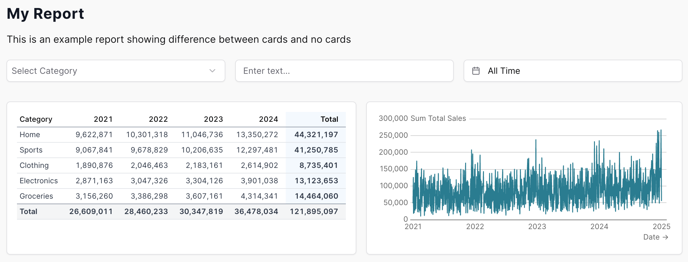
* `card` — background of individual component cards. Only takes effect when [cards](#cards-mode) are enabled.
* `cardLayoutBackground` — the page background shown behind the cards. Only takes effect when cards are enabled.
* `inputSurface` — fill for input controls (dropdowns, button groups, text inputs). Leave unset to auto-derive a raised surface from your theme; set it to pin a color.
* `sidebarBackground` — background of the published report's navigation sidebar. Unset → the sidebar tracks the page background.
* `positive` / `negative` — semantic up/down colors used by deltas, gains/losses, candlestick bodies, and red-negative values.
### `colorPalettes.default`
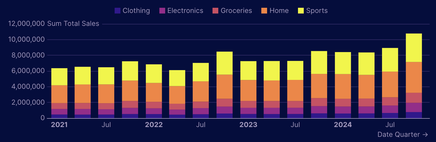
The categorical palette — the ordered list of series colors used by charts with multiple series (bar charts, line charts, etc.). Each series uses the next color in the list. Provide `light` and `dark` arrays of hex values.
 ### `colorScales.default`
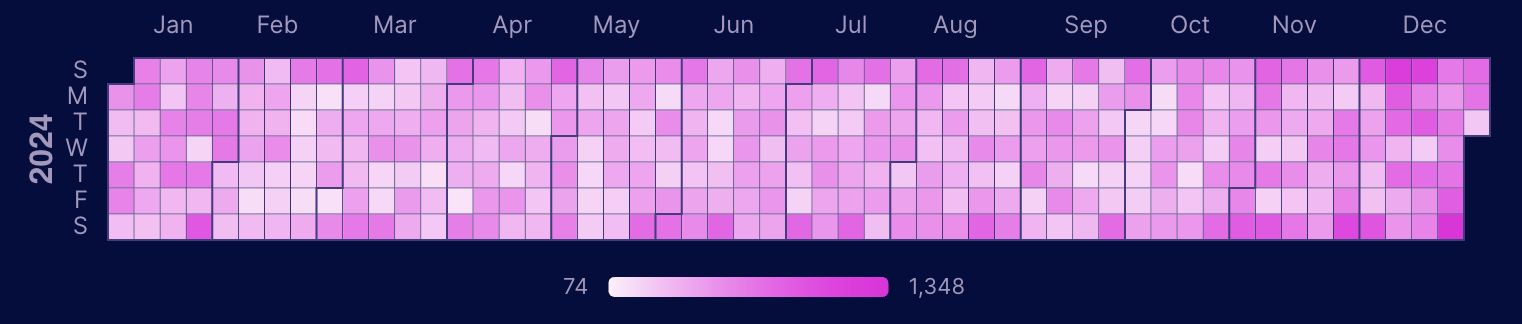
The sequential scale used for heatmaps, calendar heatmaps, and tables with `viz="color"` on a measure. Provide `light` and `dark` arrays of hex values.
**Two or more colors** form a custom gradient between your exact colors:
### `colorScales.default`
The sequential scale used for heatmaps, calendar heatmaps, and tables with `viz="color"` on a measure. Provide `light` and `dark` arrays of hex values.
**Two or more colors** form a custom gradient between your exact colors:
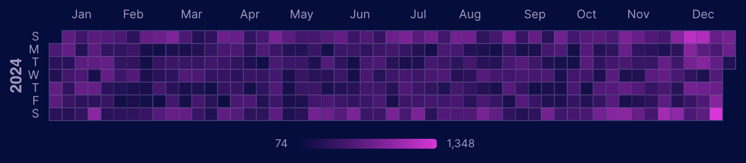
 If you provide a **single color**, the scale runs from your background to that color:
 ## Style tokens
Beyond colors, the theme controls typography, shape, spacing, and chart/table defaults. All are optional — omit a key to inherit it. The in-product theme editor exposes every token, and the generated `theme.yaml` includes a commented block of all defaults you can uncomment and edit.
* **`fonts`** — `heading`, `body`, and `mono`, each one of `sans-serif` | `serif` | `mono` (mapped to the bundled Geist / Source Serif 4 / Geist Mono). Charts follow the body font unless `chart.fontFamily` is set.
* **`baseFontSize`** — base size for report text (CSS length, e.g. `16px`); scales the whole type scale proportionally.
* **`sidebarFontSize`** — font size for the published sidebar navigation. Unset → follows the report size.
* **`radius`** — corner radius of cards, inputs, and buttons (CSS length).
* **`depth`** — shadow depth on cards/inputs: `flat` | `subtle` | `elevated`.
* **`density`** — spacing between components and inside cards: `flush` | `compact` | `default` | `comfortable`. `flush` removes grid gutters and tiles cards edge-to-edge.
* **`chart`** — `gridlines`, `baselines` (booleans); `gridlineColor`, `axisLabelColor`, `baselineColor` (light/dark colors); `fontFamily`; `barRadius` (px); `smooth`, `areaGradient` (booleans); and `animateIntro` / `animateUpdates` (chart draw-in on first render / re-animate on data change).
* **`table`** — `rowLines`, `rowShading` (default behaviors); and `barColor`, `subtotalBackground`, `totalBackground`, `rowBorderColor`, `hoverColor`, `linkColor`, `pivotBackground` (light/dark colors).
## Overriding the theme on a page
To customize a single page, add a `theme:` key to its [page settings](/features/page-settings). It mirrors the structure of `theme.yaml`. Anything you set overrides the project theme for that page only; anything you leave out is inherited.
```markdown theme={null}
---
title: Revenue
theme:
colors:
base:
light: '#ffffff'
dark: '#0b1020'
colorPalettes:
default:
light: ['#154886', '#45a1bf']
---
# Page content here
```
Overrides can be partial:
* Set only `light` (or only `dark`) and the other mode is inherited.
* Palette and scale arrays are overlaid positionally — the colors you list take the first slots and the inherited theme fills the rest — so listing a couple of palette colors keeps the remaining defaults.
## Component overrides
Component attributes are the most specific level. Set directly in your markdown, they override every theme setting for that one component.
```jinja theme={null}
{% combo_chart
data=sales
x=date
y=revenue
chart_options={
color_palette: ['#ff0000', '#00ff00']
}
/%}
```
## Cards mode
Cards wrap each component in a visual container (border + shadow) for a dashboard-style look. Cards are a [layout](/features/project-settings#layout) setting — enable them project-wide in `evidence.config.yaml`, or per page in [page settings](/features/page-settings) with `cards: true`. When cards are on, the `card` and `cardLayoutBackground` colors from your theme take effect.
**Without cards**, components render directly on the page background for a clean, document-style appearance:
## Style tokens
Beyond colors, the theme controls typography, shape, spacing, and chart/table defaults. All are optional — omit a key to inherit it. The in-product theme editor exposes every token, and the generated `theme.yaml` includes a commented block of all defaults you can uncomment and edit.
* **`fonts`** — `heading`, `body`, and `mono`, each one of `sans-serif` | `serif` | `mono` (mapped to the bundled Geist / Source Serif 4 / Geist Mono). Charts follow the body font unless `chart.fontFamily` is set.
* **`baseFontSize`** — base size for report text (CSS length, e.g. `16px`); scales the whole type scale proportionally.
* **`sidebarFontSize`** — font size for the published sidebar navigation. Unset → follows the report size.
* **`radius`** — corner radius of cards, inputs, and buttons (CSS length).
* **`depth`** — shadow depth on cards/inputs: `flat` | `subtle` | `elevated`.
* **`density`** — spacing between components and inside cards: `flush` | `compact` | `default` | `comfortable`. `flush` removes grid gutters and tiles cards edge-to-edge.
* **`chart`** — `gridlines`, `baselines` (booleans); `gridlineColor`, `axisLabelColor`, `baselineColor` (light/dark colors); `fontFamily`; `barRadius` (px); `smooth`, `areaGradient` (booleans); and `animateIntro` / `animateUpdates` (chart draw-in on first render / re-animate on data change).
* **`table`** — `rowLines`, `rowShading` (default behaviors); and `barColor`, `subtotalBackground`, `totalBackground`, `rowBorderColor`, `hoverColor`, `linkColor`, `pivotBackground` (light/dark colors).
## Overriding the theme on a page
To customize a single page, add a `theme:` key to its [page settings](/features/page-settings). It mirrors the structure of `theme.yaml`. Anything you set overrides the project theme for that page only; anything you leave out is inherited.
```markdown theme={null}
---
title: Revenue
theme:
colors:
base:
light: '#ffffff'
dark: '#0b1020'
colorPalettes:
default:
light: ['#154886', '#45a1bf']
---
# Page content here
```
Overrides can be partial:
* Set only `light` (or only `dark`) and the other mode is inherited.
* Palette and scale arrays are overlaid positionally — the colors you list take the first slots and the inherited theme fills the rest — so listing a couple of palette colors keeps the remaining defaults.
## Component overrides
Component attributes are the most specific level. Set directly in your markdown, they override every theme setting for that one component.
```jinja theme={null}
{% combo_chart
data=sales
x=date
y=revenue
chart_options={
color_palette: ['#ff0000', '#00ff00']
}
/%}
```
## Cards mode
Cards wrap each component in a visual container (border + shadow) for a dashboard-style look. Cards are a [layout](/features/project-settings#layout) setting — enable them project-wide in `evidence.config.yaml`, or per page in [page settings](/features/page-settings) with `cards: true`. When cards are on, the `card` and `cardLayoutBackground` colors from your theme take effect.
**Without cards**, components render directly on the page background for a clean, document-style appearance:
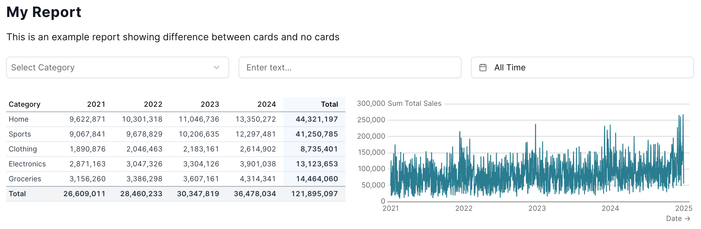 **With cards**, each component gets its own `card` background and the `cardLayoutBackground` color shows behind them: