> ## Documentation Index
> Fetch the complete documentation index at: https://docs.evidence.studio/llms.txt
> Use this file to discover all available pages before exploring further.
# Dropdown
> Display a dropdown with distinct values from a database column to use in filters
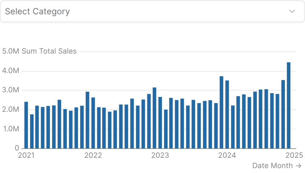 ```liquid theme={null}
{% dropdown
id="category_filter"
data="demo.daily_orders"
value_column="category"
/%}
{% bar_chart
data="demo.daily_orders"
x="date"
y="sum(total_sales)"
filters=["category_filter"]
date_grain="month"
/%}
```
## Examples
### Using `filters`
```liquid theme={null}
{% dropdown
id="category_filter"
data="demo.daily_orders"
value_column="category"
/%}
{% bar_chart
data="demo.daily_orders"
x="date"
y="sum(total_sales)"
filters=["category_filter"]
date_grain="month"
/%}
```
### Using `where`
```liquid theme={null}
{% dropdown
id="category_filter"
data="demo.daily_orders"
value_column="category"
/%}
{% bar_chart
data="demo.daily_orders"
x="date"
y="sum(total_sales)"
filters=["category_filter"]
date_grain="month"
/%}
```
## Examples
### Using `filters`
```liquid theme={null}
{% dropdown
id="category_filter"
data="demo.daily_orders"
value_column="category"
/%}
{% bar_chart
data="demo.daily_orders"
x="date"
y="sum(total_sales)"
filters=["category_filter"]
date_grain="month"
/%}
```
### Using `where`
 ```liquid theme={null}
{% dropdown
id="category_filter"
data="demo.daily_orders"
value_column="category"
/%}
{% bar_chart
data="demo.daily_orders"
x="date"
y="sum(total_sales)"
where="category = {{category_filter}}"
date_grain="month"
/%}
```
### Using Inline SQL
```liquid theme={null}
{% dropdown
id="category_filter"
data="demo.daily_orders"
value_column="category"
/%}
{% bar_chart
data="demo.daily_orders"
x="date"
y="sum(total_sales)"
where="category = {{category_filter}}"
date_grain="month"
/%}
```
### Using Inline SQL
 ````liquid theme={null}
{% dropdown
id="category_filter"
data="demo.daily_orders"
value_column="category"
/%}
```sql filtered_orders
select * from demo.daily_orders
where category = {{category_filter}}
```
{% table data="filtered_orders" /%}
````
### Using `date_range`
````liquid theme={null}
{% dropdown
id="category_filter"
data="demo.daily_orders"
value_column="category"
/%}
```sql filtered_orders
select * from demo.daily_orders
where category = {{category_filter}}
```
{% table data="filtered_orders" /%}
````
### Using `date_range`
 ```liquid theme={null}
{% dropdown
id="category_filter"
data="demo.daily_orders"
value_column="category"
date_range={
date="date"
range="last 12 months"
}
/%}
```
### Cascading Dropdowns (Linked Filters)
```liquid theme={null}
{% dropdown
id="category_filter"
data="demo.daily_orders"
value_column="category"
date_range={
date="date"
range="last 12 months"
}
/%}
```
### Cascading Dropdowns (Linked Filters)
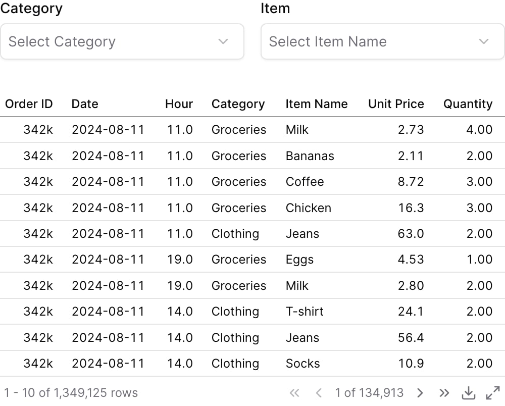 ```liquid theme={null}
{% dropdown
id="category"
data="demo.order_details"
value_column="category"
title="Category"
/%}
{% dropdown
id="item"
data="demo.order_details"
value_column="item_name"
title="Item"
filters=["category"]
/%}
{% table
data="demo.order_details"
filters=["category", "item"]
/%}
```
## Attributes
The id of the dropdown to be used in a `filters` prop
Name of the table to query
Array of filter IDs to apply when querying for dropdown options. Use this to create cascading/linked dropdowns where selecting a value in one dropdown narrows the available options in this dropdown.
Column name to use as the value for each option, and the column to filter by when this dropdown's `id` is used in the `filters` prop of a chart
Column name to use as the label for each option
List of options to display in the dropdown
Text displayed above the dropdown
Information tooltip text
URL to link the info text to (can only be used with info)
Create a custom link title for the info link, placed after the info text (can only be used with info\_link)
Icon to display in the dropdown trigger
**Allowed values:**
* `trending-up`
* `trending-down`
* `clock`
* `calendar`
* `check`
* `x`
* `info`
* `alert-circle`
* `help-circle`
* `eye`
* `eye-off`
* `user`
* `users`
* `settings`
* `cog`
* `plus`
* `minus`
* `up`
* `down`
* `right`
* `left`
* `star`
* `heart`
* `search`
* `file`
* `file-text`
* `home`
* `mail`
* `filter`
* `share`
* `bell`
* `trash`
* `credit-card`
* `globe`
* `key`
* `croissant`
* `map`
* `rotate`
* `rewind`
* `bank`
* `receipt`
* `activity`
* `chart-column`
* `chart-pie`
* `chart-no-axes-combined`
* `goal`
* `rocket`
* `trophy`
* `apple`
* `cookie`
* `donut`
* `beef`
* `cake`
* `soup`
* `utensils`
* `milk`
* `nut`
* `pyramid`
* `triangle`
* `arrow-down`
* `arrow-left`
* `arrow-right`
* `arrow-up`
* `chevron-down`
* `chevron-left`
* `chevron-right`
* `chevron-up`
* `chevrons-down`
* `chevrons-left`
* `chevrons-right`
* `chevrons-up`
* `menu`
* `external-link`
* `check-circle`
* `x-circle`
* `edit`
* `trash-2`
* `copy`
* `save`
* `download`
* `upload`
* `send`
* `refresh`
* `redo`
* `undo`
* `folder`
* `folder-open`
* `image`
* `file-image`
* `user-plus`
* `user-minus`
* `user-check`
* `lock`
* `unlock`
* `log-in`
* `log-out`
* `message-square`
* `message-circle`
* `phone`
* `phone-call`
* `bell-off`
* `video`
* `video-off`
* `play`
* `pause`
* `stop`
* `skip-back`
* `skip-forward`
* `volume`
* `volume-1`
* `volume-2`
* `volume-off`
* `volume-x`
* `bookmark`
* `tag`
* `link`
* `unlink`
* `share-2`
* `alert-triangle`
* `loader`
* `more-vertical`
* `more-horizontal`
* `grid`
* `list`
* `maximize`
* `minimize`
* `zoom-in`
* `zoom-out`
* `thumbs-up`
* `thumbs-down`
* `shopping-cart`
* `dollar-sign`
* `camera`
* `printer`
* `monitor`
* `smartphone`
* `laptop`
* `calculator`
* `cloud-sun-rain`
* `sun-snow`
* `thermometer-sun`
* `thermometer-snowflake`
* `cloudy`
* `cloud-rain-wind`
* `cloud-rain`
* `wind`
* `sun`
* `cloud-snow`
* `thermometer`
* `cloud-drizzle`
* `cloud-sun`
* `cloud`
* `cloud-lightning`
* `snowflake`
* `flame`
* `atom`
* `fuel`
* `magnet`
* `factory`
* `tree-deciduous`
* `waypoints`
* `plug`
* `dam`
* `battery`
Initial selected value(s)
Automatically select the first option when the component loads
For a multi-select dropdown, pre-selects the first N options (after `order` is applied) when the component loads. Generalizes `select_first`. Does not limit the option list and has no effect when `multiple=false`.
Placeholder text displayed when no value is selected
Includes a search input within the dropdown menu
Allows multiple selections
Includes a clear button to unselect the selected value(s)
Column name(s) with optional direction (e.g. "column\_name", "column\_name desc")
Custom SQL WHERE condition to apply to the query. For date filters, use date\_range instead.
Use date\_range to filter data for specific time periods. Accepts predefined ranges (e.g., "last 12 months"), dynamic ranges (e.g., "Last 90 days"), custom date ranges (e.g., "2020-01-01 to 2023-03-01"), or partial ranges (e.g., "from 2020-01-01", "until 2023-03-01")
**Example:**
```
date_range={
range = "today"
date = "string"
}
```
**Attributes:**
* range: `string` - Time period to filter. Use presets like 'last 7 days', dynamic patterns like 'Last 90 days', custom ranges like '2020-01-01 to 2023-03-01', or partial ranges like 'from 2020-01-01'.
* **Allowed values:**
* `today`
* `yesterday`
* `last 7 days`
* `last 30 days`
* `last 3 months`
* `last 6 months`
* `last 12 months`
* `previous week`
* `previous month`
* `previous quarter`
* `previous year`
* `this week`
* `this month`
* `this quarter`
* `this year`
* `next week`
* `next month`
* `next quarter`
* `next year`
* `week to date`
* `month to date`
* `quarter to date`
* `year to date`
* `all time`
* date: `string` - Date column to filter on. Required when the data has multiple date columns.
Set the width of this component (in percent) relative to the page width
## Using the Filter Variable
Reference this filter using `{{filter_id}}`. The value returned depends on where you use it.
The examples below show values for three scenarios:
* **No selection**
* **Single select:** "Electronics" selected
* **Multi select:** "Sports" and "Home" selected (when `multiple=true`)
| Context | Default Property | No Selection | Single Select | Multi Select |
| ----------------- | ---------------- | ------------ | --------------- | -------------------- |
| Inline SQL query | `.selected` | `''` | `'Electronics'` | `('Sports', 'Home')` |
| `where` attribute | `.selected` | `''` | `'Electronics'` | `('Sports', 'Home')` |
| Text / Markdown | `.literal` | | `Electronics` | `Sports, Home` |
### Available Properties
You can also access specific properties using `{{filter_id.property}}`:
#### .filter
Returns a complete SQL filter expression ready to use in WHERE clauses. Returns `true` when no value is selected.
````liquid theme={null}
{% dropdown id="category_filter" data="products" value_column="category" /%}
```sql filtered_products
select * from products
where {{category_filter.filter}}
```
````
| No Selection | Single Select | Multi Select |
| ------------ | -------------------------- | -------------------------------- |
| `true` | `category = 'Electronics'` | `category IN ('Sports', 'Home')` |
#### .selected
Returns the selected value(s) wrapped in quotes, suitable for SQL comparisons. Returns an empty string when no value is selected.
````liquid theme={null}
{% dropdown id="category_filter" data="products" value_column="category" /%}
```sql products_by_category
select * from products
where category = {{category_filter.selected}}
```
````
| No Selection | Single Select | Multi Select |
| ------------ | --------------- | -------------------- |
| `''` | `'Electronics'` | `('Sports', 'Home')` |
#### .literal
Returns the raw unescaped selected value(s), useful for display in text or dynamic column selection.
````liquid theme={null}
{% dropdown id="sort_column" data="products" value_column="column_name" /%}
```sql dynamic_sort
select * from products
order by {{sort_column.literal}}
```
````
| No Selection | Single Select | Multi Select |
| ------------ | ------------- | -------------- |
| \`\` | `Electronics` | `Sports, Home` |
#### .label
Returns the display label for the selected option(s). Falls back to the value if no label is defined.
```liquid theme={null}
{% dropdown id="category_filter" %}
{% option value="Electronics" label="Electronics" /%}
{% option value="Sports" label="Sports" /%}
{% option value="Home" label="Home" /%}
{% /dropdown %}
Selected: {{category_filter.label}}
```
| No Selection | Single Select | Multi Select |
| ------------ | ------------- | -------------- |
| \`\` | `Electronics` | `Sports, Home` |
#### .fmt
Returns the format string associated with the selected option. For multiple selections, returns the first format.
```liquid theme={null}
{% dropdown id="metric_selector" %}
{% option value="revenue" label="Revenue" fmt="usd" /%}
{% option value="growth_rate" label="Growth Rate" fmt="pct1" /%}
{% /dropdown %}
{% big_value data={metrics} value=value fmt={{metric_selector.fmt}} /%}
```
| No Selection | Single Select | Multi Select |
| ------------ | ------------- | ------------ |
| \`\` | `usd` | `usd` |
## Allowed Children
* [option](/components/option)
```liquid theme={null}
{% dropdown
id="category"
data="demo.order_details"
value_column="category"
title="Category"
/%}
{% dropdown
id="item"
data="demo.order_details"
value_column="item_name"
title="Item"
filters=["category"]
/%}
{% table
data="demo.order_details"
filters=["category", "item"]
/%}
```
## Attributes
The id of the dropdown to be used in a `filters` prop
Name of the table to query
Array of filter IDs to apply when querying for dropdown options. Use this to create cascading/linked dropdowns where selecting a value in one dropdown narrows the available options in this dropdown.
Column name to use as the value for each option, and the column to filter by when this dropdown's `id` is used in the `filters` prop of a chart
Column name to use as the label for each option
List of options to display in the dropdown
Text displayed above the dropdown
Information tooltip text
URL to link the info text to (can only be used with info)
Create a custom link title for the info link, placed after the info text (can only be used with info\_link)
Icon to display in the dropdown trigger
**Allowed values:**
* `trending-up`
* `trending-down`
* `clock`
* `calendar`
* `check`
* `x`
* `info`
* `alert-circle`
* `help-circle`
* `eye`
* `eye-off`
* `user`
* `users`
* `settings`
* `cog`
* `plus`
* `minus`
* `up`
* `down`
* `right`
* `left`
* `star`
* `heart`
* `search`
* `file`
* `file-text`
* `home`
* `mail`
* `filter`
* `share`
* `bell`
* `trash`
* `credit-card`
* `globe`
* `key`
* `croissant`
* `map`
* `rotate`
* `rewind`
* `bank`
* `receipt`
* `activity`
* `chart-column`
* `chart-pie`
* `chart-no-axes-combined`
* `goal`
* `rocket`
* `trophy`
* `apple`
* `cookie`
* `donut`
* `beef`
* `cake`
* `soup`
* `utensils`
* `milk`
* `nut`
* `pyramid`
* `triangle`
* `arrow-down`
* `arrow-left`
* `arrow-right`
* `arrow-up`
* `chevron-down`
* `chevron-left`
* `chevron-right`
* `chevron-up`
* `chevrons-down`
* `chevrons-left`
* `chevrons-right`
* `chevrons-up`
* `menu`
* `external-link`
* `check-circle`
* `x-circle`
* `edit`
* `trash-2`
* `copy`
* `save`
* `download`
* `upload`
* `send`
* `refresh`
* `redo`
* `undo`
* `folder`
* `folder-open`
* `image`
* `file-image`
* `user-plus`
* `user-minus`
* `user-check`
* `lock`
* `unlock`
* `log-in`
* `log-out`
* `message-square`
* `message-circle`
* `phone`
* `phone-call`
* `bell-off`
* `video`
* `video-off`
* `play`
* `pause`
* `stop`
* `skip-back`
* `skip-forward`
* `volume`
* `volume-1`
* `volume-2`
* `volume-off`
* `volume-x`
* `bookmark`
* `tag`
* `link`
* `unlink`
* `share-2`
* `alert-triangle`
* `loader`
* `more-vertical`
* `more-horizontal`
* `grid`
* `list`
* `maximize`
* `minimize`
* `zoom-in`
* `zoom-out`
* `thumbs-up`
* `thumbs-down`
* `shopping-cart`
* `dollar-sign`
* `camera`
* `printer`
* `monitor`
* `smartphone`
* `laptop`
* `calculator`
* `cloud-sun-rain`
* `sun-snow`
* `thermometer-sun`
* `thermometer-snowflake`
* `cloudy`
* `cloud-rain-wind`
* `cloud-rain`
* `wind`
* `sun`
* `cloud-snow`
* `thermometer`
* `cloud-drizzle`
* `cloud-sun`
* `cloud`
* `cloud-lightning`
* `snowflake`
* `flame`
* `atom`
* `fuel`
* `magnet`
* `factory`
* `tree-deciduous`
* `waypoints`
* `plug`
* `dam`
* `battery`
Initial selected value(s)
Automatically select the first option when the component loads
For a multi-select dropdown, pre-selects the first N options (after `order` is applied) when the component loads. Generalizes `select_first`. Does not limit the option list and has no effect when `multiple=false`.
Placeholder text displayed when no value is selected
Includes a search input within the dropdown menu
Allows multiple selections
Includes a clear button to unselect the selected value(s)
Column name(s) with optional direction (e.g. "column\_name", "column\_name desc")
Custom SQL WHERE condition to apply to the query. For date filters, use date\_range instead.
Use date\_range to filter data for specific time periods. Accepts predefined ranges (e.g., "last 12 months"), dynamic ranges (e.g., "Last 90 days"), custom date ranges (e.g., "2020-01-01 to 2023-03-01"), or partial ranges (e.g., "from 2020-01-01", "until 2023-03-01")
**Example:**
```
date_range={
range = "today"
date = "string"
}
```
**Attributes:**
* range: `string` - Time period to filter. Use presets like 'last 7 days', dynamic patterns like 'Last 90 days', custom ranges like '2020-01-01 to 2023-03-01', or partial ranges like 'from 2020-01-01'.
* **Allowed values:**
* `today`
* `yesterday`
* `last 7 days`
* `last 30 days`
* `last 3 months`
* `last 6 months`
* `last 12 months`
* `previous week`
* `previous month`
* `previous quarter`
* `previous year`
* `this week`
* `this month`
* `this quarter`
* `this year`
* `next week`
* `next month`
* `next quarter`
* `next year`
* `week to date`
* `month to date`
* `quarter to date`
* `year to date`
* `all time`
* date: `string` - Date column to filter on. Required when the data has multiple date columns.
Set the width of this component (in percent) relative to the page width
## Using the Filter Variable
Reference this filter using `{{filter_id}}`. The value returned depends on where you use it.
The examples below show values for three scenarios:
* **No selection**
* **Single select:** "Electronics" selected
* **Multi select:** "Sports" and "Home" selected (when `multiple=true`)
| Context | Default Property | No Selection | Single Select | Multi Select |
| ----------------- | ---------------- | ------------ | --------------- | -------------------- |
| Inline SQL query | `.selected` | `''` | `'Electronics'` | `('Sports', 'Home')` |
| `where` attribute | `.selected` | `''` | `'Electronics'` | `('Sports', 'Home')` |
| Text / Markdown | `.literal` | | `Electronics` | `Sports, Home` |
### Available Properties
You can also access specific properties using `{{filter_id.property}}`:
#### .filter
Returns a complete SQL filter expression ready to use in WHERE clauses. Returns `true` when no value is selected.
````liquid theme={null}
{% dropdown id="category_filter" data="products" value_column="category" /%}
```sql filtered_products
select * from products
where {{category_filter.filter}}
```
````
| No Selection | Single Select | Multi Select |
| ------------ | -------------------------- | -------------------------------- |
| `true` | `category = 'Electronics'` | `category IN ('Sports', 'Home')` |
#### .selected
Returns the selected value(s) wrapped in quotes, suitable for SQL comparisons. Returns an empty string when no value is selected.
````liquid theme={null}
{% dropdown id="category_filter" data="products" value_column="category" /%}
```sql products_by_category
select * from products
where category = {{category_filter.selected}}
```
````
| No Selection | Single Select | Multi Select |
| ------------ | --------------- | -------------------- |
| `''` | `'Electronics'` | `('Sports', 'Home')` |
#### .literal
Returns the raw unescaped selected value(s), useful for display in text or dynamic column selection.
````liquid theme={null}
{% dropdown id="sort_column" data="products" value_column="column_name" /%}
```sql dynamic_sort
select * from products
order by {{sort_column.literal}}
```
````
| No Selection | Single Select | Multi Select |
| ------------ | ------------- | -------------- |
| \`\` | `Electronics` | `Sports, Home` |
#### .label
Returns the display label for the selected option(s). Falls back to the value if no label is defined.
```liquid theme={null}
{% dropdown id="category_filter" %}
{% option value="Electronics" label="Electronics" /%}
{% option value="Sports" label="Sports" /%}
{% option value="Home" label="Home" /%}
{% /dropdown %}
Selected: {{category_filter.label}}
```
| No Selection | Single Select | Multi Select |
| ------------ | ------------- | -------------- |
| \`\` | `Electronics` | `Sports, Home` |
#### .fmt
Returns the format string associated with the selected option. For multiple selections, returns the first format.
```liquid theme={null}
{% dropdown id="metric_selector" %}
{% option value="revenue" label="Revenue" fmt="usd" /%}
{% option value="growth_rate" label="Growth Rate" fmt="pct1" /%}
{% /dropdown %}
{% big_value data={metrics} value=value fmt={{metric_selector.fmt}} /%}
```
| No Selection | Single Select | Multi Select |
| ------------ | ------------- | ------------ |
| \`\` | `usd` | `usd` |
## Allowed Children
* [option](/components/option)